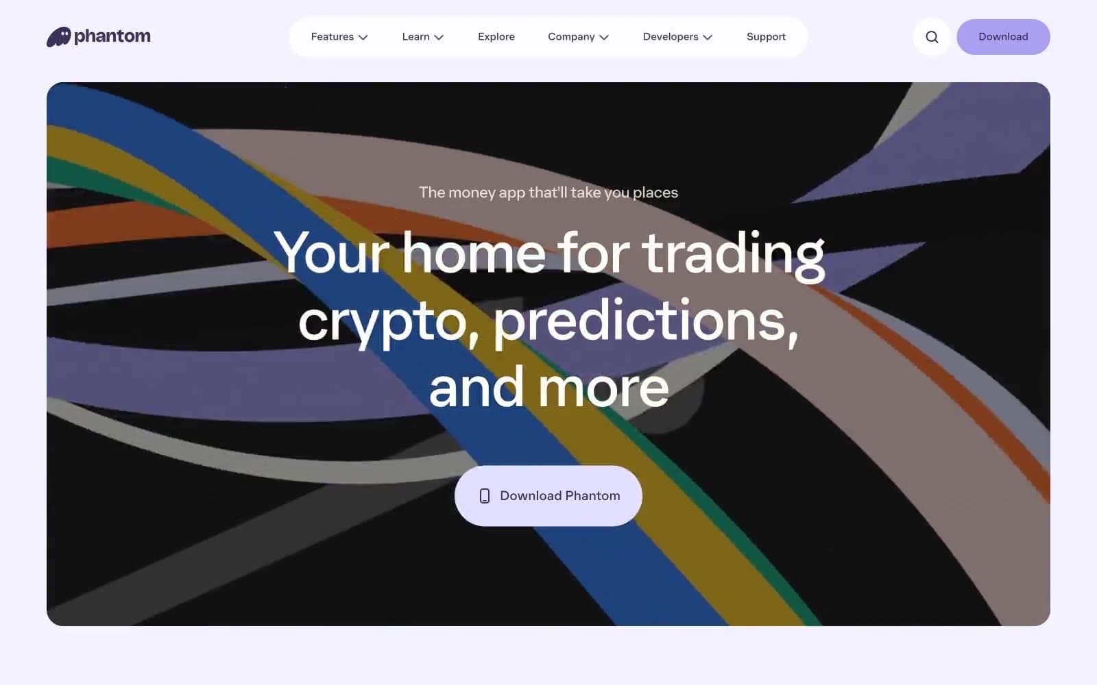
Phantom. Lavender candy shop at dusk.
- Crypto
- Mixed theme
- 12 colors
- 1 typeface
Phantom is a soft, monochromatic crypto-wallet world bathed in aubergine and lavender. The interface lives in a near-white canvas but bleeds into deep violet sections, creating a mood that oscillates between airy and intimate. Typography is whisper-weight (350) with aggressive negative tracking, letting massive 80-96px hero lines float with grace. The defining signature is generous pill-shaped geometry — navigation, buttons, and cards all dissolve into capsule forms with 24-100px radii. A single ghost mascot replaces vowels in headlines, breaking the grid with playful subversion. The palette is deliberately narrow: one primary violet does all the structural work, while pastel button tints (lavender, butter, blush) create a candy-store rhythm against the restrained backdrop.
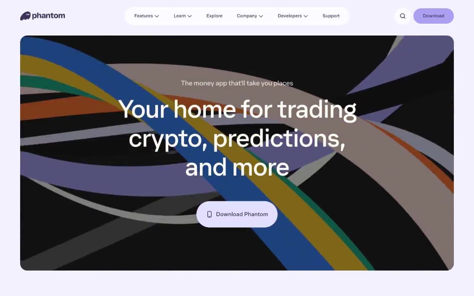
Phantom design system

Brand2
Primary brand — navigation borders, nav text, heading text, card surfaces in dark sections, icon strokes. The structural spine of the entire system
Primary action — filled CTA button background, violet glow shadow on buttons. The light-on-light button that only reveals its presence through a soft 4px halo
Accent4
Secondary action — brighter lavender for secondary CTAs, decorative fills, icon accents. Adds saturation to the pale-violet world
Accent button — occasional vivid blue button for emphasis or differentiation. Use sparingly as a high-energy interruption
Accent button — pale yellow button fill for variety in multi-action contexts. Pastel punctuation in the candy palette
Accent button — near-gray pink button for warmth and tonal range. The softest of the pastel set
Neutrals5
Body text, heading text on light backgrounds, button borders, card borders. The near-black ink for all foreground content
Muted text, icon strokes, secondary nav borders. The quiet gray for non-emphasized elements
Button background, subtle surface fill. The neutral pale surface beneath lavender hero panels
Surface background — light section panels, button fills. The warmest of the near-white neutrals
Canvas — page background, card surfaces, button borders, text on dark backgrounds. Near-white with the faintest cool tint
semantic1
Success badge — vivid green for status indicators, positive confirmations, live signals
Try a pairing
Pick any two colors from the palette to check whether text stays readable on top.
Aa
Paper White on Aubergine
11.52 : 1 contrast
- Body textPasses AA 4.5
- Large textPasses AA 3
- StrictPasses AAA 7