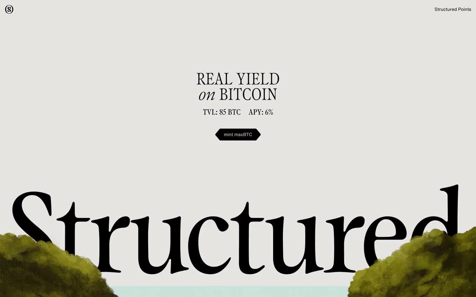
Eclipse. Think Akira signage rendered as a finance terminal.
- Crypto
- Mixed theme
- 3 colors
- 4 typefaces
Eclipse runs a monochromatic canvas with a single neon-green pulse — the visual grammar is closer to a 90s anime cel than a blockchain dashboard. Headlines use GT Alpina Condensed at hairline weights (100–200), the thinnest possible serif line that still reads as letterforms, paired with Barlow Condensed for compact UI chrome. The single chromatic token (#a1fea0) behaves like a highlighter drawn over an ink-on-paper sketch: borders, button fills, cloud illustrations, and glow halos all share that one vivid green against pure black and white. Surfaces are flat — no shadows, no gradients, no elevation tricks. Buttons are fat pills (25px radius), labels are tracked-out typewriter caps, and illustration carries the atmosphere while the type does the structural work.
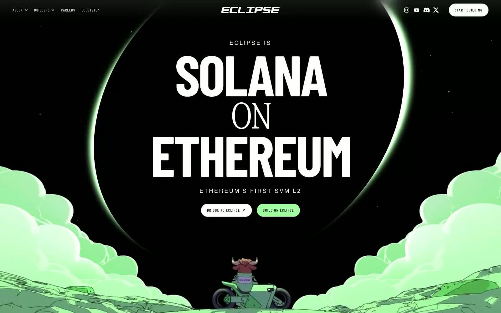
Eclipse design system

Brand1
Primary action fill, active nav state, decorative border accents, cloud and glow illustration fills, investor-card spotlight — the only chromatic token in the system, applied sparingly to make each occurrence feel like a marker pen stroke
Neutrals2
Body and heading text, hairline borders across cards/badges/buttons, footer rules, outlined button stroke — the dominant neutral that carries all structural lines
Page canvas, card surfaces, button text on dark fills, nav backgrounds, image backdrop — the base layer everything sits on
Try a pairing
Pick any two colors from the palette to check whether text stays readable on top.
Aa
Ink Black on Eclipse Green
17.20 : 1 contrast
- Body textPasses AA 4.5
- Large textPasses AA 3
- StrictPasses AAA 7