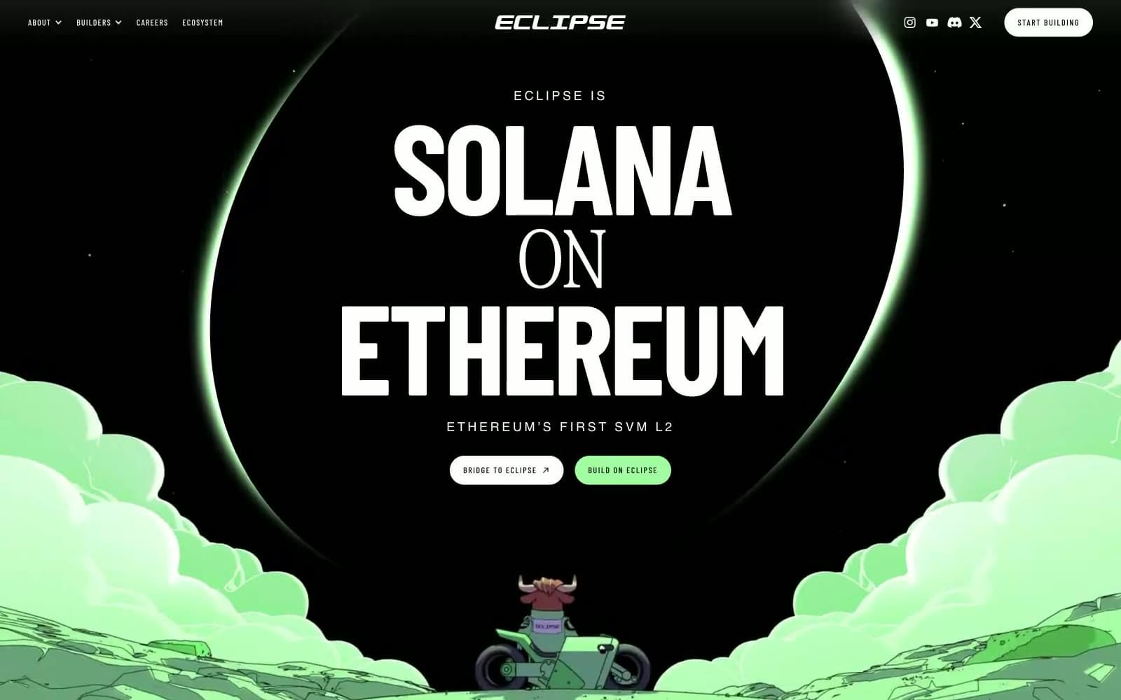
NEAR. A black chamber where geometric star-crosses hover like fiber-optic nodes, and a single neon green pulse is the only color that matters.
- Crypto
- Mixed theme
- 9 colors
- 2 typefaces
NEAR operates as a void-and-signal system: an obsidian canvas scattered with glowing emerald star-cross particles, interrupted by flat mint-green full-bleed bands and a repeating "AI" text-tile that functions as a signature wallpaper. Typography is geometric and confident — FKGrotesk at 80px for display headlines holds weight 500, bold through scale not heft, and tight tracking keeps blocks dense. Color discipline is total: pure black, pure white, and one vivid neon green (#00ec97) carry every functional role, with a softer sage (#c7f5d8) reserved exclusively for full-bleed light sections. Components are sharp and flat — 4px radii dominate, borders are 1px hairlines, shadows are absent, and elevation comes from color contrast and section rhythm rather than depth. The page alternates dark and light bands deliberately, making each section transition a moment of contrast rather than a fade.

NEAR design system

Brand1
Primary action buttons, active link backgrounds, accent text, and any element that must pulse — the only chromatic function color in the system
Accent2
Full-bleed light section backgrounds — a flat, desaturated mint that reads as ambient rather than decorative, providing visual rest between dark bands
Secondary accent within the AI text-tile pattern and illustration details — cool teal offset against Signal Green adds chromatic depth without competing
Neutrals6
Primary text on light surfaces, dark section backgrounds, inverse text on light cards — the void that carries the constellation
Secondary text, muted link borders, disabled states, tertiary metadata
Tertiary borders, muted icon fills — the quietest neutral in the system
Hairline borders, dividers, card outlines — the most-used neutral at 1500+ occurrences forms the structural skeleton
Input field borders, warm off-white fills — a slight warm shift from the achromatic scale
Light section text on dark backgrounds, card surfaces, button backgrounds on dark hero — the positive space
Try a pairing
Pick any two colors from the palette to check whether text stays readable on top.
Aa
Obsidian on Signal Green
13.45 : 1 contrast
- Body textPasses AA 4.5
- Large textPasses AA 3
- StrictPasses AAA 7