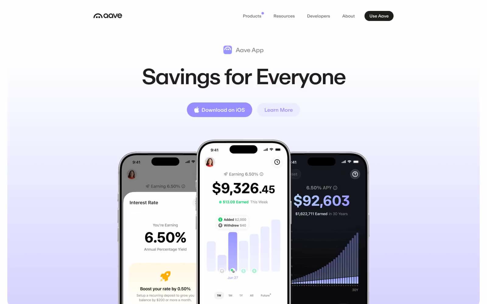
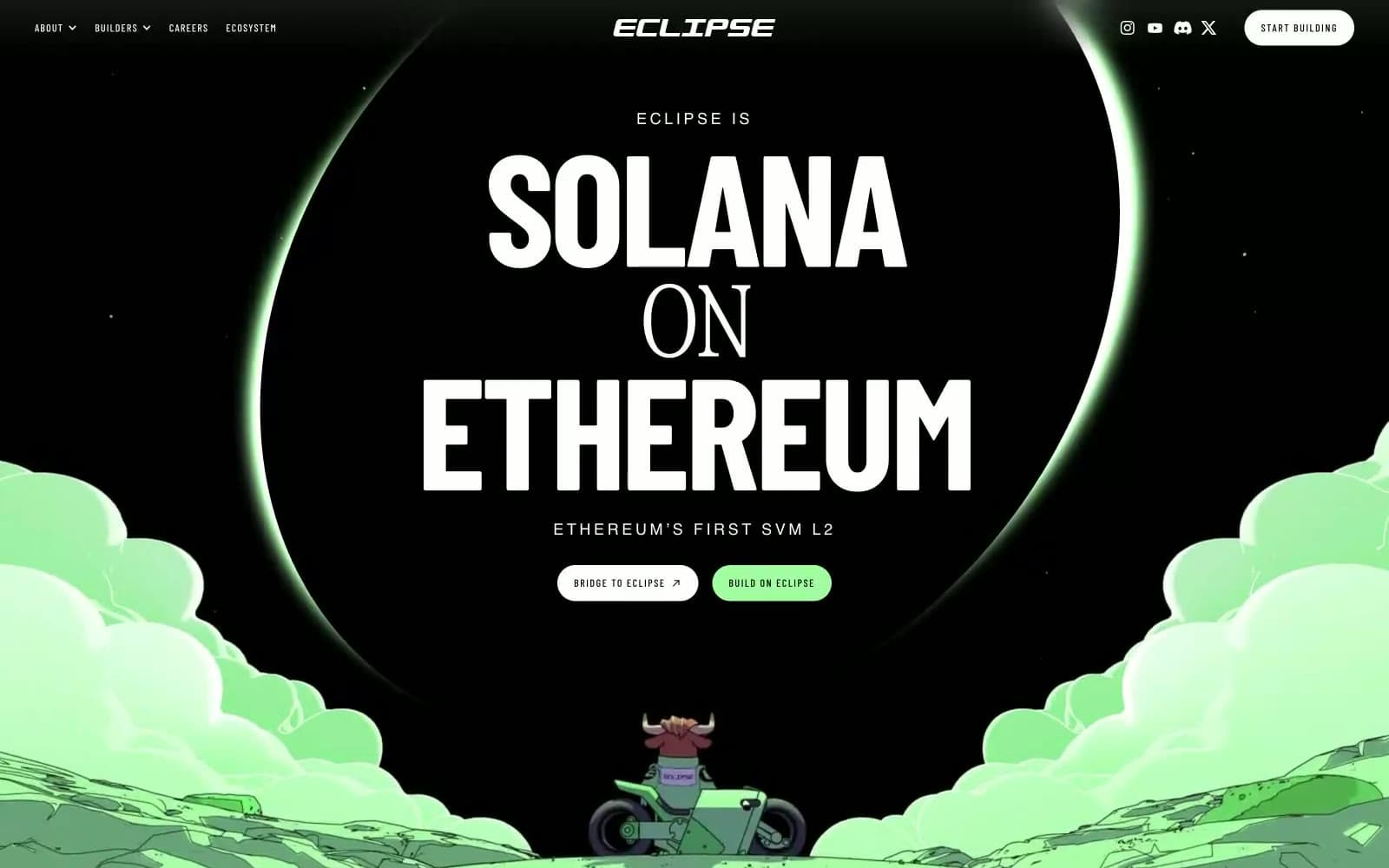
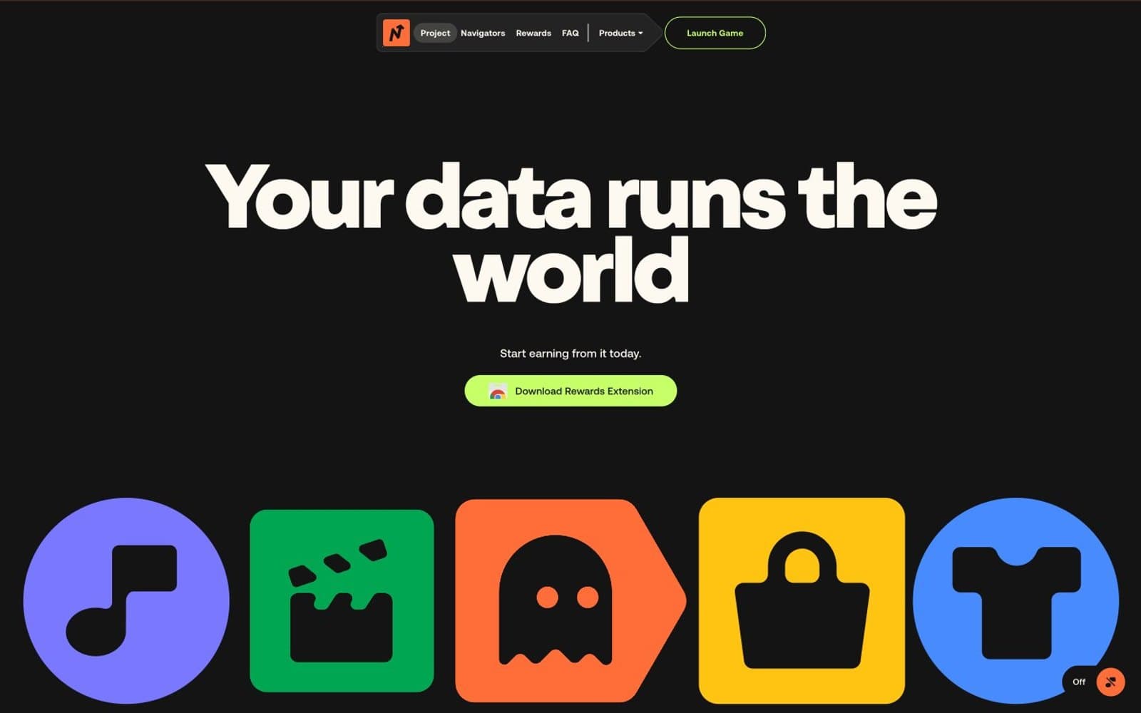
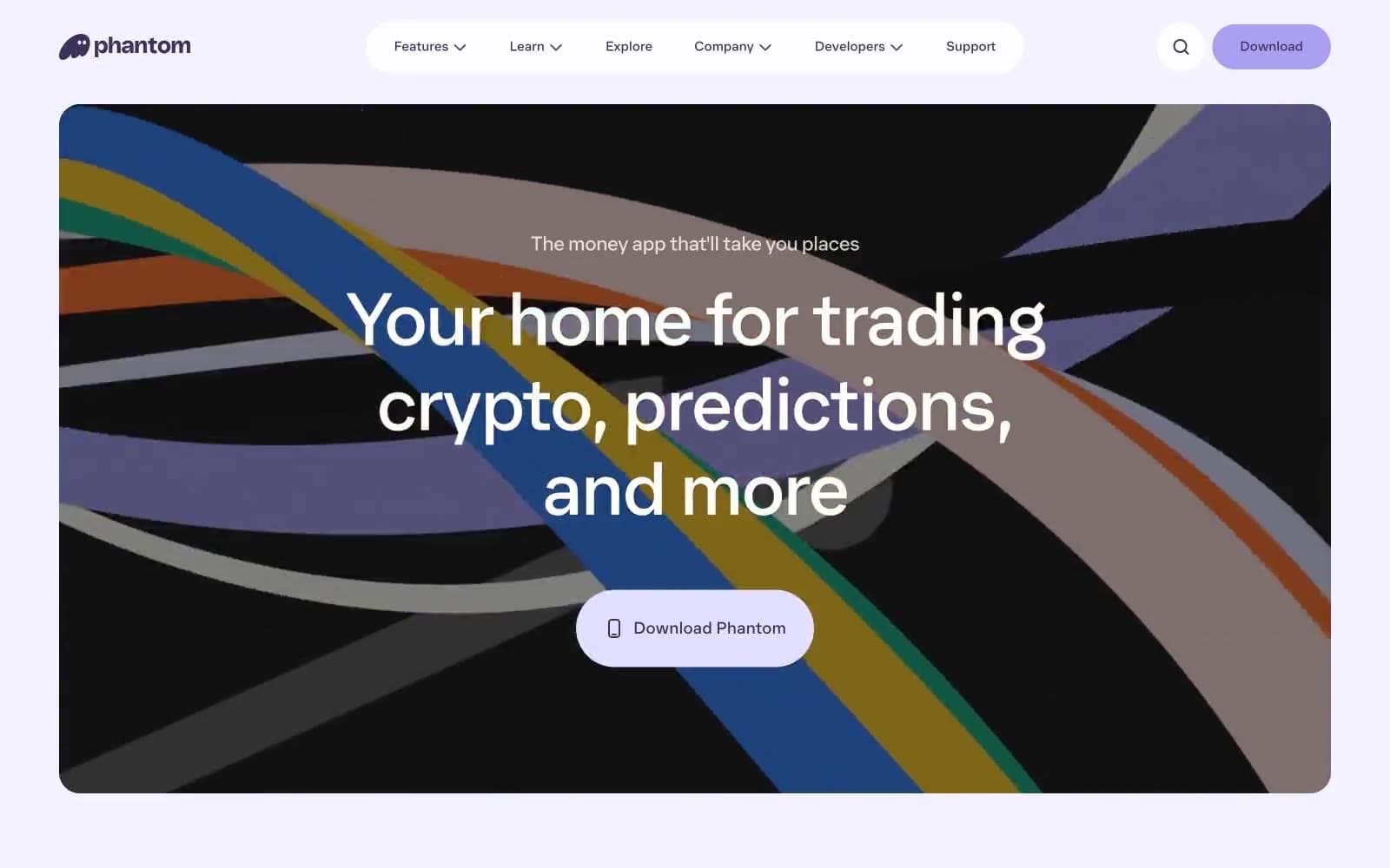
Eco. A near-monochrome ledger where negative space and oversized display type carry the entire brand weight, interrupted only by tiny electric-blue marks.
- Crypto
- Mixed theme
- 11 colors
- 5 typefaces
Eco operates as a financial cathedral rendered in near-total monochrome: a white-and-bone canvas interrupted by near-black voids, with the entire brand voice carried by type rather than color. Display sizes stretch to 90–96px with aggressive negative tracking, making headlines feel architectural and authoritative without chromatic support. Surfaces transition sharply between light (#ffffff/#efefef) and deep ink (#0f111a/#141414/#000000), creating a vault-like rhythm where every dark band reads as a chamber of gravity. A single blue gradient (deep cobalt to electric sky) surfaces sparingly on small UI marks, never as a CTA fill — actions are ghost-bordered on dark, ghost-bordered on light, or monochrome text links. Components are flat, minimal-elevation, and rely on hairline contrast and generous whitespace rather than shadow or color to separate. The system feels less like a product UI and more like a bank lobby translated into the screen — restrained, confident, almost ceremonial in its avoidance of decoration.

Eco design system

Brand2
Gradient origin — small icon accents, arrow markers, chromatic punctuation on otherwise monochrome controls
Gradient terminus — the bright terminal of the blue mark, always paired with Cobalt Signal as a gradient pair
Neutrals9
Deepest dark band background, high-contrast text on light surfaces — used where absolute weight is required
Primary heading text, dark band backgrounds, footer surface — the near-black that carries all authority and seals dark chambers
Secondary dark surface, border on dark sections — one shade lighter than Absolute for layered darkness
Dark border, secondary text on dark surfaces, image overlay tones
Supporting neutral for secondary UI, dividers, and muted labels. Do not promote it to the primary CTA color
Muted card text, disabled states, secondary metadata — the quietest readable neutral
Decorative border, link accent on dark, subtle cool-tinted hairline — the only chromatic whisper in the neutral stack
Light supporting surface for subtle backgrounds and section separation. Do not promote it to the primary CTA color
Primary canvas, card surfaces, button text on dark bands — the dominant air of the system
Try a pairing
Pick any two colors from the palette to check whether text stays readable on top.
Aa
Bone on Cobalt Signal
6.95 : 1 contrast
- Body textPasses AA 4.5
- Large textPasses AA 3
- StrictFails AAA 7