
Stripe. Indigo-ink ledger on frosted glass.
- Brand
- Light theme
- 14 colors
- 1 typeface
Stripe uses a near-monochrome financial-instrument language: a soft cool-white canvas with deep navy headings, almost no decorative chrome, and one vivid indigo (#533afd) that earns the right to be a button, link, or icon stroke. Typography is exclusively sohne-var at weight 300 — even at 56px display size — which reads as confident restraint rather than corporate shouting; letter-spacing tightens aggressively as size grows. Buttons are small, squared at 4px, and use violet fills or hairline violet outlines. The system avoids shadows entirely; depth comes from background tint shifts (white → #f8fafd → #e5edf5 → violet washes) rather than elevation. The whole interface behaves like a ledger or terminal: dense information, crisp rules, generous whitespace between sections, and color appearing only when something needs to be acted on.
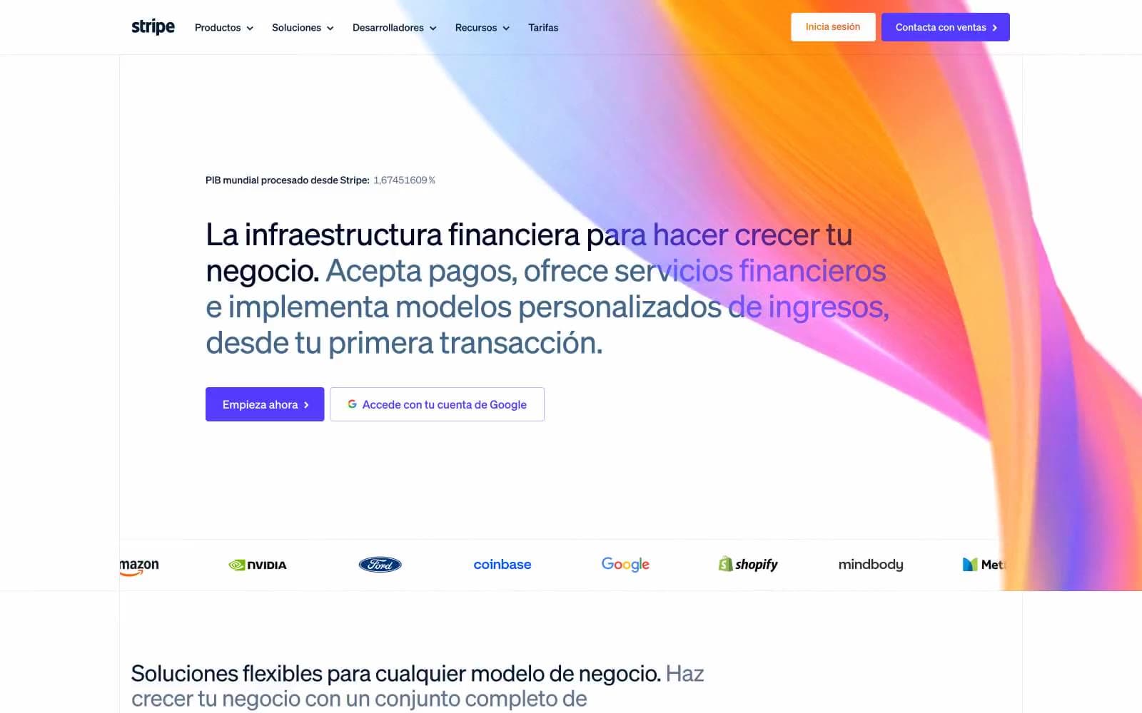
Stripe design system

Brand2
Violet action color for filled buttons, selected navigation states, and focused conversion moments.
Violet text accent for links, tags, and emphasized short phrases. Do not promote it to the primary CTA color
Accent5
Hairline outline button border (1px) — the violet companion to indigo fills; pairs with white text for ghost CTAs
Secondary outline button border and softer dividers; a paler sibling of lavender for tertiary ghost actions
Lightest violet surface — soft tinted backgrounds for highlighted cards, tag pills, and subtle emphasis blocks
Heaviest accent stroke — rare use for emphasized borders or graphic frames; reads almost as a navy
Mid-violet outline border for developer-facing buttons; sits between indigo ink and lavender border
Neutrals7
Primary heading and body text — deep near-black with a cool blue undertone that anchors the entire type system
Tertiary body text and helper copy — sits between slate and the muted violet tints used on sub-labels
Gray text accent for links, tags, and emphasized short phrases.
Muted violet-tinted text for large decorative headings and supporting copy — never for body paragraphs
Primary border color, subtle surface tint, and button hover backgrounds; the workhorse neutral that divides content
Footer background and section banding — a barely-perceptible cool tint that separates regions without a visible line
Page canvas and elevated card surfaces; the default background against which everything else is measured
Try a pairing
Pick any two colors from the palette to check whether text stays readable on top.
Aa
Pure White on Indigo Ink
6.19 : 1 contrast
- Body textPasses AA 4.5
- Large textPasses AA 3
- StrictFails AAA 7
More DESIGN.md files. Same web, different personalities.
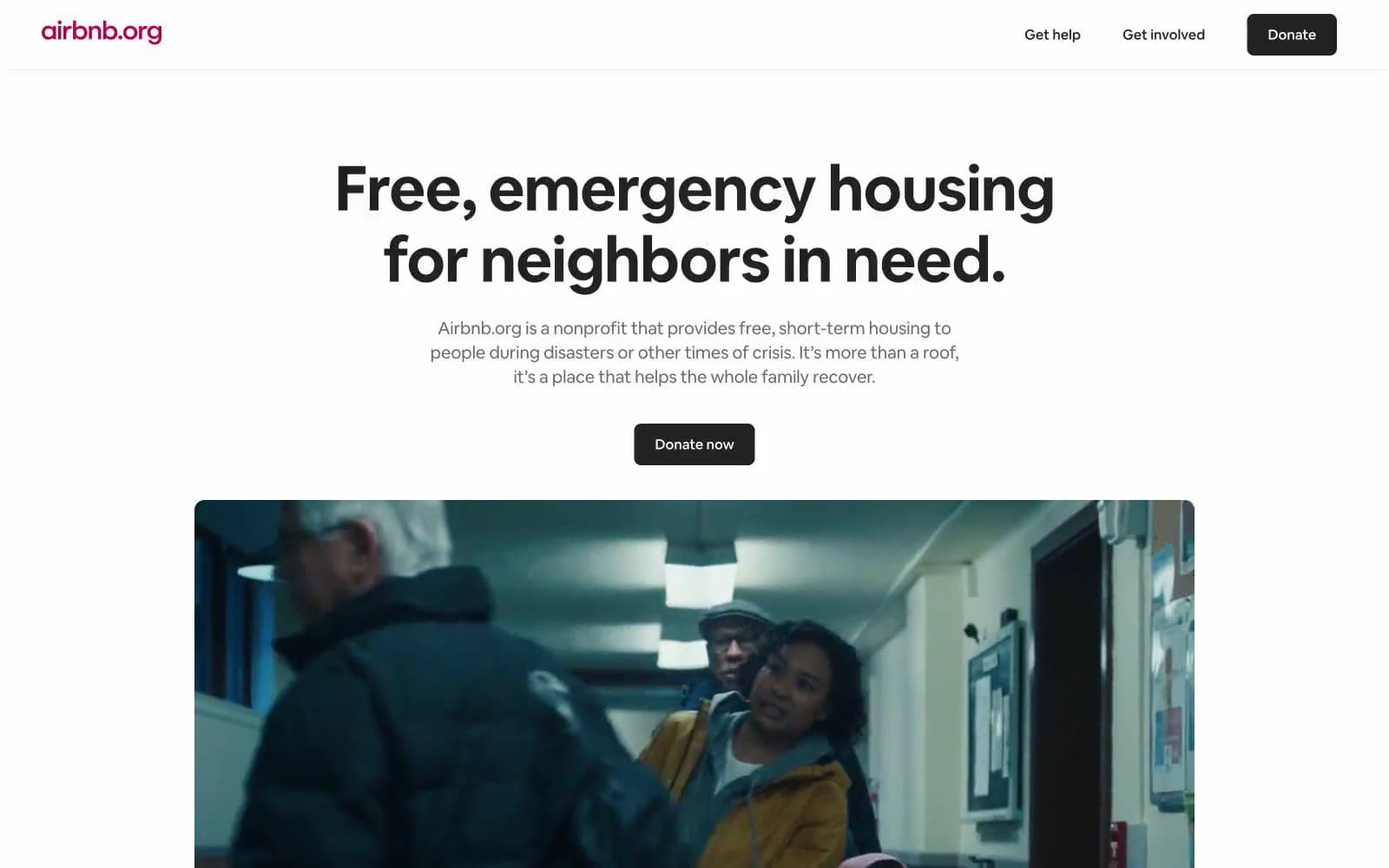
Airbnb
Brand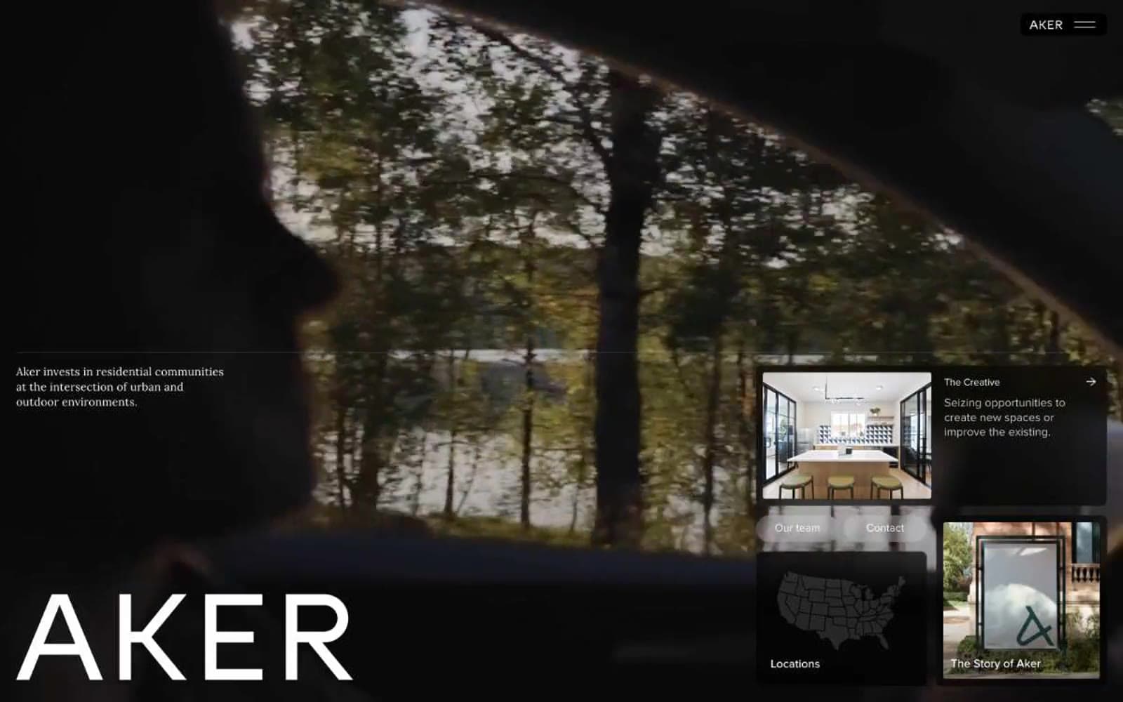
Aker
Brand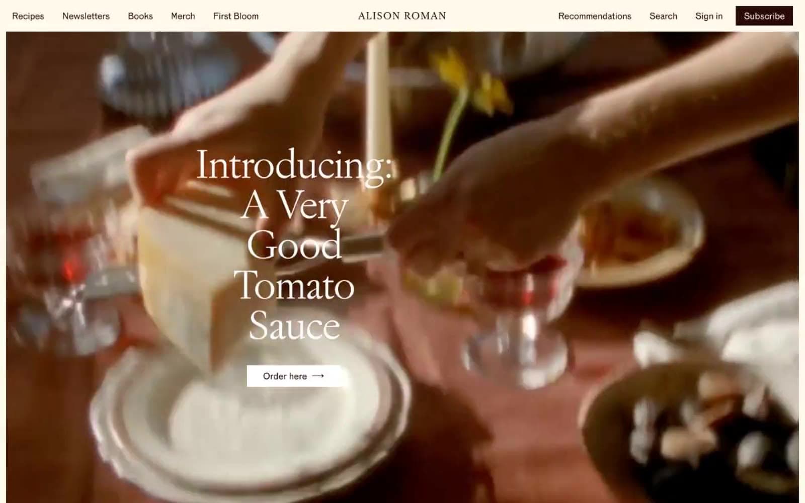
Alison Roman
Brand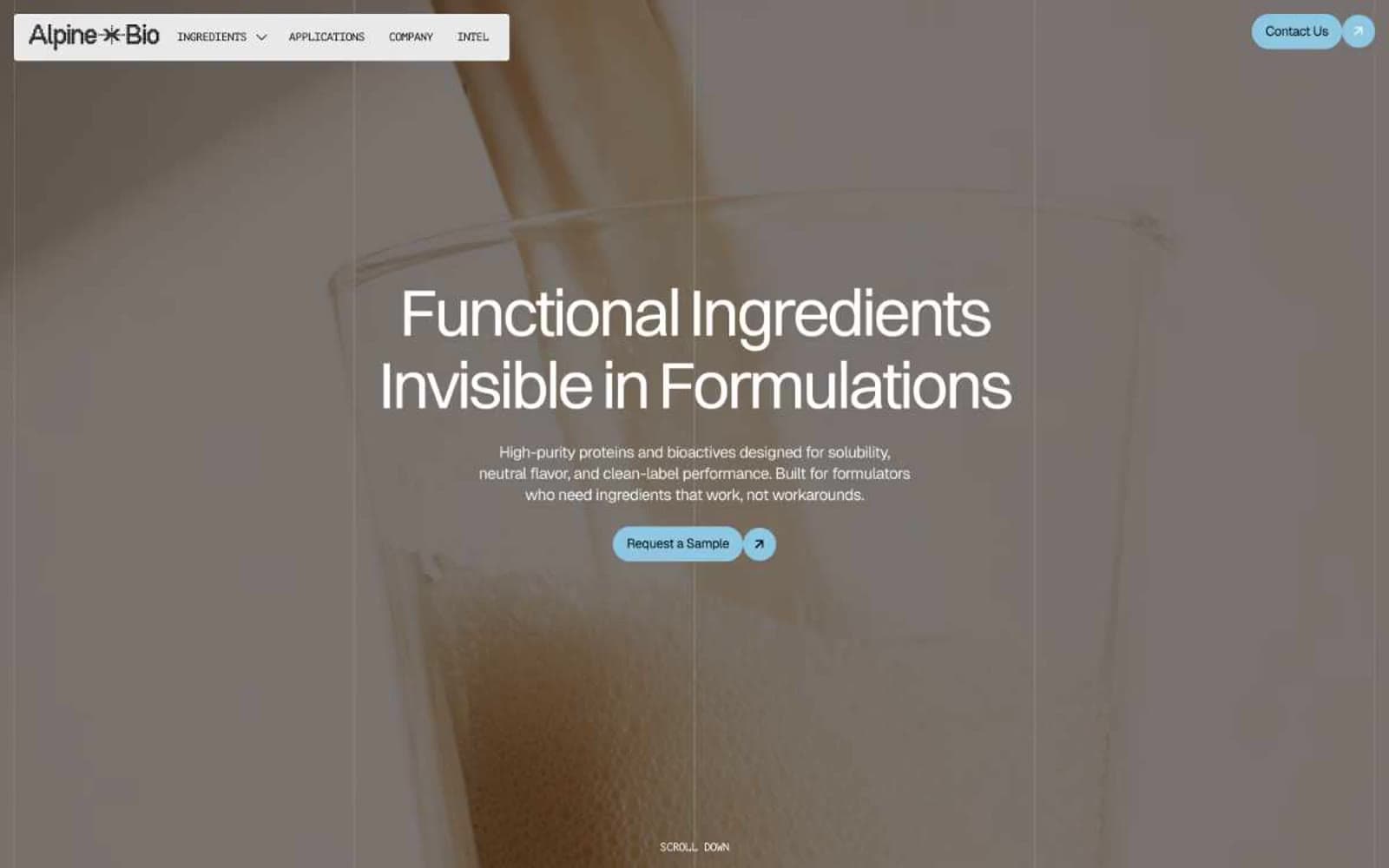
Alpine Bio
Brand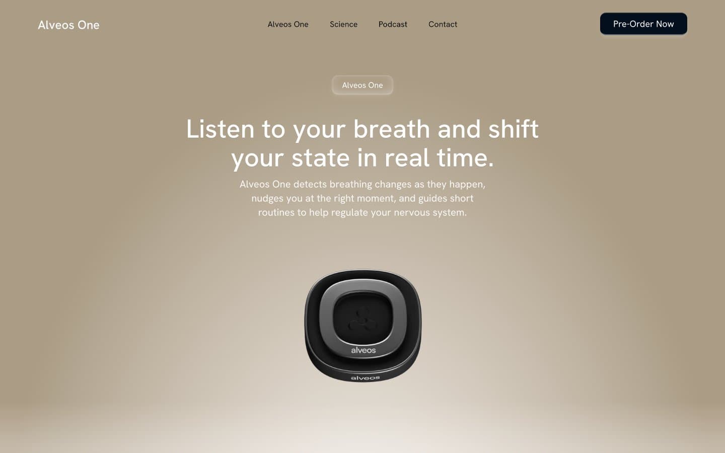
Alveos One
Brand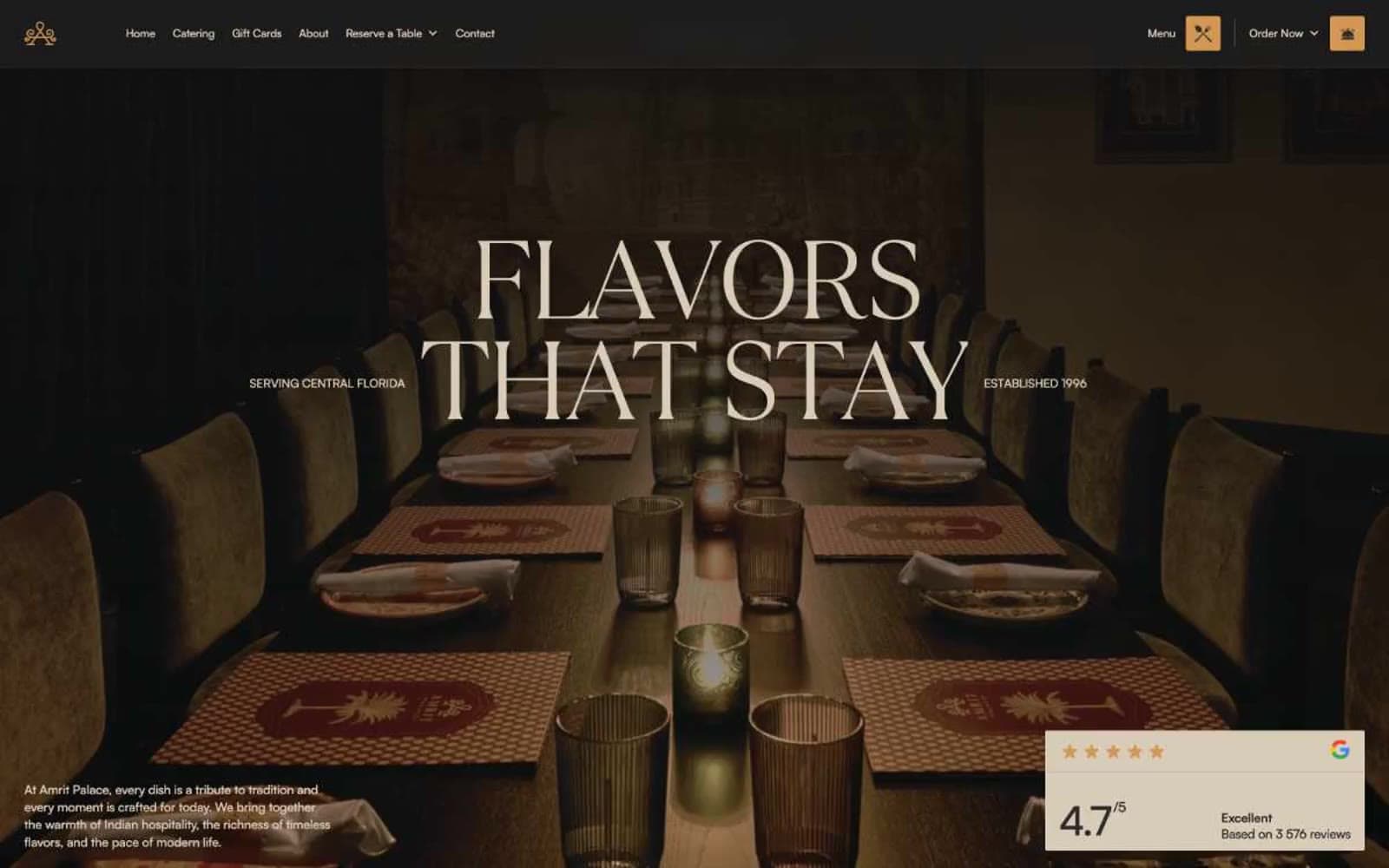
Amrit Palace
Brand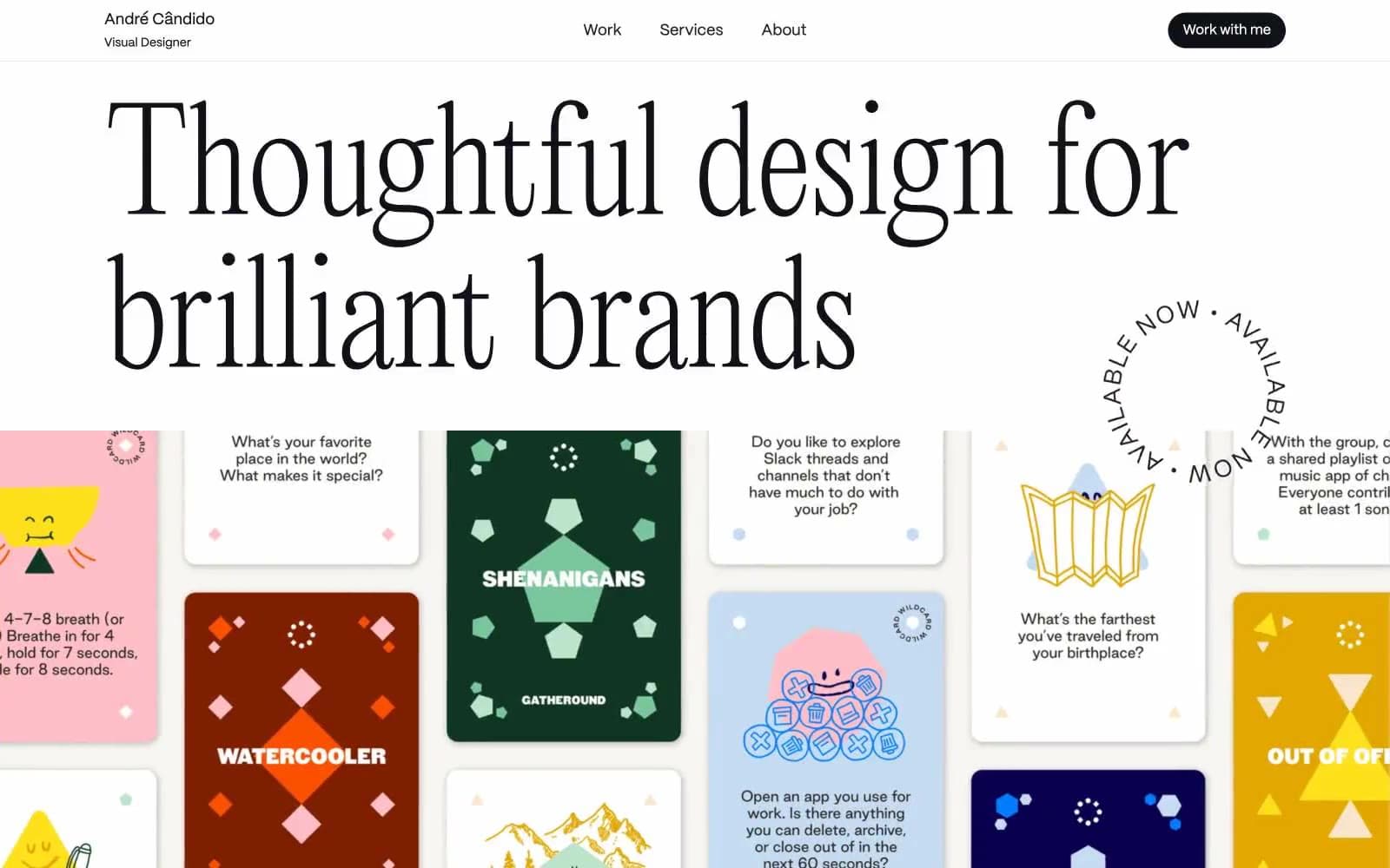
André Cândido
Brand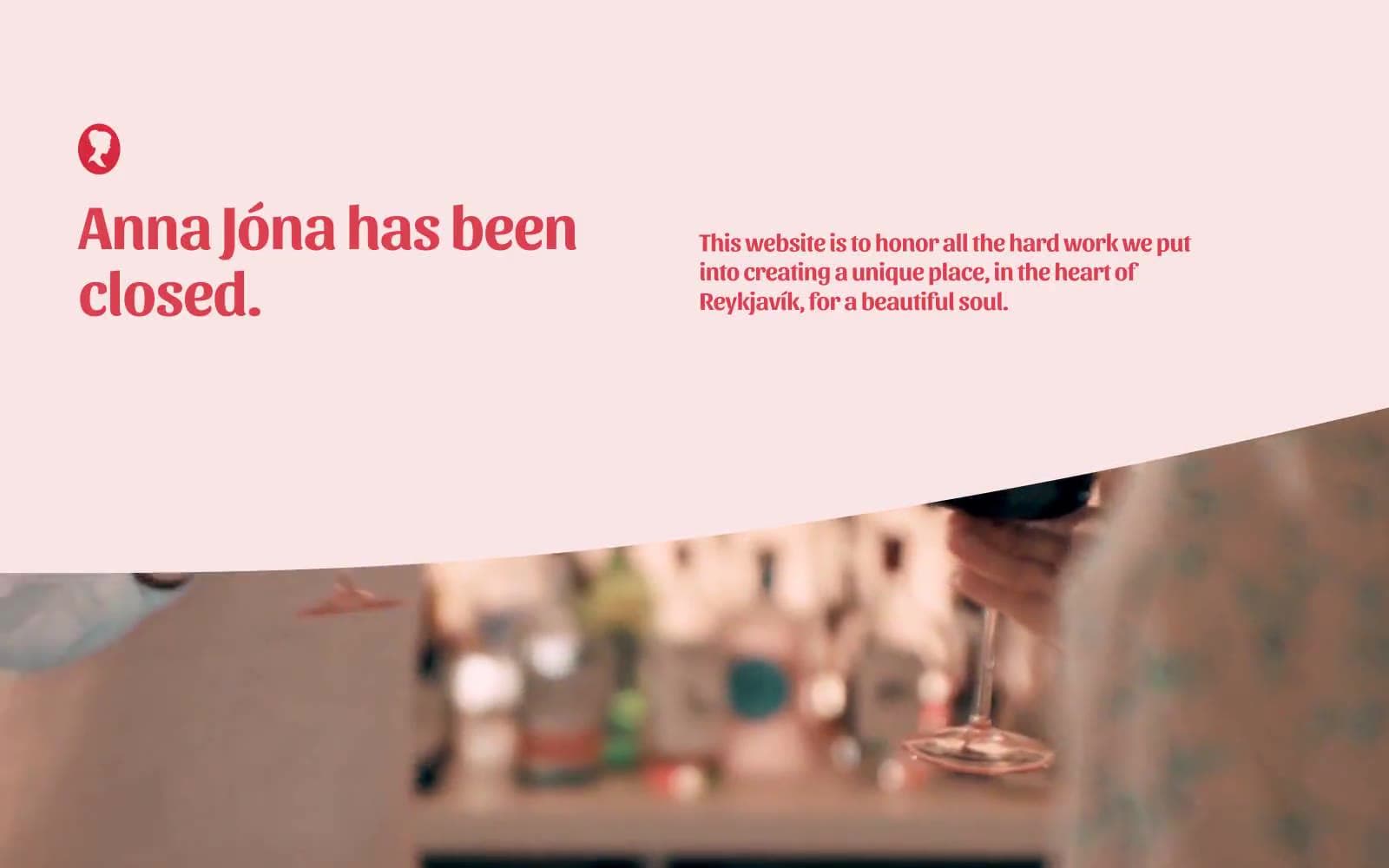
Anna Jóna
Brand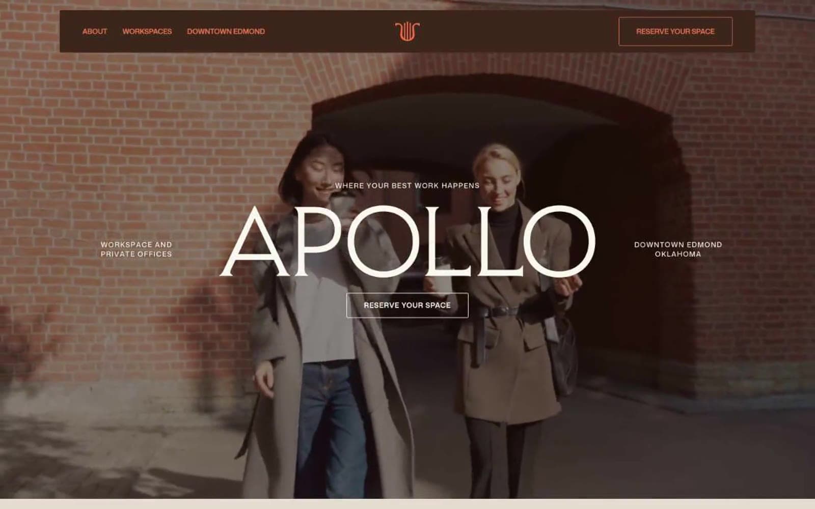
Apollo
Brand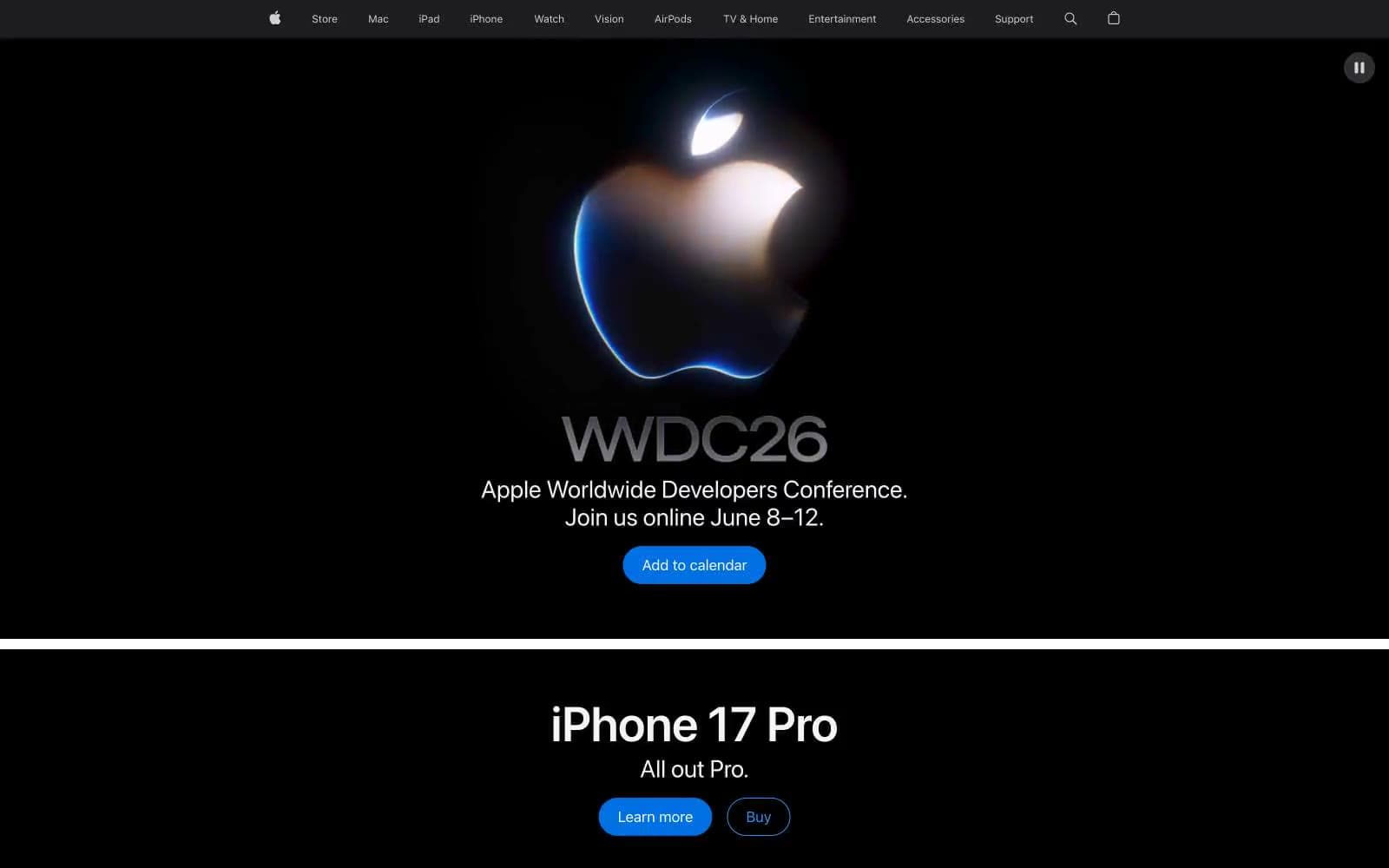
Apple
Brand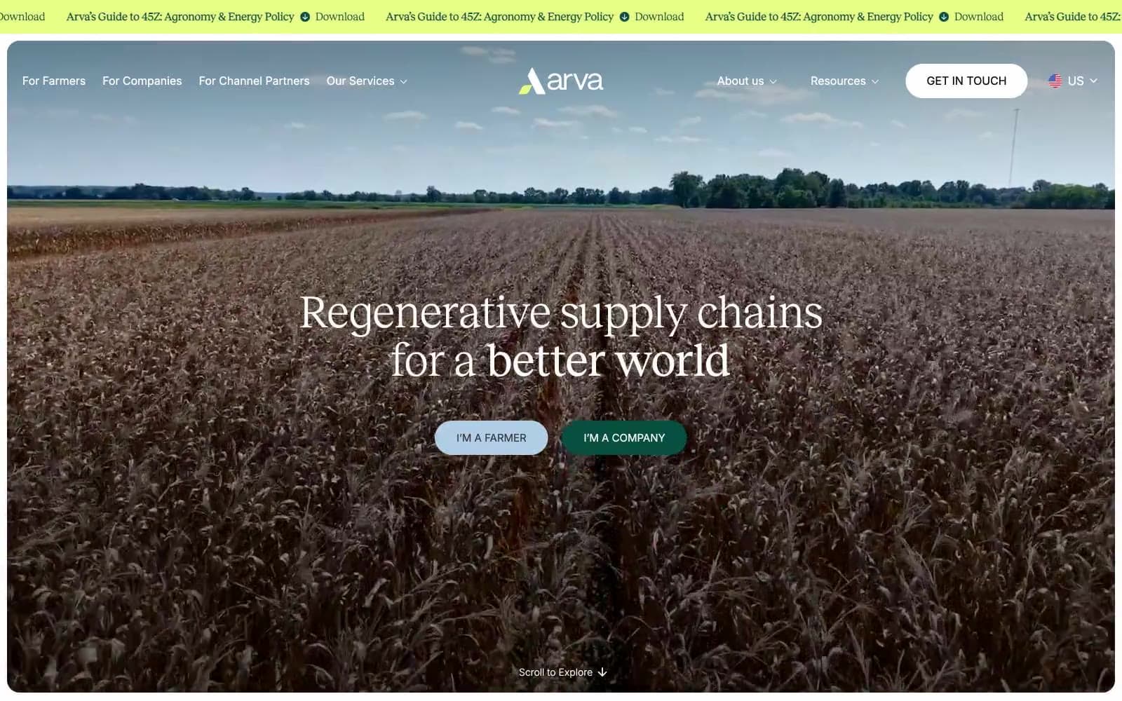
Arva
Brand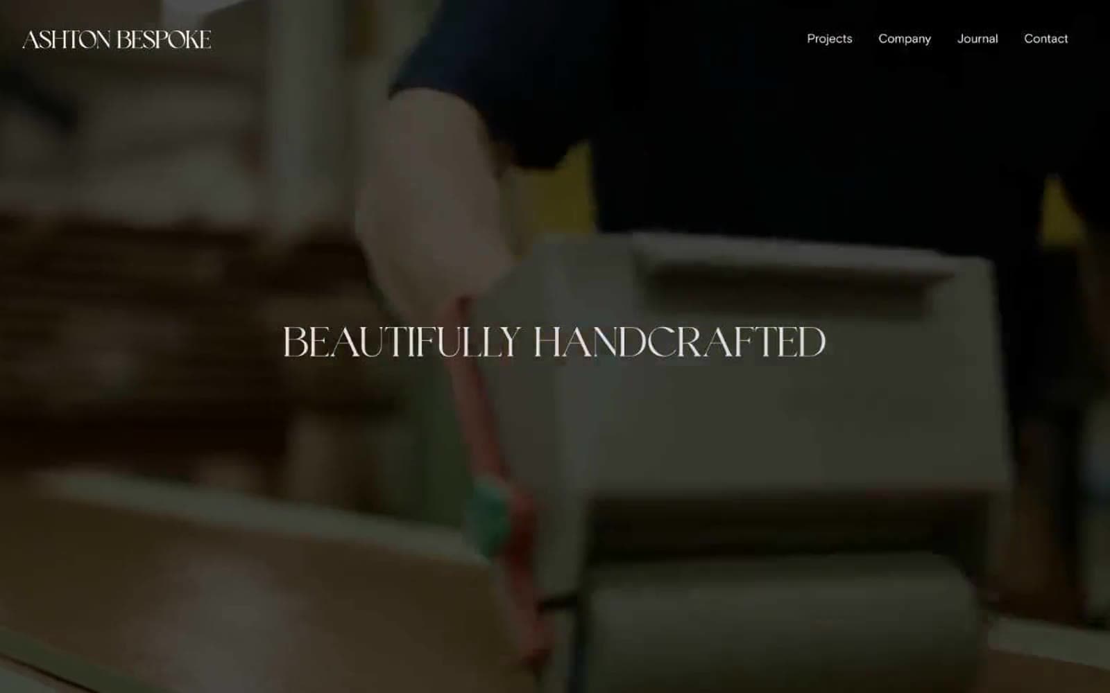
Ashton Bespoke
Brand


