
Strava. A single orange highlighter mark against black-and-white print.
- Brand
- Light theme
- 9 colors
- 1 typeface
Strava's design reads like an athlete's logbook printed on warm paper: a stark white canvas warmed by off-white surfaces and a disciplined near-black text palette, with one bolt of vivid orange that signals every primary action. The interface is deliberately flat — no gradients, no shadows, no decorative chrome — letting full-bleed photography of cyclists, runners, and hikers in motion carry all the emotional weight. The custom Boathouse typeface and tight, slightly humanist letterforms give the system a print-publication quality rather than a typical SaaS feel. Sharp 4px corners on every interactive element, warm-toned grays instead of cool ones, and an almost monastic restraint with color (one orange, one link blue) create a visual hierarchy where the orange CTA always wins attention without ever needing elevation or glow.
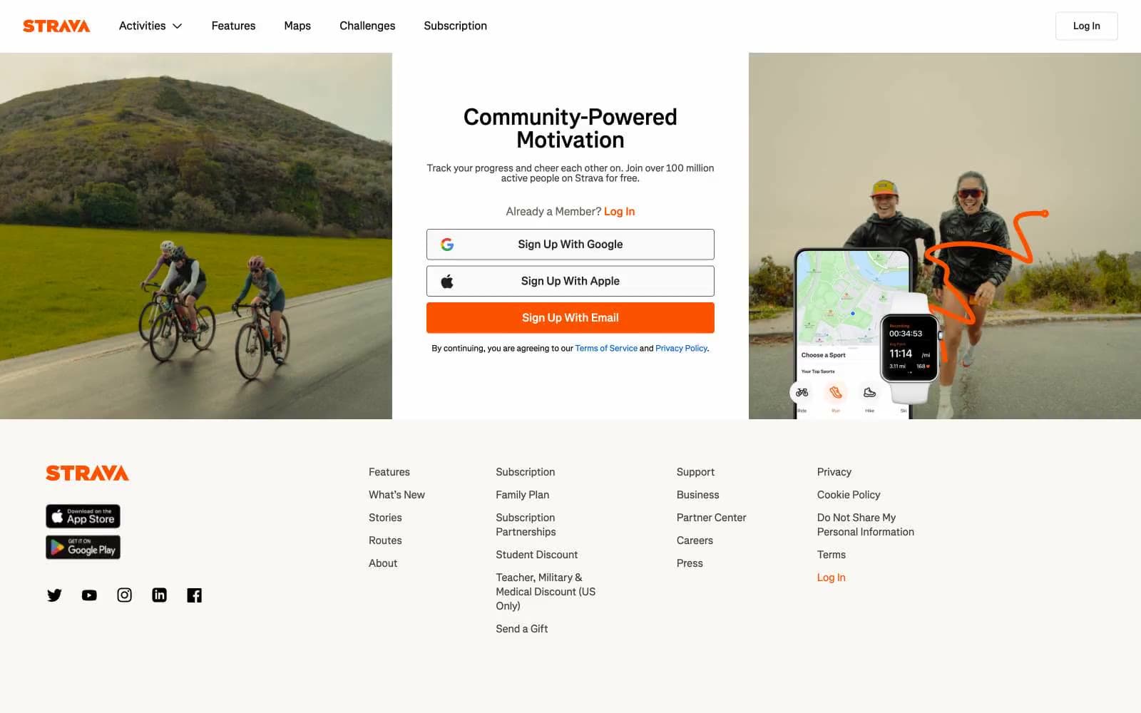
Strava design system

Brand2
Orange supporting accent for decorative details and low-frequency emphasis. Do not promote it to the primary CTA color
Inline text links and policy references; the only secondary chromatic color and reserved strictly for navigational links
Neutrals7
Primary body and heading text, icon strokes, hairline borders, button outlines
Button text, filled icon strokes, high-contrast warm near-black
Secondary body text, nav links, metadata — warm dark gray for sub-headings and long-form copy
Muted helper text, tertiary copy, placeholder labels
Hairline borders, input outlines, dividers between secondary sections
Footer background, secondary surface elevation, subtle banding beneath white
Light supporting surface for subtle backgrounds and section separation. Do not promote it to the primary CTA color
Try a pairing
Pick any two colors from the palette to check whether text stays readable on top.
Aa
Ink Black on Strava Orange
6.35 : 1 contrast
- Body textPasses AA 4.5
- Large textPasses AA 3
- StrictFails AAA 7
More DESIGN.md files. Same web, different personalities.

Airbnb
Brand
Aker
Brand
Alison Roman
Brand
Alpine Bio
Brand
Alveos One
Brand
Amrit Palace
Brand
André Cândido
Brand
Anna Jóna
Brand
Apollo
Brand
Apple
Brand
Arva
Brand
Ashton Bespoke
Brand


