
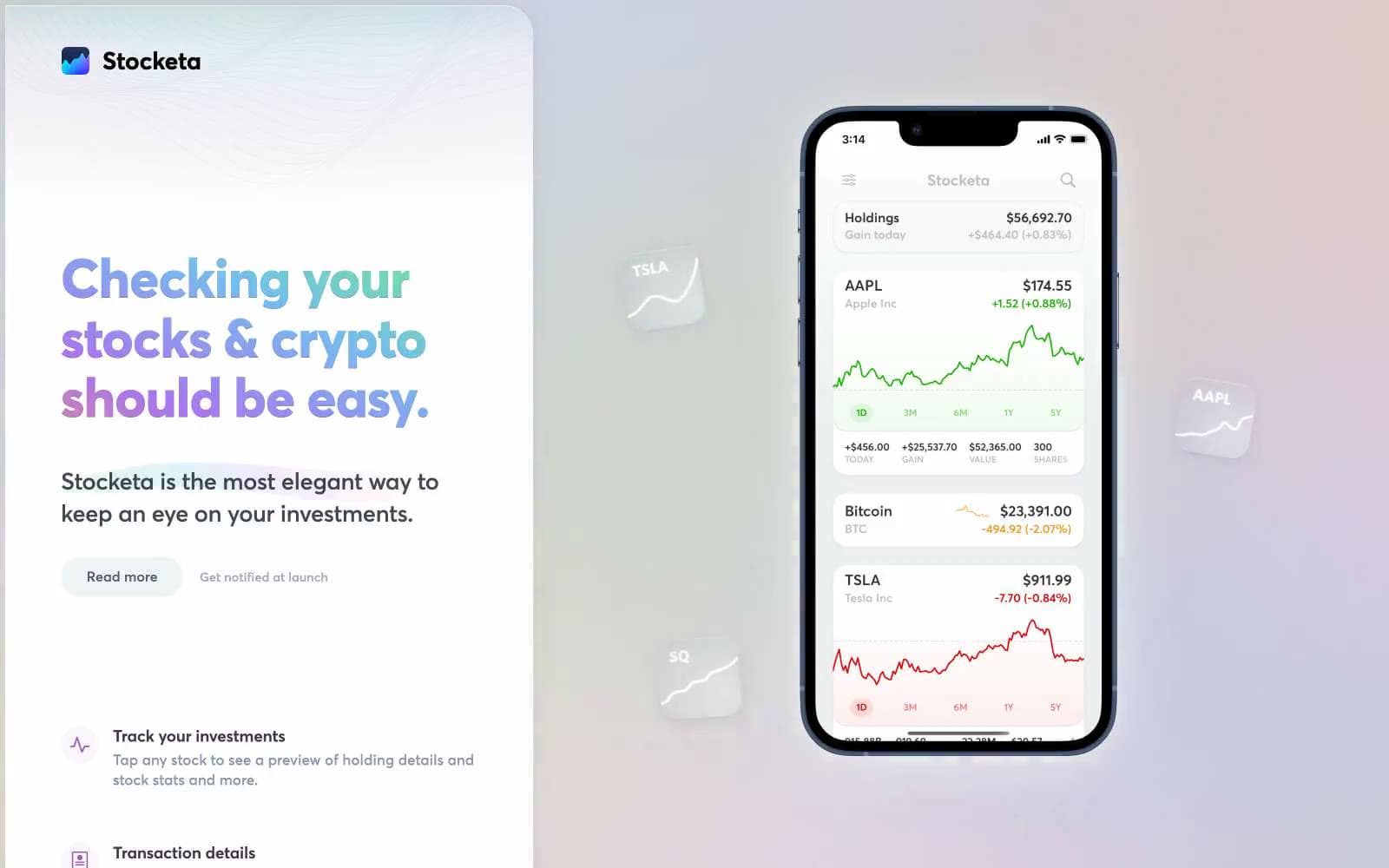
Stocketa. A light, weightless interface floating beneath a prism-washed sky.
- Finance
- Light theme
- 12 colors
- 1 typeface
Stocketa floats its product on a dreamy light canvas washed with a soft radial aurora — green, teal, purple, and pink bleeding from the top — where the color is felt as atmosphere rather than seen as decoration. The interface below stays calm and almost achromatic: white cards, hairline borders, and a signature three-layer shadow (a faint blue-tinted outer drop, a 1px white inner highlight, and a barely-there navy inset) that whispers elevation instead of declaring it. A single vivid magenta (#995bb9) does all the emotional work — painting headlines as a left-to-right gradient, filling icons, and pulling the eye through each section. Typography is a custom geometric sans (averta standard) cut for very tight negative tracking at display sizes up to 98px, giving even the biggest headlines a compressed, confident posture. The phone mockup is the hero: it sits at the visual center of every section, turning the product itself into the brand's primary visual asset.
Stocketa design system

Brand2
Headline gradient start, icon fills, decorative brand strokes — the single chromatic voice of the system, used as gradient text on display headings and as fill on small icon badges
Violet accent for outlined action borders, linked labels, and lightweight interactive emphasis. Do not promote it to the primary CTA color
Accent2
Muted violet used for decorative SVG strokes and secondary graphic outlines — sits behind the magenta as the system-wide line color
Gradient stop in the page-level aurora and accent on positive chart lines inside the phone mockup
Neutrals8
Highest-weight text and the densest border color — used where maximum contrast is required against the near-white canvas
Primary body and heading text on light surfaces — slightly warmer than pure black, reads softer at large sizes while keeping AAA contrast
Mid-neutral for muted body text and link borders — the default text color for descriptions and the border for inline link affordances
Light hairline border and secondary muted text — used on card edges and quiet metadata rows
Softest neutral for decorative SVG fills and ambient accents — supports the aurora without competing with the magenta
Page canvas and subtle surface tint — the entire site reads on this near-white, giving the aurora gradient something warm to land on
Shadow tone used in the multi-layer card elevation — too light to be a border, present only as the ambient outer blur
Card and elevated surface fill — floats above Lavender Mist as the base for product cards, phone screen, and feature panels
Try a pairing
Pick any two colors from the palette to check whether text stays readable on top.
Aa
Paper White on Aurora Magenta
4.61 : 1 contrast
- Body textPasses AA 4.5
- Large textPasses AA 3
- StrictFails AAA 7
More DESIGN.md files. Same web, different personalities.
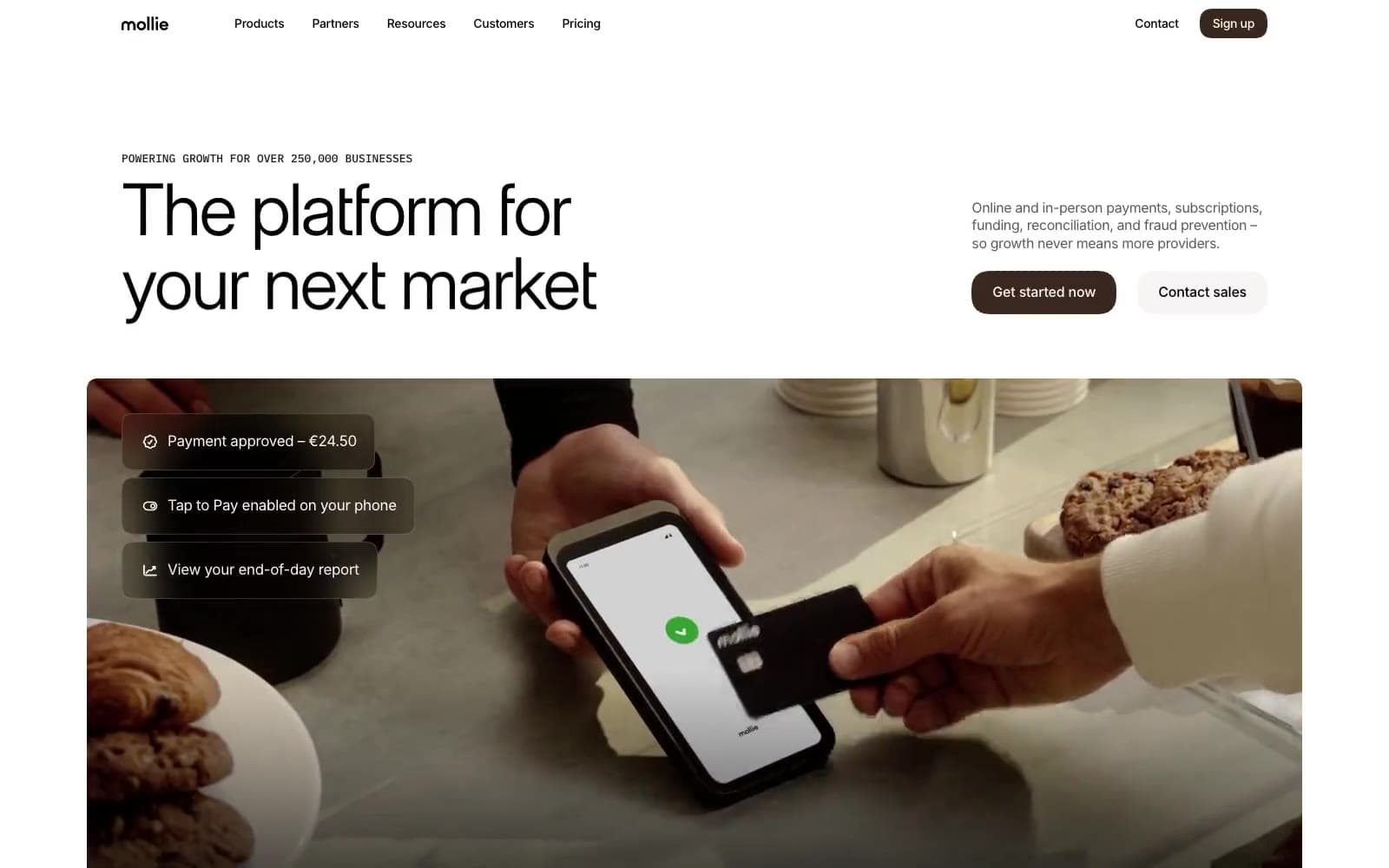
Mollie
Finance
a16z speedrun
Finance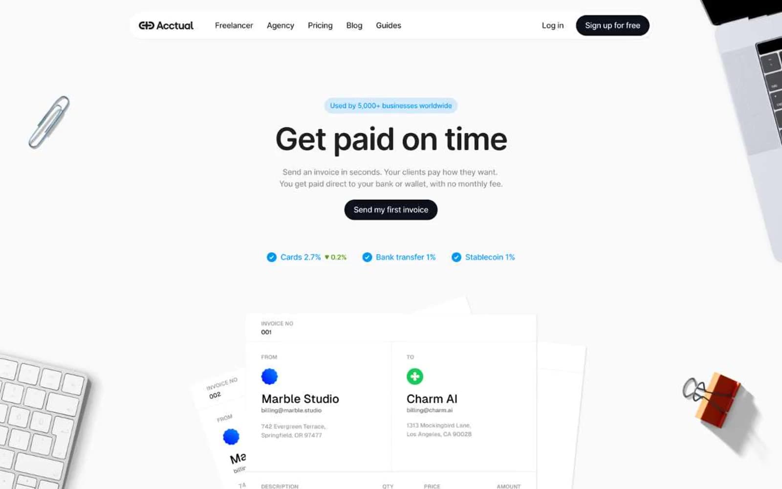
Acctual
Finance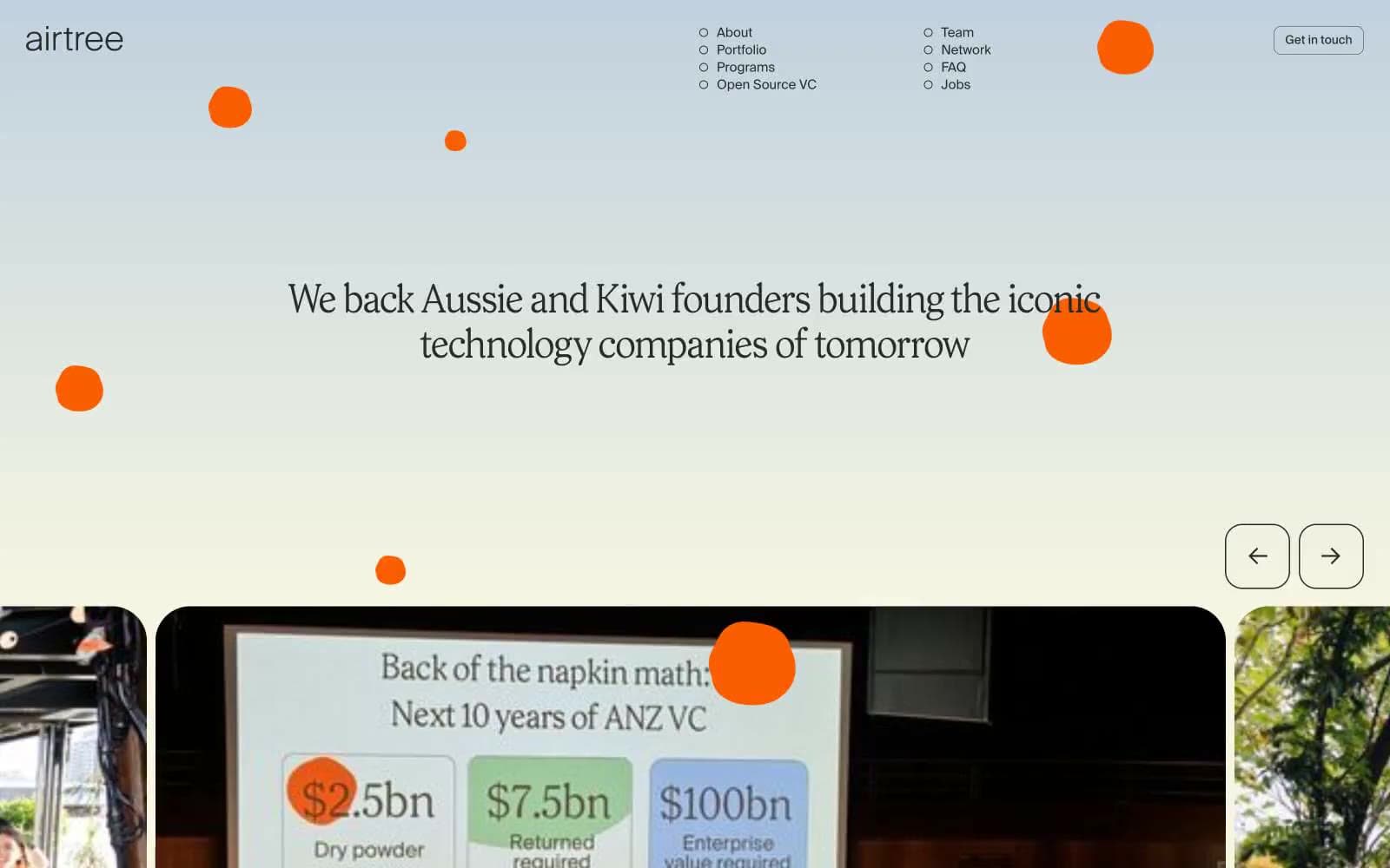
Airtree
Finance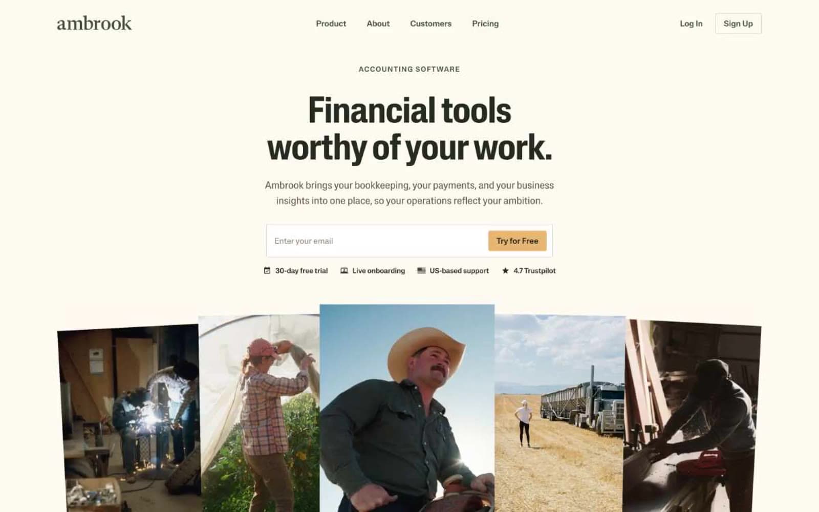
Ambrook
Finance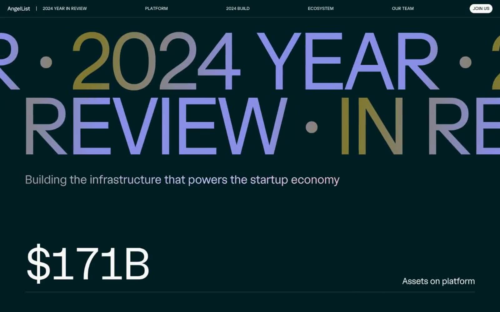
Angellist 2024
Finance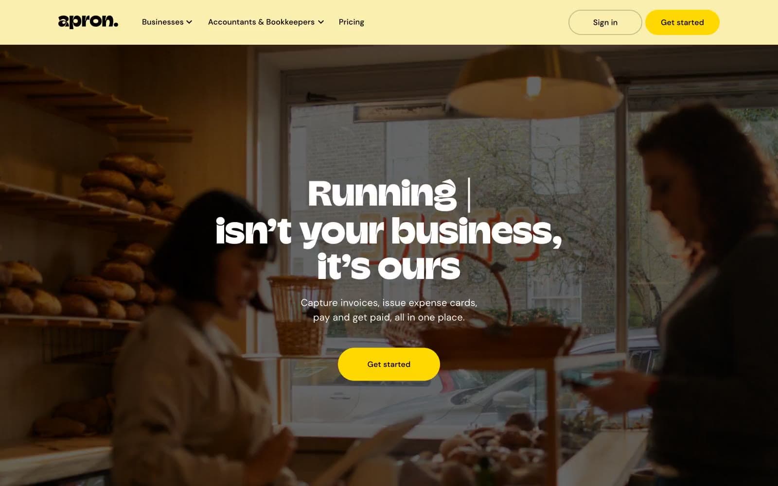
Apron
Finance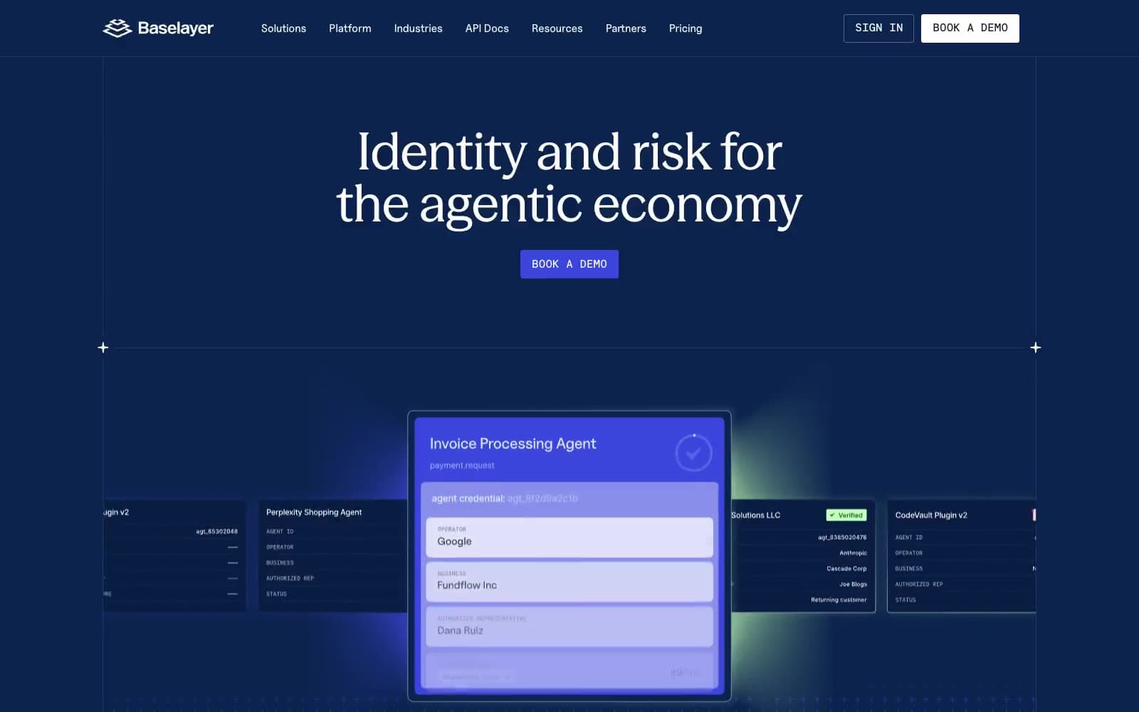
Baselayer
Finance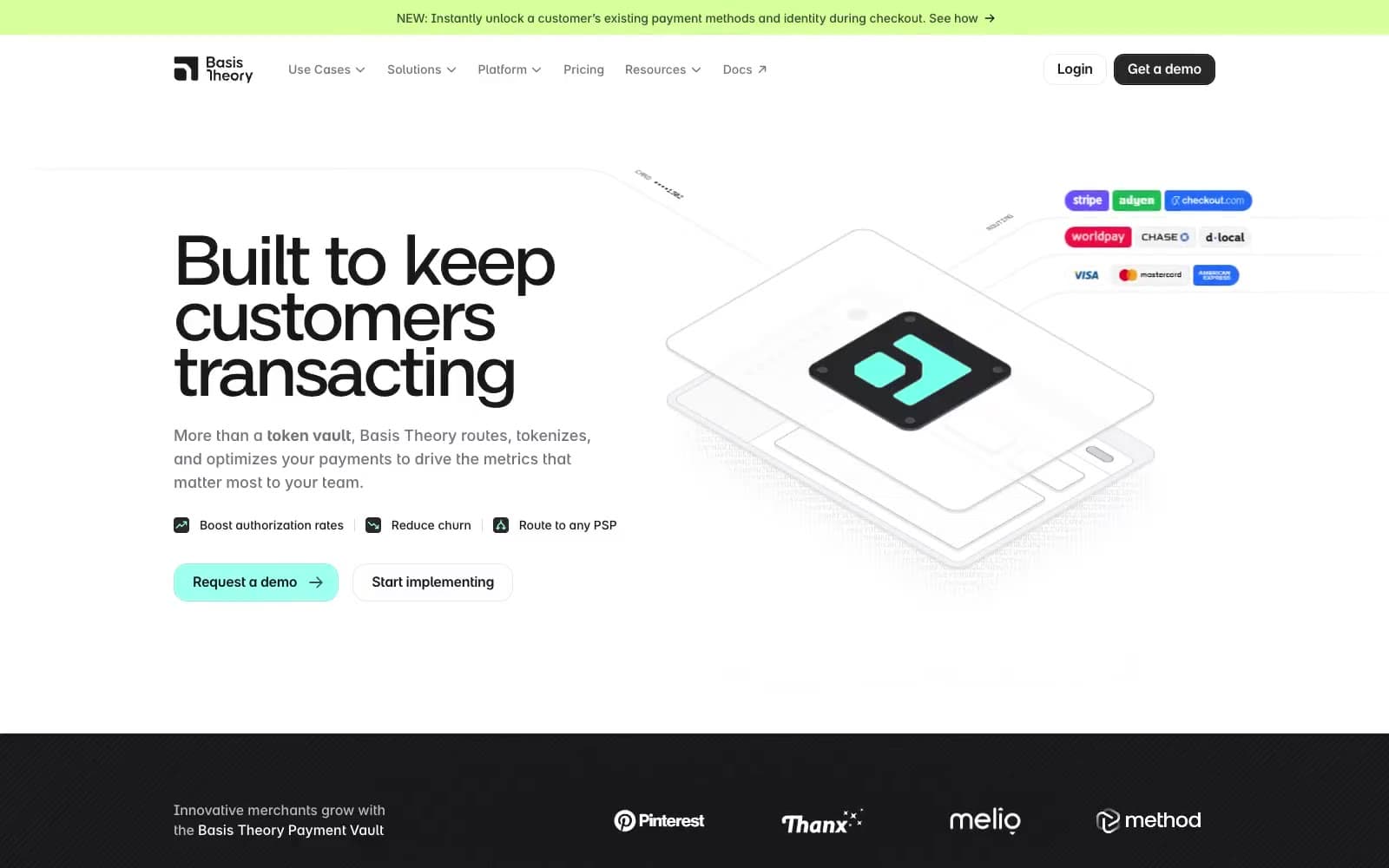
Basis Theory
Finance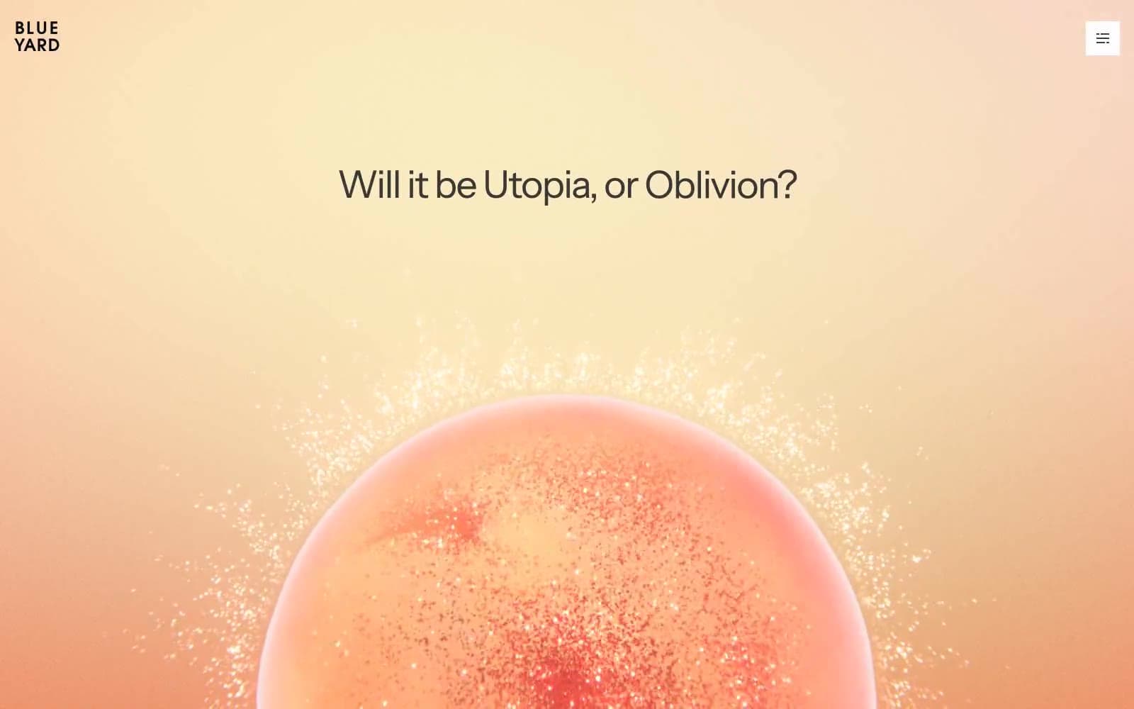
BlueYard Capital
Finance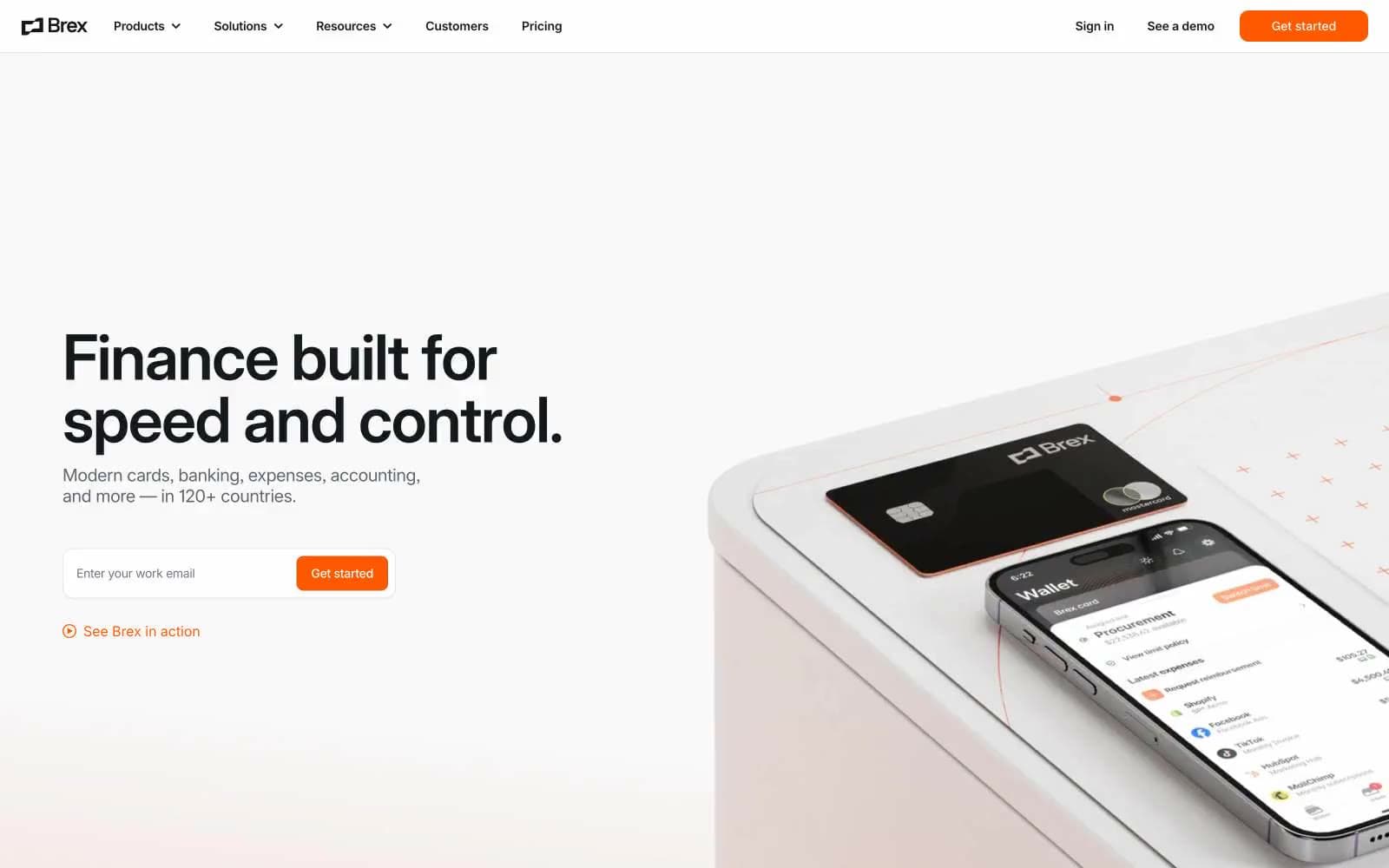
Brex
Finance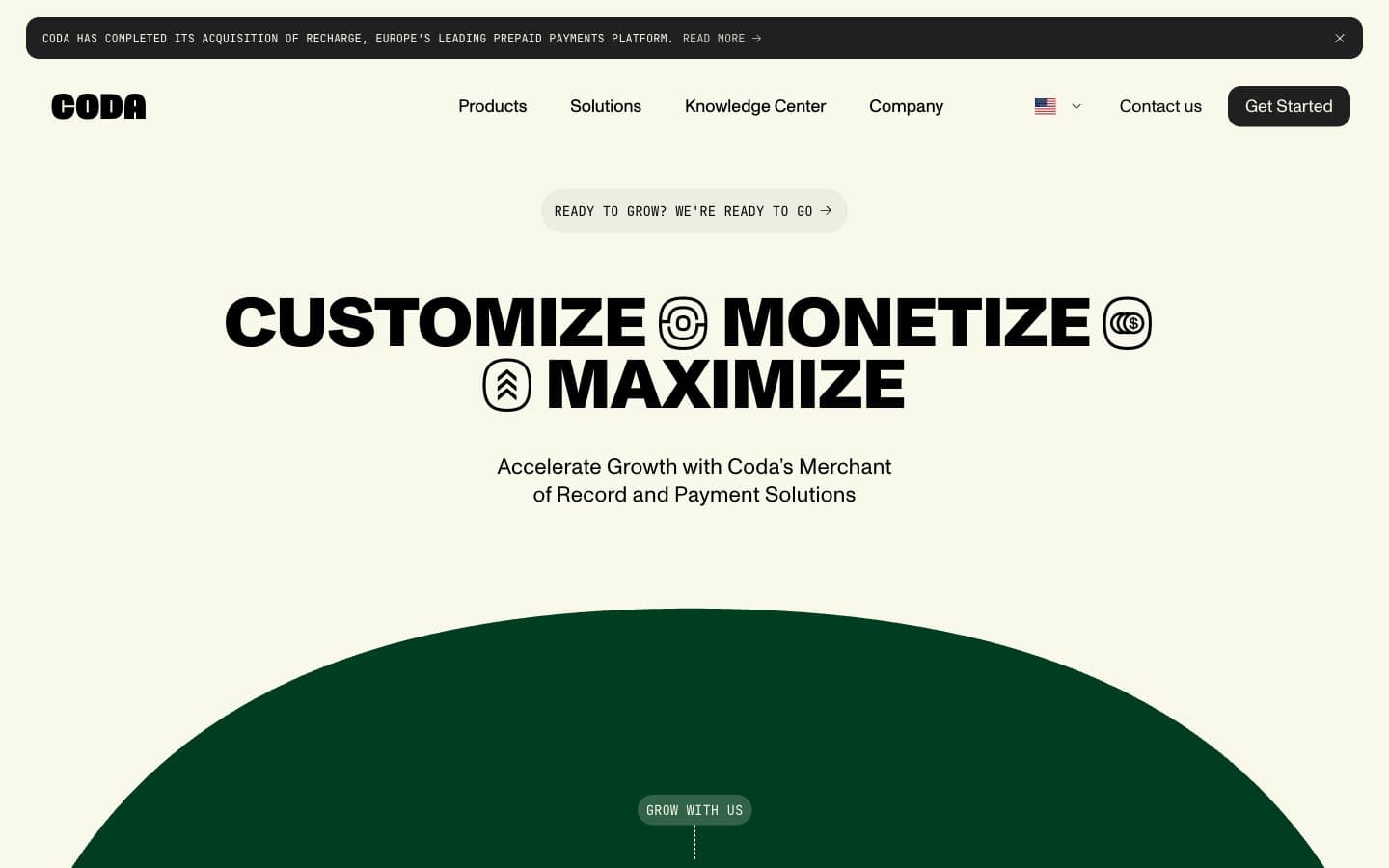
Coda
Finance


