
Stink Studios. The projector hums, the room is black, only the reel glows.
- Studio
- Dark theme
- 5 colors
- 3 typefaces
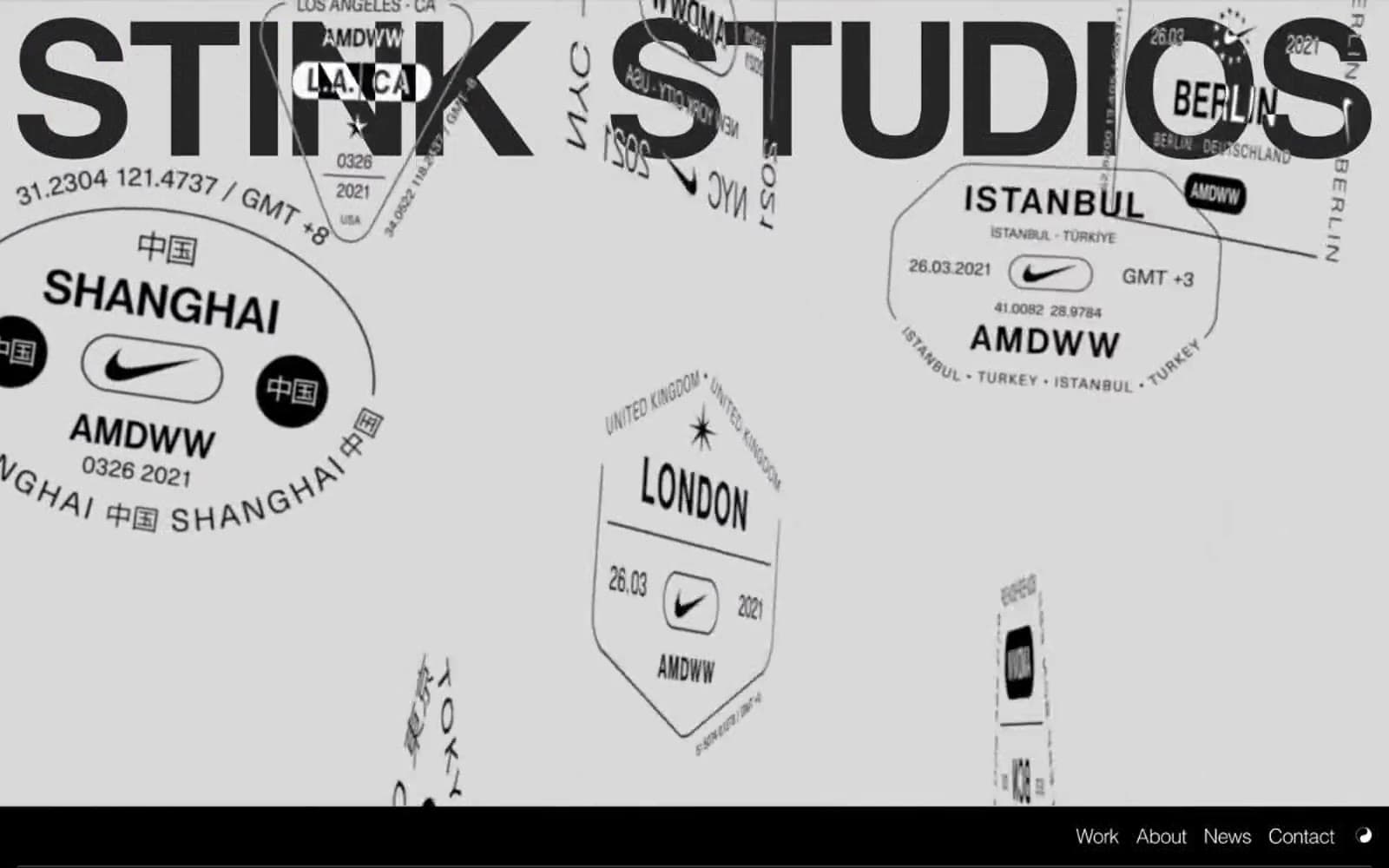
Stink Studios operates as a cinematic canvas: a near-monochrome world where black absorbs everything except the work, and typography carries every structural decision. The visual language is deliberately austere — no UI chrome, no decorative gradients on controls, no colored buttons pulling attention from the reels. Instead, a film-studio hero (blue-lit, full-bleed) establishes the world, large confident headlines in negative-tracked Helvetica and Times New Roman do the talking, and warmth arrives only through the work itself. The system is built for an AI agent to produce gallery-like pages where large type and full-bleed media do the heavy lifting, and every interactive element recedes into a flat black plane.
Stink Studios design system

Accent2
Accent warmth for marquee display moments, logo gradient highlight, and select project card color treatments — borrowed from the work, never applied to UI chrome
Deep warm surface for warm-toned project cards and content imagery containers — the shadow side of the coral accent
Neutrals3
Neutral form states, badge text, and quiet UI feedback where color should stay understated. Do not promote it to the primary CTA color
Subtle tonal break from pure black for nested surfaces and hairline borders that need to feel present without breaking the dark mode
Primary text, heading strokes, nav links, icon strokes, badge fills, logo type — the only high-contrast value in the system
Try a pairing
Pick any two colors from the palette to check whether text stays readable on top.
Aa
Void on Ember Coral
6.38 : 1 contrast
- Body textPasses AA 4.5
- Large textPasses AA 3
- StrictFails AAA 7
More DESIGN.md files. Same web, different personalities.

Basement Studio
Studio
Production Portugal
Studio
Active Theory
Studio
Adnaut
Studio
Agence K72
Studio
Akash Tyagi
Studio
Analogue
Studio
Athletics
Studio
BAM Photographers
Studio
Bareis + Nicolaus
Studio
Becklyn
Studio
Branding
Studio


