
Stellar. Gallery wall at midnight.
- Studio
- Dark theme
- 9 colors
- 1 typeface
Stellar operates in a midnight-black creative marketplace language: pure void canvas, dark elevated surfaces, oversized whisper-light display type, and a single vivid violet that fires only when an action matters. The entire interface reads like a portfolio on a closed gallery wall — everything recedes into shadow except the headline and the one CTA. Color is rationed: achromatic text and hairline borders do 95% of the work, and #6a48f2 appears as a precise electric punctuation on the reserve button, link hovers, and selected states. Components are minimal and borderless by default, gaining shape only through subtle #2c2c2 outlines and 6-10px corner softening. The design's defining choice is restraint — massive 70-104px type at weight 400 with tight negative tracking creates a hushed authority that does not compete with the photography of the designers themselves.
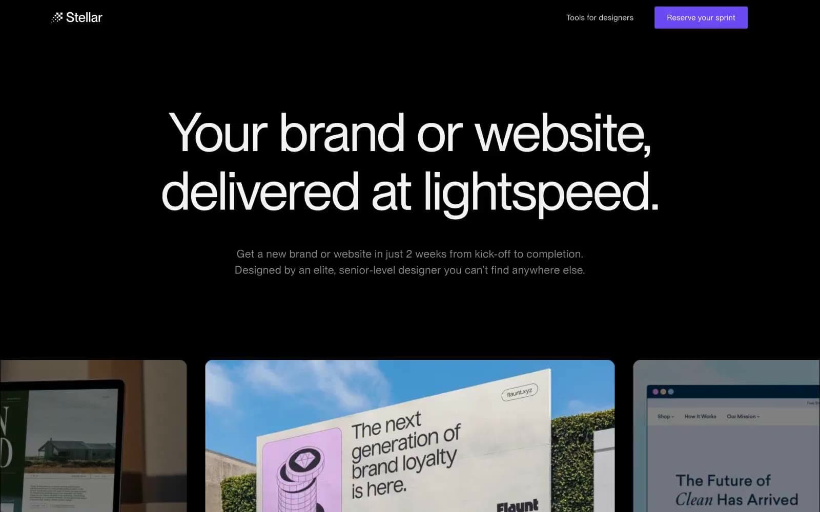
Stellar design system

Brand1
Primary CTA fill, active link, brand accent — the single chromatic note in an achromatic system, reserved for actions that convert; Accent gradient terminus — fades from Sprint Violet into soft pink to signal premium/highlight moments
Neutrals8
Page background, primary canvas — absolute black eliminates surface depth, making images and white type feel like they float
Card surfaces, elevated panels, designer profile containers — one shade above void to separate without illuminating
Borders on inputs, buttons, and nav dividers — the thinnest readable outline on near-black
Muted body text, secondary labels, inactive borders — the only gray with enough chroma to carry information
Nav text at rest — sits one step below pure white to create a de-emphasized nav hierarchy
Helper text, subtle text accents on dark surfaces
Headings, high-emphasis text — slightly off-white to avoid harshness against pure black
Primary headings, logo text, pure-contrast display copy
Try a pairing
Pick any two colors from the palette to check whether text stays readable on top.
Aa
Paper on Void Black
21.00 : 1 contrast
- Body textPasses AA 4.5
- Large textPasses AA 3
- StrictPasses AAA 7
More DESIGN.md files. Same web, different personalities.

Basement Studio
Studio
Production Portugal
Studio
Active Theory
Studio
Adnaut
Studio
Agence K72
Studio
Akash Tyagi
Studio
Analogue
Studio
Athletics
Studio
BAM Photographers
Studio
Bareis + Nicolaus
Studio
Becklyn
Studio
Branding
Studio


