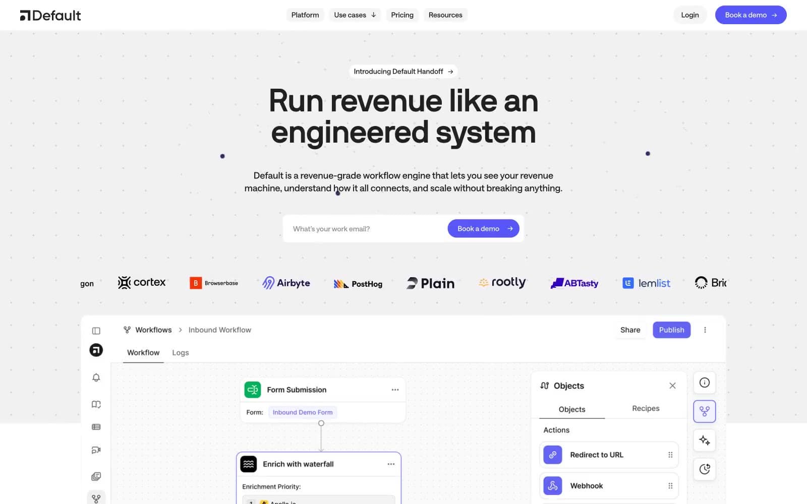
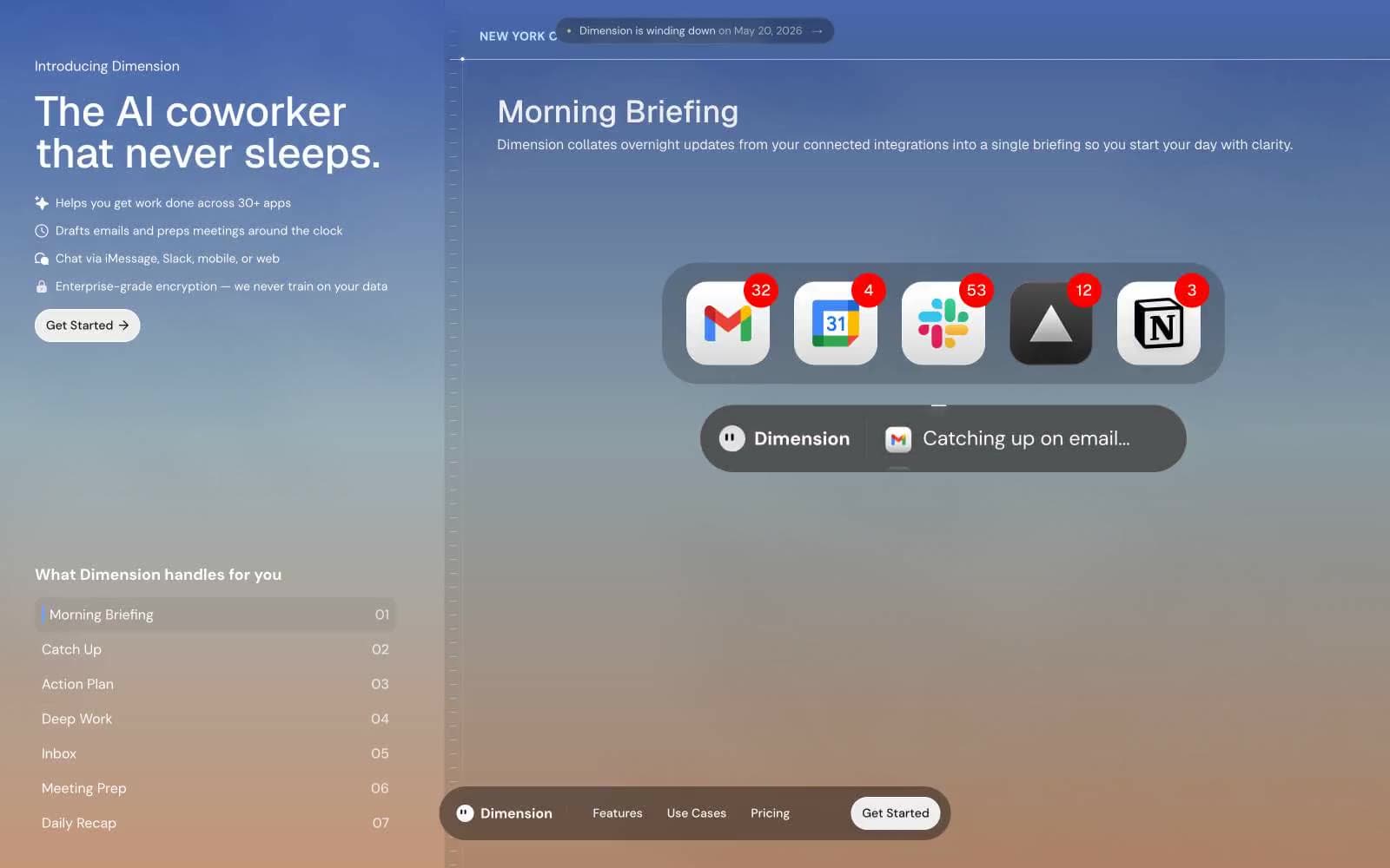
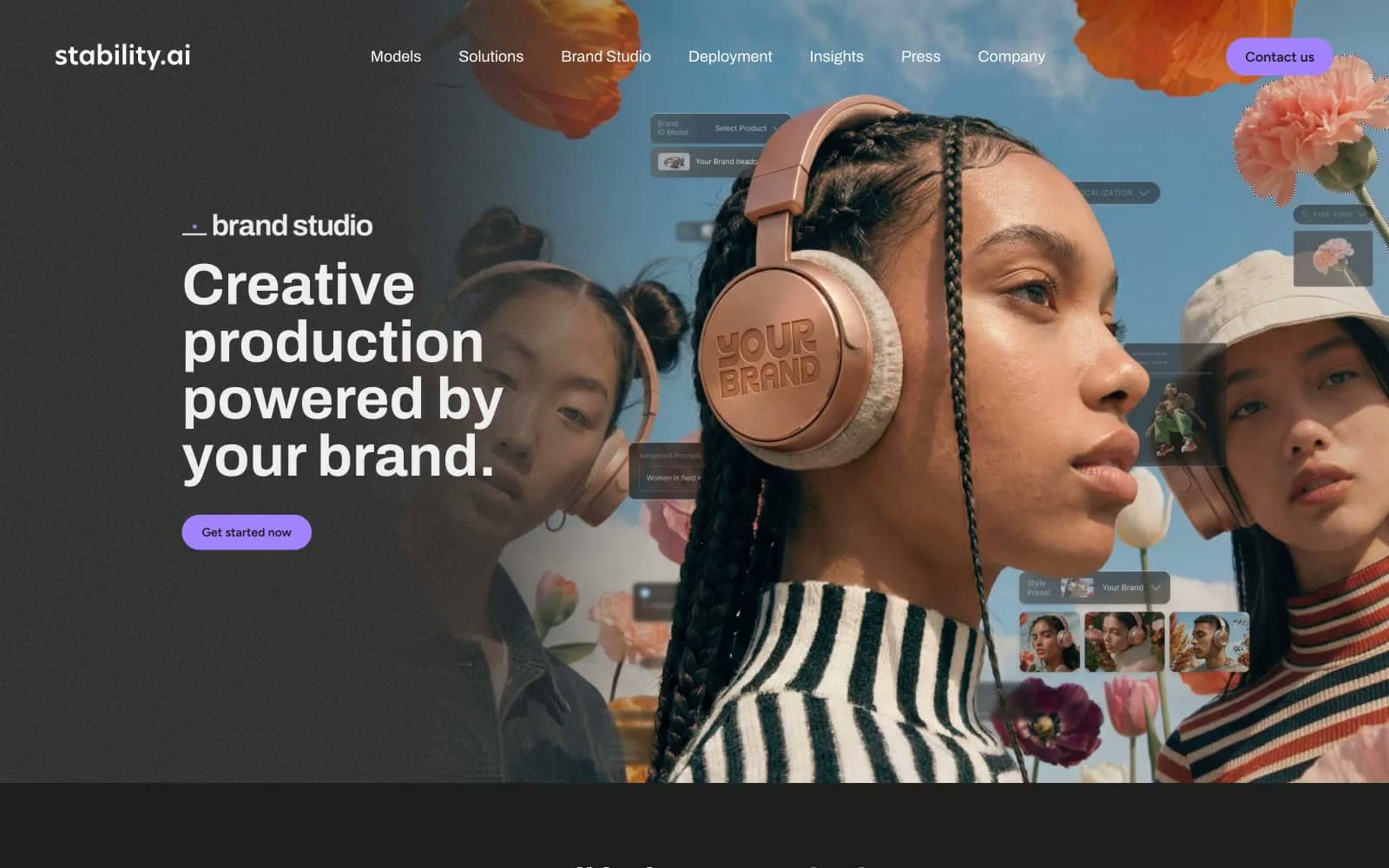
Stability AI. Lavender pulse in a darkroom.
- AI
- Dark theme
- 12 colors
- 3 typefaces
Stability AI is a dark-canvas creative platform with a single electric lavender accent cutting through near-black surfaces. Full-bleed editorial photography dominates the hero, with floating product UI composited over models and flora to fuse tool and output into one image. Typography is Archivo in confident weights, with display sizes tightened at low line-heights (≈0.98–1.07) so headlines stack as compact editorial blocks rather than airy marketing copy. Interaction is signaled almost entirely by the violet pulse — pill-shaped CTAs, underlined links, arrow affordances, and even footer social icons all read as the same lavender frequency. Surfaces layer subtly (#1e1e1 → #383838 → #000000) with zero decorative shadow, so depth comes from tonal shifts and generous negative space rather than elevation. Components are lightweight and confident: pill buttons, thin dividers, and muted-violet body text (#725d91) that recedes while keeping the page tonally unified.
Stability AI design system

Brand2
Violet supporting accent for decorative details and low-frequency emphasis. Do not promote it to the primary CTA color
Violet supporting accent for decorative details and low-frequency emphasis. Do not promote it to the primary CTA color
Accent1
Dark-mode link variant, decorative deep-violet wash — used at low prominence for links on lighter surfaces within the footer band
Neutrals9
Hero overlay, deepest contrast surface, text-shadow reservoir — pure black for cinematic hero grading and maximum text contrast
Page background, section canvas, input fields, dark surface base — the dominant near-black that everything else floats on
Elevated card surface, image borders, list-item dividers — one step lighter than the canvas for subtle layering without shadows
Headings, body text on dark, and muted link text — a desaturated violet that keeps the page tonally unified with the accent while letting content recede
Tertiary text, disabled states, footer micro-copy — the deepest readable gray, used when content should be present but invisible
Secondary body copy, helper text, subtle link variants on dark — the lightest purple-tinted neutral, bridging the gap between mauve headings and white labels
Secondary body text, muted labels, low-emphasis copy — sits between Bone headings and darker supporting text for a clear hierarchy
Primary light text on dark surfaces — the dominant body and label color, nearly white but warmed off pure to sit comfortably on near-black
Headlines, logo, pure-contrast text, button labels on violet fills — reserved for highest-emphasis copy where absolute white reads correctly
Try a pairing
Pick any two colors from the palette to check whether text stays readable on top.
Aa
Void on Iris Spark
7.14 : 1 contrast
- Body textPasses AA 4.5
- Large textPasses AA 3
- StrictPasses AAA 7