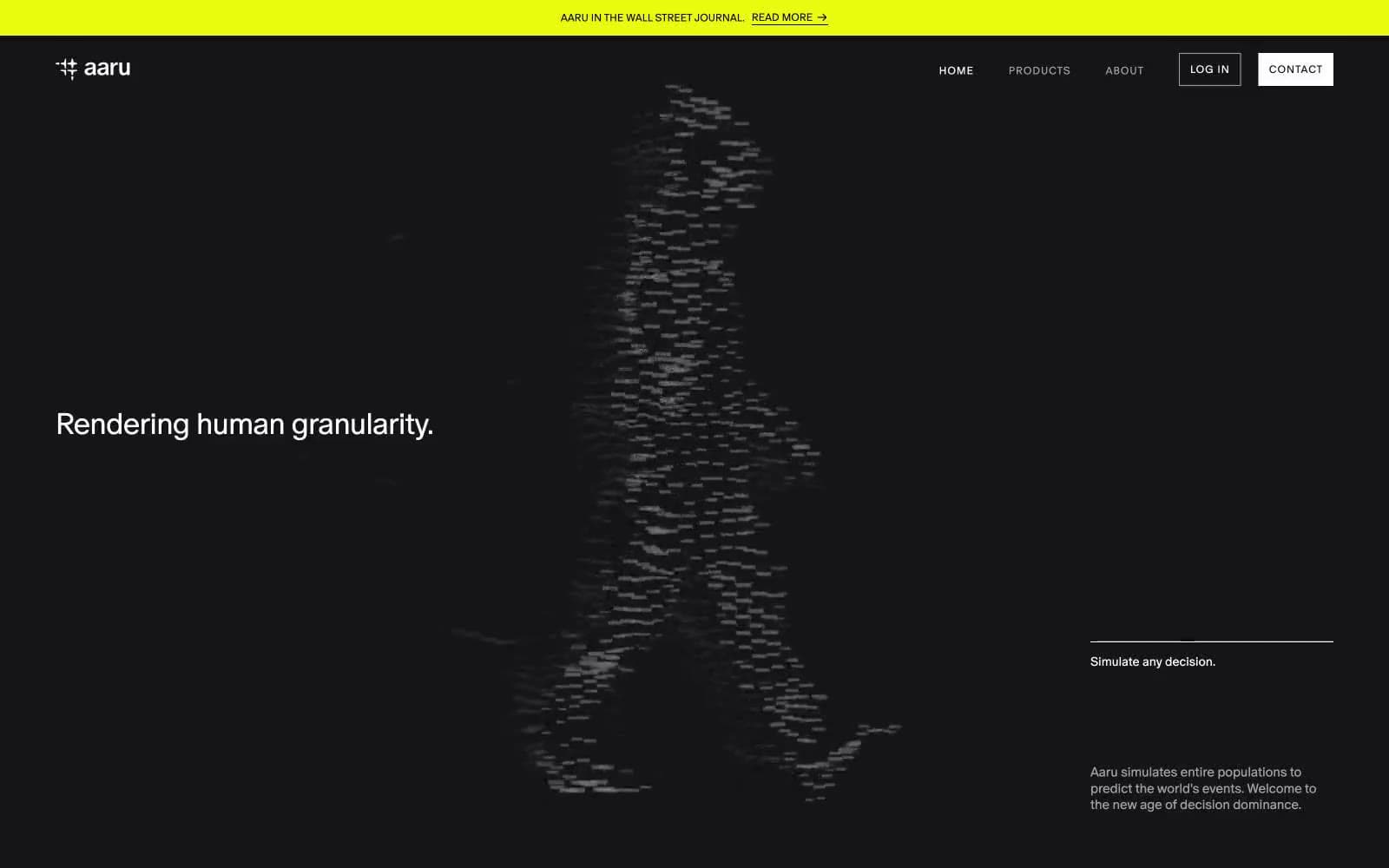
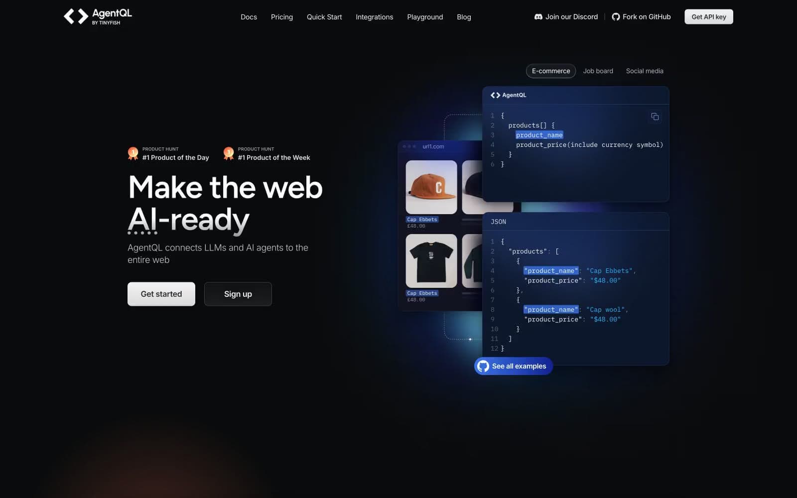
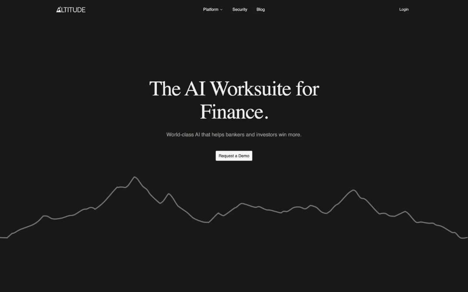
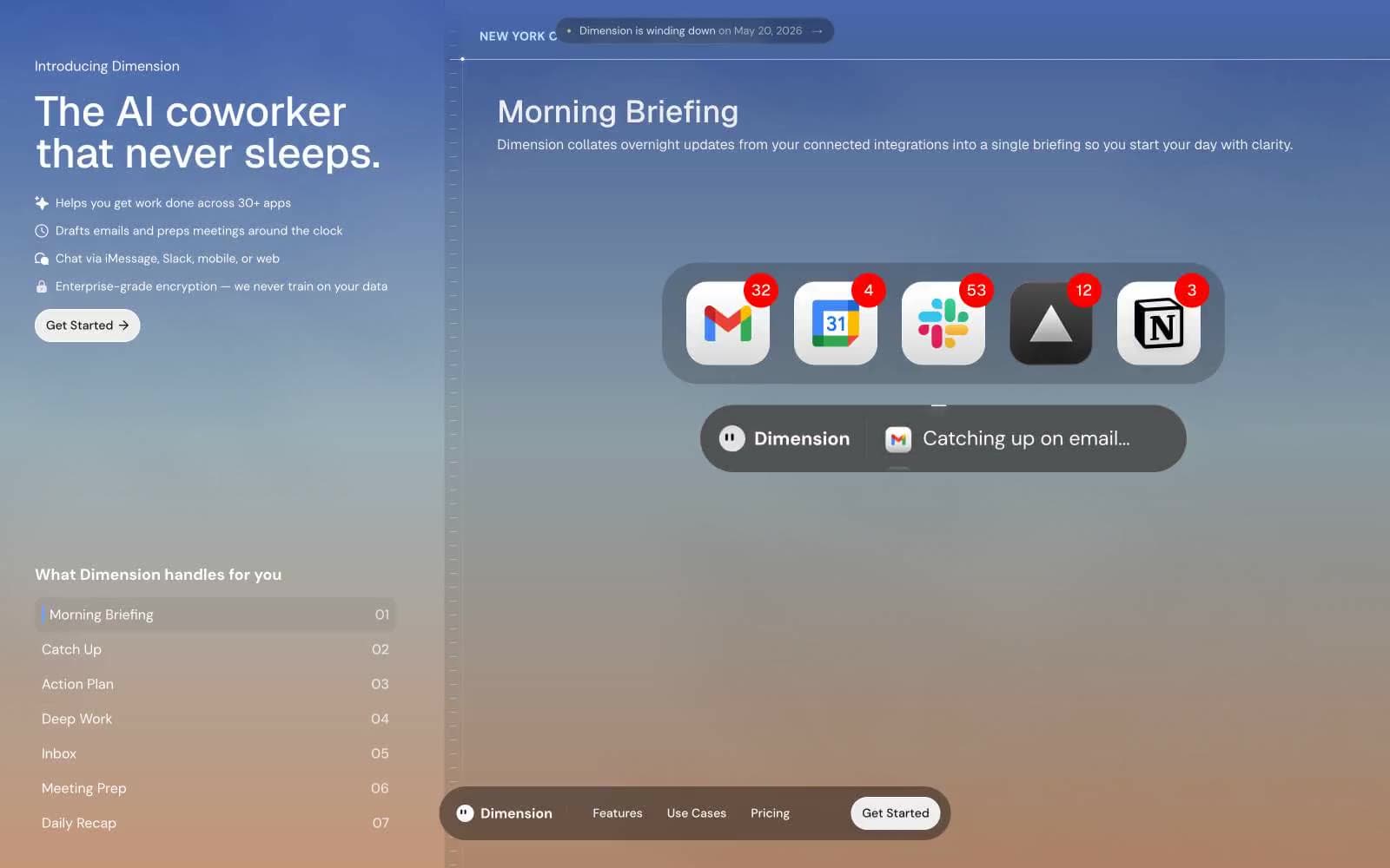
Spellbook. A dark editorial surface where a warm orange pen mark is the only sound.
- AI
- Dark theme
- 10 colors
- 2 typefaces
Spellbook operates as a midnight legal library: near-black canvas, editorial serif display type, and a single coral-orange action color that cuts through the darkness. The system refuses the typical SaaS blue/gradient playbook — instead it borrows from premium print: Arizona Mix at 67–77px with aggressively tight tracking turns headlines into magazine covers, while Soehne handles all UI at quiet, compact sizes. The visual hierarchy is built on contrast between white text on #121719 and the warmth of #f94d1 CTAs, not on shadows or elevation. Surfaces stay flat; depth comes from background shifts (canvas → #222729 → #2b3133 for inputs) and from typographic scale, not drop shadows. Components are sharp-edged (4px radius) except buttons and badges which go full pill (1600px/100px), creating a deliberate tension between editorial precision and soft, inviting action targets.
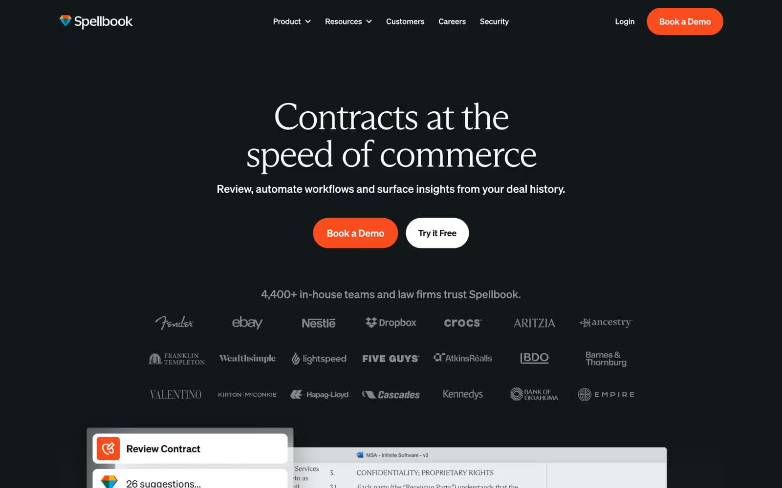
Spellbook design system

Brand1
Primary action buttons (Book a Demo, Try Free) — the only warm hue on the page; signals decision points without aggression
Accent2
Accent for select feature cards and section highlights — used sparingly to add editorial weight, never on actions
Inline links, logo gradient, and decorative icon strokes — cool counterpoint to the warm coral primary
Neutrals7
Page canvas, primary background — near-black with a faint cool tint, not pure black; sets the midnight tone
Elevated card and panel surfaces sitting one step above the canvas; used for feature cards and link hovers
Input field backgrounds, form controls — one level above card surfaces to read as recessed
Medium-contrast borders, control outlines, and structural separators.
Tertiary text, disabled states, and lighter dividers — sits between Ashen Type and Manuscript White
Light surface variant for cards on dark, light-mode button text, and subtle off-white highlights
Primary headings, body text on dark surfaces, ghost-button borders, and inverted text on coral CTAs
Try a pairing
Pick any two colors from the palette to check whether text stays readable on top.
Aa
Courtroom Ink on Coral Verdict
5.26 : 1 contrast
- Body textPasses AA 4.5
- Large textPasses AA 3
- StrictFails AAA 7