
Spécialiste Belge. Linen-bound brand cookbook.
- Brand
- Light theme
- 5 colors
- 1 typeface
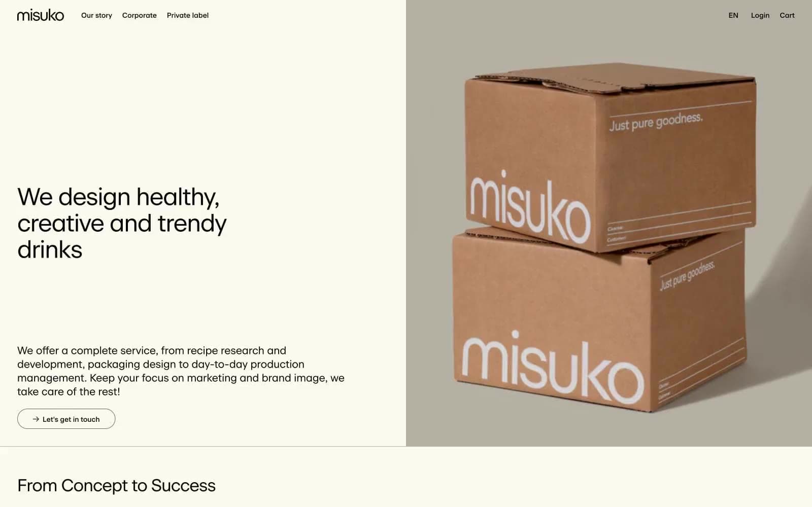
Misuko operates as an editorial atelier for beverage branding: a warm cream canvas (#fcf9ee) carries a single custom serif-influenced sans (beausite) set in tight tracking, producing a magazine-spread calm. Every element speaks the same warm-monochrome dialect — black ink, warm-gray dividers, and beige paper — so color is reserved for product photography (cardboard tan) and the occasional pastel icon, never for chrome or decoration. The interface is almost entirely flat: no shadows, no gradients, no rounded corners beyond a single 20px pill on links, and no chromatic button fills — actions are ghost-outlined in black. Information density stays low; breathing room is generous and rhythm is dictated by large display headlines followed by narrow body columns, with three-column service grids and case-study cards doing the structural work.
Spécialiste Belge design system

Neutrals5
Dark borders and separators for elevated surfaces and inverted UI. Do not promote it to the primary CTA color
Secondary text, muted body copy, card meta lines — warm dark gray, 5.2:1 on Bone White, carries metadata without competing with primary text
Hairline borders, input outlines, list dividers — warm gray that disappears against the cream, only visible at the exact edge it frames
Card surfaces, section backgrounds, one decorative button fill — a half-shade deeper than Bone White, reads as the same material under indirect light
Page canvas, hero left panel, newsletter input background — the warmest near-white, slightly yellowed like aged paper
Try a pairing
Pick any two colors from the palette to check whether text stays readable on top.
Aa
Bone White on Ink Black
19.92 : 1 contrast
- Body textPasses AA 4.5
- Large textPasses AA 3
- StrictPasses AAA 7
More DESIGN.md files. Same web, different personalities.

Airbnb
Brand
Aker
Brand
Alison Roman
Brand
Alpine Bio
Brand
Alveos One
Brand
Amrit Palace
Brand
André Cândido
Brand
Anna Jóna
Brand
Apollo
Brand
Apple
Brand
Arva
Brand
Ashton Bespoke
Brand


