
Signal Messenger. Frosted privacy glass.
- Brand
- Light theme
- 10 colors
- 2 typefaces
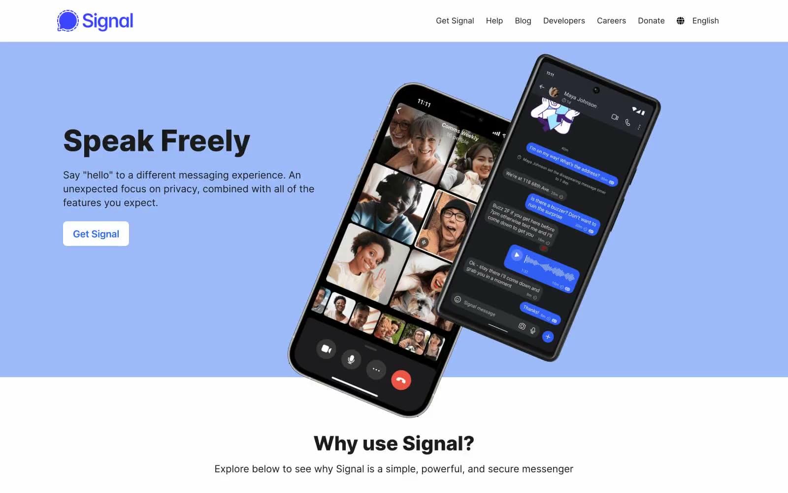
Signal speaks through a frosted privacy glass aesthetic: a nearly monochrome canvas of white and pale blue washes, with one confident blue accent that guides the eye to interactions. The design is deliberately restrained — weight 800 headlines carry all the visual weight alone, surrounded by generous whitespace and almost no ornamentation. Buttons are outlined rather than filled, signaling honesty over persuasion; the only solid color blocks appear in product mockups and the dark slate footer. A distinctive halftone dot illustration style provides the sole decorative personality, rendered entirely in the brand blue. The overall feel is technical documentation elevated to brand: trustworthy, quiet, and precise.
Signal Messenger design system

Brand2
Violet supporting accent for decorative details and low-frequency emphasis. Do not promote it to the primary CTA color
Navigation links and brand mark anchors — slightly cooler and more electric than Signal Blue, reserved for chrome-level interaction
Accent2
Hero section wash, large decorative panels — soft periwinkle that bathes the page in brand color without overwhelming
Secondary feature panel backgrounds — desaturated teal that recedes behind content, used to break the page rhythm without adding chroma
Neutrals6
Primary body and heading text — soft black at AAA contrast on every surface, the dominant typographic color
Footer background — muted purple-black that grounds the page in a warm dark wash without pure black harshness
Secondary body text, subdued paragraphs — cool gray with a faint violet cast that echoes the brand blue
Hairline borders, dividers, footer text — the structural neutral that separates content bands
Page canvas — off-white that warms the stark white without going cream
Light supporting surface for subtle backgrounds and section separation. Do not promote it to the primary CTA color
Try a pairing
Pick any two colors from the palette to check whether text stays readable on top.
Aa
White on Signal Blue
4.74 : 1 contrast
- Body textPasses AA 4.5
- Large textPasses AA 3
- StrictFails AAA 7
More DESIGN.md files. Same web, different personalities.

Airbnb
Brand
Aker
Brand
Alison Roman
Brand
Alpine Bio
Brand
Alveos One
Brand
Amrit Palace
Brand
André Cândido
Brand
Anna Jóna
Brand
Apollo
Brand
Apple
Brand
Arva
Brand
Ashton Bespoke
Brand


