
Shopify. Midnight bazaar under mint lanterns.
- Commerce
- Dark theme
- 16 colors
- 2 typefaces
Shopify's design language reads as a midnight marketplace lit by mint-green signals: a near-black canvas with a faint forest tint, white typography at whisper-light weights (330) that lets generous letter-spacing carry the voice, and a single vivid mint accent that functions as functional punctuation rather than decoration. Surfaces stack in subtle dark-green tints (#02090a → #041e18 → #072720) so that cards feel like panels lifted from the same material, separated by hairline borders rather than heavy shadows. The primary action is a high-contrast white pill button — the green never fills an action — which keeps the brand hue available for inline highlights, key phrases, and iconography where it reads as confidence rather than urgency. Layout alternates between cinematic full-bleed photography and dark content bands with rounded media cards (12px radius), creating a rhythm of spectacle and catalog.

Shopify design system

Brand1
Green supporting accent for decorative details and low-frequency emphasis. Do not promote it to the primary CTA color
Accent3
Secondary accent for gradient washes, decorative icons, and teal-tinted emphasis text
Decorative gradient that sweeps from mint to violet, used in feature highlights and brand flourishes
Decorative surface gradient — dark teal to deeper teal for atmospheric panels and section backgrounds
Neutrals12
Page canvas and hero backgrounds — near-black with a green undertone makes the mint accent glow rather than fight
Sectional backgrounds where a cooler, blue-tinted dark is needed for variation
Card and elevated surface — one step up from canvas, reads as a panel cut from the same dark material
Secondary card surface and nav backgrounds — provides a second elevation step above Forest Floor
List dividers and inset borders on dark surfaces — green-tinted so dividers feel atmospheric, not structural
Hairline borders and card outlines — the most-used divider color, bridges green and neutral tones
Tertiary text and inactive state captions
Muted helper text, footer metadata, and secondary nav labels
Body text in teal-tinted sections and secondary paragraph copy
Muted body copy and link text where a subtle green-gray harmonizes with the brand hue
Secondary surface highlights, subtle borders, and inactive iconography on light or dark contexts
Light supporting surface for subtle backgrounds and section separation. Do not promote it to the primary CTA color
Try a pairing
Pick any two colors from the palette to check whether text stays readable on top.
Aa
Abyssal Ink on Mint Signal
13.99 : 1 contrast
- Body textPasses AA 4.5
- Large textPasses AA 3
- StrictPasses AAA 7
More DESIGN.md files. Same web, different personalities.
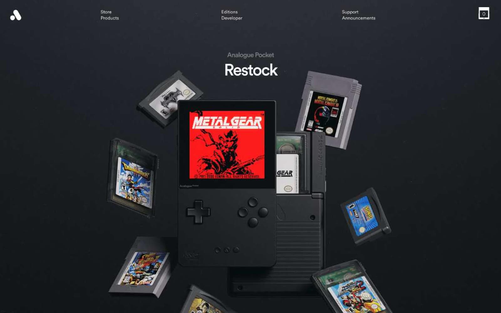
Analogue
Commerce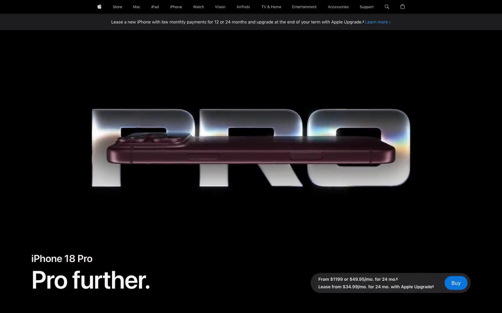
Apple iPhone 18 Pro
Commerce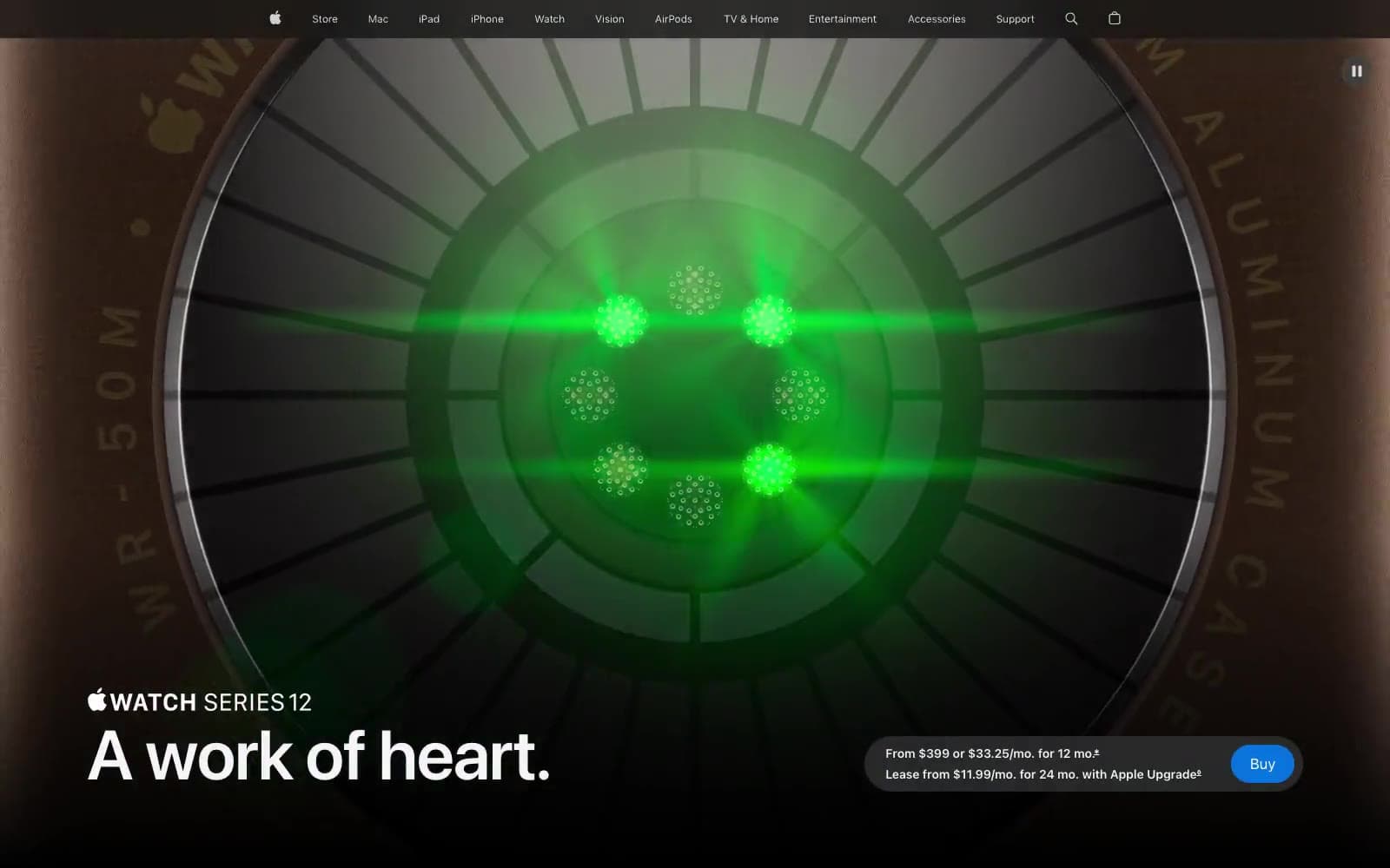
Apple Watch Series 12
Commerce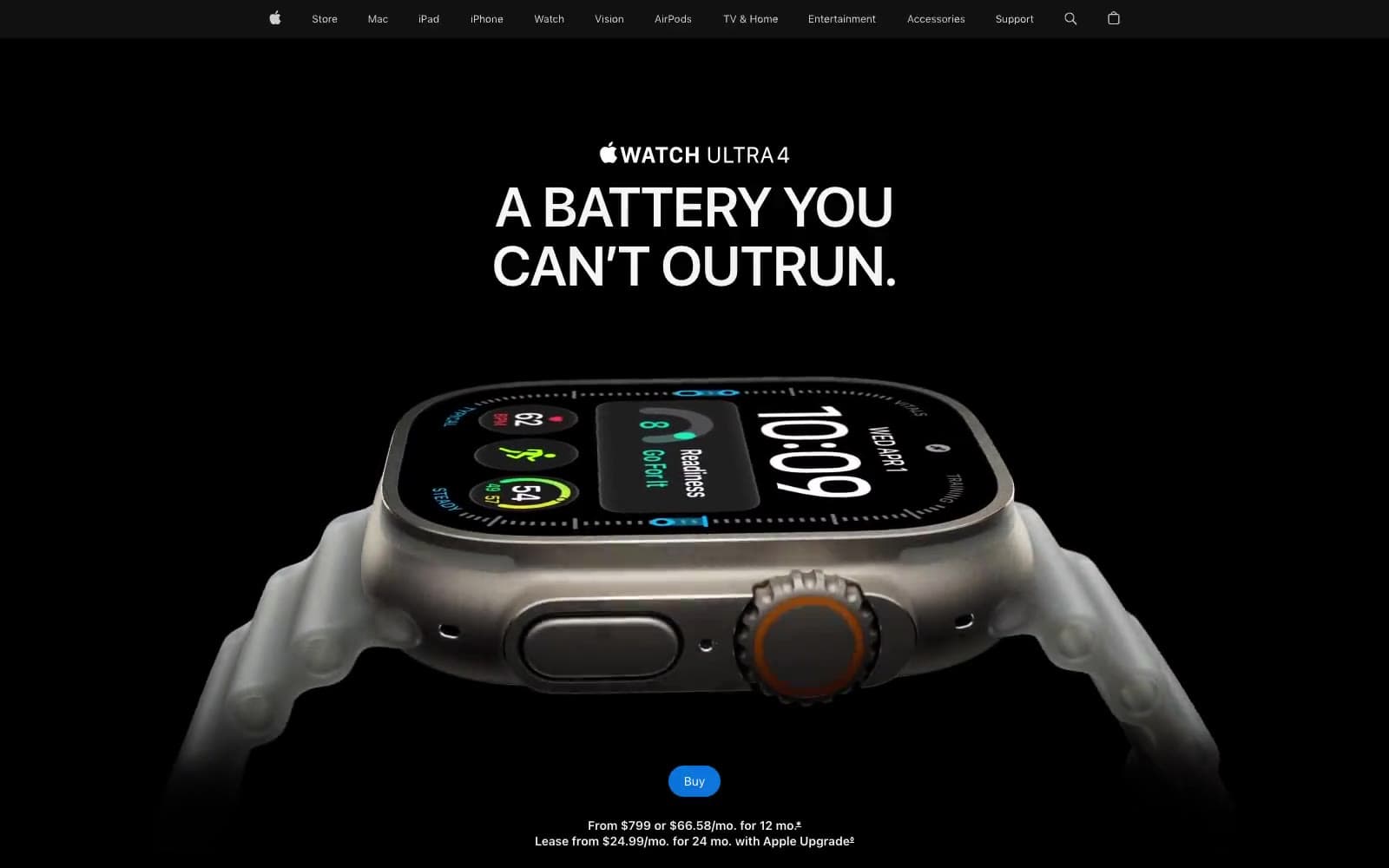
Apple Watch Ultra 4
Commerce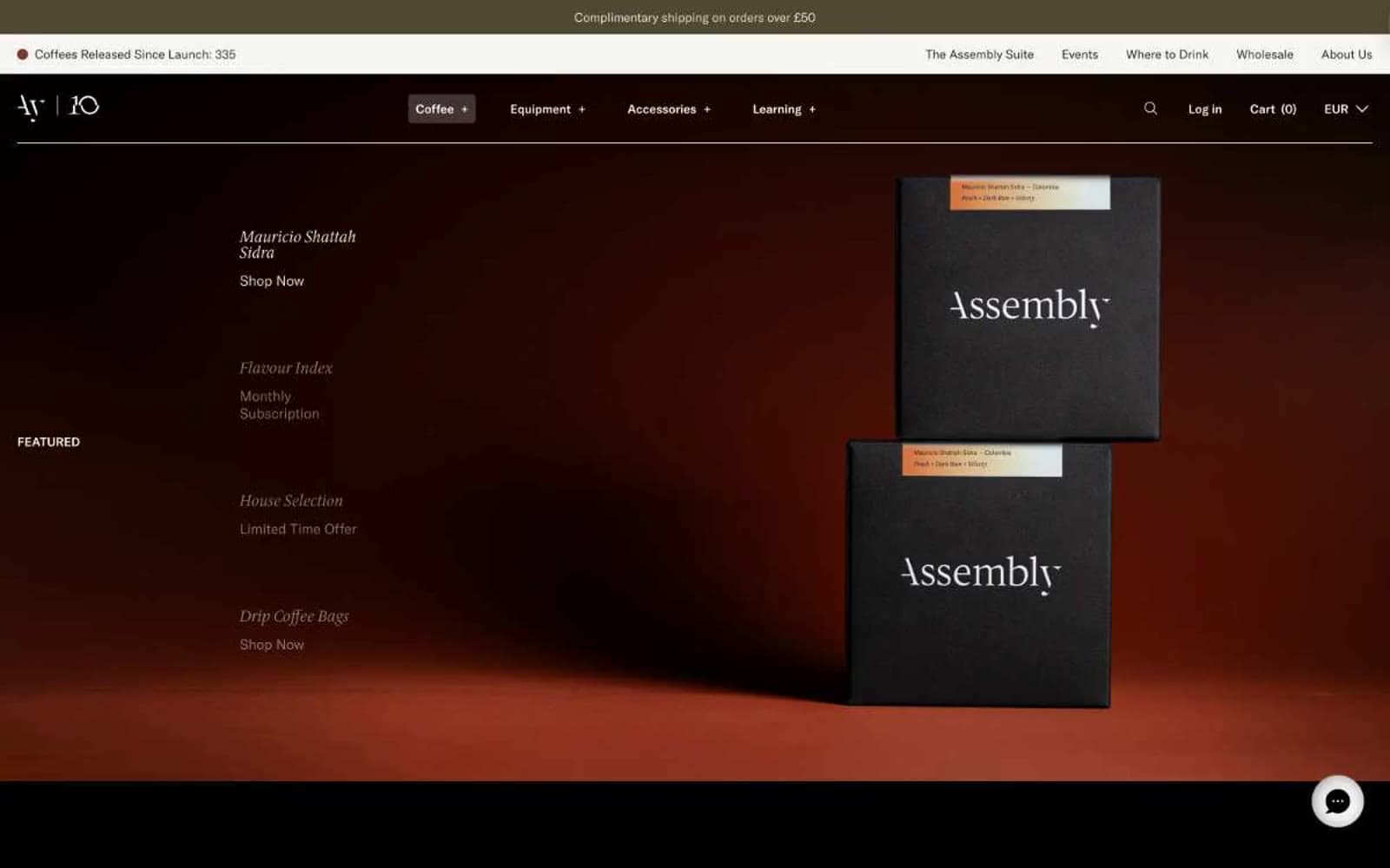
Assembly Coffee London
Commerce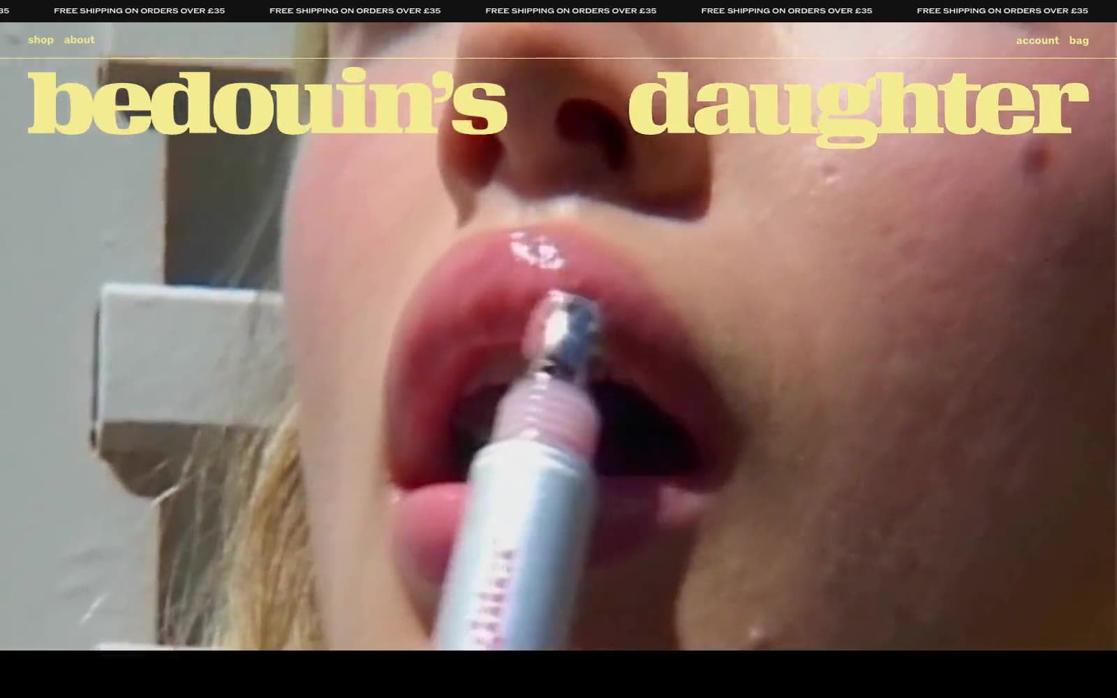
Bedouin's Daughter
Commerce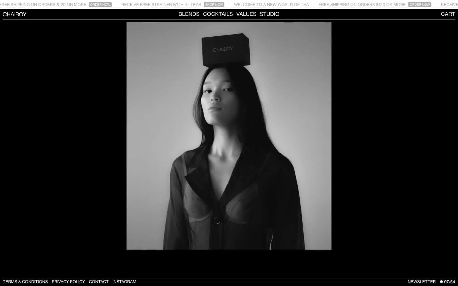
CHAIBOY
Commerce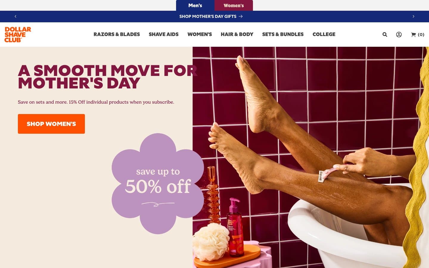
Dollar Shave Club
Commerce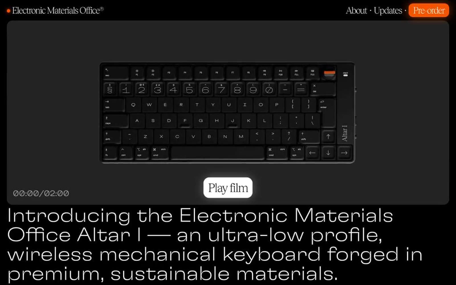
Electronic Materials Office®
Commerce
Elektron
Commerce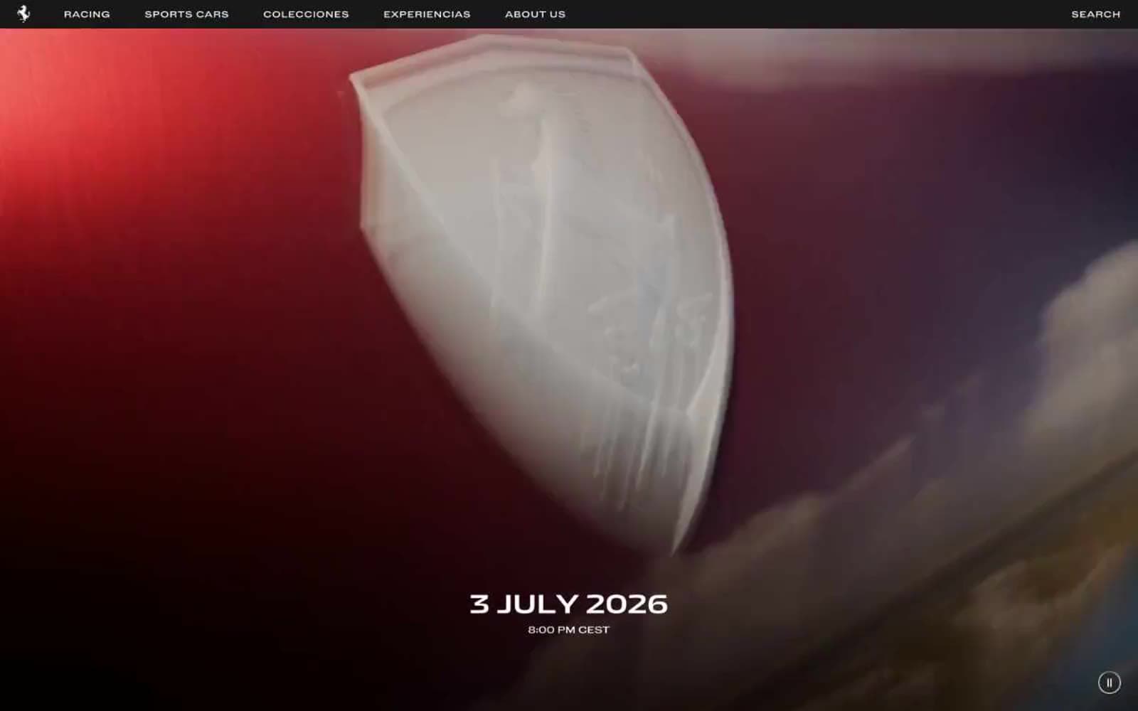
Ferrari
Commerce
Holiday 100
Commerce


