
Shares. A clinical white workspace where one color marks every deliberate action.
- Finance
- Light theme
- 10 colors
- 2 typefaces
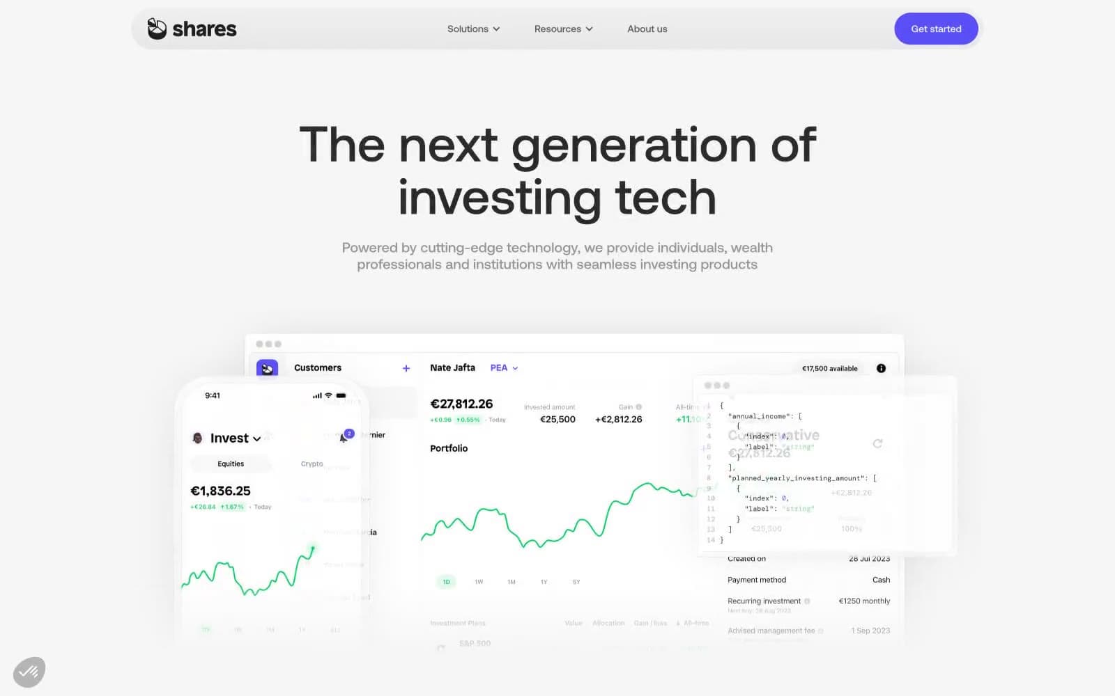
A monochromatic fintech interface on near-white surfaces, where one vivid violet does all the talking. The visual language is sparse and confident: no decorative gradients, no chromatic ornamentation, no shadow theatrics. Everything sits on flat porcelain with dark charcoal text, and the only color that earns attention is Signal Violet (#594ff4), reserved strictly for action — filled buttons, active links, brand marks. Components lean on geometry rather than depth: pill-shaped controls (99px radius), generously rounded cards (36px), and soft 1px gray dividers instead of elevation. Typography is geometric and tightly tracked, with large headlines at compressed line-heights (1.05–1.15) that feel architectural rather than editorial. Product mockups float in layered, slightly overlapping arrangements — phone + dashboard + code panel — anchored by a single brand color.
Shares design system

Brand1
Primary action fill, active links, brand iconography — the only chromatic color in the system, creating high-contrast urgency against the monochrome canvas
Neutrals9
Footer fill, maximum-contrast text — used sparingly for the darkest dark
Primary headings, body text emphasis, dark surface fills — the dominant dark neutral
Secondary text, dense borders, icon strokes — the most-used neutral
Muted body text, navigation subtext, secondary borders
Tertiary text, helper copy, light borders
Muted link text, hairline dividers, inactive borders
Image and photo borders, very light separators
Card surfaces, FAQ panels, subtle background tints — the soft elevation layer
Page canvas, button text on violet fill, primary card background — the dominant base surface
Try a pairing
Pick any two colors from the palette to check whether text stays readable on top.
Aa
Porcelain on Signal Violet
5.46 : 1 contrast
- Body textPasses AA 4.5
- Large textPasses AA 3
- StrictFails AAA 7
More DESIGN.md files. Same web, different personalities.

Mollie
Finance
a16z speedrun
Finance
Acctual
Finance
Airtree
Finance
Ambrook
Finance
Angellist 2024
Finance
Apron
Finance
Baselayer
Finance
Basis Theory
Finance
BlueYard Capital
Finance
Brex
Finance
Coda
Finance


