
Sequence. Blueprint paper with violet annotations.
- Finance
- Light theme
- 19 colors
- 3 typefaces
Sequence reads like an editorial finance publication rendered in product form: a near-white canvas, a humanist sans (TWK Lausanne) carrying almost all interface text, and a light-weight serif (Moderat Serif) used sparingly on large display headlines to inject editorial gravity. Depth comes from hairline borders and thin layered shadows, not heavy panels or colored fills. A single vivid violet (#a565ff) is the only chromatic accent in the system — it functions as a precise annotation, appearing on primary CTAs, active icons, and subtle brand glows, while the rest of the interface stays in cool grays. Soft blue-violet radial washes in hero and section backgrounds create atmospheric depth without committing to color, and the overall density is compact and precise rather than spacious or airy.
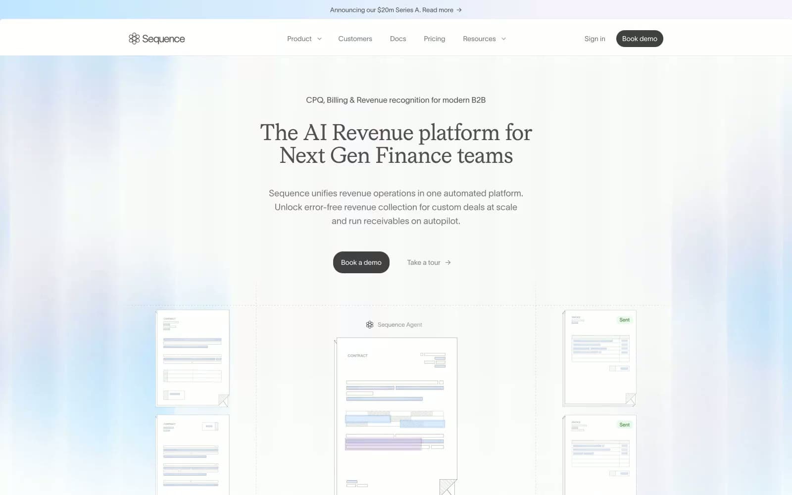
Sequence design system

Brand2
Primary CTAs, active icons, brand glow accents — the single chromatic accent in the system; everything else defers to it
Link text, secondary text emphasis, and accent strokes where violet would be too loud
Accent3
Soft tinted backgrounds for highlighted callouts and subtle surface differentiation
Violet supporting accent for decorative details and low-frequency emphasis. Do not promote it to the primary CTA color
Green text accent for links, tags, and emphasized short phrases. Use as a supporting accent, not as a status color
Neutrals14
Icon fills and contrast anchors where pure black is required
Primary heading and body text — near-black with a barely-warm tint
Secondary headings, emphasized body text, and list accents
Default body text and the most-used text color across the system
Muted helper text, navigation labels, and secondary table text
SVG illustration stroke and fill — the default for vector graphics in content
Placeholder text, disabled labels, and tertiary table cells
Cooler border for inputs, dividers, and sections needing visual separation from Ash
Default hairline border — the structural backbone of the entire UI; the most-used color in the system
Inset borders, button outlines, and shadow-stack fills for elevation
Disabled surface fills, table row alternates, and recessed UI regions
Warm cream accent for announcement bars and subtle highlight bands
Recessed card surfaces and subtle panel backgrounds one step off white
Primary canvas, card surfaces, button fills, and elevated surface layer
Try a pairing
Pick any two colors from the palette to check whether text stays readable on top.
Aa
Noir on Violet Pulse
5.91 : 1 contrast
- Body textPasses AA 4.5
- Large textPasses AA 3
- StrictFails AAA 7
More DESIGN.md files. Same web, different personalities.
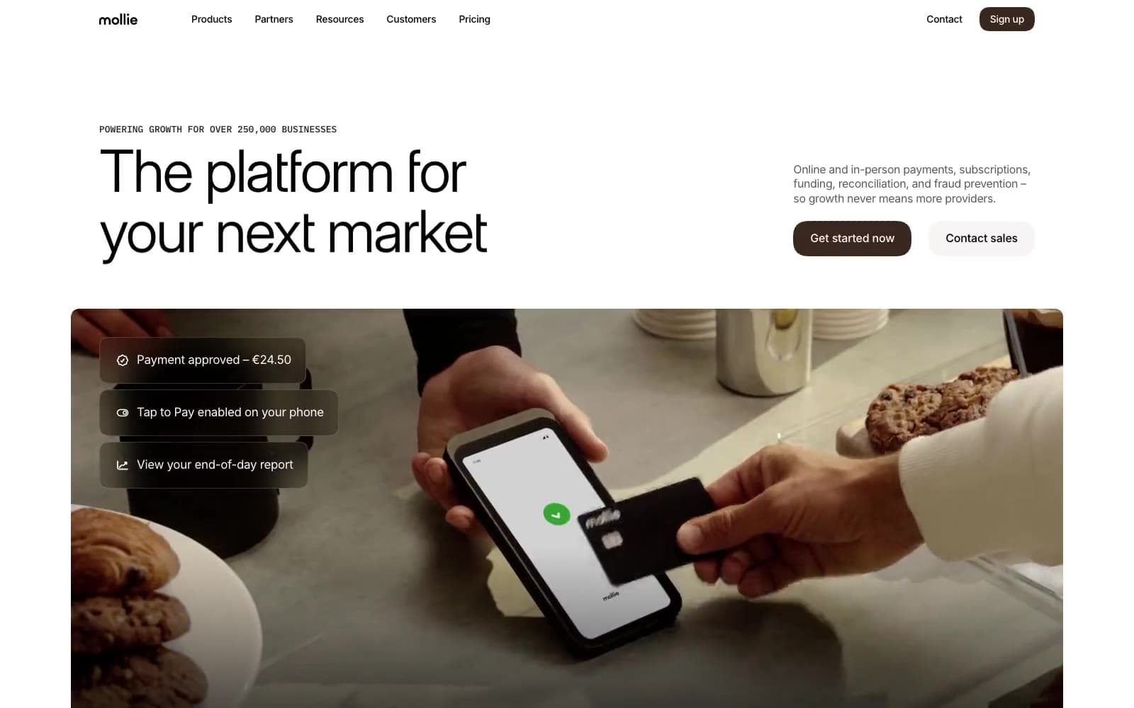
Mollie
Finance
a16z speedrun
Finance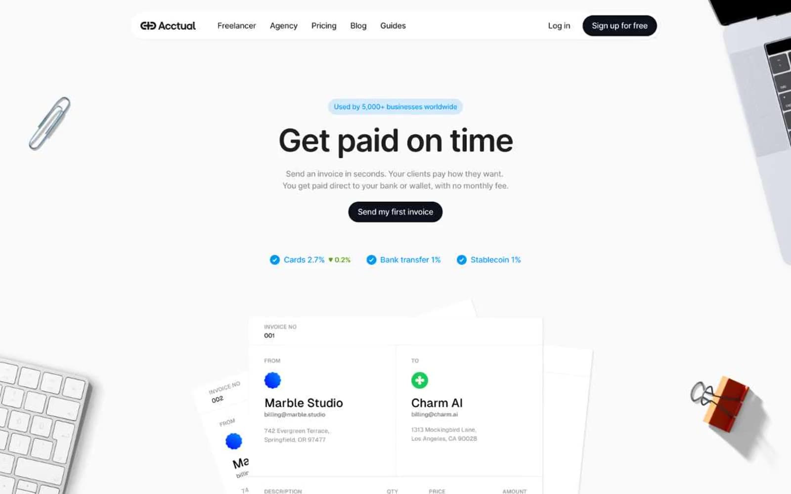
Acctual
Finance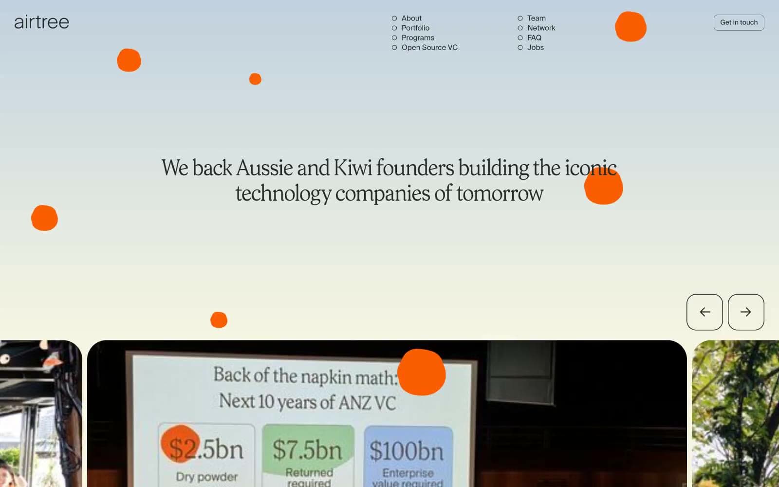
Airtree
Finance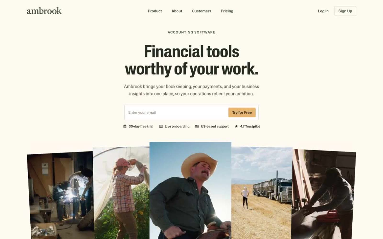
Ambrook
Finance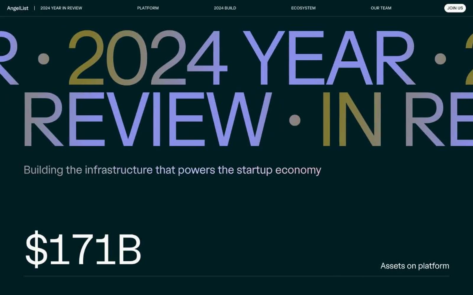
Angellist 2024
Finance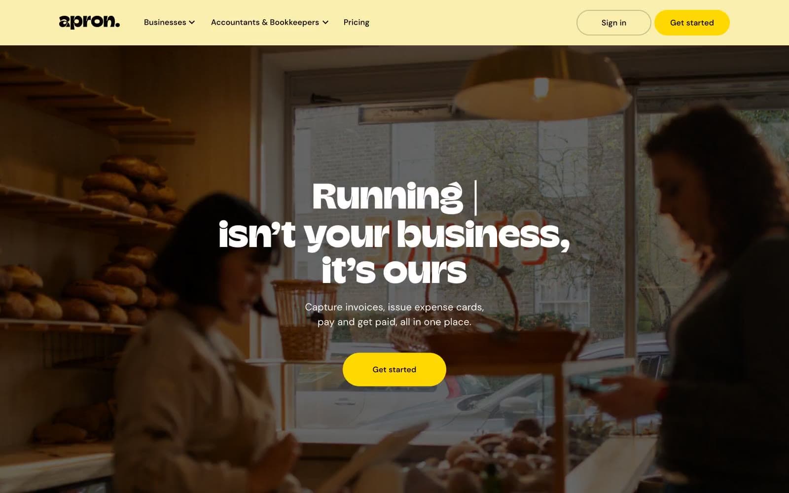
Apron
Finance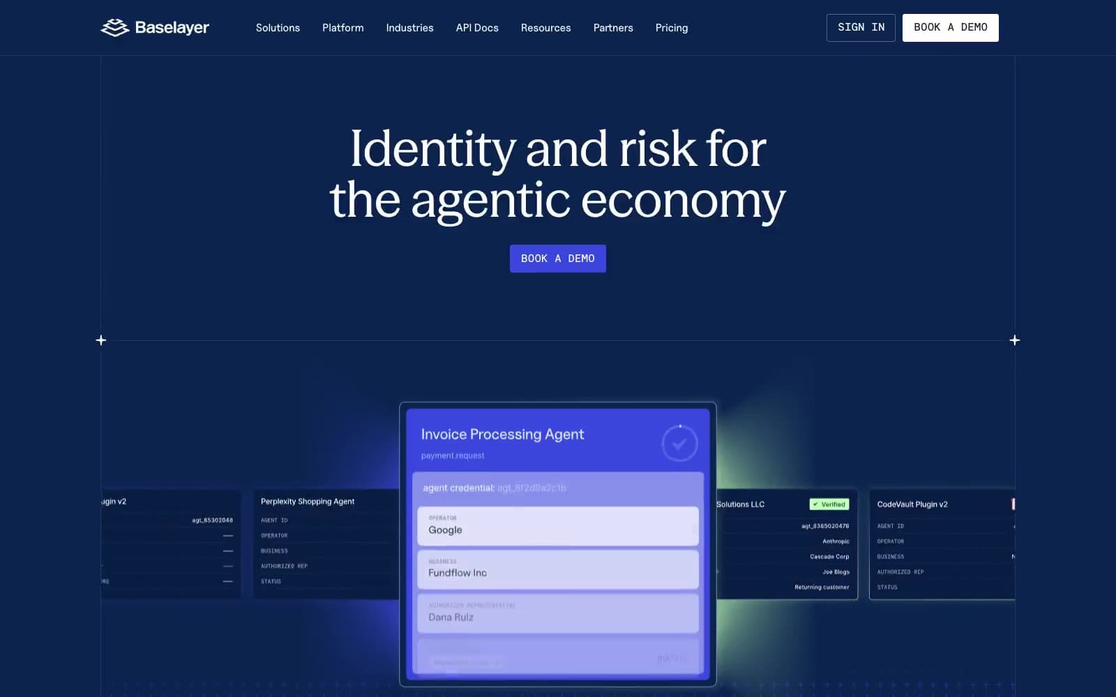
Baselayer
Finance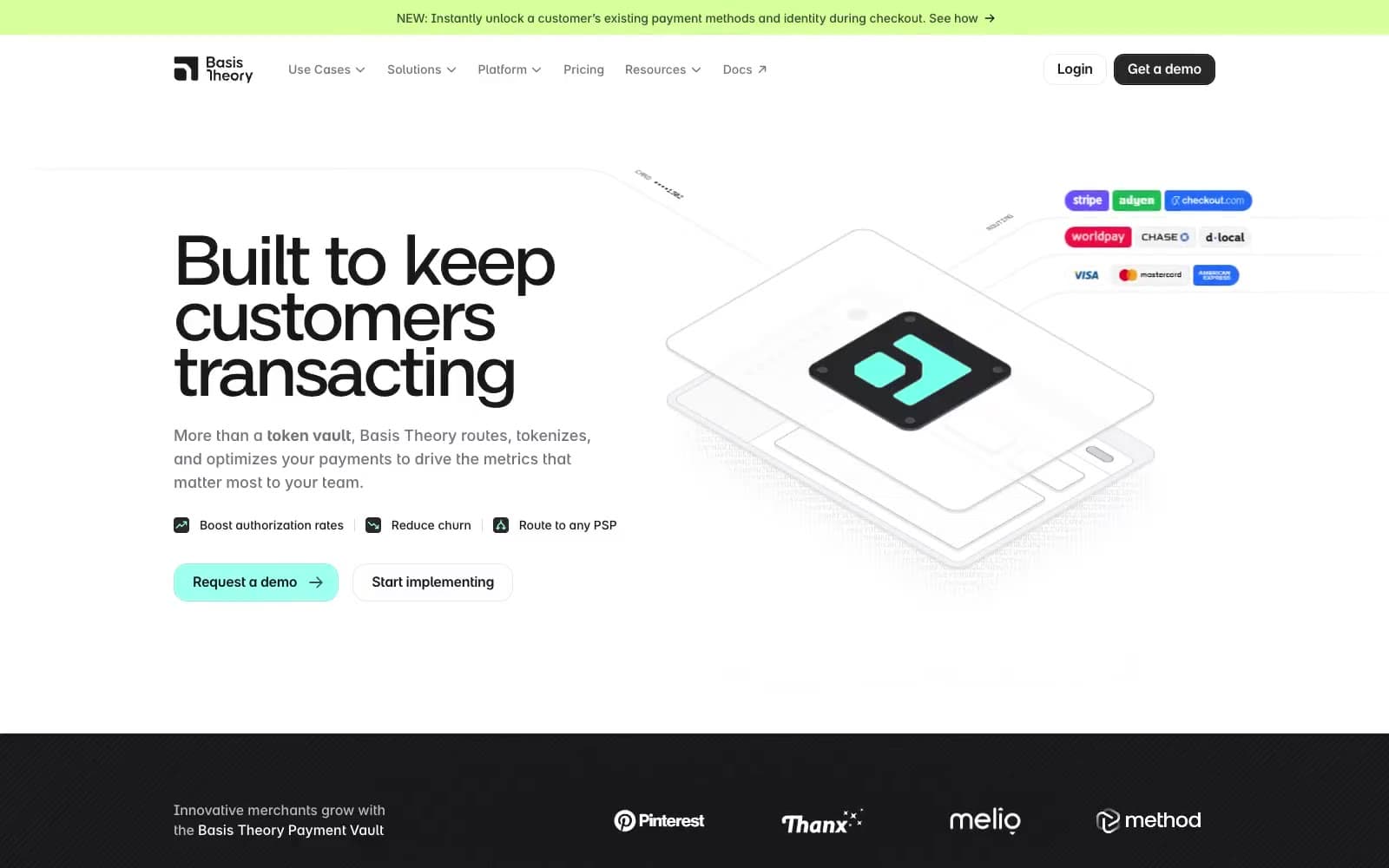
Basis Theory
Finance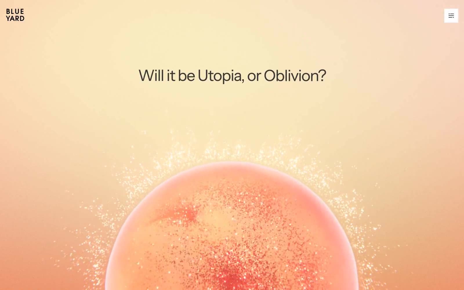
BlueYard Capital
Finance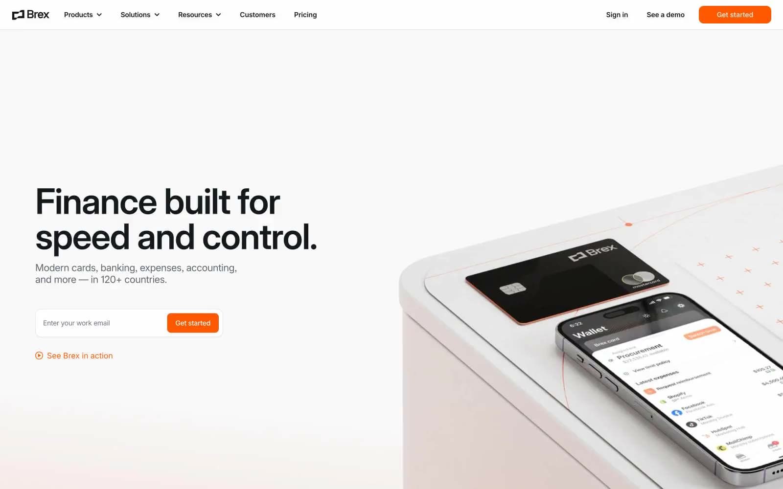
Brex
Finance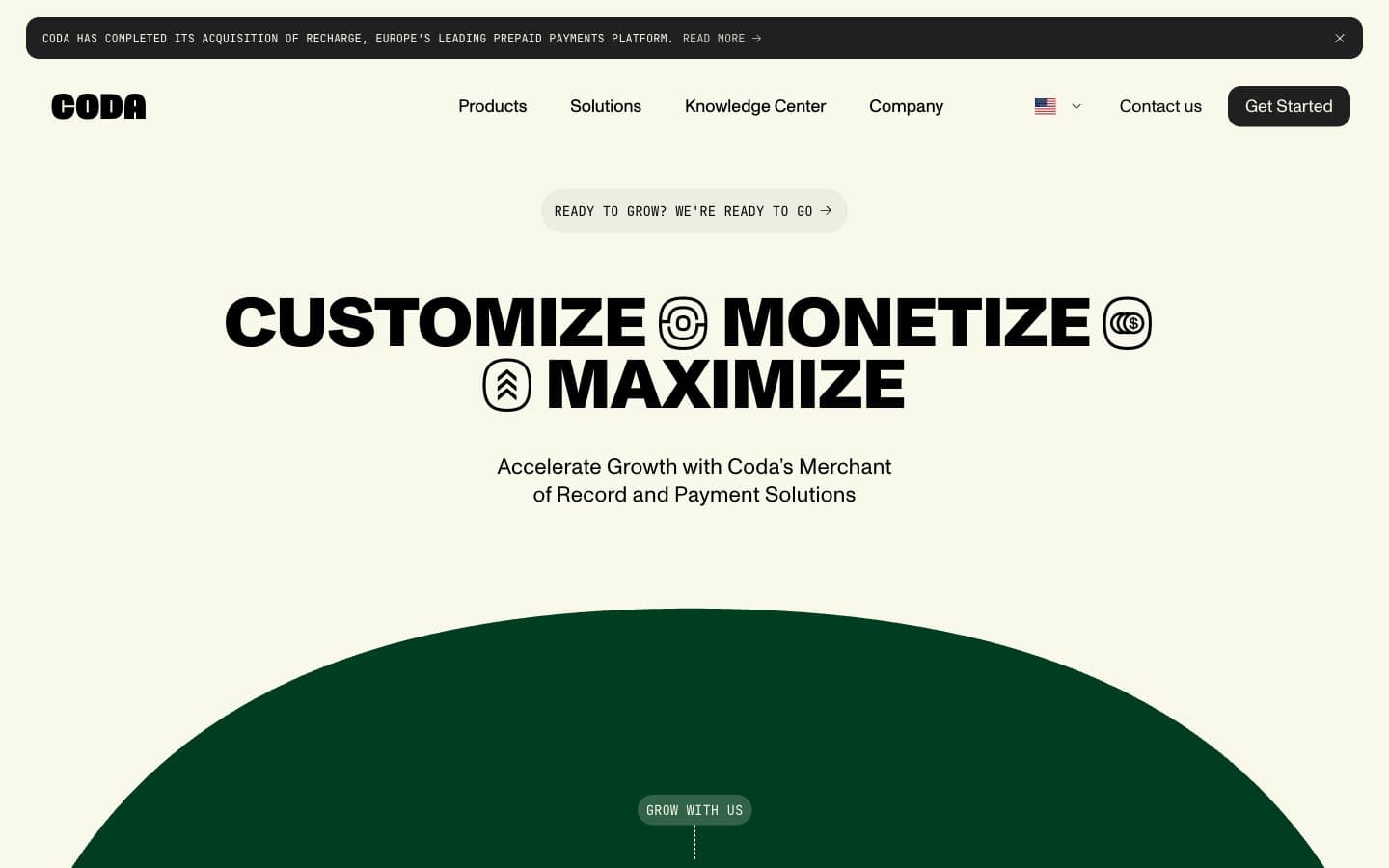
Coda
Finance


