
Seed. Living organism under laboratory glass.
- Brand
- Light theme
- 11 colors
- 2 typefaces
Seed uses a botanical-clinical language: warm snow-white canvas, deep forest green surfaces, and whisper-light headline weights (300–350) that read more like a peer-reviewed journal than a supplement brand. The palette is almost monochrome — 93% achromatic — with a single vivid lime (#d3fa99) used as functional punctuation for badges and 'New' tags. Components are deliberately weightless: pill-shaped controls, 16px-radius cards, no drop shadows, no gradients, no decorative borders. The visual restraint IS the brand — scientific credibility earned through typographic confidence and chromatic silence, not through visual volume.
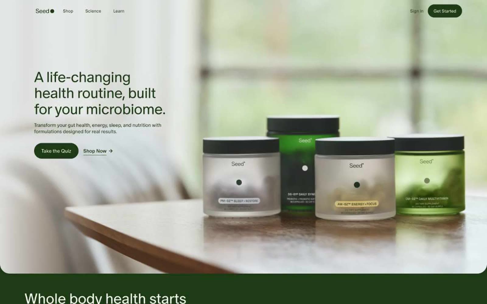
Seed design system

Brand1
Primary brand color — filled CTAs, dark section backgrounds, navigation surfaces, and primary body text. A near-black green that reads as ink on snow-white and as depth in dark sections
Accent4
Green wash for highlight backgrounds, decorative bands, and soft emphasis behind content.
Product variant accent — DM-02 Daily Multivitamin card and supporting elements. Muted green that harmonizes with Forest Depths without competing
Yellow wash for highlight backgrounds, decorative bands, and soft emphasis behind content.
Product variant accent — PM-02 Sleep + Restore card and supporting elements. Cooler green-blue for the evening product
Neutrals6
Primary body text on light sections where maximum contrast is needed. Used sparingly — most text defaults to Forest Depths for tonal warmth
Secondary body text, captions, and low-emphasis helper text. Provides one tier of text de-emphasis below primary Forest Depths
Disabled button backgrounds, muted button states, and low-emphasis borders
Translucent surface and frosted-glass overlay backgrounds (used with backdrop-filter: blur). Also serves as a muted neutral surface for content cards on white sections
Secondary surface — alternating section backgrounds, subtle panels, and muted separators. Sits between Snow White and the dark sections to create quiet rhythm
Page canvas, card surfaces, button text, and primary inverse text. A warm off-white (not pure white) that softens the high-contrast dark green and reads organic rather than clinical-sterile
Try a pairing
Pick any two colors from the palette to check whether text stays readable on top.
Aa
Snow White on Forest Depths
12.26 : 1 contrast
- Body textPasses AA 4.5
- Large textPasses AA 3
- StrictPasses AAA 7
More DESIGN.md files. Same web, different personalities.
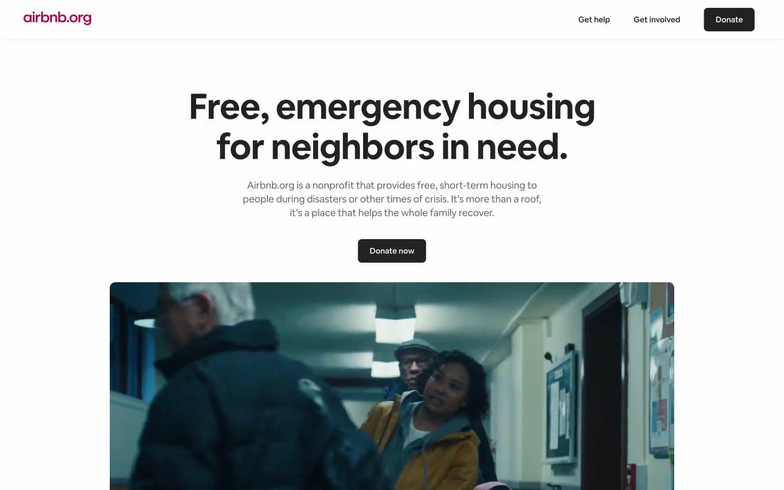
Airbnb
Brand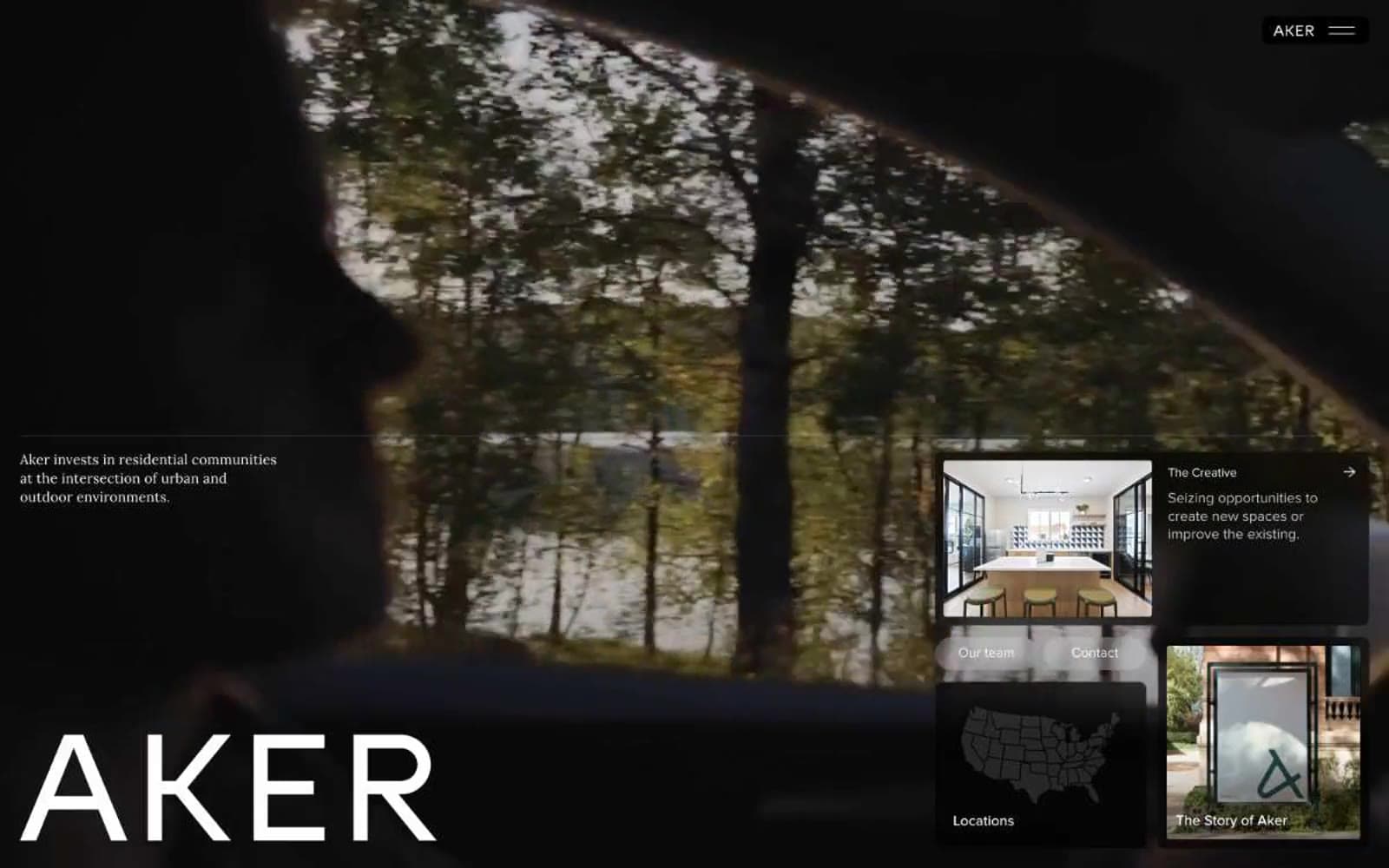
Aker
Brand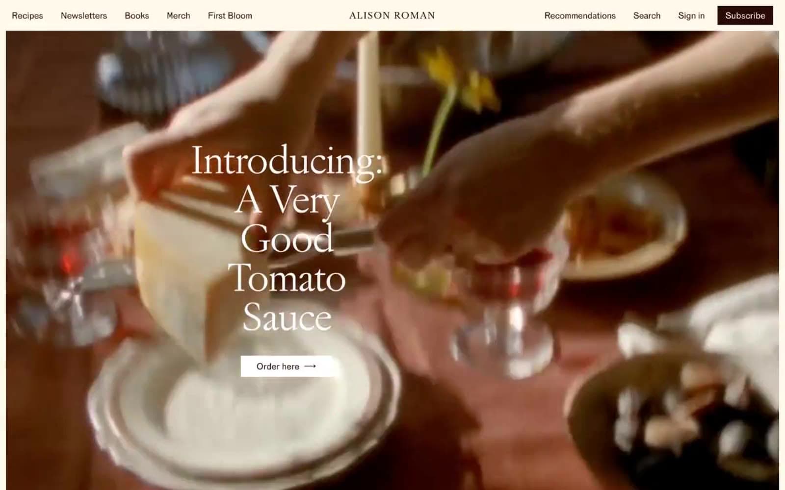
Alison Roman
Brand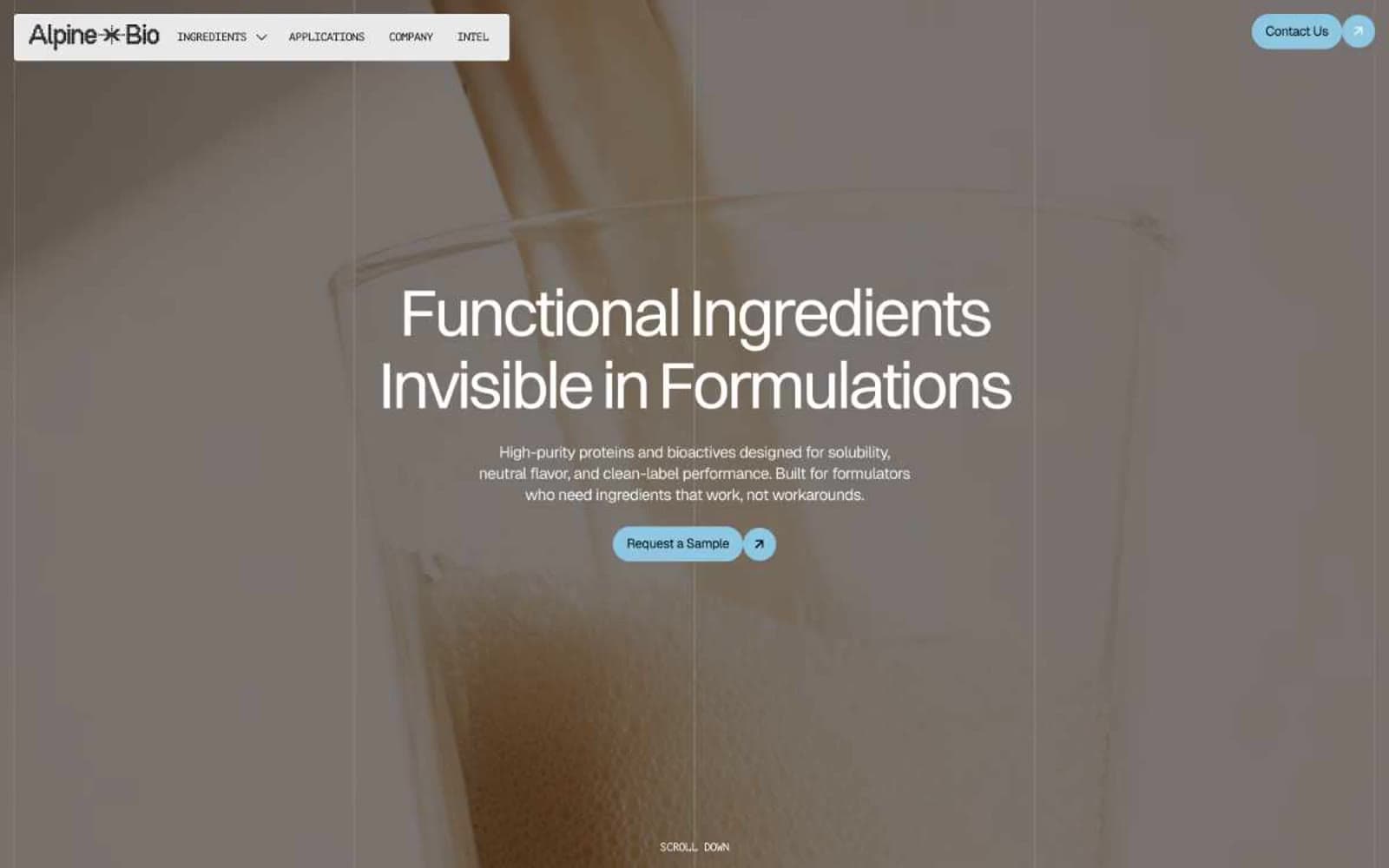
Alpine Bio
Brand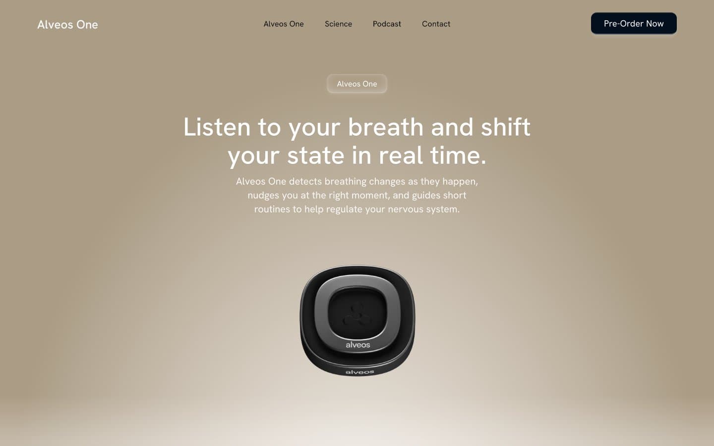
Alveos One
Brand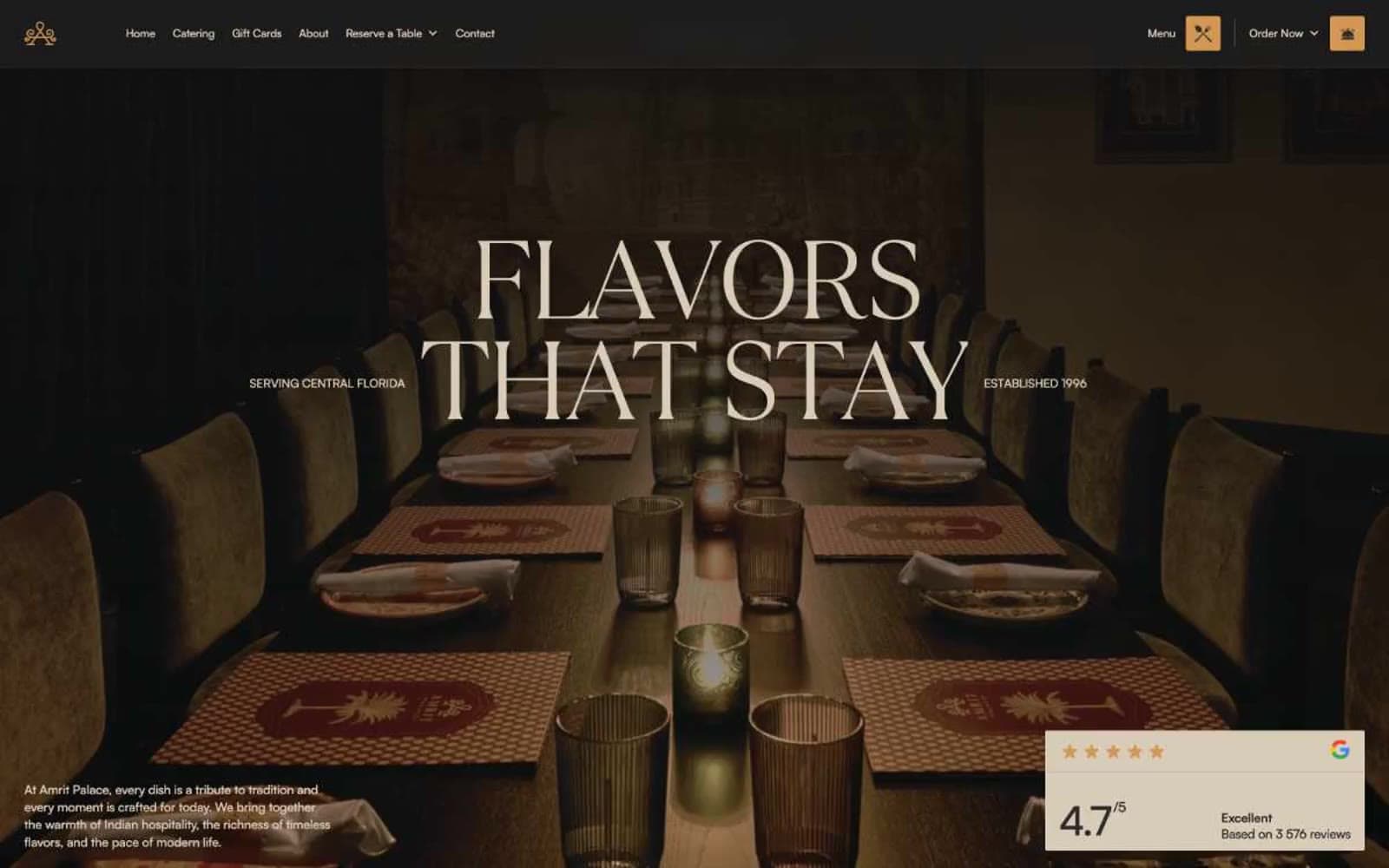
Amrit Palace
Brand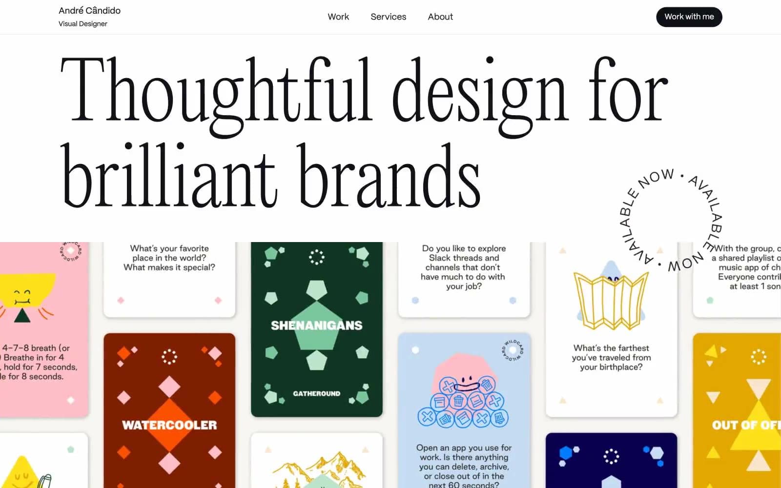
André Cândido
Brand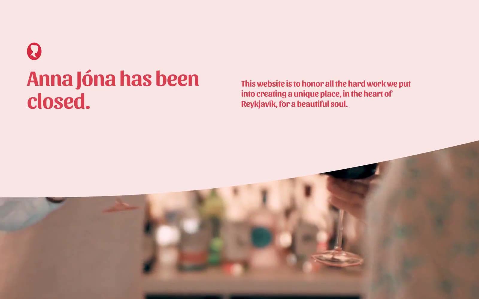
Anna Jóna
Brand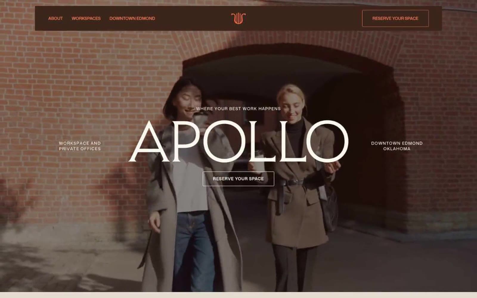
Apollo
Brand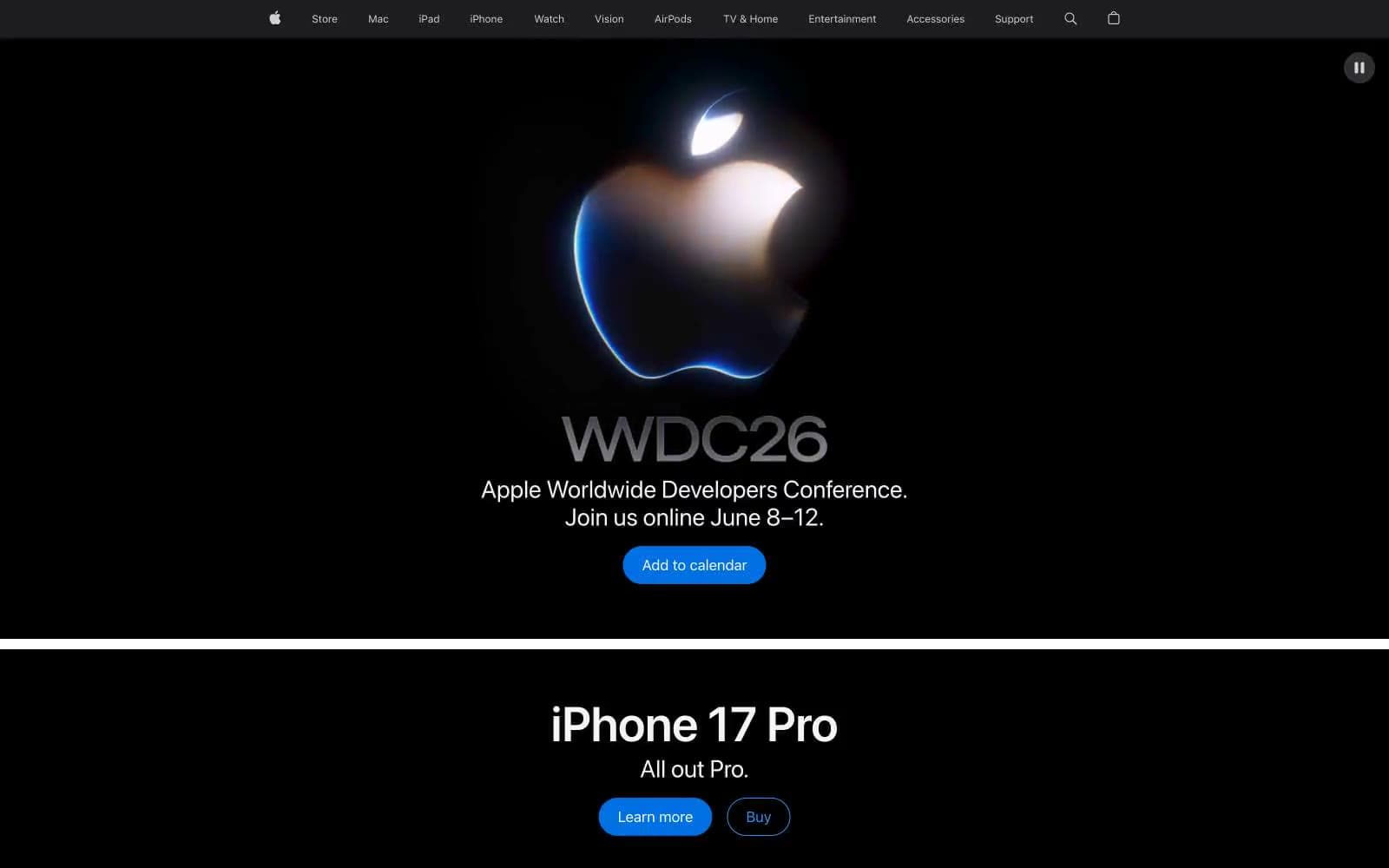
Apple
Brand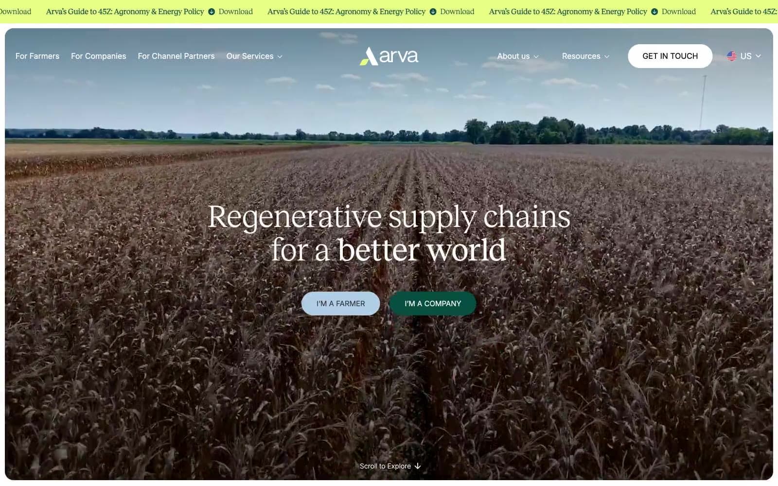
Arva
Brand
Ashton Bespoke
Brand


