
Sauce Labs. A dark engineering console where a single green pulse marks every live signal.
- Developer tools
- Dark theme
- 13 colors
- 2 typefaces
Sauce Labs operates as a neon-lit engineering console: deep obsidian canvas (#132322) with white precision typography and a single vivid green (#3ddc91) that activates every interactive surface. The system alternates between dark structural bands and light content cards (#edf7f5), creating rhythm through luminance contrast rather than ornament or elevation. Components are confident and generously rounded — 56px pill buttons, 20px card radii, minimal shadow — reading as high-end developer tooling where the product's intelligence is the visual subject. The green accent is rationed: it appears on primary actions, active tab states, announcement bars, and stat highlights, never as decoration, which gives it real semantic weight.
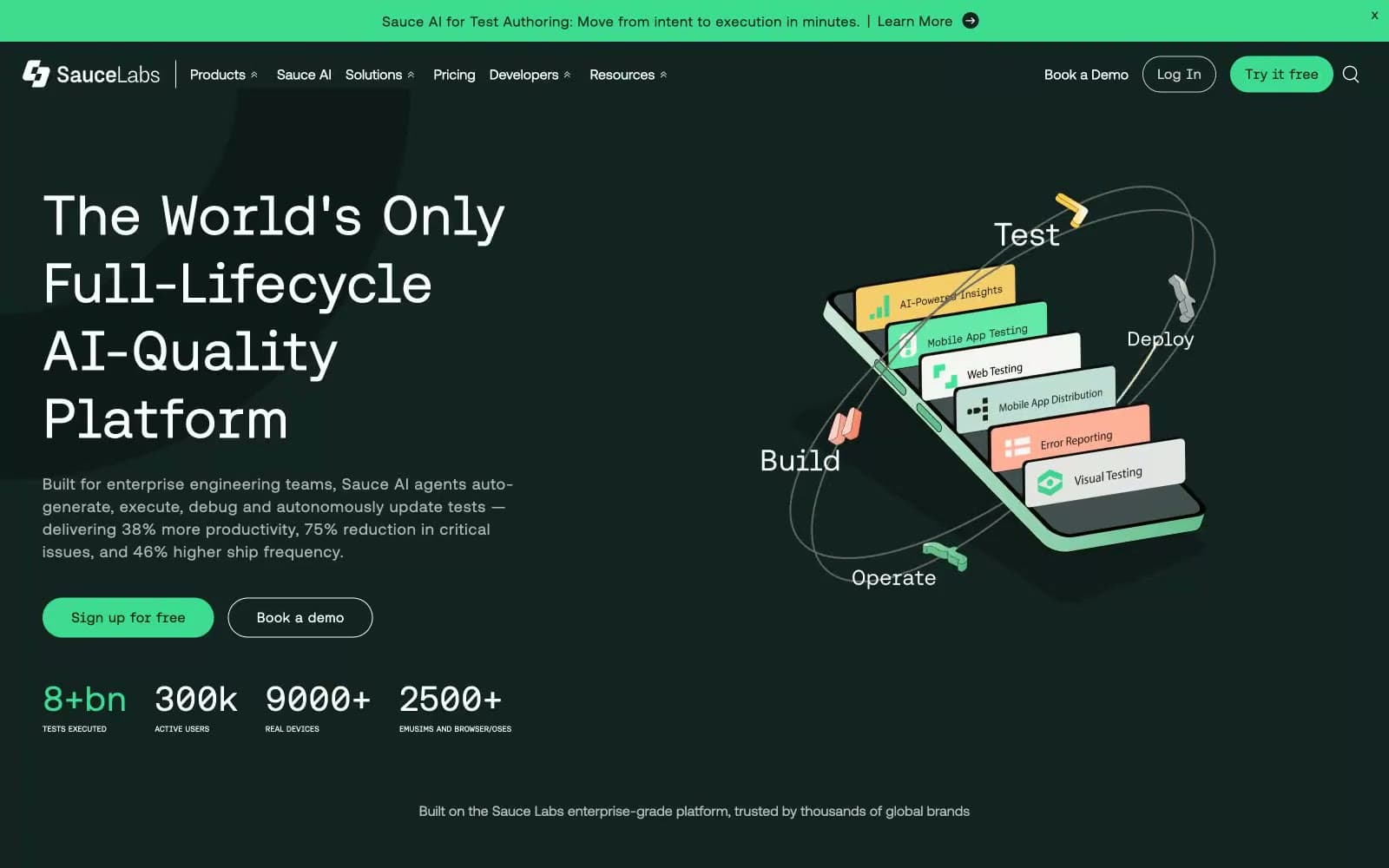
Sauce Labs design system

Brand1
Green action color for filled buttons, selected navigation states, and focused conversion moments.
Accent2
Green wash for highlight backgrounds, decorative bands, and soft emphasis behind content. Do not promote it to the primary CTA color
Accent fills within isometric illustrations and product mockups — a warm punctuation that breaks the green monochrome and adds dimensional interest to graphics
Neutrals10
SVG icon fills, high-contrast decorative strokes — graphic asset workhorse
Darkest surface for overlays, modals, and maximum-contrast panels
Darker surface variant for nested elements, deep card backgrounds, gradient endpoints — pushes further into the void when extra depth is needed
Primary page background, dark navigation, dark card surfaces — the structural canvas that absorbs everything else and makes the green accent feel electric by contrast
Icon fills, decorative SVG strokes on light sections
Muted body text, captions on light backgrounds, secondary labels
Medium borders on light cards, secondary dividers, subtle frame lines
Hairline dividers and borders on light surfaces — quiet structural lines that never compete with content
Light content card surfaces, elevated feature panels — the bright counterpoint that breaks up dark sections and hosts detailed content
Primary text on dark surfaces, card content backgrounds, light section canvases — maximum contrast against the obsidian shell
Try a pairing
Pick any two colors from the palette to check whether text stays readable on top.
Aa
Pure Black on Neon Pulse
11.84 : 1 contrast
- Body textPasses AA 4.5
- Large textPasses AA 3
- StrictPasses AAA 7
More DESIGN.md files. Same web, different personalities.

Railway
Developer tools
Nuxt
Developer tools
Astro
Developer tools
Authkit
Developer tools
Axiom
Developer tools
BaseHub
Developer tools
Better Stack
Developer tools
Bun
Developer tools
Checkly
Developer tools
ClickHouse
Developer tools
Depot
Developer tools
dope.security
Developer tools


