
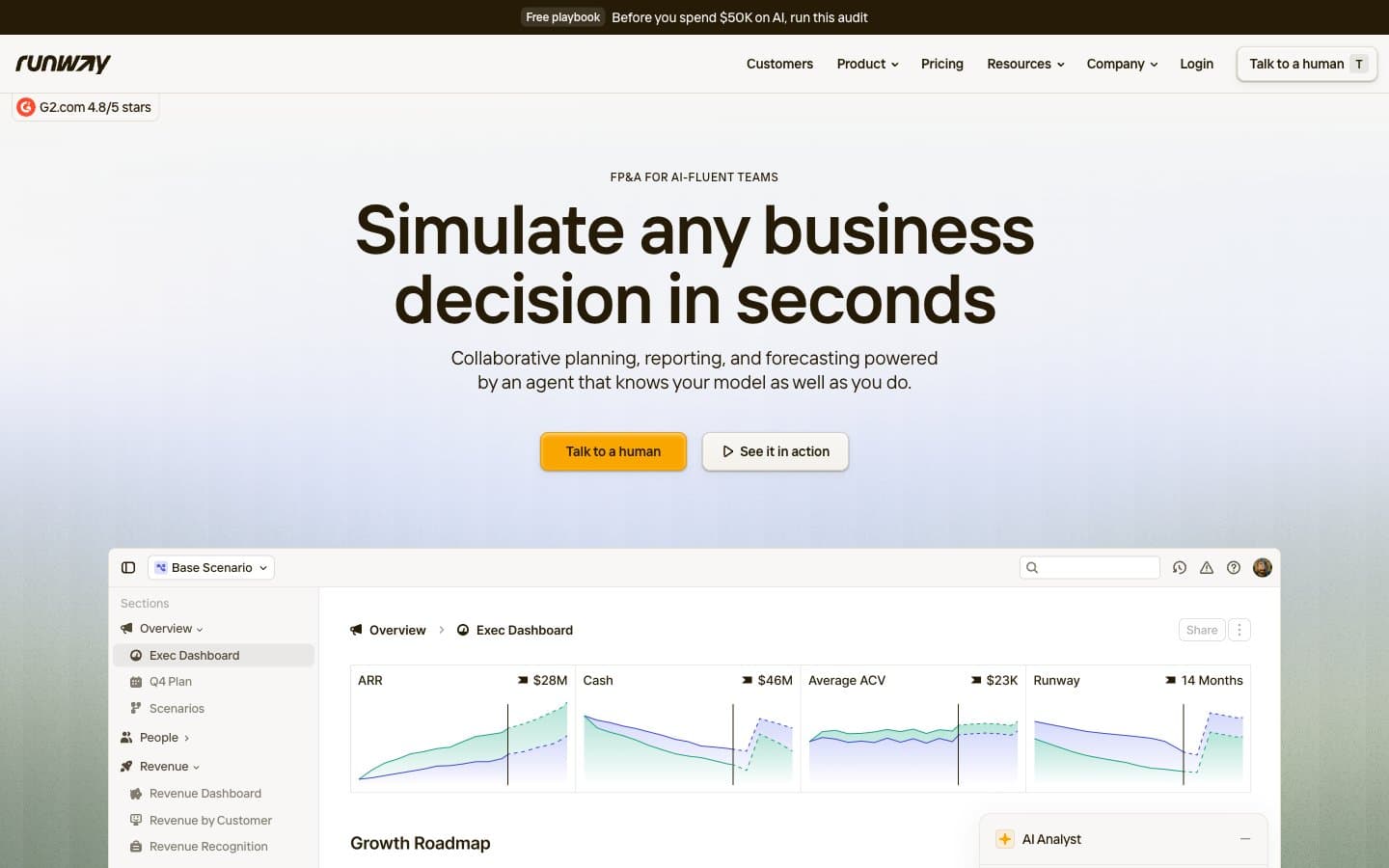
Runway. Kraft paper ledger under amber desk lamp.
- Finance
- Light theme
- 13 colors
- 1 typeface
Runway renders a warm, paper-like financial workspace: a cream canvas (#f8f7f5) holds white card surfaces, linen-warm dividers (#e3dfd5), and deep espresso text (#261b07) that feels printed rather than rendered. A single amber accent (#f9a600) is the only chromatic signal in the interface — it marks the primary action and never decorates, giving CTAs the weight of a highlighter on a ledger page. Typography is tight and slightly humanist via the custom Interphases Pro Variable font with non-standard weights (492, 584), producing a confident density that reads like a well-set business document. Shadows are warm-tinted browns, not cool grays, so even elevation feels like layers of kraft paper rather than floating panels. The whole system communicates analytical warmth — serious about numbers, soft on the eyes.
Runway design system

Brand2
Yellow action color for filled buttons, selected navigation states, and focused conversion moments.
Yellow accent for outlined action borders, linked labels, and lightweight interactive emphasis. Do not promote it to the primary CTA color
Accent3
Decorative accent, chart highlight, warm icon stroke — the secondary warm hue for visual punctuation
Soft badge background — the only cool wash in the system, used sparingly for tag differentiation
Warm badge background — amber-tinted tag fill for status and category labels
Neutrals8
Primary text, headings, icons, nav text, footer text, top banner — deep warm black that replaces true black throughout
Body text, secondary content — warm dark gray for paragraphs and descriptions
Muted body text, nav borders, secondary heading borders — readable but recedes
Shadow tint base, muted icon strokes — warm brown undertone keeps shadows on-brand
Subtle button borders, secondary dividers — a step lighter than Linen for nested separation
Primary divider color, card borders, section separators — warm gray that separates without cutting
Page background, hero wash, elevated card shadows — the warm paper that grounds every screen
Card surfaces, product screenshot backgrounds, button fills for ghost variants — the clean layer on top of cream
Try a pairing
Pick any two colors from the palette to check whether text stays readable on top.
Aa
Espresso on Amber Signal
8.44 : 1 contrast
- Body textPasses AA 4.5
- Large textPasses AA 3
- StrictPasses AAA 7
More DESIGN.md files. Same web, different personalities.

Mollie
Finance
a16z speedrun
Finance
Acctual
Finance
Airtree
Finance
Ambrook
Finance
Angellist 2024
Finance
Apron
Finance
Baselayer
Finance
Basis Theory
Finance
BlueYard Capital
Finance
Brex
Finance
Coda
Finance


