
Revolut. White ink, pill buttons, one blue ribbon of color in an otherwise grayscale world.
- Finance
- Light theme
- 8 colors
- 2 typefaces
Revolut runs an editorial-monochrome banking language: the product UI is nearly entirely achromatic — white surfaces, #1f1f1f ink, hairline #c9c9cd dividers — and the entire color budget is outsourced to full-bleed sky photography that washes across hero sections. Aeonik Pro at weight 500 carries every display moment with aggressively tightened tracking (-0.024em at 88px), while Inter at 16px handles all UI density. Controls are exclusively pill-shaped (9999px) in four restrained variants, and the only chromatic element in the entire system is a single blue gradient reserved for the promotional bar. Surfaces prefer to float without shadows — edges do the work that elevation usually would.
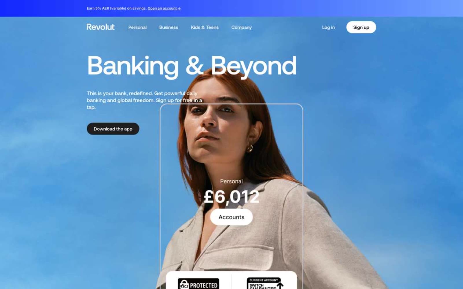
Revolut design system

Brand1
Promotional bar gradient start. The single chromatic accent in the entire system — only ever appears as part of the blue gradient on top-of-page offer strips
Neutrals7
Button text on light surfaces, pure-black background blocks. Used where maximum contrast is required
Primary text, footer background, filled dark buttons. The near-black that carries all body and display copy
Tertiary body text, inline badge copy, and minor muted surfaces between true ink and slate
Neutral form states, badge text, and quiet UI feedback where color should stay understated.
Hairline borders, disabled dividers, and the dominant link color at 80 occurrences. The neutral that defines edge separation without shadow
List and grouped-background fills — the recessed surface beneath cards, tables, and secondary containers
Page canvas, card surfaces, button text on dark fills, button borders on light fills. The dominant surface color across all sections
Try a pairing
Pick any two colors from the palette to check whether text stays readable on top.
Aa
Bone on Pure Black
21.00 : 1 contrast
- Body textPasses AA 4.5
- Large textPasses AA 3
- StrictPasses AAA 7
More DESIGN.md files. Same web, different personalities.

Mollie
Finance
a16z speedrun
Finance
Acctual
Finance
Airtree
Finance
Ambrook
Finance
Angellist 2024
Finance
Apron
Finance
Baselayer
Finance
Basis Theory
Finance
BlueYard Capital
Finance
Brex
Finance
Coda
Finance


