
Retool. A precision tool surface lit by ember glow, where everything is built.
- Developer tools
- Dark theme
- 12 colors
- 3 typefaces
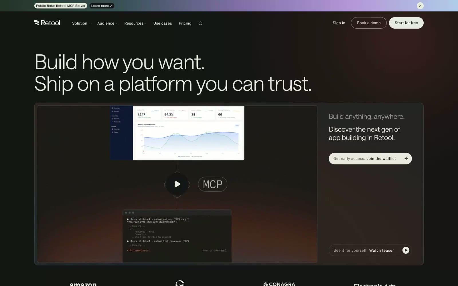
Retool operates on a near-black canvas — #151515 as the dominant ground — with off-white text (#e9ebdf) that reads more like parchment than pure white, giving the dark surface a warm, organic quality rather than a cold tech-void. Typography is the primary design tool: the custom 'saansFont' runs from weight 300 at 72px down to 380 at body sizes, with aggressive negative tracking at large scales creating compressed, authoritative headlines that feel proprietary. Surface depth is achieved through a three-step stack (#0e0e0 → #151515 → #242424) with no shadows — cards are literally darker or lighter slabs of the same material, not elevated objects. The only chromatic punctuation is muted teal (#185849, #0e352c) used as subtle background washes, while the hero gradient bleeds warm earthy tones (amber-rust into near-black) from the bottom-left, creating atmospheric depth without visual noise. Buttons are square-cornered or pill-cornered depending on context — no in-between — reinforcing a binary, decisive visual grammar.
Retool design system

Brand2
Decorative background wash — large-area teal tint used as atmospheric section color
Deeper teal wash, badge and label backgrounds in forest green
Accent1
Animated text shimmer gradient — parchment transitions through coral and steel blue, used on select highlight phrases
Neutrals9
Deepest surface layer, card backgrounds that recede below canvas
Primary page background, dominant surface across all sections; Hero background gradient — warm amber-rust bleeds from bottom-left into near-black
Raised card and panel backgrounds — one step above canvas
Subtle borders and dividers on dark surfaces
Mid-tone icon fills, decorative borders, muted surface accents
Secondary body text, nav subtitles, helper labels
Tertiary text, eyebrow labels, captions
Subheadings, supporting body copy, secondary headings
Primary text, headline color, outlined button borders and text, pill button fill — slightly warm off-white that softens the contrast against near-black ground
Try a pairing
Pick any two colors from the palette to check whether text stays readable on top.
Aa
Parchment on Forest Deep
6.88 : 1 contrast
- Body textPasses AA 4.5
- Large textPasses AA 3
- StrictFails AAA 7
More DESIGN.md files. Same web, different personalities.

Railway
Developer tools
Nuxt
Developer tools
Astro
Developer tools
Authkit
Developer tools
Axiom
Developer tools
BaseHub
Developer tools
Better Stack
Developer tools
Bun
Developer tools
Checkly
Developer tools
ClickHouse
Developer tools
Depot
Developer tools
dope.security
Developer tools


