
Resend. Black velvet with violet neon.
- Developer tools
- Dark theme
- 18 colors
- 6 typefaces
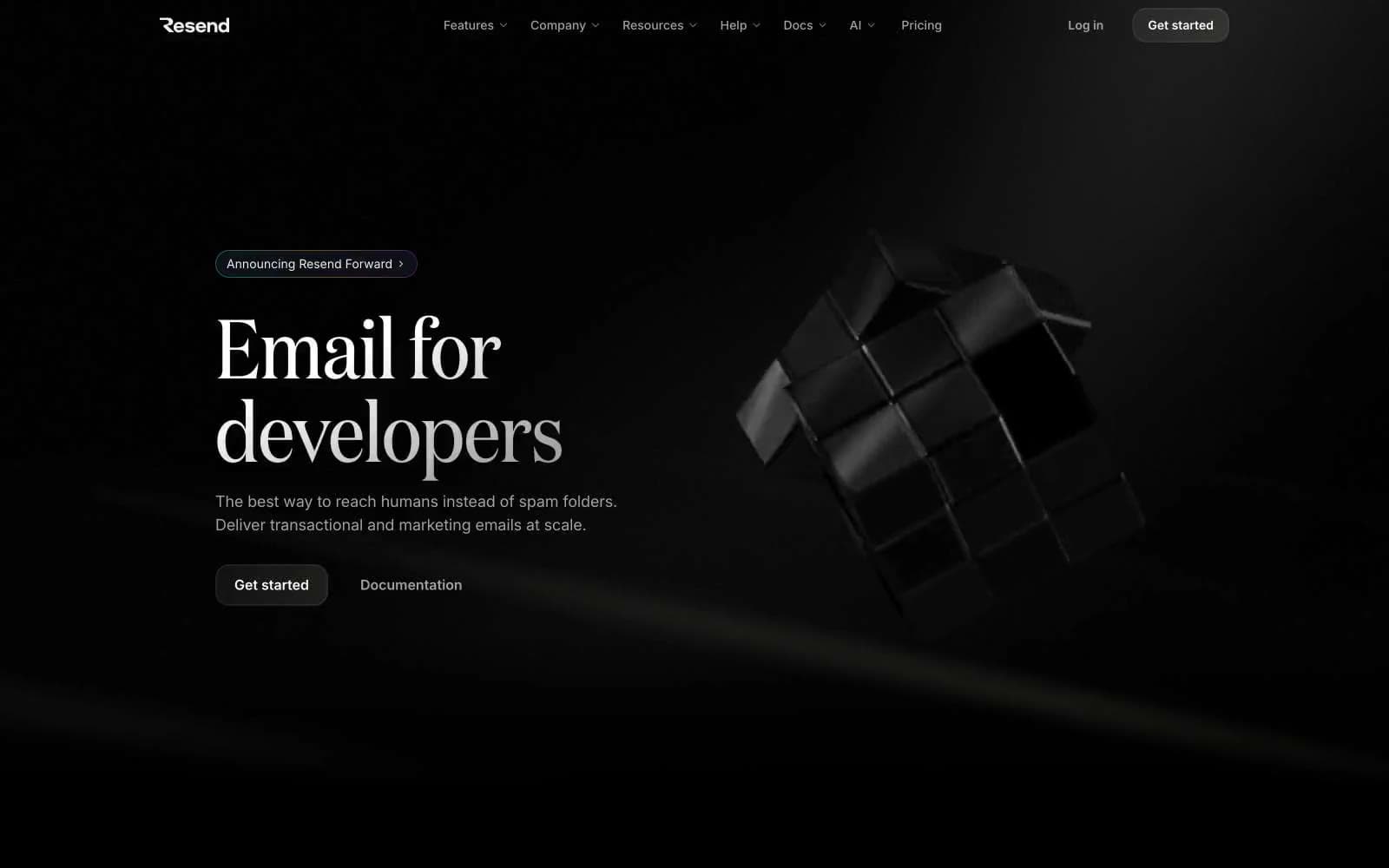
Resend lives in a near-total darkness — pure black canvas, hairline graphite borders, and white-on-black typography that feels like reading text printed on matte glass. The hero is anti-decorative: a single large serif headline at 96px Domaine next to a 3D black cube, with no gradient wash and no marketing illustration. The brand mark is a tight violet (#9281f7) that appears in email-address strings, status icons, and code samples — never on buttons. A monospaced font (Commit Mono) carries the developer identity through every code block, badge, and inline label, making the page read like a terminal wrapped in a luxury interface. Components are sharp-cornered or gently rounded (6px / 16px), low-elevation, and rely on 1px borders rather than shadows to separate layers. Motion is restrained but expressive: fade-and-slide hero text, subtle WebGL rotation on the hero cube, and short 150ms ease-out transitions on hover.
Resend design system

Brand2
Violet text accent for links, tags, and emphasized short phrases; Diagonal violet-to-magenta gradient on icon containers and brand badges
Violet text accent for links, tags, and emphasized short phrases
Accent7
Blue action color for filled buttons, selected navigation states, and focused conversion moments.
Blue text accent for links, tags, and emphasized short phrases
Green text accent for links, tags, and emphasized short phrases. Use as a supporting accent, not as a status color
Red text accent for links, tags, and emphasized short phrases. Use as a supporting accent, not as a status color
Red wash for highlight backgrounds, decorative bands, and soft emphasis behind content. Use as a supporting accent, not as a status color
Yellow text accent for links, tags, and emphasized short phrases. Use as a supporting accent, not as a status color
Yellow wash for highlight backgrounds, decorative bands, and soft emphasis behind content. Use as a supporting accent, not as a status color
Neutrals9
Page background, card surfaces, overlay scrims — the entire canvas
Subtle card-to-canvas surface lift — used in edge fades and elevated panels
1px borders on cards, inputs, buttons, code blocks, dividers — defines every layer separation
Inline code text, muted labels — text that should disappear into the surface
Subtle decorative strokes, disabled states, low-emphasis borders
Muted body text, badge labels, icon strokes — third-tier text and metadata
Link color, inactive button text, supporting captions — fourth-tier text
Body text, secondary headings, stroke outlines on icons — the primary reading color
Primary headings, hero text, button labels, icon fills on dark surfaces
Try a pairing
Pick any two colors from the palette to check whether text stays readable on top.
Aa
Void Black on Iris Violet Glow
10.06 : 1 contrast
- Body textPasses AA 4.5
- Large textPasses AA 3
- StrictPasses AAA 7
More DESIGN.md files. Same web, different personalities.

Railway
Developer tools
Nuxt
Developer tools
Astro
Developer tools
Authkit
Developer tools
Axiom
Developer tools
BaseHub
Developer tools
Better Stack
Developer tools
Bun
Developer tools
Checkly
Developer tools
ClickHouse
Developer tools
Depot
Developer tools
dope.security
Developer tools


