
Relief. Cream-paper harbor under flat sky-blue.
- Finance
- Light theme
- 14 colors
- 1 typeface
Relief uses a warm nautical-sky language: a cream canvas (#f9f7f0) replaces the default stark white, and a single vivid sky blue (#2e96ff) carries every interactive moment. Information architecture flips the usual light-card-on-white pattern — deep navy (#134f26f) feature and testimonial cards sit on cream like buoys on sand, creating bold visual blocks. The headline font Gilroy runs at tight -0.018em tracking across every size, giving text a compact, rounded confidence. Buttons earn their weight not from gradients or glow, but from a chunky 7px solid blue drop-shadow that makes the sky-blue fill appear to physically lift off the page.
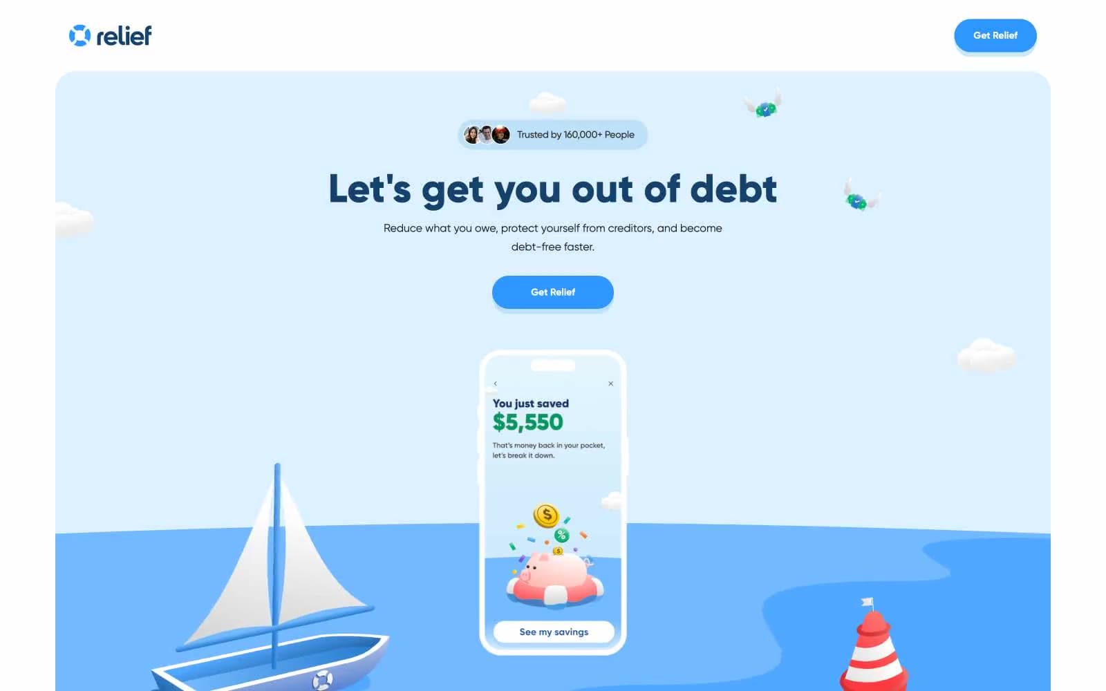
Relief design system

Brand3
Feature card fills, testimonial card fills, heading text — the dominant dark surface that anchors content blocks against the cream
Primary action buttons, active states, key emphasis text — the single chromatic accent that drives every interaction
Outlined link and action border — a darker navy for ghost-style interactive elements that need to read on cream
Accent4
Badge and trust-pill backgrounds, soft highlight washes behind icons and social proof
Button shadow tone — the same hue family used for the chunky pop shadow under sky-blue buttons
Blue decorative accent for icons, marks, and small graphic details
Decorative illustration fills, mid-tone in 3D hero artwork
Neutrals7
Heavier text instances, emphasis copy
Primary body and UI text — the dominant neutral for readable copy across cards, paragraphs, and labels
Stronger borders and link outlines where extra weight is needed
Muted secondary text, body copy in lighter contexts, de-emphasized metadata
Hairline borders and dividers between sections and cards
Page canvas — the entire site rests on this off-white, never pure #ffffff. Removes clinical SaaS sterility; reads as approachable, paper-like
Elevated card surfaces, input fields, and light-bordered elements
Try a pairing
Pick any two colors from the palette to check whether text stays readable on top.
Aa
Snow on Deep Harbor
10.31 : 1 contrast
- Body textPasses AA 4.5
- Large textPasses AA 3
- StrictPasses AAA 7
More DESIGN.md files. Same web, different personalities.

Mollie
Finance
a16z speedrun
Finance
Acctual
Finance
Airtree
Finance
Ambrook
Finance
Angellist 2024
Finance
Apron
Finance
Baselayer
Finance
Basis Theory
Finance
BlueYard Capital
Finance
Brex
Finance
Coda
Finance


