
Relate dot App. Diversity mosaic behind frosted notes.
- Brand
- Light theme
- 8 colors
- 6 typefaces
A domain-marketplace surface that turns a wall of human portraits into the brand canvas: a dense color-coded photo mosaic of diverse faces on saturated background blocks, with crisp white information cards floating on top like sticky notes. Typography is the loud element — oversized all-caps display lockup sits above utilitarian sans body text in a calm neutral scale. Chromatic accents are functional, not decorative: a single blue drives links and the Buy Now affordance, while a vivid green signals availability and supplementary actions. The overall impression is a premium product card that breathes through whitespace inside each panel rather than through gaps between them, letting the portrait grid supply all the energy the chrome refuses to.
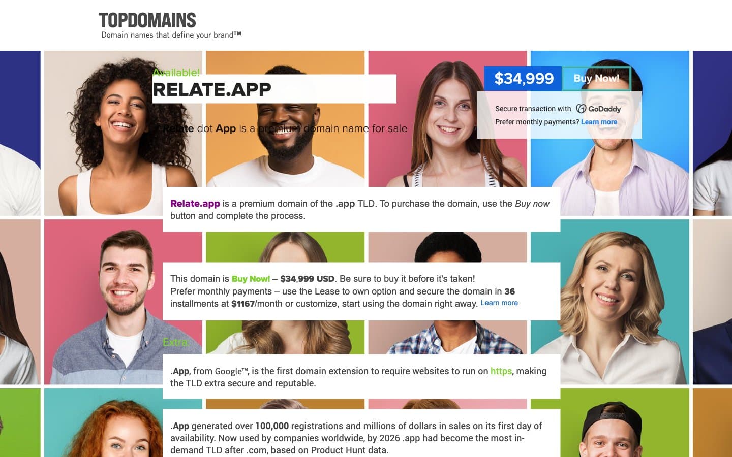
Relate dot App design system

Brand3
Green outline accent for tags, dividers, and focused UI edges
Blue accent for outlined action borders, linked labels, and lightweight interactive emphasis. Do not promote it to the primary CTA color
Hover/pressed state for Signal Blue links and outlined actions, visited-link fallback — one step darker so the interactive state has a clear visual step
Neutrals5
Heavy borders, heading underlines, icon fills, structural dividers
Headline text, dark section headers, strong emphasis
Body text, default copy, long-form paragraphs, footer text — the working text color for the entire interface
Hairline borders, input outlines, ghost button borders, neutral chip backgrounds
Page background, floating information cards, content panels, price badge surface
Try a pairing
Pick any two colors from the palette to check whether text stays readable on top.
Aa
Ink on Lime Pulse
11.29 : 1 contrast
- Body textPasses AA 4.5
- Large textPasses AA 3
- StrictPasses AAA 7
More DESIGN.md files. Same web, different personalities.

Airbnb
Brand
Aker
Brand
Alison Roman
Brand
Alpine Bio
Brand
Alveos One
Brand
Amrit Palace
Brand
André Cândido
Brand
Anna Jóna
Brand
Apollo
Brand
Apple
Brand
Arva
Brand
Ashton Bespoke
Brand


