
Redis Agency. A pitch-black gallery where serif type and a single red radish do all the brand work.
- Studio
- Dark theme
- 5 colors
- 3 typefaces
Redis Agency is a darkroom editorial system: a pitch-black canvas where massive Times New Roman display type and a single warm coral accent do all the talking. The visual language borrows from fashion magazine spreads and surrealist art direction — surreal food photography, organic green botanical forms, oversized serif headlines that feel cropped and overlapping rather than neatly typeset. Body and UI copy sit in a clean humanist sans (Suisse Intl) at modest sizes, which makes the display serif feel even more theatrical. The page stays nearly monochrome — black canvas, white type, a mid-gray for secondary text and hairline borders, and a coral red (#eb516d) that acts like a single brushstroke across an otherwise austere composition. Components are minimal: pill-shaped buttons, hairline borders, generous whitespace. Everything feels curated rather than generated — this is brand craft, not a SaaS dashboard.
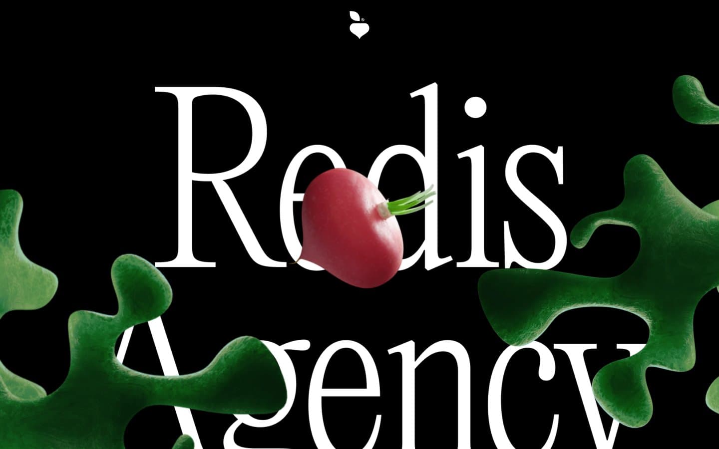
Redis Agency design system

Brand1
Single chromatic accent — barcode panel surface, red-punctuation moments; warm coral against the black field functions like a magazine pull-quote, used sparingly as the only saturated color in the UI
Neutrals4
Page canvas and true-black surface — the dominant ground that makes everything else float
Deep divider borders, near-invisible structural lines between dark surfaces
Secondary text, hairline borders, muted UI strokes — the mid-gray that softens without disappearing
Primary text, pill button outlines, card outlines on dark canvas — high-contrast foreground against the black field
Try a pairing
Pick any two colors from the palette to check whether text stays readable on top.
Aa
Obsidian on Radish Bloom
5.93 : 1 contrast
- Body textPasses AA 4.5
- Large textPasses AA 3
- StrictFails AAA 7
More DESIGN.md files. Same web, different personalities.

Basement Studio
Studio
Production Portugal
Studio
Active Theory
Studio
Adnaut
Studio
Agence K72
Studio
Akash Tyagi
Studio
Analogue
Studio
Athletics
Studio
BAM Photographers
Studio
Bareis + Nicolaus
Studio
Becklyn
Studio
Branding
Studio


