
Raus. Every page a postcard from the woods.
- Brand
- Light theme
- 7 colors
- 2 typefaces
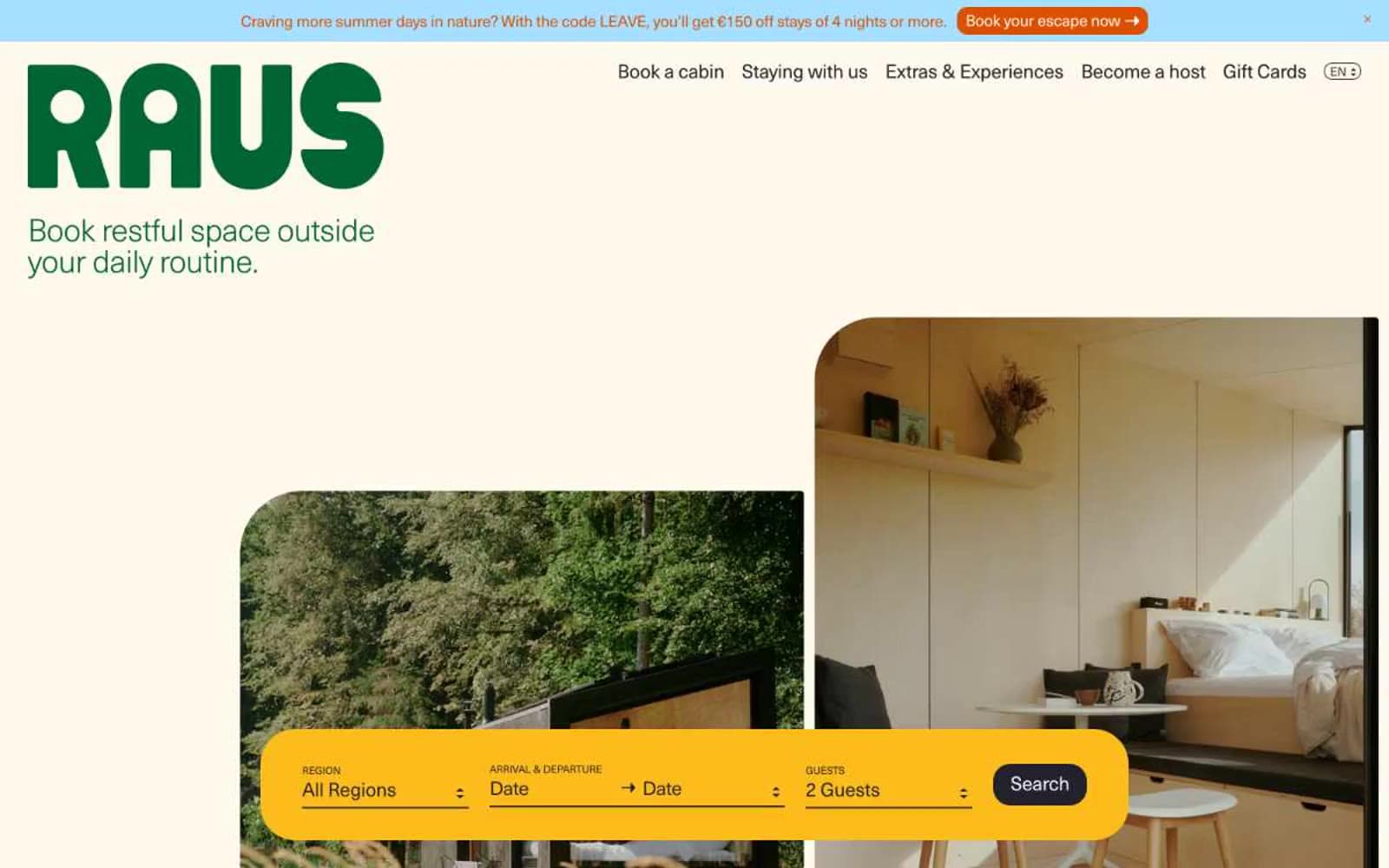
Raus is an editorial cabin-booking platform rendered as a warm, hand-printed travel journal: cream paper backgrounds, generous generous breathing room, and photography that sits beside text rather than beneath it. The brand uses a deep forest green as a calm, non-shouting identity color — present in the wordmark and key links but never screaming — while a bright marigold yellow search bar acts as the single visual exclamation point on each page, anchoring the booking flow. Typography does the heavy lifting: a single neo-grotesque face set at weight 300 with tight negative tracking creates an airy, almost whispered voice that contrasts with the confident, rounded geometry of the components. Surfaces are warm and matte, corners are generously rounded (20px is the default, 40px for hero cards), and shadows are absent — depth comes from layering cream on cream, not elevation.
Raus design system

Brand1
Brand wordmark, primary headings on hero, link text, and the only chromatic authority — deep forest green used sparingly to mark identity, never decoration
Accent3
Search bar surface, accent blocks, tag fills, the single bright punctuation on an otherwise muted page. Makes the booking flow unmistakable
Top announcement bar background and soft accent surfaces. Cool counterpoint to the warm canvas — signals timely, transient messaging
Gift voucher CTA on the announcement bar and warm interactive accent. Reads as firelight against the cream — chosen for urgency in promotional contexts, not for the primary booking flow
Neutrals3
Body text, headings, dark surfaces, icon strokes, hairline borders. Anchors the entire system — almost-black but slightly warm, never pure black
Primary page background and card canvas — warm cream that gives the entire site its printed, hand-made feel. Not white, not beige; paper
Search bar text, button labels on dark fills, image overlays, and any surface that needs to sit forward of the cream canvas
Try a pairing
Pick any two colors from the palette to check whether text stays readable on top.
Aa
Snow on Pine
7.31 : 1 contrast
- Body textPasses AA 4.5
- Large textPasses AA 3
- StrictPasses AAA 7
More DESIGN.md files. Same web, different personalities.

Airbnb
Brand
Aker
Brand
Alison Roman
Brand
Alpine Bio
Brand
Alveos One
Brand
Amrit Palace
Brand
André Cândido
Brand
Anna Jóna
Brand
Apollo
Brand
Apple
Brand
Arva
Brand
Ashton Bespoke
Brand


