
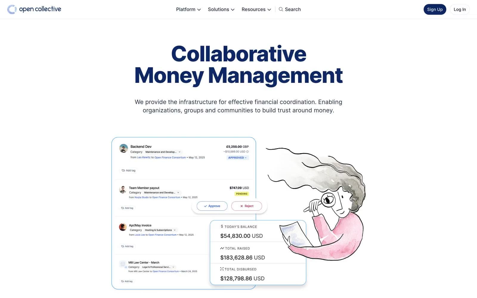
Raise. A near-white page with a single deep-navy headline and a hand-drawn illustration pulling warmth into a financial interface.
- Finance
- Light theme
- 9 colors
- 1 typeface
Open Collective's design language is a sunlit open ledger: a near-white canvas, hairline cool-gray dividers, and one deep navy that does all the chromatic work. Headlines carry the brand — oversized, weight 800, tightly tracked Inter at 60–72px — sitting directly on white with no panel behind them, so type itself becomes the hero. Body copy stays in a compact, near-black ink, never pure black, giving the financial content a softer documentary feel. Soft watercolor illustration breaks up the financial density with human warmth; UI chrome stays minimal, with 12px radii and a single subtle card shadow. Color is rationed like ink: the navy is the only saturated hue, used for headings, primary actions, and the brand mark — everything else is neutral.
Raise design system

Brand1
Primary headings, primary CTA button fill, brand mark, active navigation — the only saturated color on the page, used to anchor identity and signal action
Neutrals8
Primary body text, high-emphasis copy, button text on light backgrounds, icon strokes — the default text color across nearly all contexts
Secondary headings, icon strokes, body text where slightly lighter weight is needed
Tertiary headings and supporting labels, slightly softer than Inkwell for hierarchy breaks
Secondary body text, list items, captions that need to remain readable but recede
Muted helper text, secondary icons, tertiary link color — supporting information that should not compete with primary content
Subtle placeholder text, disabled chrome, decorative dividers
Hairline borders, card outlines, input borders, dividers, table separators — the structural neutral, used at extremely high frequency
Page canvas, card surfaces, button fills, input fields — the dominant surface color
Try a pairing
Pick any two colors from the palette to check whether text stays readable on top.
Aa
Paper White on Collective Navy
14.10 : 1 contrast
- Body textPasses AA 4.5
- Large textPasses AA 3
- StrictPasses AAA 7
More DESIGN.md files. Same web, different personalities.

Mollie
Finance
a16z speedrun
Finance
Acctual
Finance
Airtree
Finance
Ambrook
Finance
Angellist 2024
Finance
Apron
Finance
Baselayer
Finance
Basis Theory
Finance
BlueYard Capital
Finance
Brex
Finance
Coda
Finance


