
Public. A near-monochrome canvas, a serif at weight 300, one violet accent doing all the chromatic work.
- Finance
- Light theme
- 11 colors
- 3 typefaces
Public reads like a financial broadsheet rendered in UI: a near-monochrome canvas of cool grays and bone white, with one vivid violet used sparingly as a linking accent. The signature is Denton, a custom serif held at an almost whispered weight 300 for display headlines — a deliberate inversion of fintech convention that swaps the usual bold sans for something editorial and considered. Inter carries every functional surface, keeping the interface legible and quiet. Surfaces are flat and unembellished, depth is earned through the occasional 16px-radius card or a soft 10px shadow rather than gradients or heavy elevation. The only true color is #0027b3 violet, reserved for links and the rare inline accent tag; everything else is ink, paper, and shadow. Buttons are long pill shapes (100px radius) — the primary action is a matte black fill, secondaries are ghost outlines. Generous vertical breathing room between sections and a centered editorial layout reinforce the sense that this is a place for reading, not scanning.
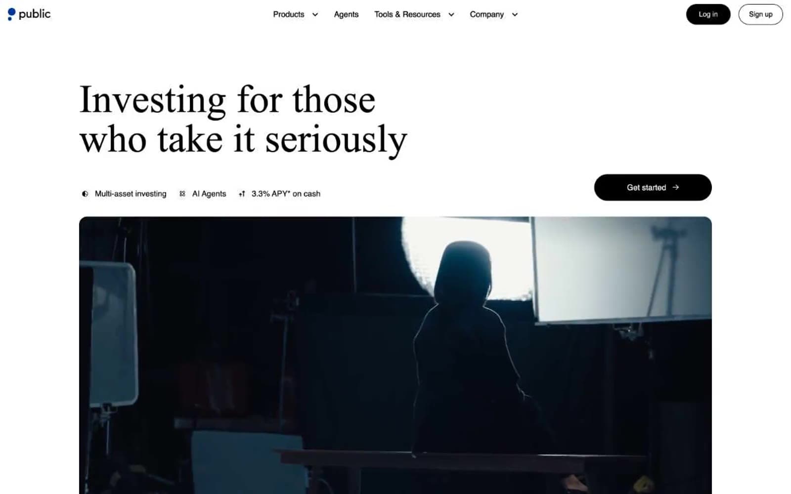
Public design system

Brand1
Inline text links, link borders, the sole chromatic accent — a deep electric violet that makes the rare colored element read as switched on
Accent1
Decorative illustration fills, subtle highlight washes, icon tints
Neutrals9
Primary button fill, hardest borders, maximum-weight text
Primary text, nav ink, strong borders — the deepest reading tone
Dark surfaces, nav bar fills, inverted card backgrounds
Body text on canvas, secondary borders, the workhorse neutral
Muted helper text, inactive tags, disabled labels
Secondary borders, input outlines, table dividers
Hairline borders, subtle dividers, card outlines on canvas
Page background — the dominant surface behind every section
Card surfaces, elevated panels, inverted button fills
Try a pairing
Pick any two colors from the palette to check whether text stays readable on top.
Aa
Paper White on Violet Ink
10.82 : 1 contrast
- Body textPasses AA 4.5
- Large textPasses AA 3
- StrictPasses AAA 7
More DESIGN.md files. Same web, different personalities.

Mollie
Finance
a16z speedrun
Finance
Acctual
Finance
Airtree
Finance
Ambrook
Finance
Angellist 2024
Finance
Apron
Finance
Baselayer
Finance
Basis Theory
Finance
BlueYard Capital
Finance
Brex
Finance
Coda
Finance


