
Break Maiden. Oversized white type carved into a black gallery wall.
- Studio
- Dark theme
- 3 colors
- 3 typefaces
Break Maiden operates as a black-canvas portfolio for a creative studio: pure black surfaces, oversized white display type, and product imagery presented like a curated print spread. The visual system is deliberately monochrome and typographically aggressive — a single custom display face (Martin) at near-billboard scale does all the emotional work, while a restrained neo-grotesque (America) carries navigation, body, and captions. The page is a gallery: project tiles sit on an irregular three-column grid with generous gutters, letting the product photography carry the color that the interface refuses to. There are no buttons, gradients, shadows, or decoration in the chrome itself — the system derives its identity from the contrast between negative space and a colossal heading, not from palette depth.
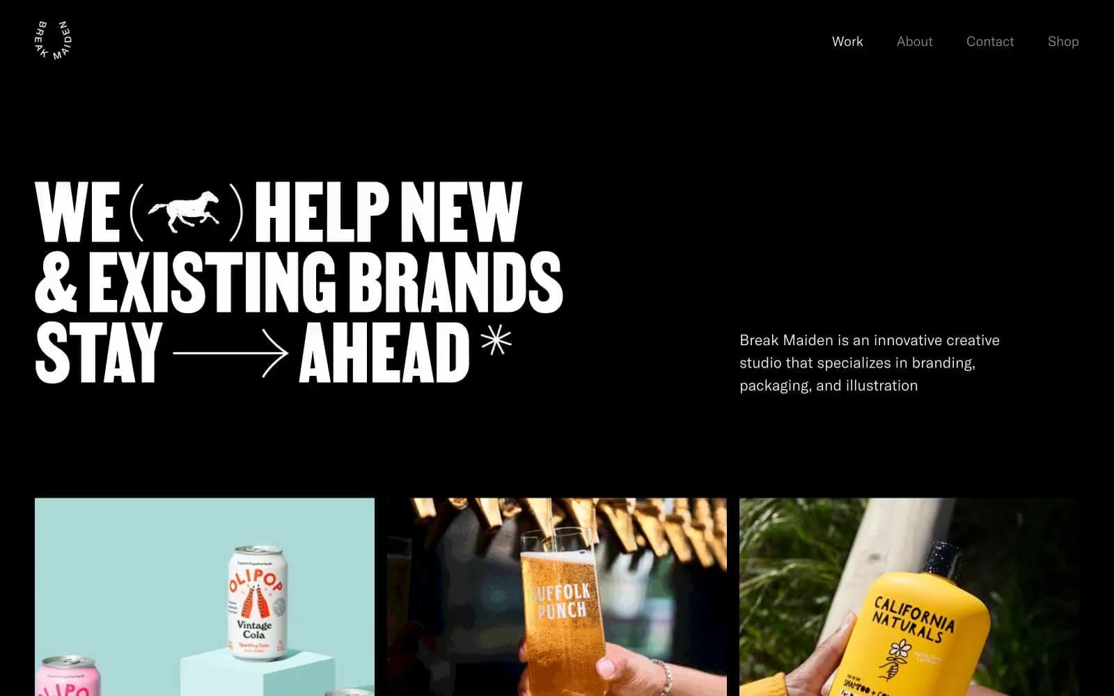
Break Maiden design system

Neutrals3
Page canvas, hero background, card surface base — the only color that ever fills a region. Every section, card, and divider sits on this absolute black
Muted metadata and secondary nav strokes — the only mid-tone in the system, reserved for information that must recede behind the headline
Primary display type, nav text, card titles, body copy, hairline borders on the few framed elements — used wherever a shape or letter needs to be seen against black
Try a pairing
Pick any two colors from the palette to check whether text stays readable on top.
Aa
Bone White on Onyx Black
21.00 : 1 contrast
- Body textPasses AA 4.5
- Large textPasses AA 3
- StrictPasses AAA 7
More DESIGN.md files. Same web, different personalities.

Basement Studio
Studio
Production Portugal
Studio
Active Theory
Studio
Adnaut
Studio
Agence K72
Studio
Akash Tyagi
Studio
Analogue
Studio
Athletics
Studio
BAM Photographers
Studio
Bareis + Nicolaus
Studio
Becklyn
Studio
Branding
Studio


