
Privy. Ink-on-marble editorial spread.
- Crypto
- Light theme
- 8 colors
- 3 typefaces
Privy operates as an editorial crypto-fintech system: a near-monochrome canvas interrupted by a single vivid violet announcement band and one heavy near-black button. Typography carries the brand more than color — a custom display face (ABC Favorit) sets headlines in weight 400 at remarkably tight tracking (-0.03em) and very tight line-heights (1.03–1.15), giving even the 56px+ words a compressed, journalistic presence rather than a tech-SaaS feel. Surfaces stay flat and high-contrast: white canvas, near-black ink (#010110) for body and primary actions, with dark mode introduced selectively as full-bleed bands rather than a themable surface. Components are minimal — pill buttons (100px radius), 8px-radius cards, 1px hairline borders — letting the custom serif and the violet accent do the heavy lifting.
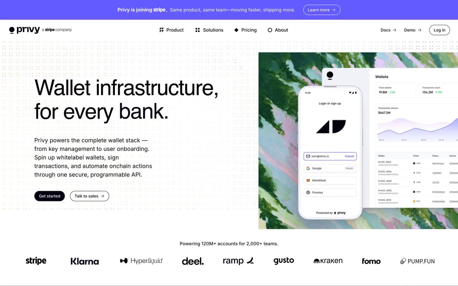
Privy design system

Brand1
Announcement bar fill, link hover states, the single chromatic accent — violet against monochrome creates a strobe effect that draws the eye to time-sensitive copy
Accent1
Decorative illustration fills, abstract graphic washes inside hero imagery — carries no UI function, lives only in artwork
Neutrals6
Primary text, nav borders, icon strokes, filled primary buttons, input borders — the structural near-black that reads as pure black at body sizes
Dark-mode card surfaces, elevated dark panels, secondary dark backgrounds
Highest elevation in dark mode — feature card backgrounds, overlaid panels
Muted helper text, secondary body copy, subtle borders — the only neutral that drops to medium contrast intentionally
Decorative dot pattern, hairline dividers, inactive surface washes
Page background, card surfaces, input fields — the dominant neutral that everything else sits on
Try a pairing
Pick any two colors from the palette to check whether text stays readable on top.
Aa
Canvas on Iris Pulse
4.70 : 1 contrast
- Body textPasses AA 4.5
- Large textPasses AA 3
- StrictFails AAA 7
More DESIGN.md files. Same web, different personalities.
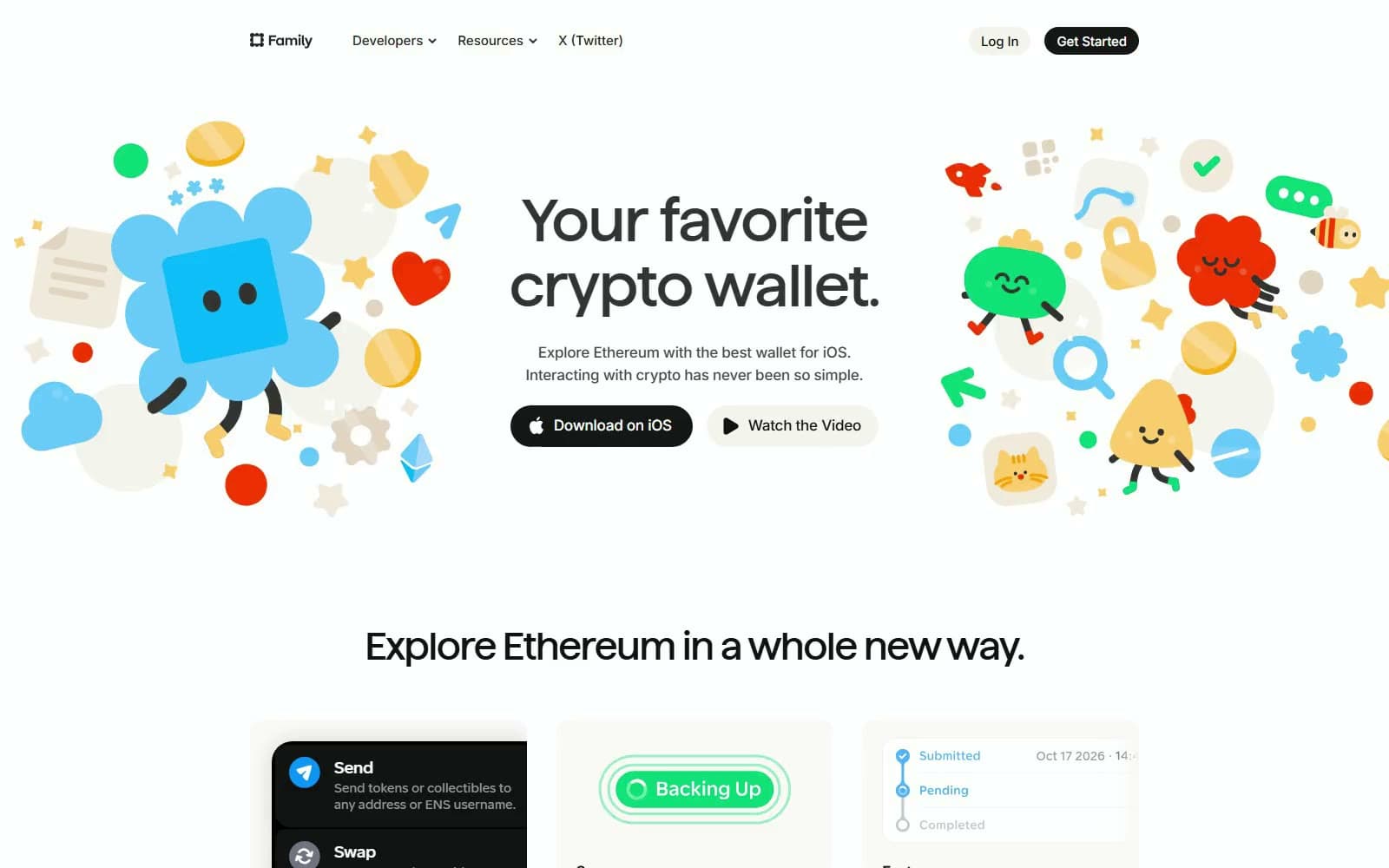
Family
Crypto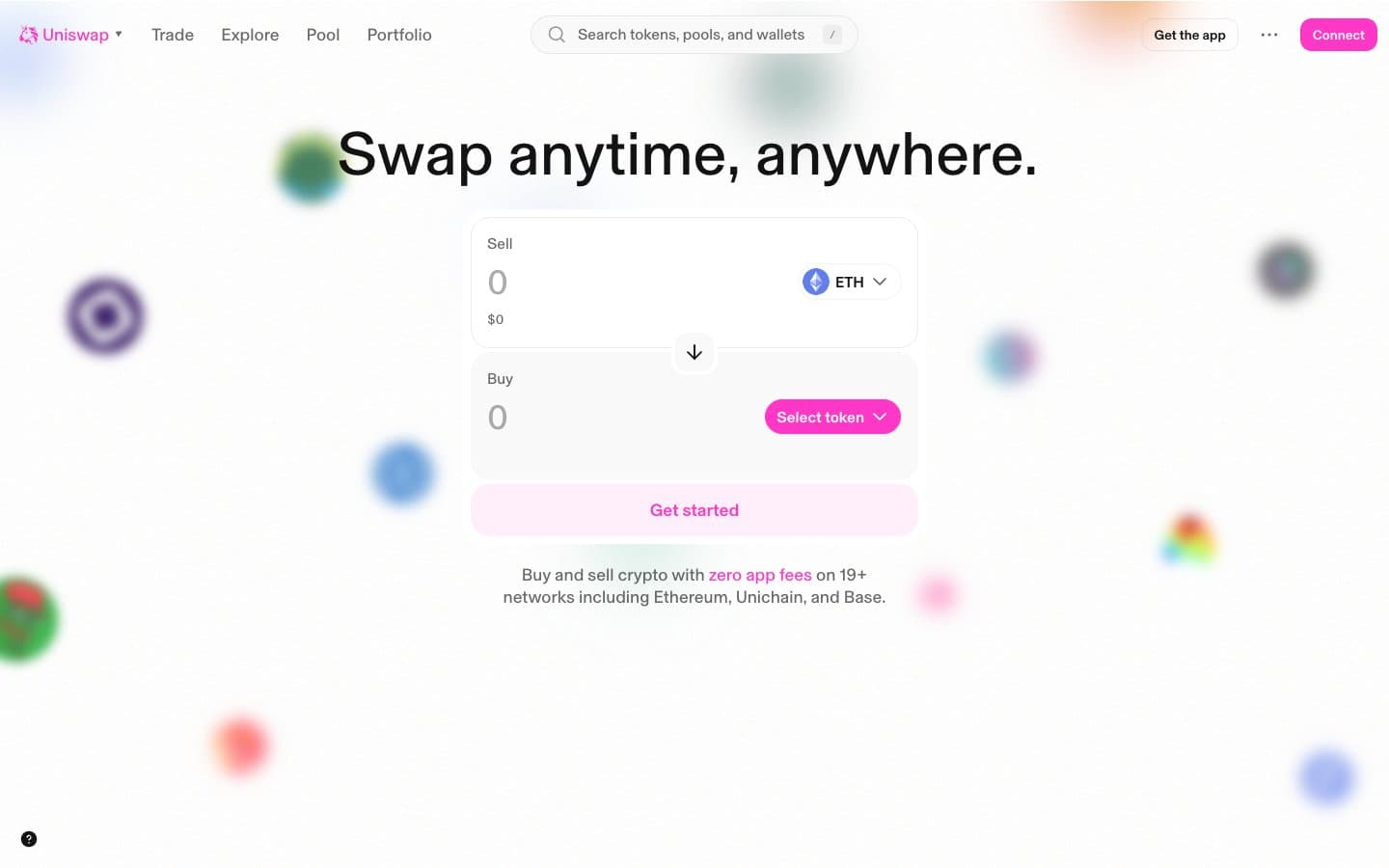
Uniswap
Crypto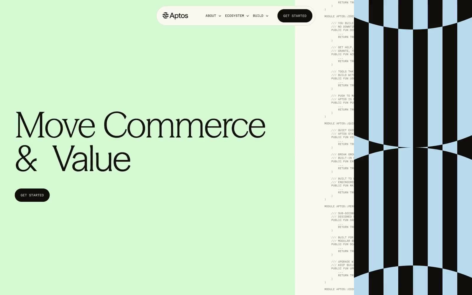
Aptos Network
Crypto
Base
Crypto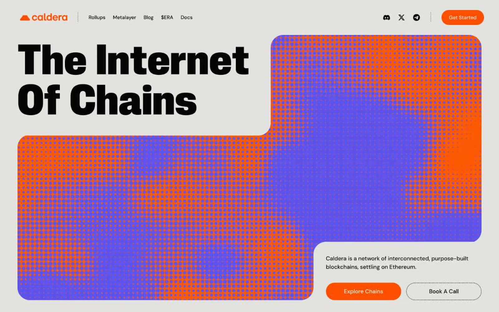
Caldera
Crypto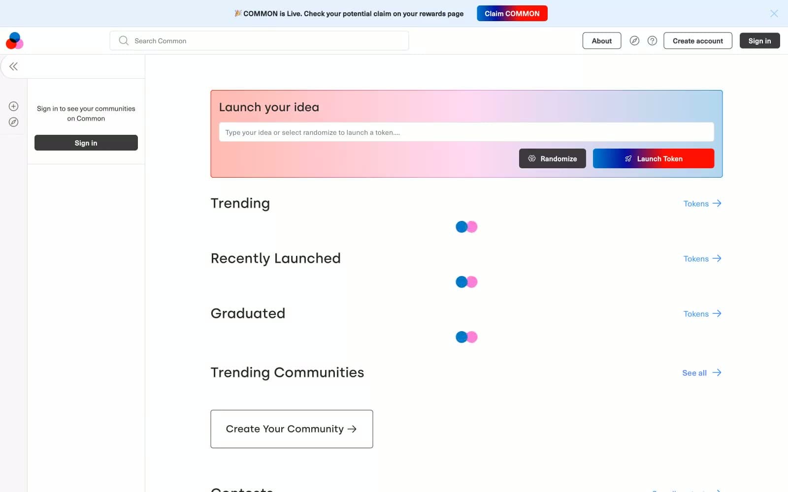
Common
Crypto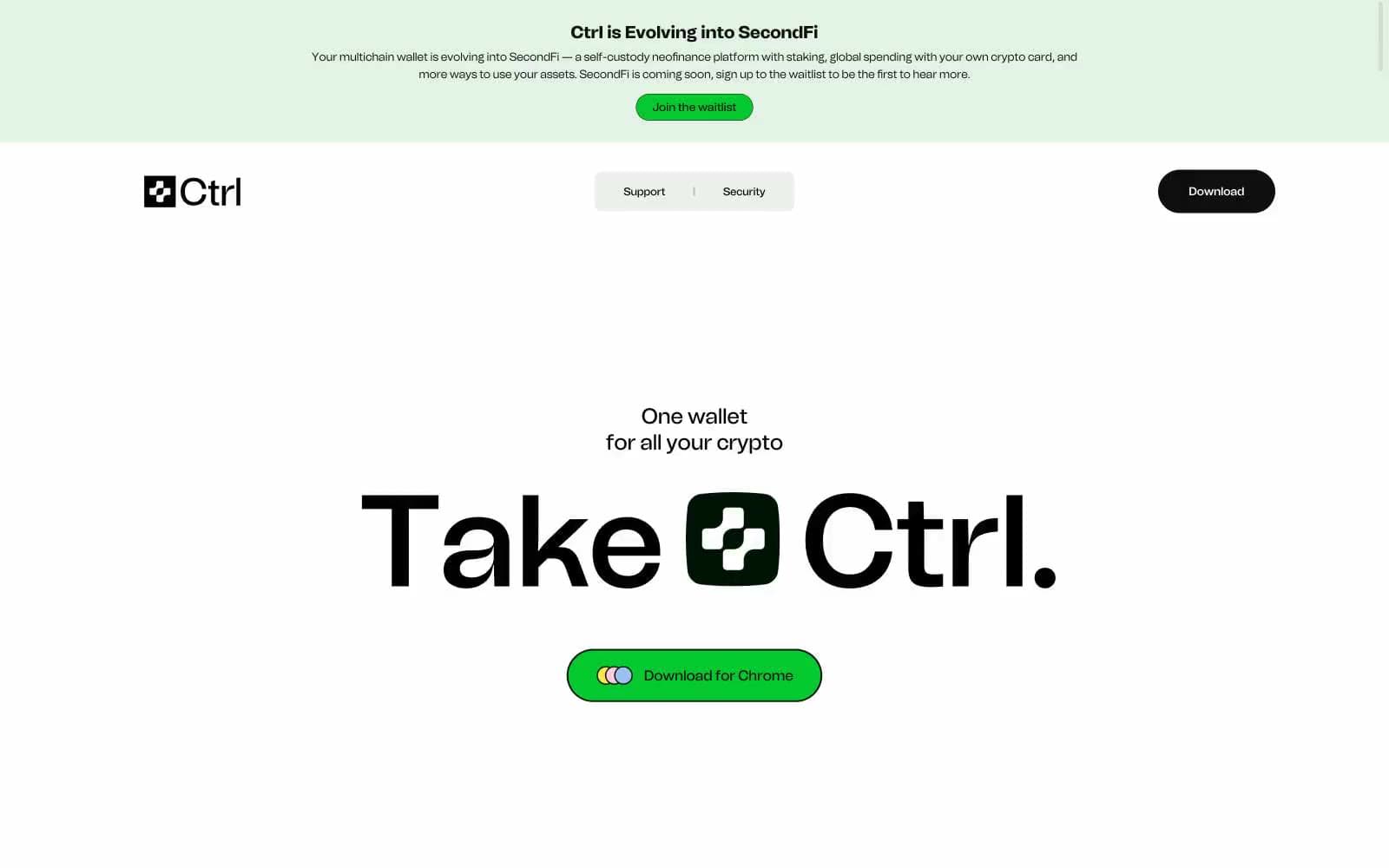
Ctrl Wallet
Crypto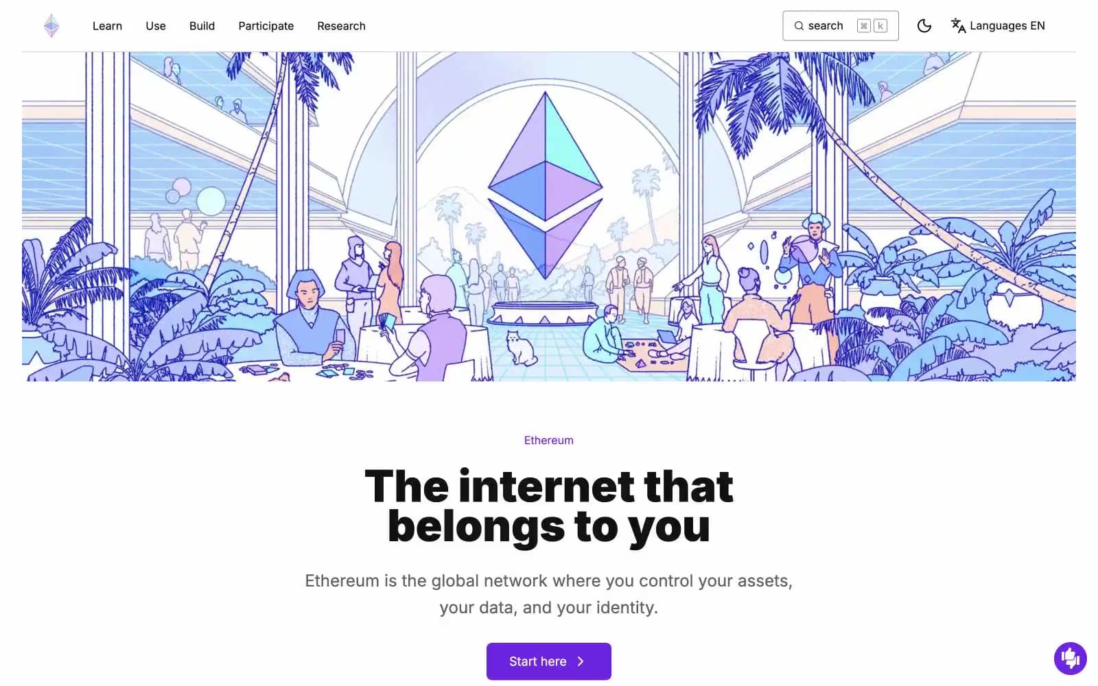
ethereum.org
Crypto
Gamma
Crypto
Glow
Crypto
Kraken
Crypto
Lens
Crypto


