
Portrait. Polaroid memory wall on cream paper.
- Brand
- Light theme
- 21 colors
- 2 typefaces
Portrait is a sunlit, deeply personal canvas for identity: a near-white page where a single deep-navy ink carries almost all text and structural lines, and color appears only as warm pastel surface washes or a signature rainbow that bleeds through italicized words, button borders, and small decorative strokes. The type system is two-voice — Switzer for steady UI, Basier Circle for giant display headlines that compress tight against each other — and the geometry favors generous rounding (24px cards, 28px pill buttons) with barely-there shadows that let content float rather than stamp itself. Everything reads like a scrapbook: scattered tilted photo cards, mint and peach and sky-blue tints, a thin rainbow border around the Sign up button, and a sticky pill nav that hovers above the page with a whisper of elevation. The overall density is comfortable, the rhythm is calm, and the brand voice is warm but restrained — let the user be loud, keep the frame quiet.
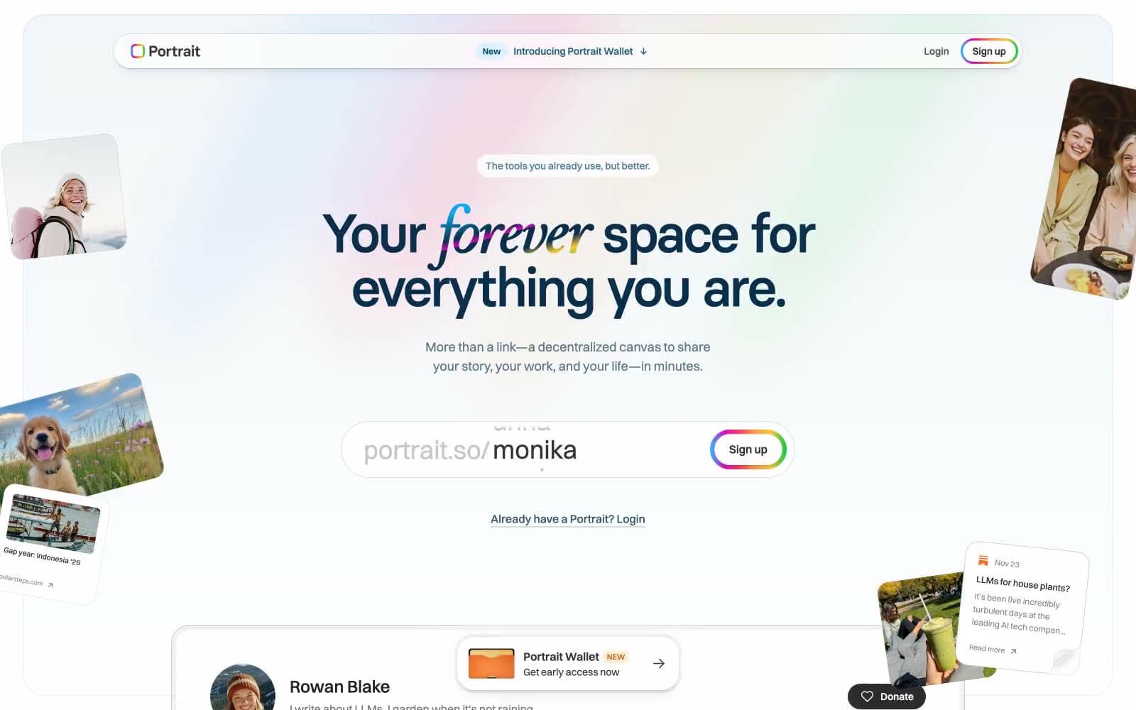
Portrait design system

Brand2
Primary text, heading strokes, outlined action borders — the single deep navy that holds the entire type and structural line system
Secondary brand ink for nav strokes, icons, and accent text where Ink feels too heavy
Accent11
Supporting palette color for small decorative accents when the core palette needs contrast. Do not promote it to the primary CTA color
Decorative spectrum color — appears only as part of the rainbow gradient, never as a standalone fill
Decorative spectrum color — appears only as part of the rainbow gradient composition
Decorative spectrum color — appears only as part of the rainbow gradient composition
Decorative spectrum color — appears only as part of the rainbow gradient composition
Decorative spectrum color — appears only as part of the rainbow gradient composition
Decorative spectrum color — appears only as part of the rainbow gradient composition
Decorative spectrum color — appears only as part of the rainbow gradient composition
Soft pastel surface tint used on badge chips and small highlighted areas
Soft section background, alternate surface, and quiet card fill
Soft pastel surface tint used on warm-accent chips and highlighted areas
Neutrals8
Body text and icon strokes where Portrait Ink feels too cool — slightly warmer reading tone
Universal stroke and heavy text color — every hairline border, icon outline, and default UI line lives here
Quiet icon strokes and low-emphasis nav accents
Muted helper text, secondary nav text, and decorative borders that should recede behind primary ink
Disabled state borders and placeholder strokes
Light dividers and structural hairlines on neutral surfaces
Card surface tint and the lightest possible structural divider
Page background and the universal surface above which all color floats
Try a pairing
Pick any two colors from the palette to check whether text stays readable on top.
Aa
White Canvas on Portrait Ink
13.66 : 1 contrast
- Body textPasses AA 4.5
- Large textPasses AA 3
- StrictPasses AAA 7
More DESIGN.md files. Same web, different personalities.

Airbnb
Brand
Aker
Brand
Alison Roman
Brand
Alpine Bio
Brand
Alveos One
Brand
Amrit Palace
Brand
André Cândido
Brand
Anna Jóna
Brand
Apollo
Brand
Apple
Brand
Arva
Brand
Ashton Bespoke
Brand


