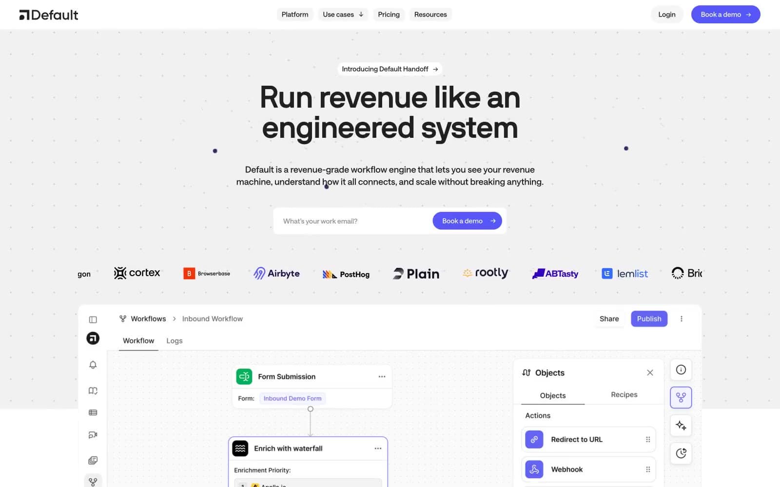
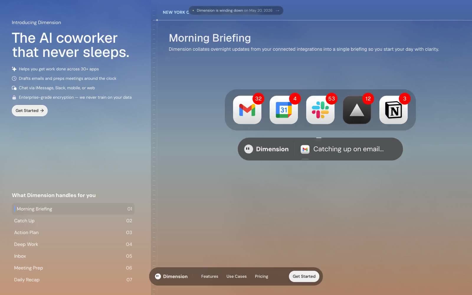
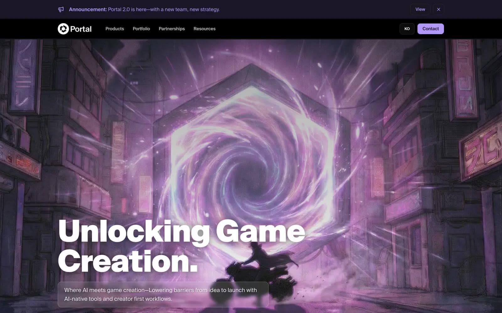
Portal. A heavy, weight-900 headline, #b296f8 glow, and a 10px corner in the dark.
- AI
- Dark theme
- 18 colors
- 1 typeface
Portal is a dark-mode gaming/AI brand system built around a single vivid violet accent that reads as a dimensional energy source cutting through obsidian surfaces. The visual logic is theatrical: nearly-black canvas (#000000), near-black surface layers (#0f0f13, #1d1d1d), hairline charcoal borders (#292929), and one vivid lavender (#b296f8) that appears as a portal-glow on icons, strokes, button fills, and shadow tints. Typography is heavily weighted (Suisse Intl 900) for display headlines — the voice is monumental, not quiet — paired with compact body text in the 400/500 range. Components share a single 10px radius and gain dimensionality from violet-tinted shadows (rgba(178,150,248,0.20) 0px 25px 50px -12px) rather than neutral elevation, making even flat cards feel like they emit light. Badge variants encode status through saturated border + desaturated fill pairs (green, blue, violet, pink), giving multi-category taxonomy without diluting the brand violet.
Portal design system

Brand2
Primary action buttons, icon strokes, accent text, shadow tint — the singular brand signal; lavender that reads as dimensional energy
Muted violet border for accent rules and decorative dividers
Accent6
Violet badge border for category tags in the violet family
Violet badge text fill — desaturated lavender for readable on-dark violet tag content
Pink/magenta badge border for editorial or community-event categories
Green outline accent for tags, dividers, and focused UI edges. Use as a supporting accent, not as a status color
Blue outline accent for tags, dividers, and focused UI edges. Use as a supporting accent, not as a status color
Blue outline accent for tags, dividers, and focused UI edges. Use as a supporting accent, not as a status color
Neutrals8
Page canvas, hero backgrounds, deepest surface — the obsidian backdrop against which the brand violet glows
Elevated card surfaces, button fills for neutral/ghost controls, hero overlays
Card-specific border tone, one step lighter than Carbon to create layered card edges
Hairline borders across cards, nav, body, links, and lists — the structural grid in a single near-black tone
Subtle violet-tinted dark border for sections and footer dividers — the only near-gray with hue
Muted helper text, secondary list items, dimmed icon strokes — quiet copy in the body
Primary body and UI text, nav links, card text, icon strokes — soft white for long-form reading on black
Display headings, brand mark, button labels on dark — pure white reserved for the loudest type moments
semantic2
Success badge text — soft mint for green category labels on dark
Info badge text — desaturated sky for blue category labels on dark
Try a pairing
Pick any two colors from the palette to check whether text stays readable on top.
Aa
Void Black on Portal Violet
8.61 : 1 contrast
- Body textPasses AA 4.5
- Large textPasses AA 3
- StrictPasses AAA 7