
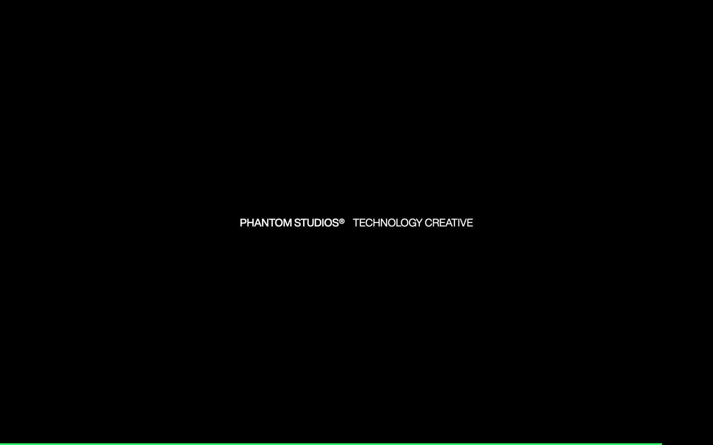
Phantom Studios. Green signal line on a black void.
- Studio
- Dark theme
- 5 colors
- 2 typefaces
Phantom Studios operates as a near-totalist dark canvas: a single black field with one centered white text mark and a thin green horizon line anchoring the bottom of the viewport. The aesthetic is terminal-meets-poster — almost no chrome, no images, no navigation visible in the fold, just type on void with one signal color doing all the work. Typography is split between a geometric workhorse (Helvetica Now) for UI and display, and a tiny monospace face (ballinger-mono) for metadata, taglines, and trademark marks — the pairing reads as coded rather than designed. Everything is uppercase, everything is small, and the green line acts as a system indicator or cursor rather than decoration. The page makes you look harder than usual because there is almost nothing to look at; restraint is the product.
Phantom Studios design system

Accent1
Green wash for highlight backgrounds, decorative bands, and soft emphasis behind content
Neutrals4
Page canvas, primary surface — the only background; every other color reads as light emitted from this base
Hairline borders, secondary dividers, and structural rules — sits just above the void to define edges without lifting weight
Muted helper text and inactive label borders — 3.7:1 against black intentionally fails contrast, signaling de-emphasis rather than legibility
All text, dividers, list markers, and outline borders — 21:1 contrast against Void means type is the loudest element on the page by far
Try a pairing
Pick any two colors from the palette to check whether text stays readable on top.
Aa
Void on Signal Green
15.55 : 1 contrast
- Body textPasses AA 4.5
- Large textPasses AA 3
- StrictPasses AAA 7
More DESIGN.md files. Same web, different personalities.

Basement Studio
Studio
Production Portugal
Studio
Active Theory
Studio
Adnaut
Studio
Agence K72
Studio
Akash Tyagi
Studio
Analogue
Studio
Athletics
Studio
BAM Photographers
Studio
Bareis + Nicolaus
Studio
Becklyn
Studio
Branding
Studio


