
Paragraph. A literary journal where the only color is ink-blue and every border is a page edge.
- Crypto
- Light theme
- 8 colors
- 2 typefaces
Paragraph reads like a literary journal that learned to type: a vast white parchment where serif headlines do the heavy lifting and a single periwinkle blue is the only chromatic voice. The warm taupe borders (#dbd5d2) replace cold grays everywhere, making every container feel like a page edge rather than a UI panel. Typography carries meaning — IvyOra serif at 64px with -0.03em tracking whispers editorial authority while Google Sans Flex at 14-16px keeps utility invisible. Layout breathes: centered compositions, generous vertical gaps, and pill-shaped controls at 24-28px radius that feel handwritten rather than engineered. Color is rationed — one blue for action, warm neutrals for everything else, no gradients, no decorative chrome.
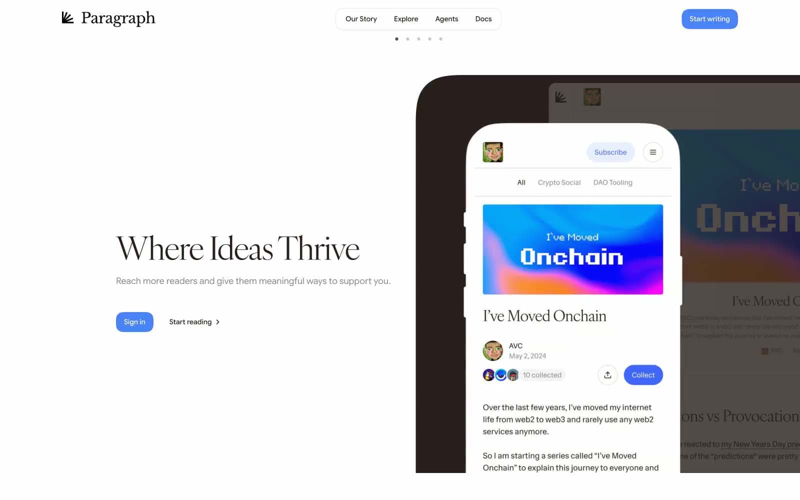
Paragraph design system

Brand1
Violet wash for highlight backgrounds, decorative bands, and soft emphasis behind content. Do not promote it to the primary CTA color
Accent2
Violet supporting accent for decorative details and low-frequency emphasis. Do not promote it to the primary CTA color
Inset border and subtle blue-tinted edge on elevated or focused elements
Neutrals5
All text, icons, and heading strokes — warm near-black with brown undertone, never pure #000
Muted helper text, secondary metadata, and inactive nav items
Primary border color for all containers, cards, nav, body, and links — warm taupe that reads as paper edge, not digital gray
Secondary surface for badges, subtle panel backgrounds, and inactive card states
Primary page canvas and white card surfaces. Do not promote it to the primary CTA color
Try a pairing
Pick any two colors from the palette to check whether text stays readable on top.
Aa
Ink Black on Periwinkle Action
4.51 : 1 contrast
- Body textPasses AA 4.5
- Large textPasses AA 3
- StrictFails AAA 7
More DESIGN.md files. Same web, different personalities.
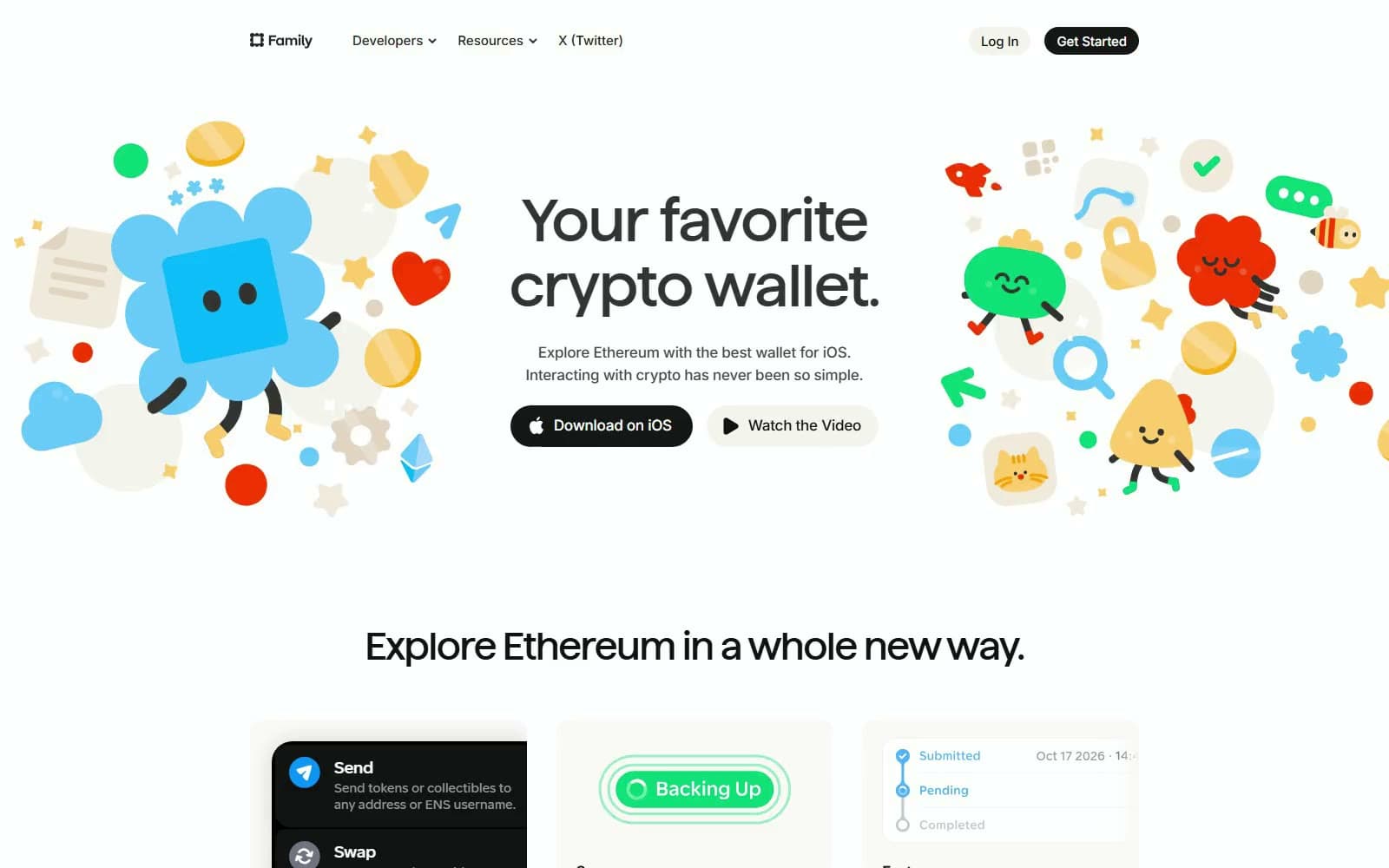
Family
Crypto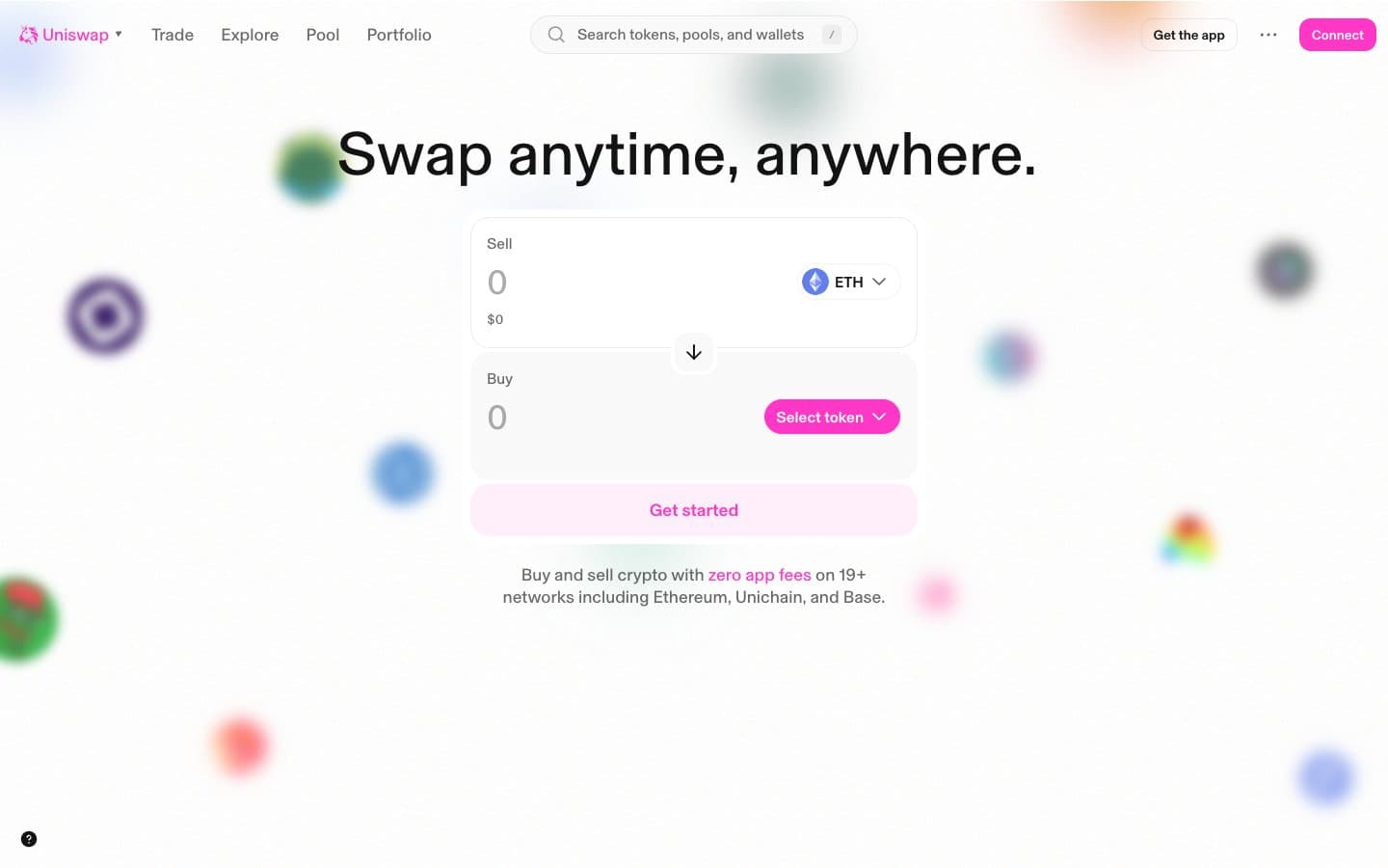
Uniswap
Crypto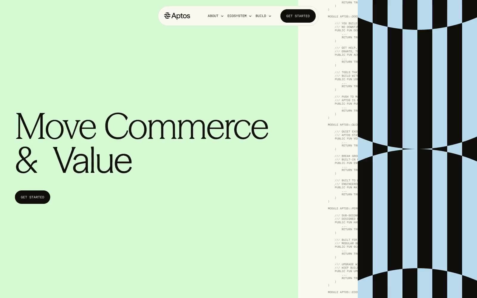
Aptos Network
Crypto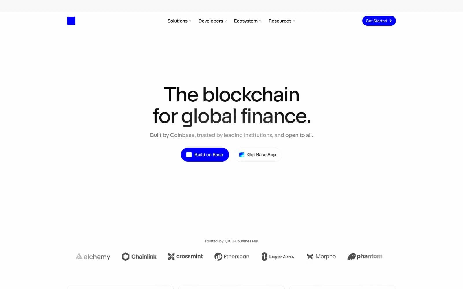
Base
Crypto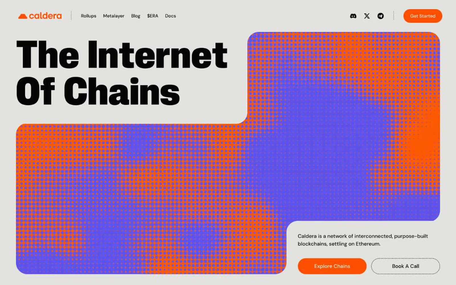
Caldera
Crypto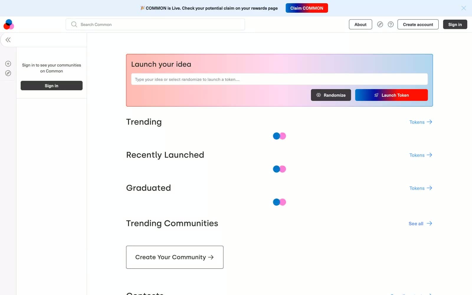
Common
Crypto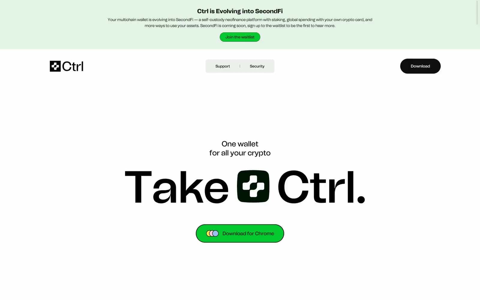
Ctrl Wallet
Crypto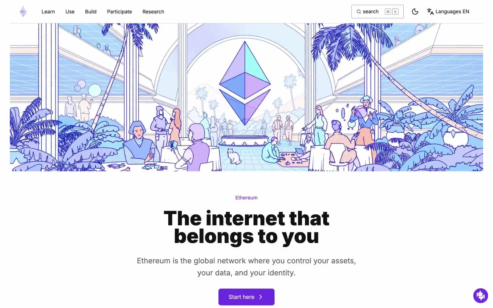
ethereum.org
Crypto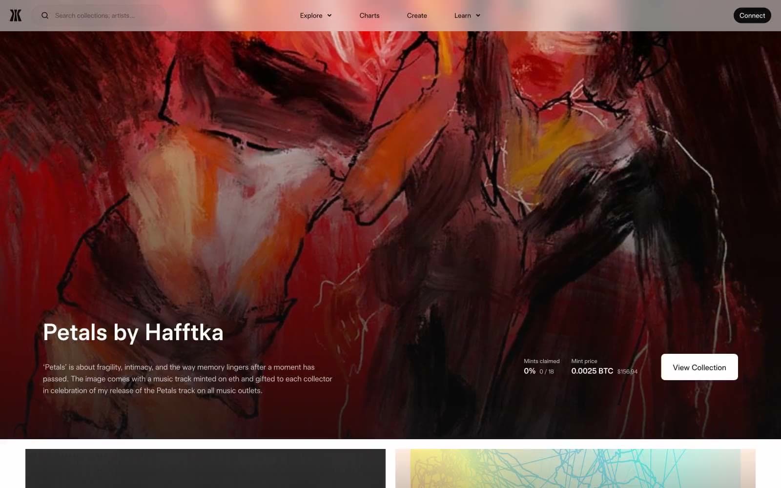
Gamma
Crypto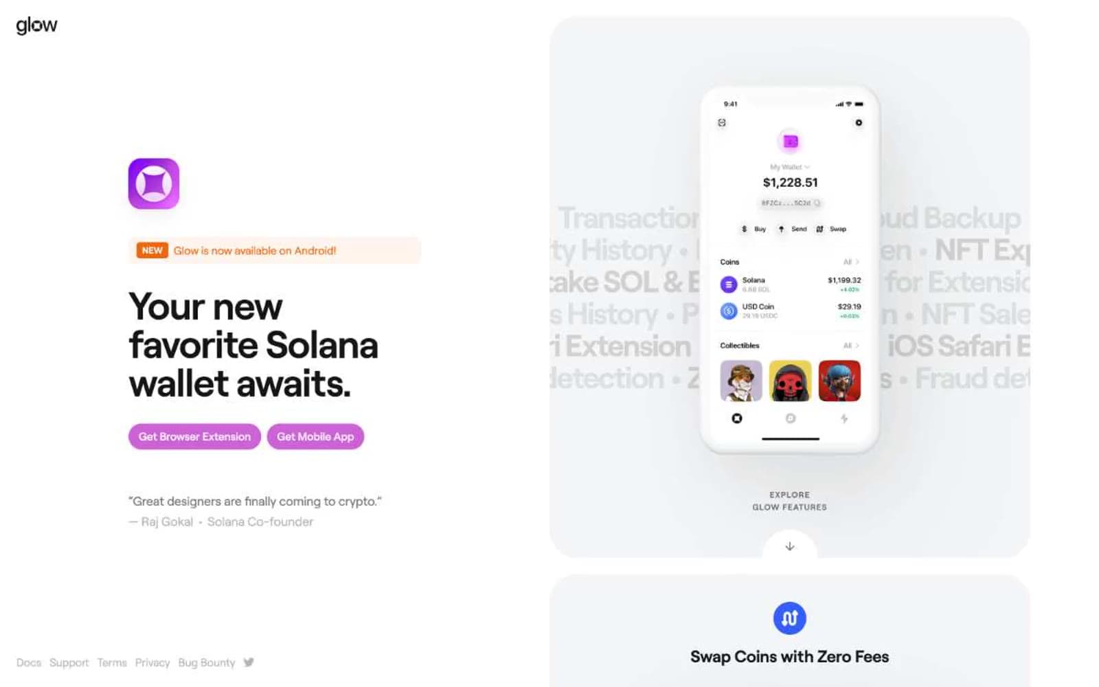
Glow
Crypto
Kraken
Crypto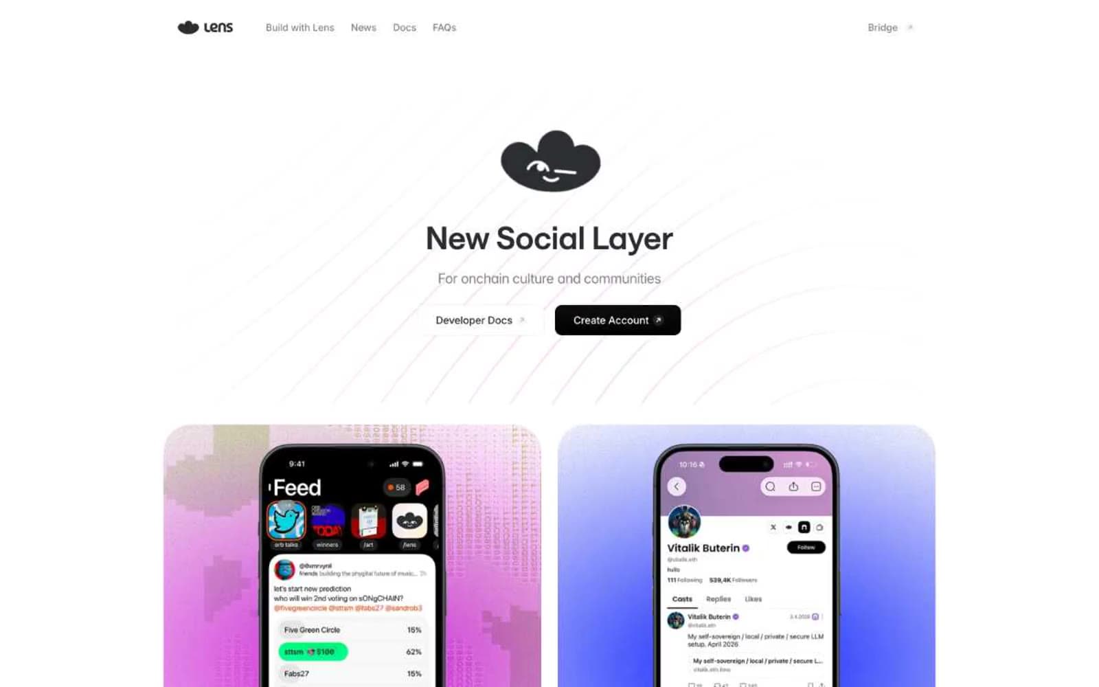
Lens
Crypto


