
Panxo. Every surface echoes ledger paper, every accent reads like a highlighted cell.
- Brand
- Light theme
- 15 colors
- 2 typefaces
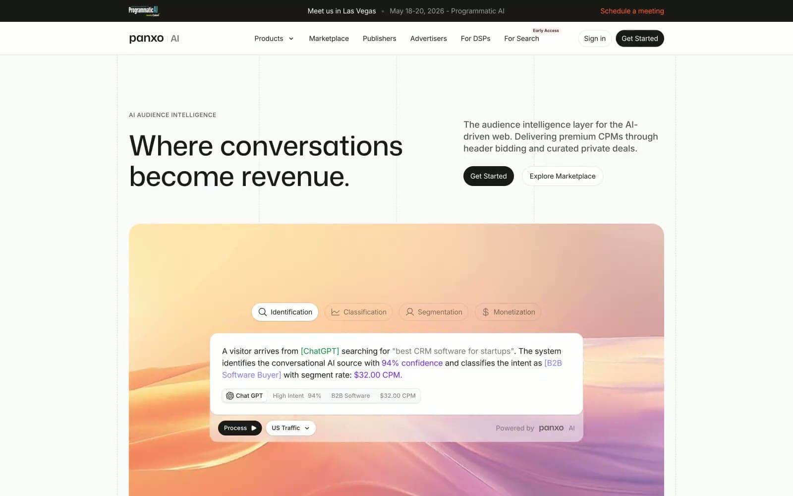
Panxo reads like a financial data terminal wearing a startup's wardrobe — numbers and metrics front and center, but the palette stays warm cream and near-black rather than cold blue. The base surface is #fafafa pushing toward #f7f3eb (a barely-warm off-white), while the primary text mass is the rich near-black #1c1a17 — warmer than pure black, almost coffee. The hero visualization uses a candy-colored gradient (teal → violet → amber) as its only splash of chromatic energy against otherwise achromatic structure. Mona Sans at weight 700 and aggressive negative tracking (-0.04em at 56px) makes headlines feel compressed and purposeful — data labels rather than declarations. Interactive elements use a single deep orange (#ff6020) for CTAs, distinct from the violet data-highlight colors (#777eff, #731fff) used for semantic classification signals inside UI demos.
Panxo design system

Brand1
Primary CTA buttons, announcement bar link, high-emphasis interactive triggers — warm orange against near-black creates urgency without aggression
Accent4
Data classification labels, AI confidence highlights, link color inside product demos — signals machine intelligence rather than human action
Secondary violet accent, gradient midpoint stop, deeper classification markers
Hero demo background gradient — teal-to-violet-to-amber sweep used as atmospheric backdrop for the product visualization
Hero section vertical gradient background (top stop, blue-white)
Neutrals8
Primary text, filled CTA button background, dark card surface — warmer than pure black, prevents the page from reading as cold despite high contrast
Tertiary text, icon strokes, nav link default state
Secondary body text, metadata labels, muted headings
Placeholder text, disabled states
Hairline borders, subtle dividers
Borders, divider lines, ghost button borders
Hero section background wash — the warmest surface tone, used for large atmospheric areas
Page background, card surfaces, badge fills — the dominant surface; slightly warmer than #ffffff, giving the page a matte paper quality
semantic2
AI Traffic 'High' indicator badges, positive signal states
Semantic success backgrounds, gradient anchor (green end of the spectrum gradient)
Try a pairing
Pick any two colors from the palette to check whether text stays readable on top.
Aa
Coal Ink on Smolder
5.74 : 1 contrast
- Body textPasses AA 4.5
- Large textPasses AA 3
- StrictFails AAA 7
More DESIGN.md files. Same web, different personalities.

Airbnb
Brand
Aker
Brand
Alison Roman
Brand
Alpine Bio
Brand
Alveos One
Brand
Amrit Palace
Brand
André Cândido
Brand
Anna Jóna
Brand
Apollo
Brand
Apple
Brand
Arva
Brand
Ashton Bespoke
Brand


