
Pa'lais. Botanical sketchbook dipped in honey.
- Brand
- Light theme
- 10 colors
- 8 typefaces
Pa'lais reads like a hand-illustrated artisan cookbook dropped into a modern food-magazine layout. The canvas is a warm cream paper (#fbf9f6) with pure white cards layered on top, anchored by a single deep-indigo brand voice (#234386) that owns every headline, link, and primary button. That indigo is intentionally the only saturated cool in the system; everything else is warm and edible — honey-gold (#ffc400), burnt orange (#ed7328), warm sand (#d2b68c), mint sage (#a2d3a6) — and those warms appear almost exclusively as organic flowing blob shapes and botanical line-art, never as flat fills. Typography splits into two loud voices: bold condensed display fonts in all-caps navy for headlines, and widely-tracked geometric sans (Axiforma / ITC Avant Garde) for labels and UI chrome with letter-spacing up to 0.27em. A handwritten script carries emotional taglines ('The future of cooking – today'). Components stay lightweight — soft 8px cards, generous 32px-radius pill buttons, hairline borders — letting the illustrations and photography do the storytelling.
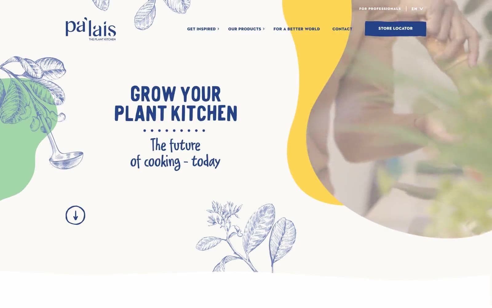
Pa'lais design system

Brand1
Primary brand color — headlines, navigation text, links, filled CTA buttons, and dark section backgrounds. The only cool saturated hue in the system, it gives every action weight and authority
Accent5
Decorative accent — used exclusively in organic flowing blob shapes and illustration highlights, never as a fill or button. The warm burst of yellow is the system's signature punctuation against the cream canvas
Orange accent for outlined action borders, linked labels, and lightweight interactive emphasis.
Soft illustration blue — used in botanical line-art washes and supporting decorative blobs. Lighter and more atmospheric than the primary indigo, it adds depth to the plant illustrations
Subtle warm accent — used sparingly in illustration details and supporting decorative shapes. Bridges the gap between the cream canvas and the more saturated orange and gold accents
Botanical green — appears in organic blob shapes and plant illustration washes. Soft enough to read as a pastel, it reinforces the plant-based brand without competing with the indigo or orange
Neutrals4
Primary text, hairline borders, icon strokes, and neutral UI elements. The sheer frequency of black borders (503+ occurrences) signals the system relies on thin dividing lines rather than card elevation to separate content
Card shadow base tone — used exclusively in box-shadow declarations at low opacity. The shadow is the only elevation mechanism; there are no borders on cards
Page canvas and hero background. This warm off-white is the system's base surface, immediately distinguishing it from a stark white SaaS layout — it reads as paper, not screen
Card surfaces, text on dark backgrounds, button text fills, and inset panels. Creates the layered surface effect — white cards resting on the cream canvas
Try a pairing
Pick any two colors from the palette to check whether text stays readable on top.
Aa
Pure White on Deep Indigo
9.47 : 1 contrast
- Body textPasses AA 4.5
- Large textPasses AA 3
- StrictPasses AAA 7
More DESIGN.md files. Same web, different personalities.
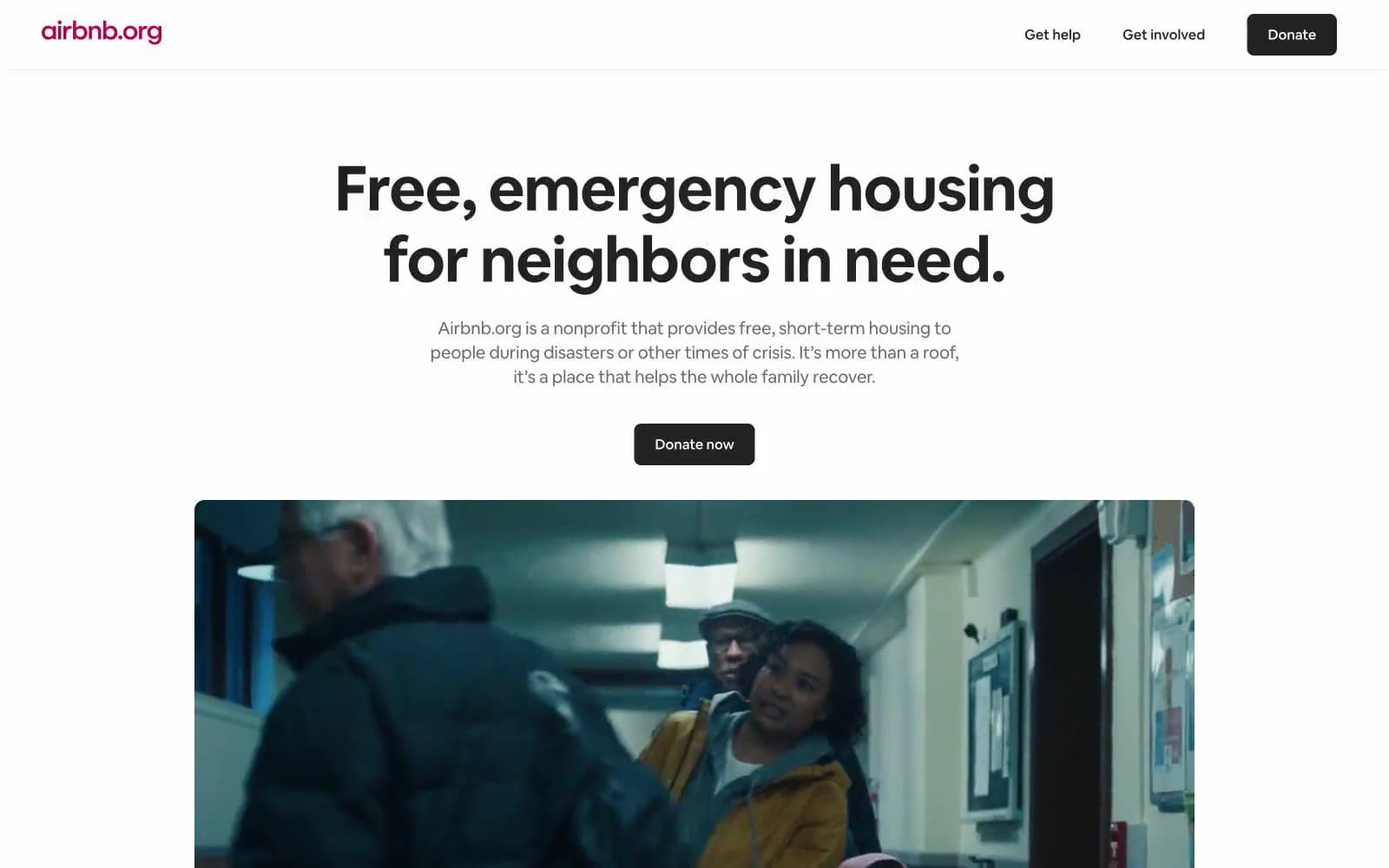
Airbnb
Brand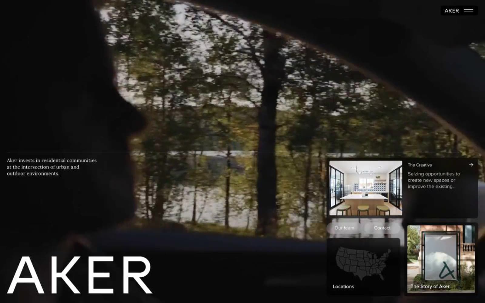
Aker
Brand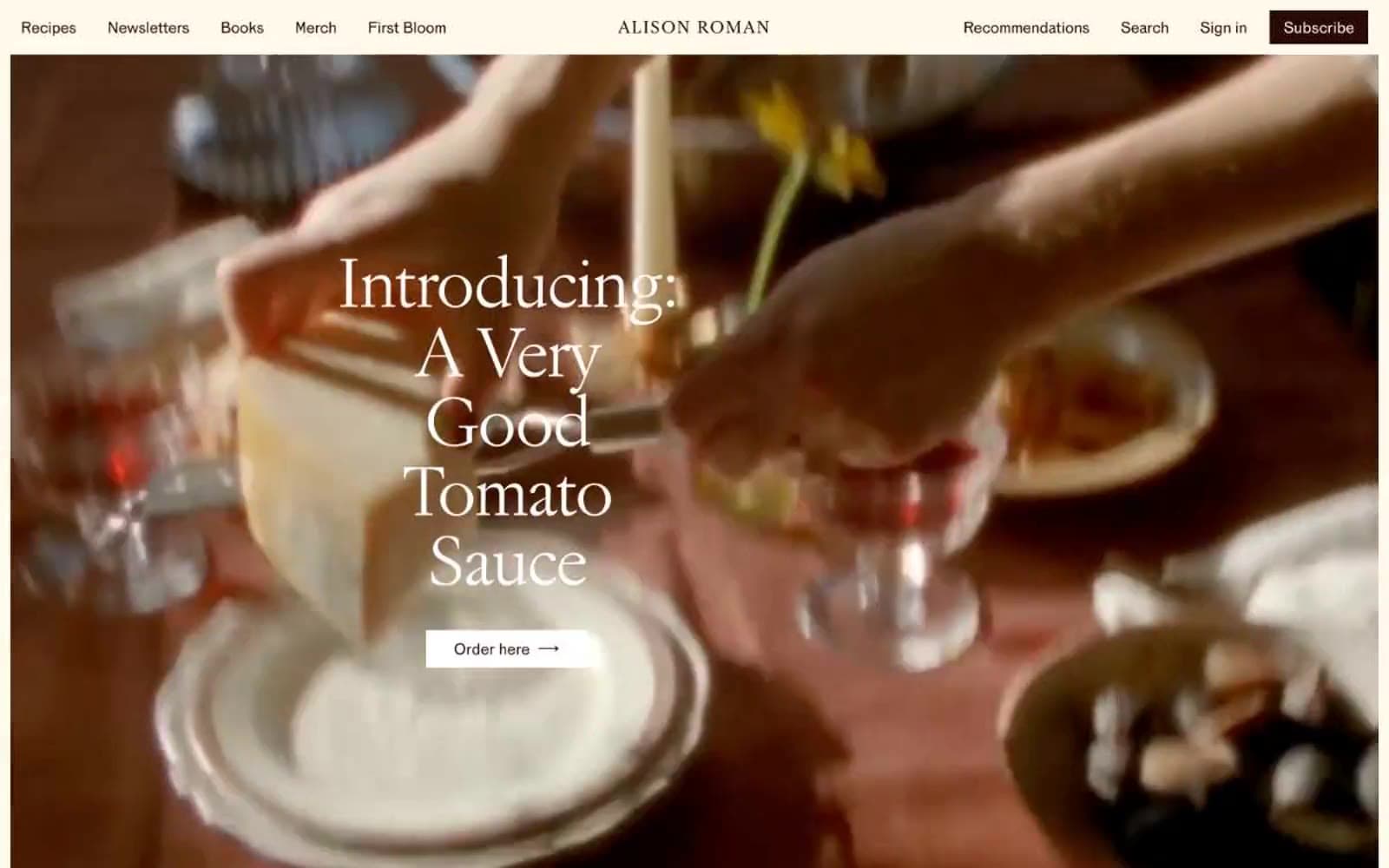
Alison Roman
Brand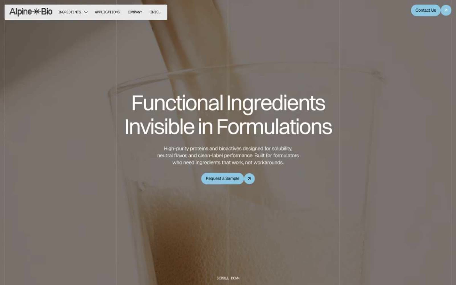
Alpine Bio
Brand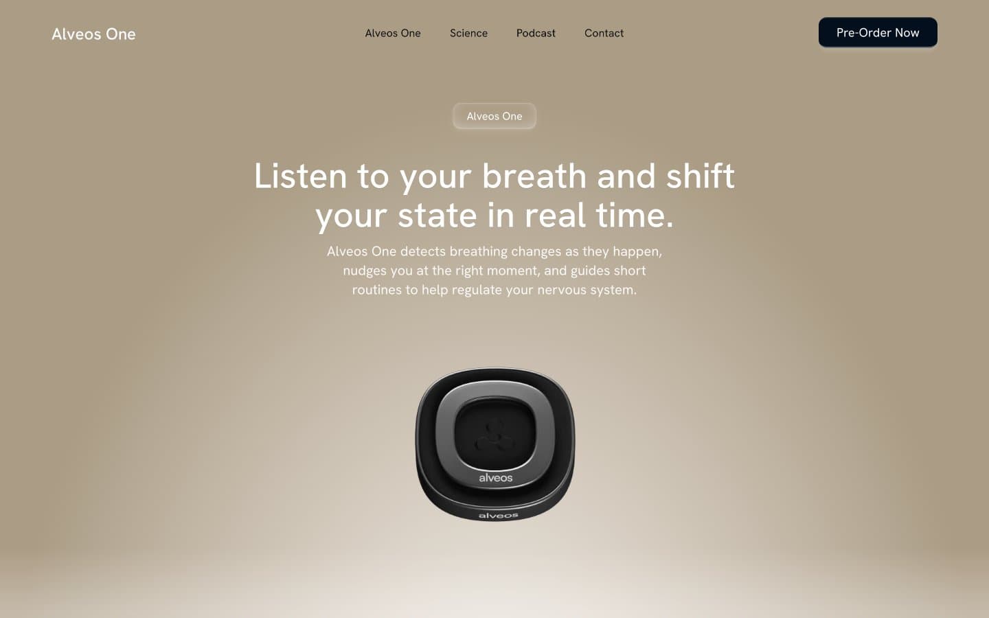
Alveos One
Brand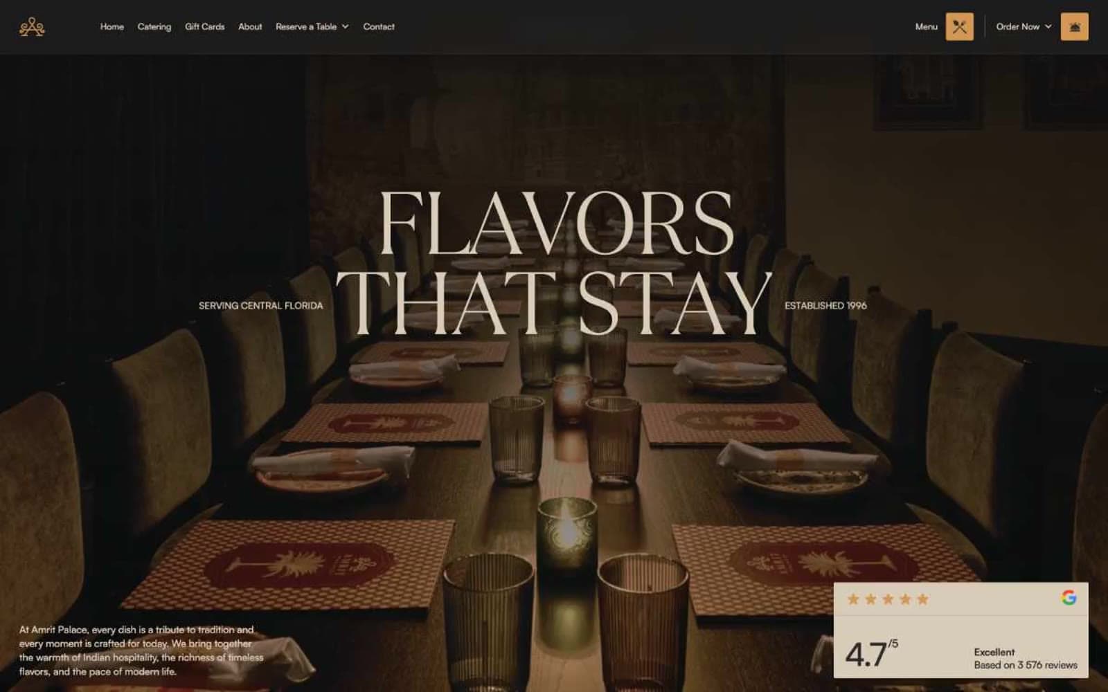
Amrit Palace
Brand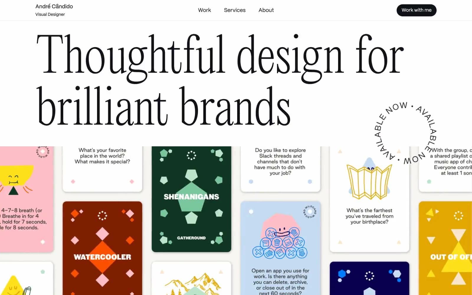
André Cândido
Brand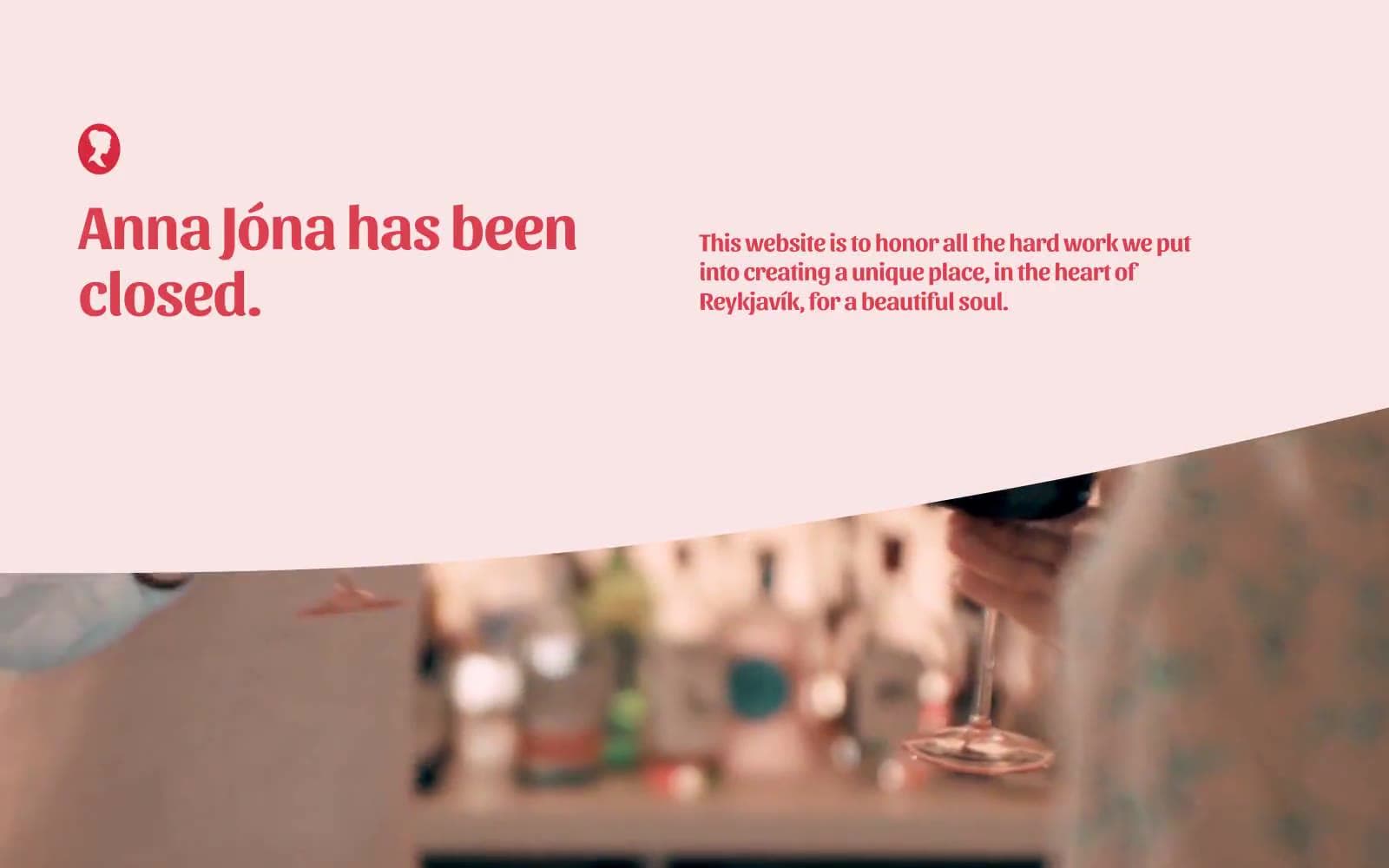
Anna Jóna
Brand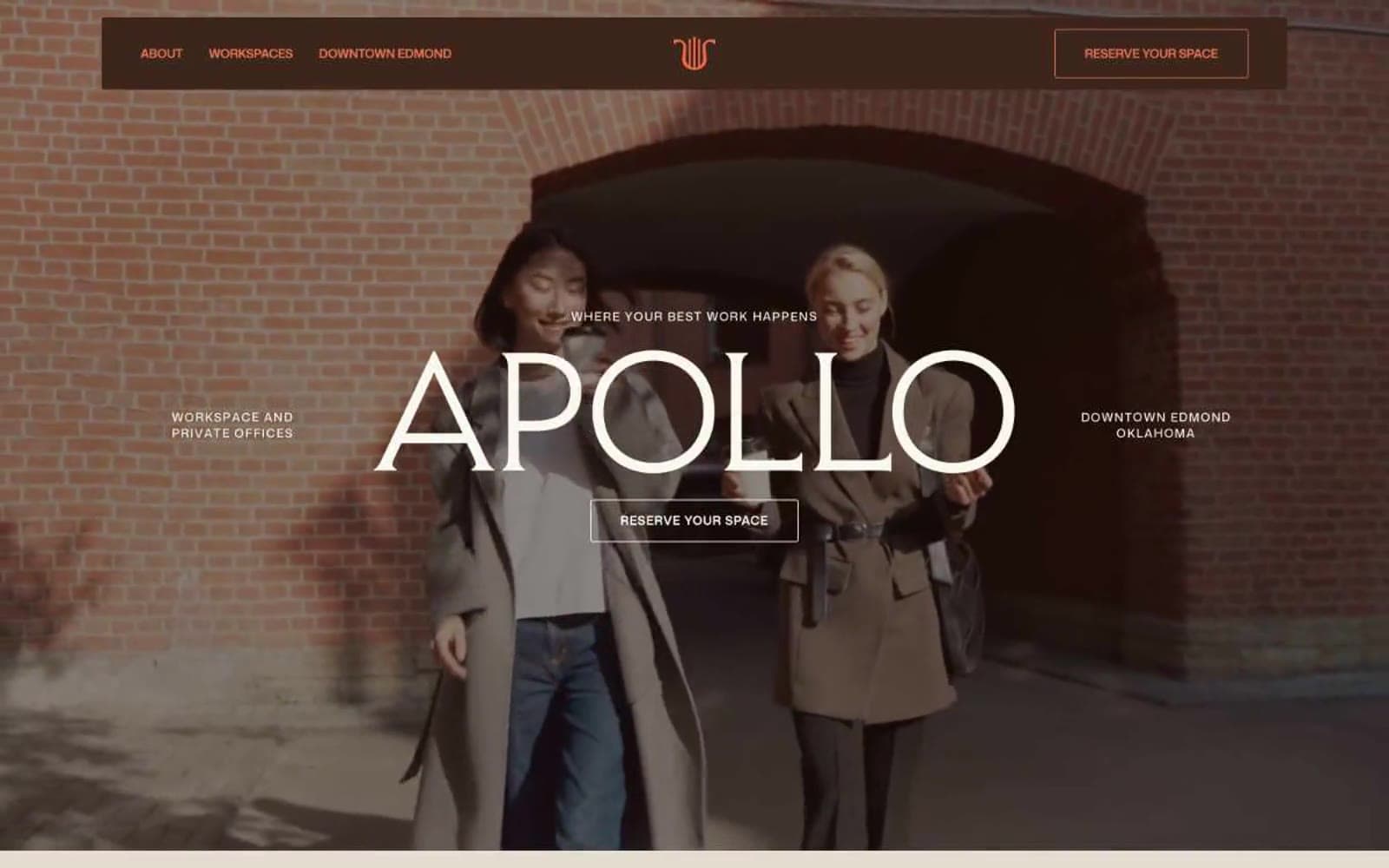
Apollo
Brand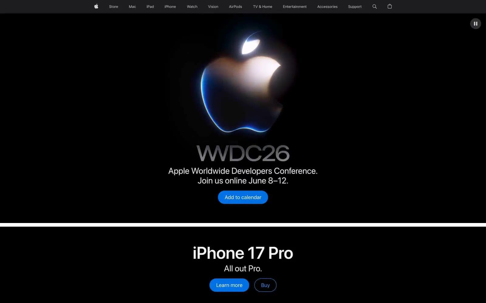
Apple
Brand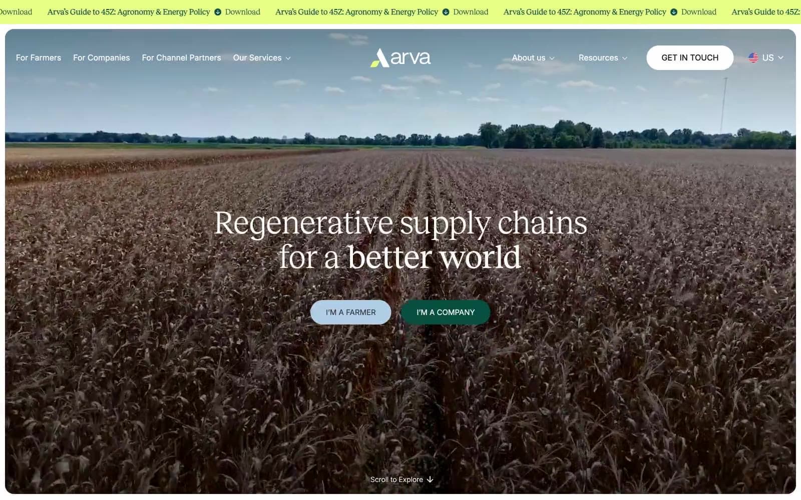
Arva
Brand
Ashton Bespoke
Brand


