
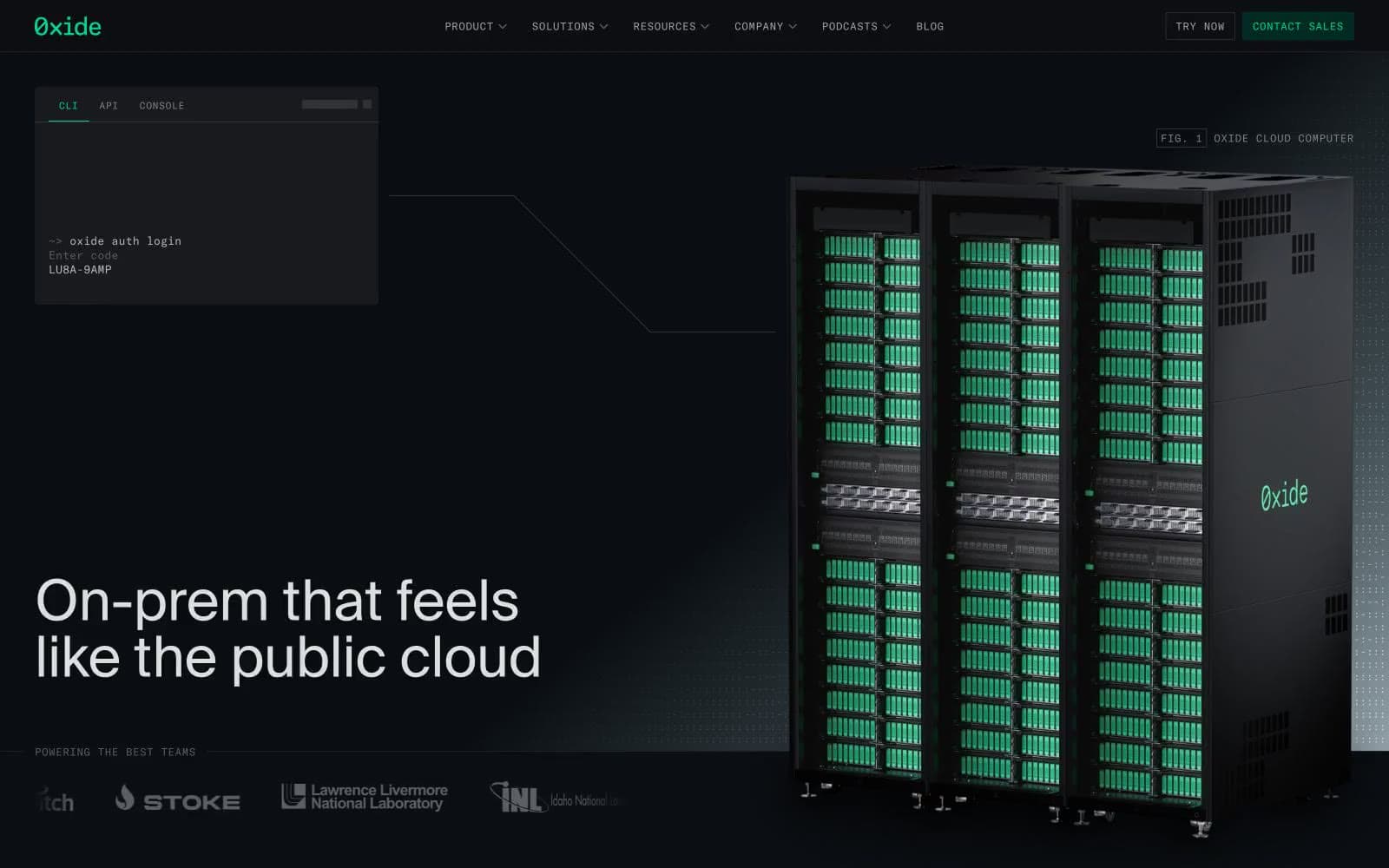
Oxide Computer Company. Datacenter rack at midnight with one green LED lit.
- Developer tools
- Dark theme
- 16 colors
- 2 typefaces
Oxide uses a terminal-grade infrastructure language: near-black canvas, razor-thin 1px hairlines, monospace labels that read like CLI output, and a single vivid green that behaves like an LED status indicator rather than a marketing accent. The site treats its own interface the way it treats its racks — exposed, functional, and free of decoration. Everything technical (tabs, badges, nav items, code, system labels) renders in GT America Mono at small sizes with wide tracking; everything human (headlines, body, marketing copy) uses SuisseIntl at comfortable sizes with tight tracking. Color is rationed: green only signals active/initialized/selected states, while magenta-tinted status lines (like 'STATUS ERROR') hint at secondary diagnostics. Surfaces are nearly flat — inset 1px strokes instead of drop shadows, no rounded corners on structural elements, and a surface stack that moves from true black through charcoal to deep teal rather than the usual gray ramp.
Oxide Computer Company design system

Brand3
Green accent for outlined action borders, linked labels, and lightweight interactive emphasis. Do not promote it to the primary CTA color
Filled CTA background, button fill, badge background — the only chromatic fill in the interface, reserved for primary action surfaces
Hover/active state for deep teal surfaces, decorative green wash in body copy contexts, large-area green-tinted backgrounds
Accent4
Red text accent for links, tags, and emphasized short phrases. Use as a supporting accent, not as a status color
Violet text accent for links, tags, and emphasized short phrases. Use as a supporting accent, not as a status color
Red text accent for links, tags, and emphasized short phrases. Use as a supporting accent, not as a status color
Green text accent for links, tags, and emphasized short phrases. Use as a supporting accent, not as a status color
Neutrals9
Page canvas, deepest background layer — absorbs everything below the fold
Card surfaces, terminal mockup backgrounds, badge fill
Elevated surface, nested panel backgrounds, subtle border against carbon
Dominant neutral — body text borders, hairlines, icon strokes, grid line color (appears 5,900+ times as borderColor)
Muted body text, secondary labels, disabled helper text
Tertiary text, icon outlines, inactive nav items
Secondary text, link text at rest, footer copy
Primary UI text, nav items, body copy at default weight
Headline color, high-emphasis text, display copy — the lightest ink in the system
Try a pairing
Pick any two colors from the palette to check whether text stays readable on top.
Aa
Void Black on Phosphor Green
10.35 : 1 contrast
- Body textPasses AA 4.5
- Large textPasses AA 3
- StrictPasses AAA 7
More DESIGN.md files. Same web, different personalities.

Railway
Developer tools
Nuxt
Developer tools
Astro
Developer tools
Authkit
Developer tools
Axiom
Developer tools
BaseHub
Developer tools
Better Stack
Developer tools
Bun
Developer tools
Checkly
Developer tools
ClickHouse
Developer tools
Depot
Developer tools
dope.security
Developer tools


