
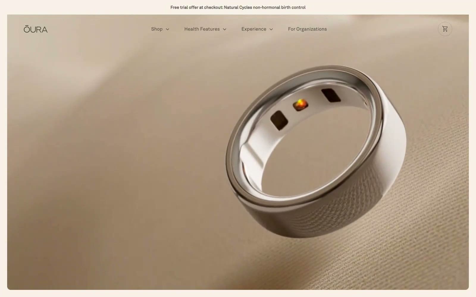
Oura Ring. Warm oatmeal atelier under soft daylight.
- Brand
- Light theme
- 11 colors
- 2 typefaces
Oura speaks in a warm, tactile language of skin and ceramic: a cream-oatmeal canvas (#f7f1e8), deep charcoal text, and photography that fills every viewport with human-scale detail. The type system pairs a precise grotesque (AkkuratLL) for everything functional with an editorial high-contrast serif (Editorial New) for emotional headlines — italic flourishes in the serif whisper rather than shout. Color is nearly absent by design: the entire palette lives in warm neutrals, with a single muted olive (#5b6550) used as the only chromatic accent. Components are quiet and rounded — pill buttons, 8px-radius cards, 12px-radius inputs, hairline 1px borders in #ececec. The feeling is luxury wellness: less technology product, more considered object you wear on your body.
Oura Ring design system

Accent1
Supporting neutral for secondary UI, dividers, and muted labels. Do not promote it to the primary CTA color
Neutrals10
Dark supporting neutral for text, icons, and strong contrast. Do not promote it to the primary CTA color
Supporting neutral for secondary UI, dividers, and muted labels. Do not promote it to the primary CTA color
Body copy, secondary headings, button borders, input borders — warm near-black that sits softer than pure #000
Tertiary text, icon secondary states, disabled button text
Muted helper text, secondary metadata, inactive nav, sub-labels
Subtle background fills for alternating sections, muted surface layer
Hairline dividers, image borders, card outlines, input borders — the structural 1px that holds the system together
Page canvas, hero backgrounds, card surfaces — the warm paper-white that makes every photograph feel tactile
Secondary card surface, button border tint, subtle elevated panels
Text on dark fills, inverted button text, clean card highlights
Try a pairing
Pick any two colors from the palette to check whether text stays readable on top.
Aa
Pure White on Sage Whisper
6.14 : 1 contrast
- Body textPasses AA 4.5
- Large textPasses AA 3
- StrictFails AAA 7
More DESIGN.md files. Same web, different personalities.

Airbnb
Brand
Aker
Brand
Alison Roman
Brand
Alpine Bio
Brand
Alveos One
Brand
Amrit Palace
Brand
André Cândido
Brand
Anna Jóna
Brand
Apollo
Brand
Apple
Brand
Arva
Brand
Ashton Bespoke
Brand


