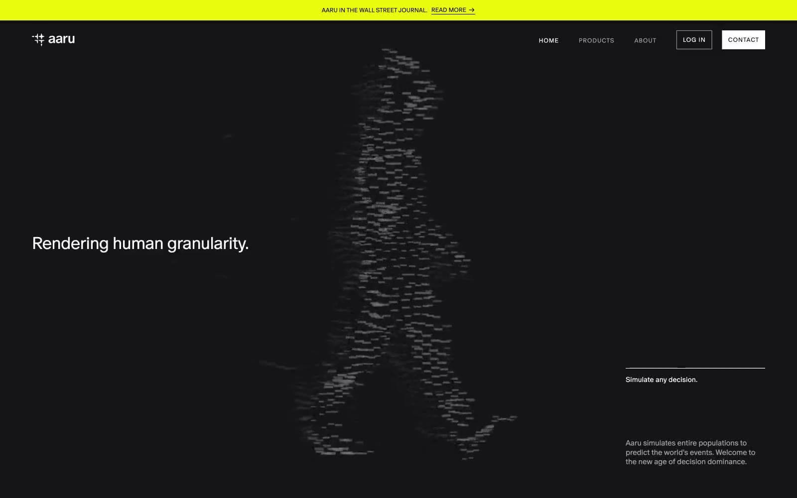
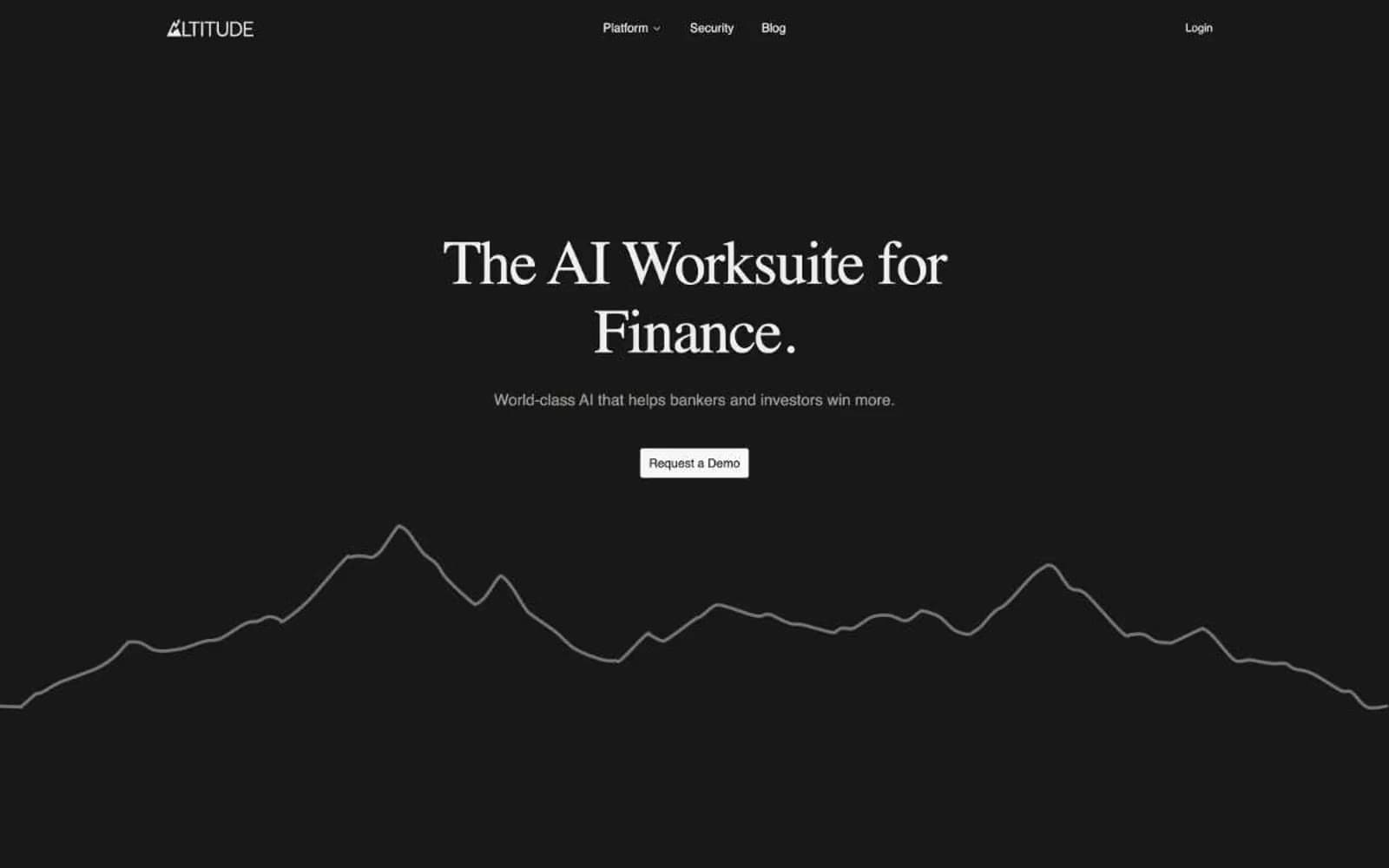
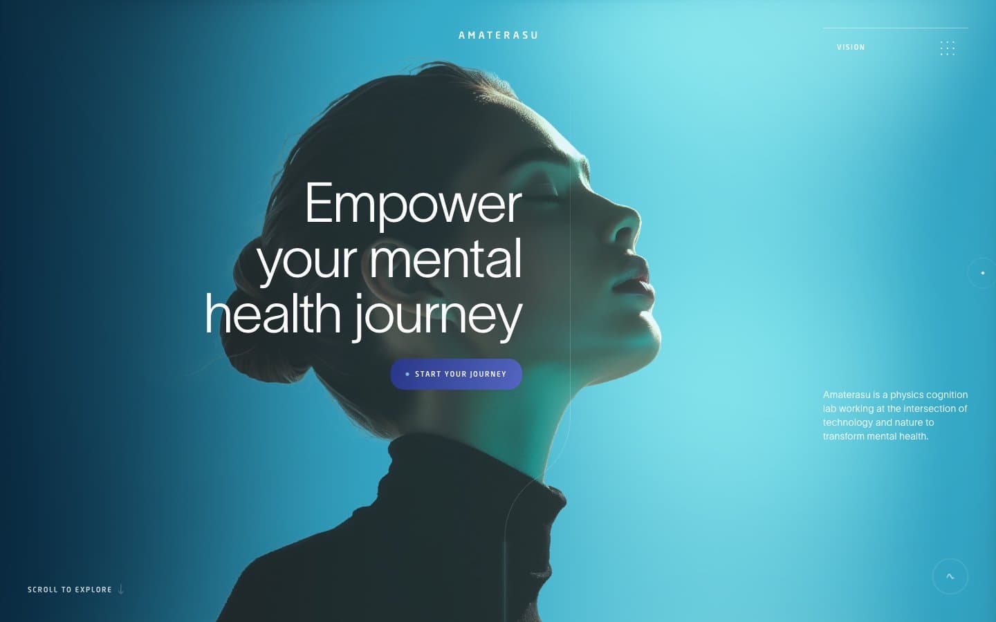
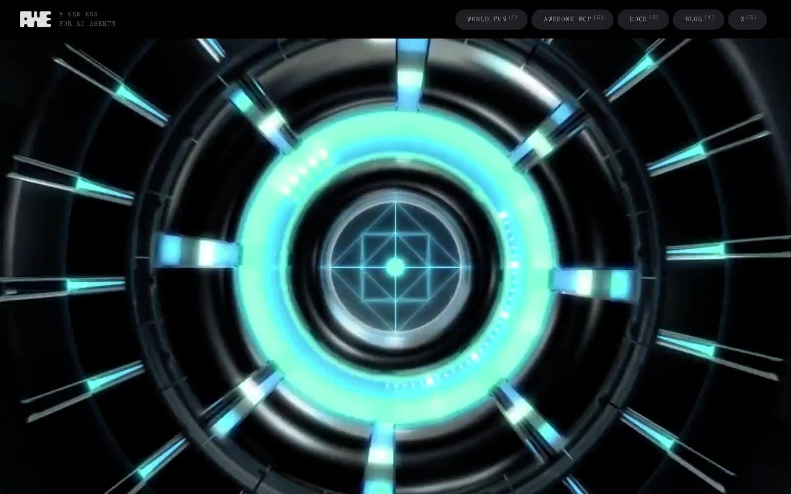
Ori. Black void, white light, one ignited switch.
- AI
- Dark theme
- 7 colors
- 3 typefaces
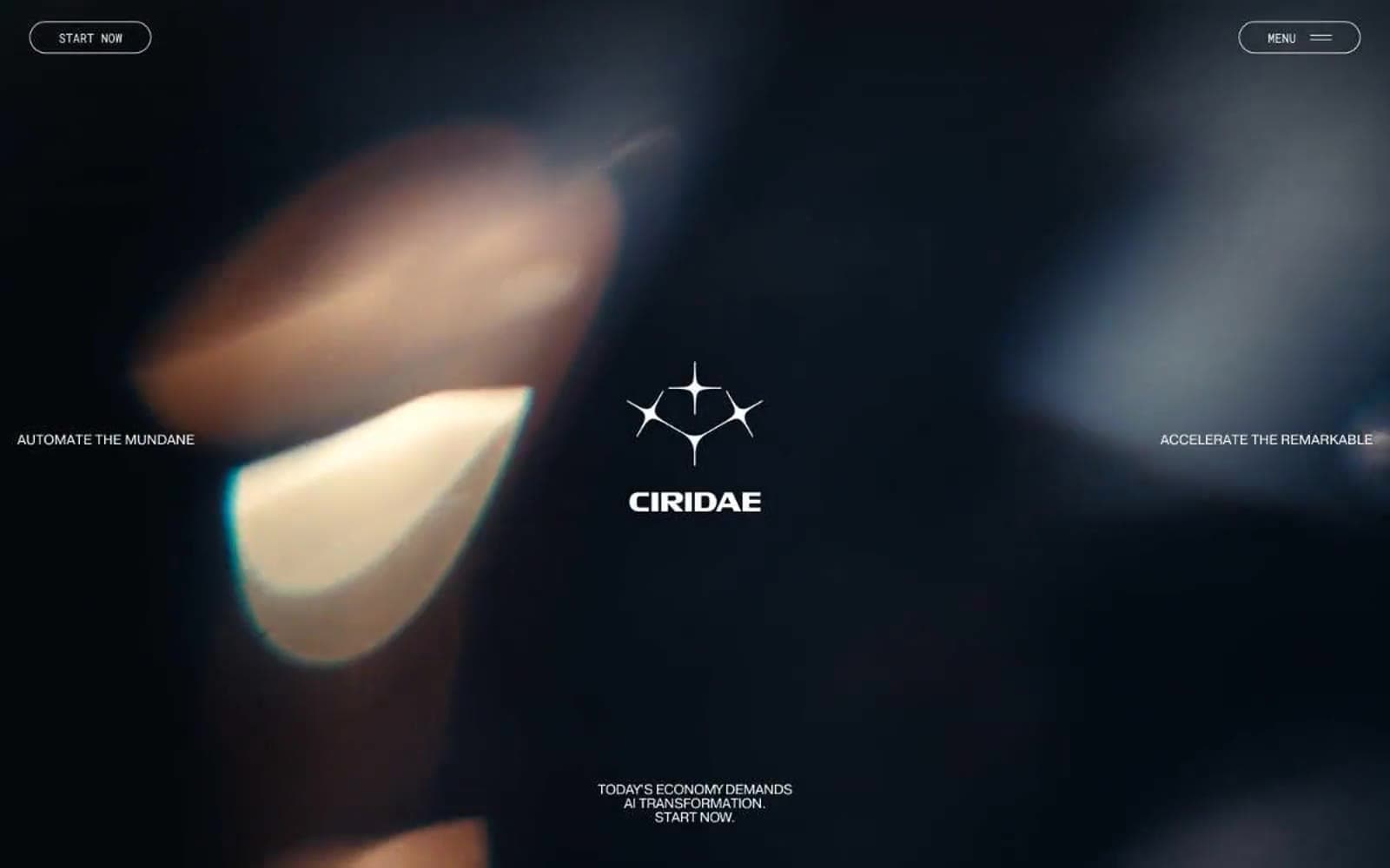
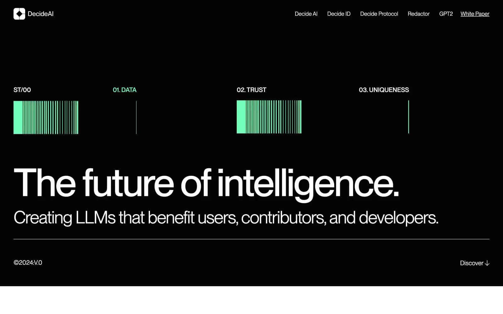
Radiant (formerly Ori) operates in a dark infrastructure-at-night language: pure black canvas, bright white typography at whisper-light weight, and a single saturated orange that ignites action and full-bleed statements. The visual grammar borrows from data-center photography — server racks, neon edge-lights, and hard architectural lines — and translates that into UI: zero border-radius on interactive elements, hairline borders, and monospaced labels that feel like terminal readouts. Headlines in TWK Everett at weight 300 create a cool, confident scale that never shouts; orange is rationed for CTAs, one full-bleed band, and accent details, making it feel like a power-on indicator rather than decoration. The system is text-forward and cinematic — large type breathes against dark voids, sections alternate between black and orange with no gradients or shadows to soften transitions.

Ori design system

Brand1
Orange action color for filled buttons, selected navigation states, and focused conversion moments.
Neutrals6
Page canvas, hero background, card surface base, footer — the dominant stage on which everything floats
Neutral form states, badge text, and quiet UI feedback where color should stay understated.
Hairline dividers, ghost button borders, section separators — barely-there structural lines
Secondary metadata, timestamps, muted labels, tertiary body copy
Card borders on dark surfaces, secondary text, dimmed paragraph copy — a lighter neutral for readability without full white
Primary text, headlines, nav items, icon strokes, ghost button borders — the luminous text color across all dark surfaces
Try a pairing
Pick any two colors from the palette to check whether text stays readable on top.
Aa
Void Black on Ember Orange
6.41 : 1 contrast
- Body textPasses AA 4.5
- Large textPasses AA 3
- StrictFails AAA 7