
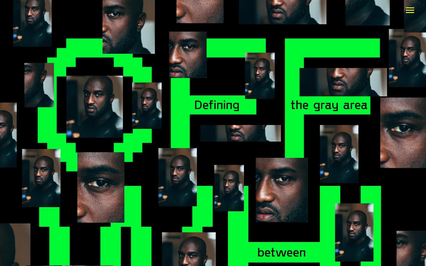
OFF WHITE. A wall of pixelated green typography in which portrait photographs of a single human face are pressed into the negative space between monumental letterforms, all on absolute black.
- Studio
- Dark theme
- 6 colors
- 3 typefaces
This is a conceptual editorial experience, not a product UI — the visual system weaponizes binary extremes (pure black canvas, pure white text) and three vivid chromatic accents (electric green, alarm red, hi-vis yellow) to physically manifest the site's theme of the 'gray area between black and white.' Typography is deliberately polarized: a custom blocky display face scaled to 180–500px acts as architecture, while a conventional Times serif at 16px whispers against it as editorial annotation. Layout is collage-driven rather than grid-rigid — portrait photographs overlap display type, bleed past frames, and stack in an irregular scatter, producing a zine/protest-poster feel that rejects conventional product UI patterns. Spacing is generous vertically (60–120px) but horizontally dense and chaotic, with no max-width container constraining the canvas. The custom 'Offwhite' display face is the single most important asset in the system: its blocky pixel-inspired geometry makes every letter a sculptural object.
OFF WHITE design system

Brand1
Green action color for filled buttons, selected navigation states, and focused conversion moments
Accent2
Frame borders, decorative strokes, section dividers — the most-used border color in the system. Borders total 44 instances vs only 12 backgrounds, meaning red reads as a hard rectangular frame or alert outline rather than a surface fill
Yellow outline accent for tags, dividers, and focused UI edges
Neutrals3
Page canvas, photo tile borders (104 image borders), all text colors. The most frequent single color in the system (3357 occurrences) — everything else floats on it
Medium-contrast borders, control outlines, and structural separators.
Hairline borders, dividers, input outlines, and card edges on light surfaces.
Try a pairing
Pick any two colors from the palette to check whether text stays readable on top.
Aa
Absolute Black on Voltage Green
14.85 : 1 contrast
- Body textPasses AA 4.5
- Large textPasses AA 3
- StrictPasses AAA 7
More DESIGN.md files. Same web, different personalities.

Basement Studio
Studio
Production Portugal
Studio
Active Theory
Studio
Adnaut
Studio
Agence K72
Studio
Akash Tyagi
Studio
Analogue
Studio
Athletics
Studio
BAM Photographers
Studio
Bareis + Nicolaus
Studio
Becklyn
Studio
Branding
Studio


