
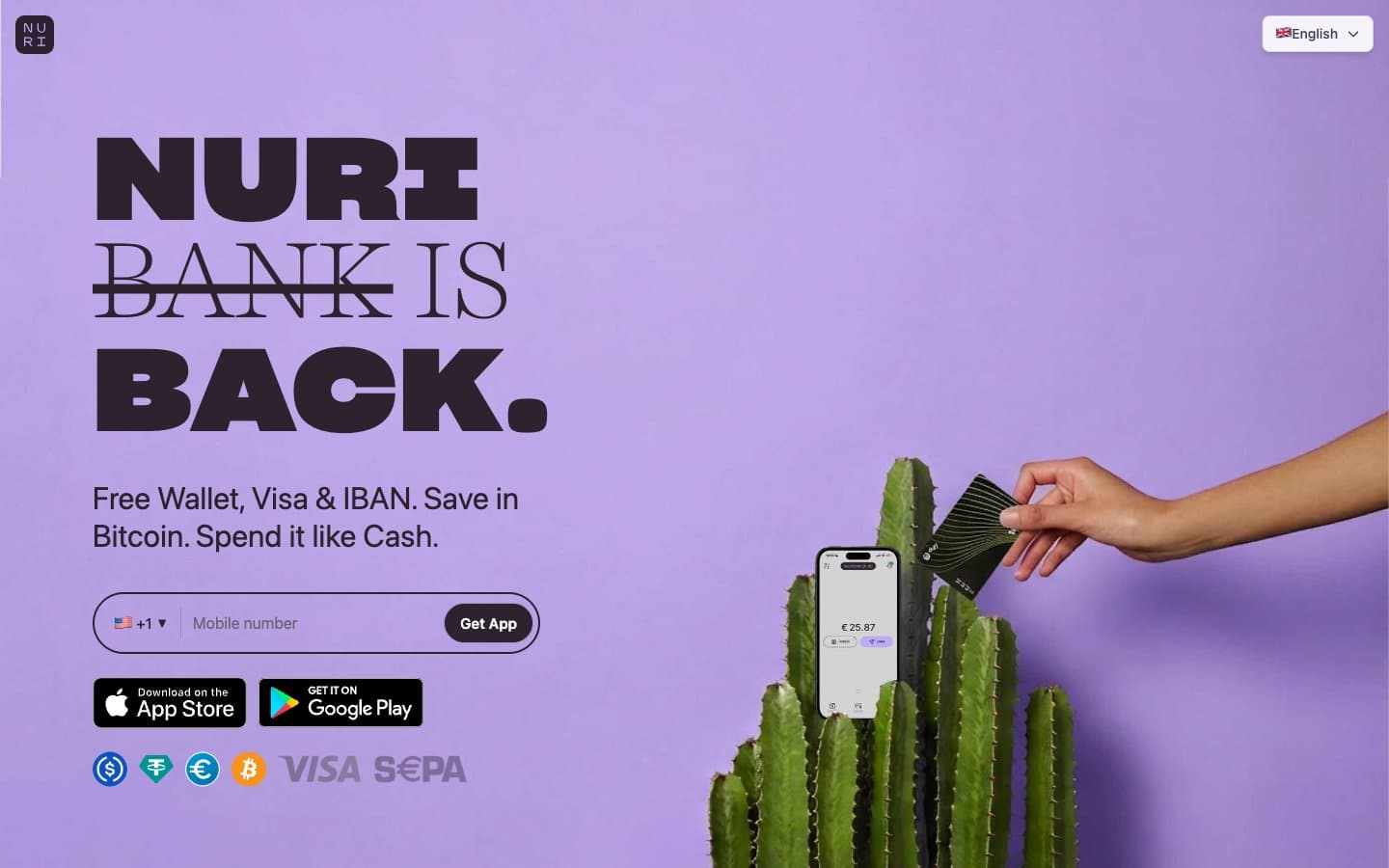
Nuri. Pill-soft, serif-meets-stencil, cool violet bleeding into warm cream.
- Finance
- Light theme
- 14 colors
- 3 typefaces
Nuri operates on a soft lavender canvas with a single bold typographic gesture: enormous Sharp Grotesk black-slab headlines colliding with whisper-weight Harriet Display serifs in the same line, like a financial publication cut by a graffiti stencil. The palette stays in cool violet territory across canvas, card, and hero surfaces, with a warm cream band cutting in near the footer — a deliberate cool-to-warm color temperature arc that signals a human, editorial fintech rather than a blue-and-white banking clone. Surfaces are pill-soft (9999px and 48px radii dominate), shadows are nearly absent, and accents appear as small illustrated characters and one Bitcoin-orange punctuation mark rather than as saturated UI chrome.
Nuri design system

Brand2
Hero section background, full-bleed brand wash — saturated lavender makes the page unmistakable from a thumbnail
Card and panel surfaces — desaturated companion to Hero Violet, used for elevated content blocks on the lighter canvas
Accent1
Accent for the Bitcoin currency icon and selective callouts — the only warm chromatic note in a cool palette, anchoring the crypto identity
Neutrals11
Maximum-contrast text, logo marks, hard-edge elements where Ink Plum feels too soft
Primary text, filled button backgrounds, dark borders — near-black with a violet undertone that keeps it on-palette
Icon strokes, button text on light surfaces, mid-emphasis labels
Secondary headings, link text, subdued body copy
Muted helper text, captions, tertiary metadata
Button borders, disabled-state surfaces, secondary dividers
Hairline borders, dividers, input outlines — the universal 1px rule throughout the UI
Page canvas — the dominant background across most sections, a barely-there violet tint instead of pure white
Footer band and warm transitions — breaks the lavender monotony with a peach-tinged neutral
Footer base surface, light secondary backgrounds
Button text, inverse surfaces, card highlights on colored backgrounds
Try a pairing
Pick any two colors from the palette to check whether text stays readable on top.
Aa
Jet on Hero Violet
10.38 : 1 contrast
- Body textPasses AA 4.5
- Large textPasses AA 3
- StrictPasses AAA 7
More DESIGN.md files. Same web, different personalities.

Mollie
Finance
a16z speedrun
Finance
Acctual
Finance
Airtree
Finance
Ambrook
Finance
Angellist 2024
Finance
Apron
Finance
Baselayer
Finance
Basis Theory
Finance
BlueYard Capital
Finance
Brex
Finance
Coda
Finance


