
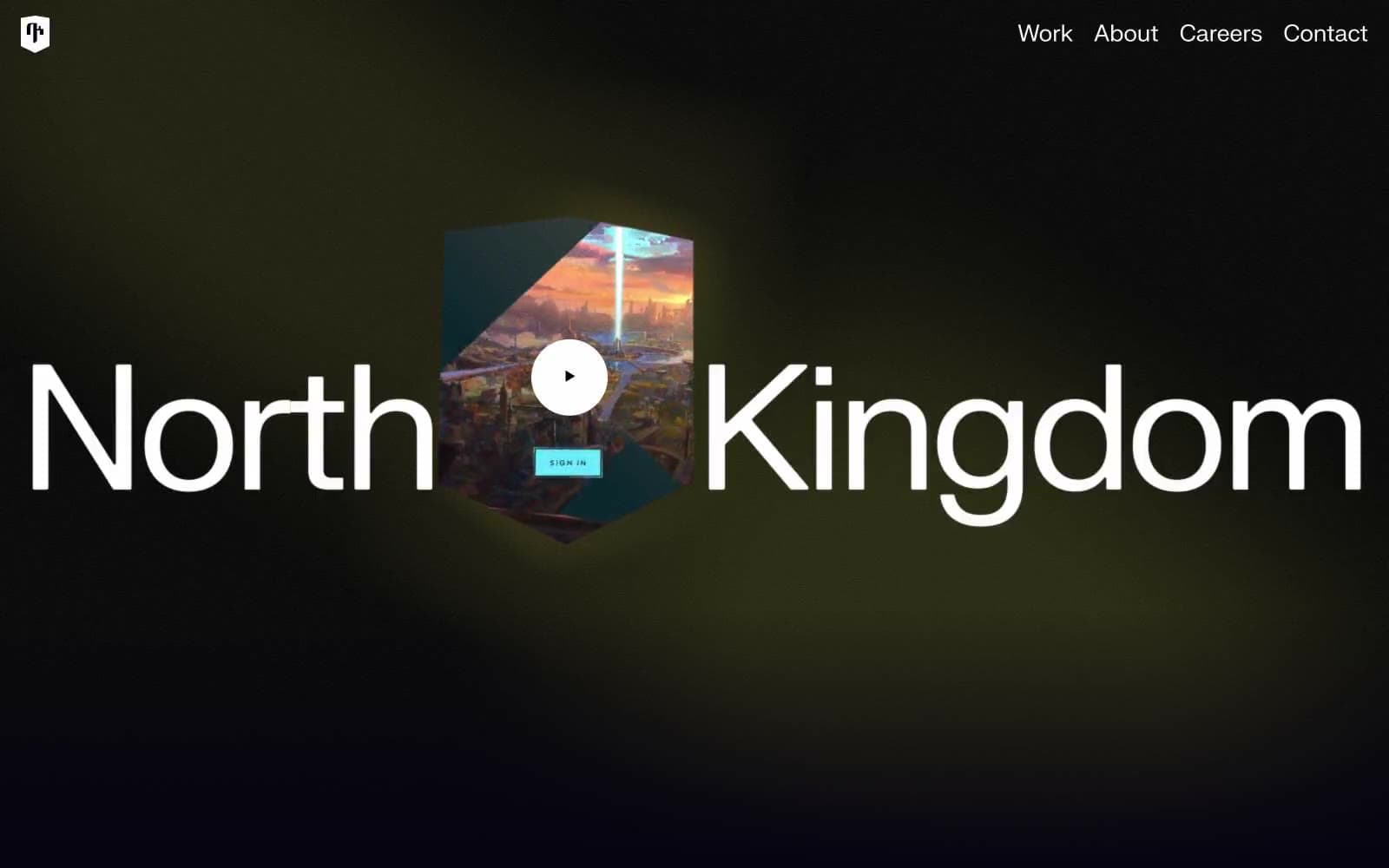
North Kingdom. A black film-studio soundstage where a single wordmark glows.
- Studio
- Dark theme
- 5 colors
- 2 typefaces
North Kingdom reads as a cinematic void: an almost-black canvas (#050311) swallowing everything except oversized white type and a single luminous accent. The wordmark is the hero — giant neo-grotesque letterforms spanning the full viewport, flanked by a 3D shield emblem with a circular play affordance. The entire palette is near-monochrome; there is no chromatic brand color, no gradients, no decorative warmth. Every component lives or dies by contrast: white type and hairlines on darkness, with a single muted gray (#9b9aa0) carrying all secondary information. Surfaces are flat — no shadows, no elevation tricks, no glass effects. Geometry is quiet and slightly sharp: 8px image/card radii, 4px button radii, with one outlier 26px pill input that signals interactivity. The effect is a digital agency portfolio treated like a film title card.
North Kingdom design system

Neutrals5
Monochrome icon fills, brand marks, and high-contrast graphic details. Do not promote it to the primary CTA color
Page canvas, section backgrounds, dark surface base — the near-black stage on which all content sits, carrying a barely-perceptible cool-violet undertone that keeps it from feeling clinical
Dividers, low-emphasis borders, hairline separators between sections — quiet structural lines that organize the dark canvas without drawing attention
Muted body text, secondary headings, subtle borders, disabled states — carries all secondary information without competing with the white voice
Primary text, headline color, hairline borders, icon strokes, button outlines — the only high-contrast voice in the system; when something needs to be seen, it is white
Try a pairing
Pick any two colors from the palette to check whether text stays readable on top.
Aa
Pure White on Carbon Black
21.00 : 1 contrast
- Body textPasses AA 4.5
- Large textPasses AA 3
- StrictPasses AAA 7
More DESIGN.md files. Same web, different personalities.

Basement Studio
Studio
Production Portugal
Studio
Active Theory
Studio
Adnaut
Studio
Agence K72
Studio
Akash Tyagi
Studio
Analogue
Studio
Athletics
Studio
BAM Photographers
Studio
Bareis + Nicolaus
Studio
Becklyn
Studio
Branding
Studio


