
Nornorm. A white-walled furniture gallery where one deep blue stroke cuts through warm bone and ink.
- Brand
- Light theme
- 8 colors
- 1 typeface
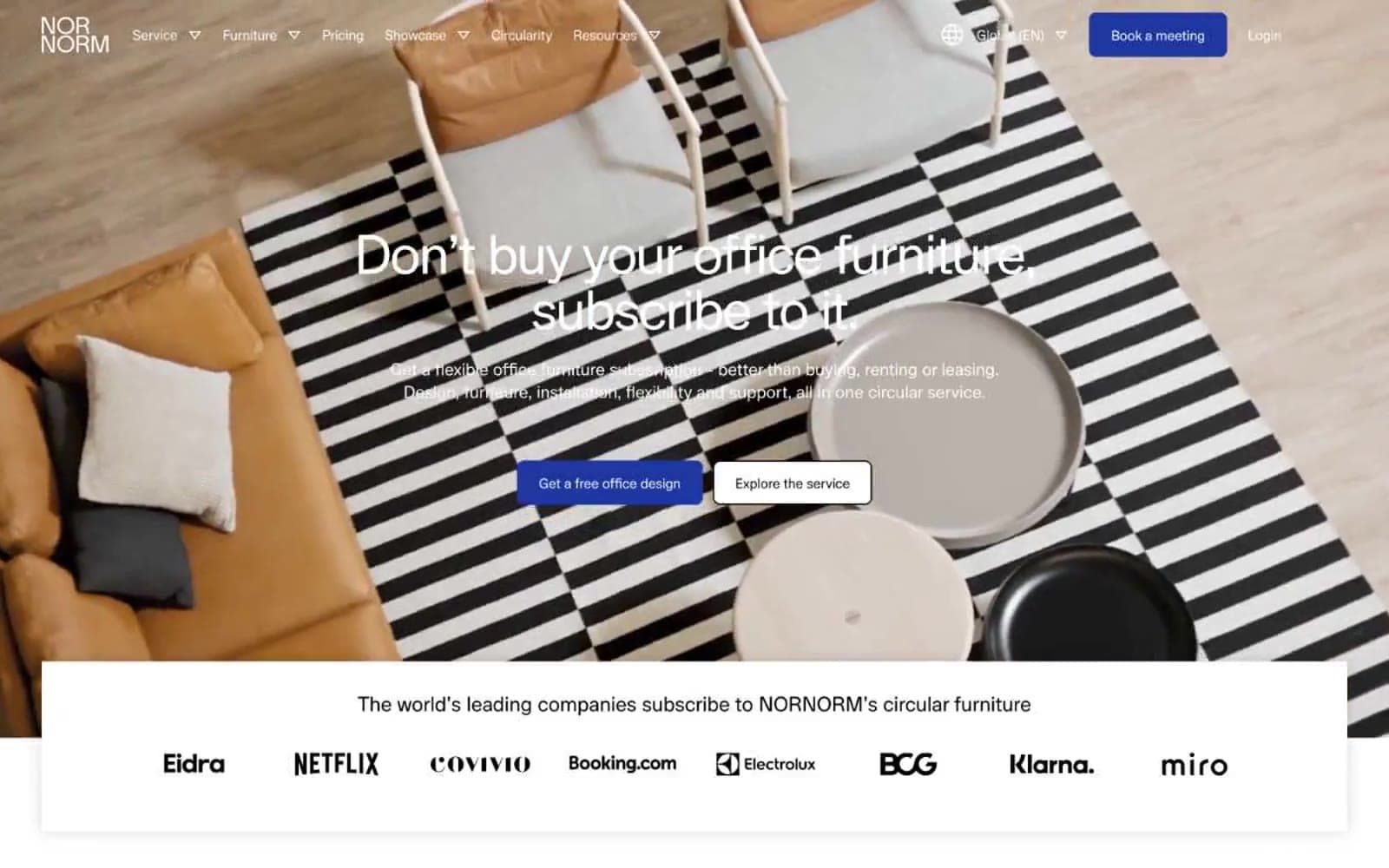
Nornorm's visual system is a near-monochromatic Scandinavian showroom: a white canvas warmed by a bone surface, a single deep cobalt as the only chromatic voice, and a custom geometric typeface (Lunar) tracked tight at -0.03em across every size. The discipline is rationed color — the cobalt appears only on the logo, the primary CTA, and the active state, everything else lives in grayscale. Photography carries the brand's emotional weight: full-bleed editorial interiors, warm leather textures, sculptural paper-craft vignettes, and living office scenes do the storytelling so the interface can stay quiet. Components are flat, pill-shaped, and borderless — a cobalt-filled button next to a dark ghost button, no shadows, no gradients, no decoration beyond generous whitespace and a single accent.
Nornorm design system

Brand1
Violet outline accent for tags, dividers, and focused UI edges. Do not promote it to the primary CTA color
Neutrals7
Primary text, nav text, strong borders, and the ghost button outline — the typographic workhorse
Slightly warm near-black for body and heading text — a softer alternative to pure black that matches the warm bone surface
Hairline borders and structural dividers
Secondary body text, helper copy, nav muted labels, and dividers — the warm mid-gray that gives body text hierarchy without competing with the brand accent
Subtle elevated surface and neutral button fill for low-emphasis controls
Warm off-white surface for section bands, feature card panels, and soft contrast zones against pure white
Page background, card surfaces, button text on cobalt, nav background, image backgrounds
Try a pairing
Pick any two colors from the palette to check whether text stays readable on top.
Aa
Canvas White on Cobalt Ink
9.96 : 1 contrast
- Body textPasses AA 4.5
- Large textPasses AA 3
- StrictPasses AAA 7
More DESIGN.md files. Same web, different personalities.

Airbnb
Brand
Aker
Brand
Alison Roman
Brand
Alpine Bio
Brand
Alveos One
Brand
Amrit Palace
Brand
André Cândido
Brand
Anna Jóna
Brand
Apollo
Brand
Apple
Brand
Arva
Brand
Ashton Bespoke
Brand


