
Nile Postgres. A quiet command center where three pastel tiles glow in the dark.
- Developer tools
- Dark theme
- 12 colors
- 4 typefaces
Nile operates in the visual language of an infrastructure command center: a near-black canvas (#0e0e0e) with elevated surface cards (#1c1c1c) and a trio of pastel feature blocks — cyan #6fe2ff, amber #ffba6a, and lavender #d8d3ff — that function as colored tiles floating in deep space. Typography is geometric and precise: Aeonik at weights 400/500/600/700, with display sizes stretching to 96px on tight negative tracking, giving headlines an architectural, engineered feel. A signature sunset gradient (amber → lavender → cyan) threads through the hero wordmark and likely other moments, providing the only moment of continuous color flow. Components stay flat and quiet — hairline borders (#2f3336) over heavy elevation, pill buttons (9999px), rounded 16-20px cards, and no decorative shadows. The overall atmosphere is restrained infrastructure: developer-facing, confident through restraint rather than spectacle, with chromatic accents used sparingly as functional category tags rather than decoration.
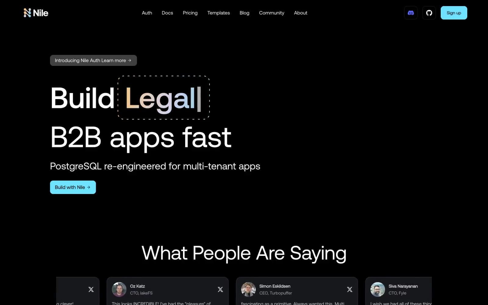
Nile Postgres design system

Brand1
Blue action color for filled buttons, selected navigation states, and focused conversion moments.
Accent3
Amber feature card background, warm category accent in the trio
Lavender feature card background, cool category accent in the trio
Signature gradient — amber to lavender to cyan, used on hero wordmark highlights and atmospheric washes
Neutrals8
Page canvas, deepest surface — the black that everything floats on
Card surfaces, elevated panels, testimonial tiles
Mid-elevation surfaces, subtle layering above cards
Hairline card borders — the quietest structural line
Borders, dividers on elevated elements, button outlines
Tertiary text, helper copy, de-emphasized metadata
Secondary text, muted labels, icon fills at rest
Primary text, headings, icons — the dominant foreground
Try a pairing
Pick any two colors from the palette to check whether text stays readable on top.
Aa
Deep Void on Signal Cyan
12.87 : 1 contrast
- Body textPasses AA 4.5
- Large textPasses AA 3
- StrictPasses AAA 7
More DESIGN.md files. Same web, different personalities.

Railway
Developer tools
Nuxt
Developer tools
Astro
Developer tools
Authkit
Developer tools
Axiom
Developer tools
BaseHub
Developer tools
Better Stack
Developer tools
Bun
Developer tools
Checkly
Developer tools
ClickHouse
Developer tools
Depot
Developer tools
dope.security
Developer tools


