
Munro Partners. A warm cream canvas holding generous whitespace, a whisper-weight grotesque, and full-bleed mountain photography where the landscape does the talking and the interface stays nearly invisible.
- Finance
- Light theme
- 16 colors
- 3 typefaces
Munro Partners operates in a quiet, editorial register: a warm cream canvas (#fff9ee) holds generous whitespace, with every interface element trimmed in a single warm dark brown (#3f322a) that reads as ink rather than black. The Neue Haas Grotesk typography is set tight and small, with a 68px display headline at weight 400 that whispers against full-bleed mountain photography rather than shouting. A single deep teal (#004e4e) is reserved for the most important interactive moments, while muted violets, aubergine, and ice blue appear as thin accent borders on cards and data treatments. The system feels less like a financial product and more like a printed annual report — calm, spacious, and confident enough to let landscape imagery carry the emotional weight.
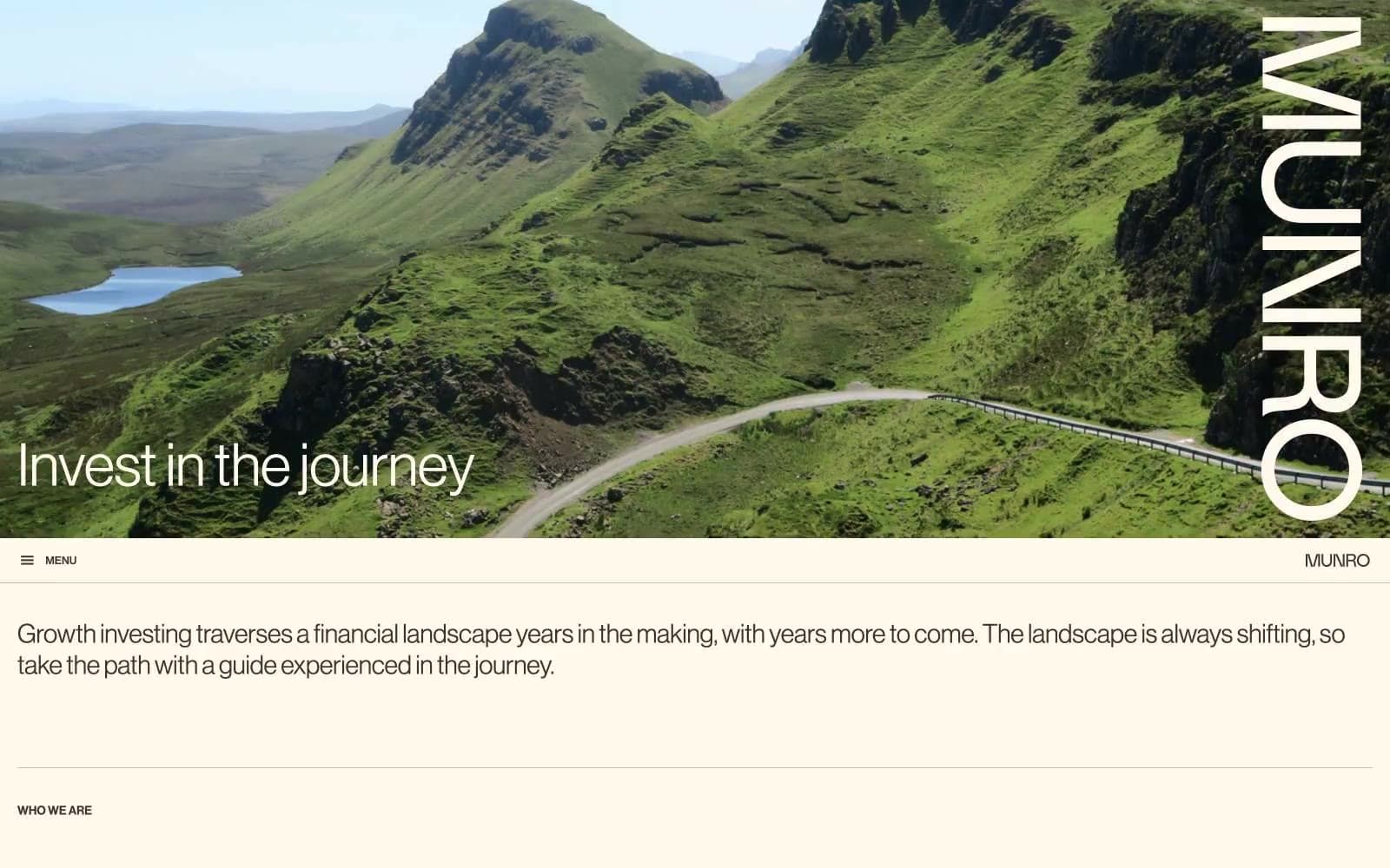
Munro Partners design system

Brand1
Primary action buttons, filled CTAs — the single chromatic fill color permitted for interactive moments, creating quiet authority against the cream
Accent6
Decorative card borders, heading accent strokes, editorial highlight containers
Decorative card borders, accent strokes on data containers
Link accents, decorative borders on blue-themed content blocks
Input field backgrounds, soft highlight washes on data rows, subtle surface tint
Occasional button accent for editorial highlight CTAs
Occasional button accent for warm-themed CTAs
Neutrals9
Input text color, high-contrast form text — the only context where true black appears
Primary text, all borders, nav links, body copy, headings — replaces black throughout the system, giving every line a warm ink-like quality
Secondary headings, muted label text
Secondary text, subtle borders, nav dividers — the mid-tone that bridges Bark Brown headings and lighter dividers
Input field borders, form element outlines
Hairline dividers, image borders, subtle separators between sections
Lightest border tone, disabled states, subtle structure lines
Page canvas, section backgrounds, card surfaces, nav bar fill — the warm off-white that defines the entire mood and replaces what would normally be pure white
Elevated card surfaces, video embed containers, contrast panels against the cream canvas
Try a pairing
Pick any two colors from the palette to check whether text stays readable on top.
Aa
Paper White on Deep Teal
9.55 : 1 contrast
- Body textPasses AA 4.5
- Large textPasses AA 3
- StrictPasses AAA 7
More DESIGN.md files. Same web, different personalities.
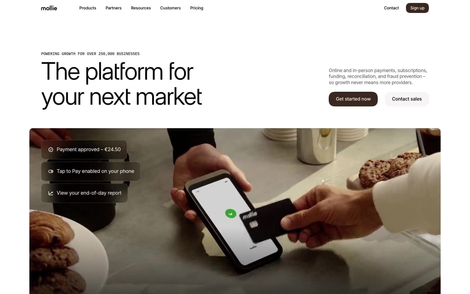
Mollie
Finance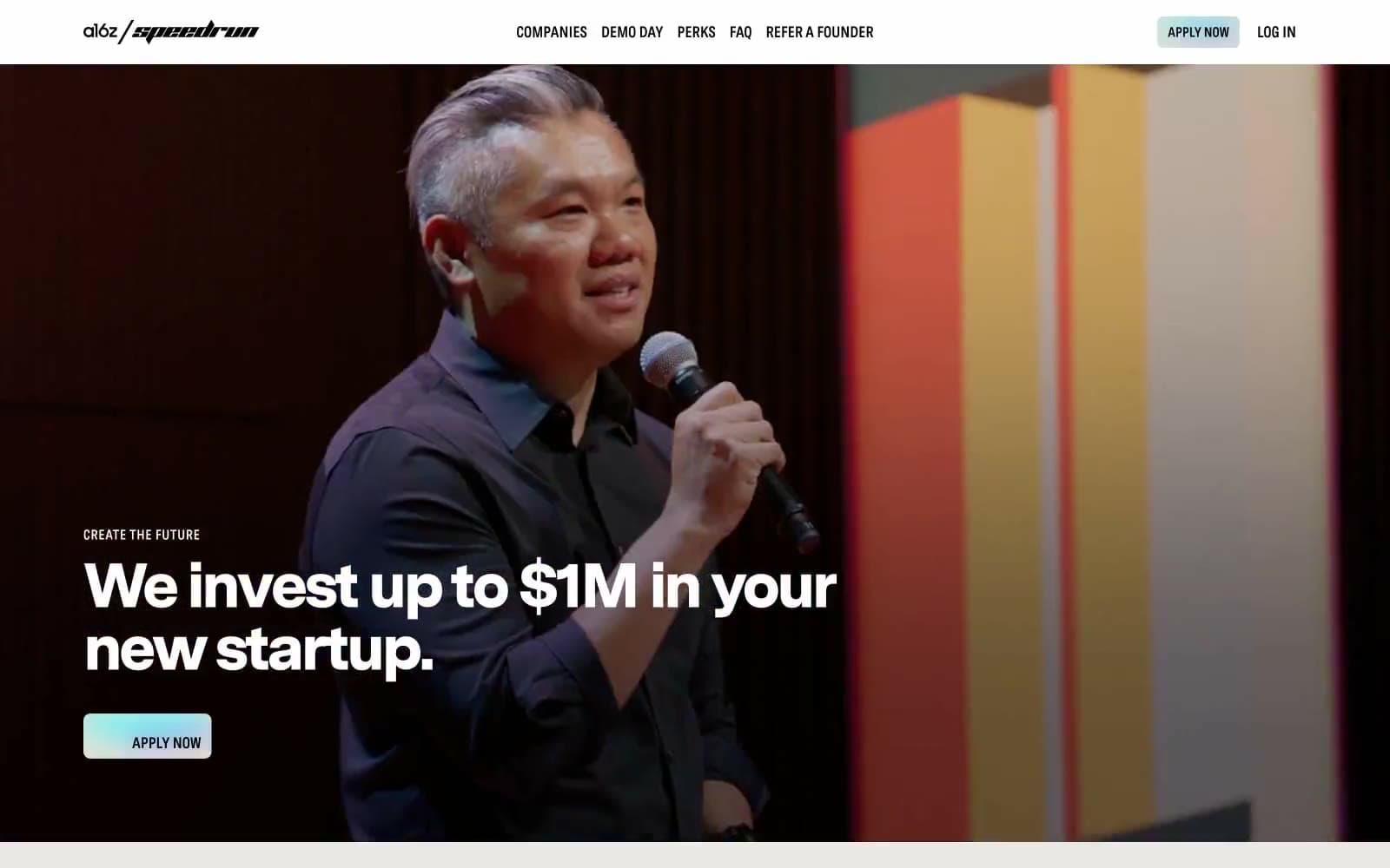
a16z speedrun
Finance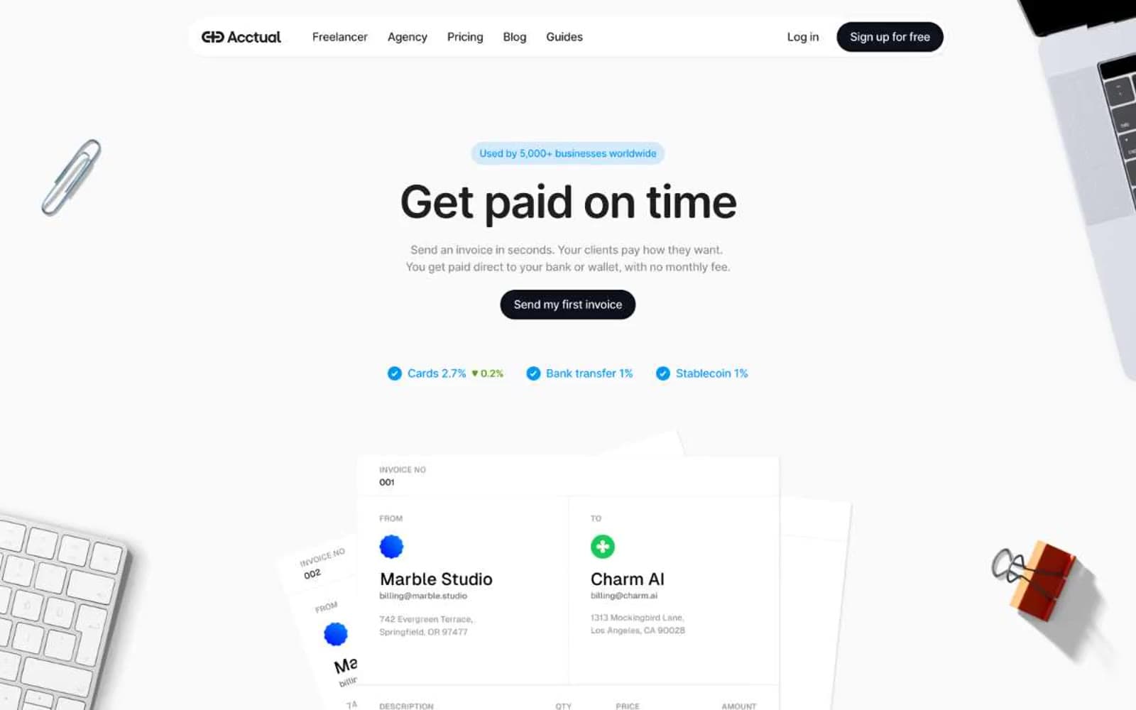
Acctual
Finance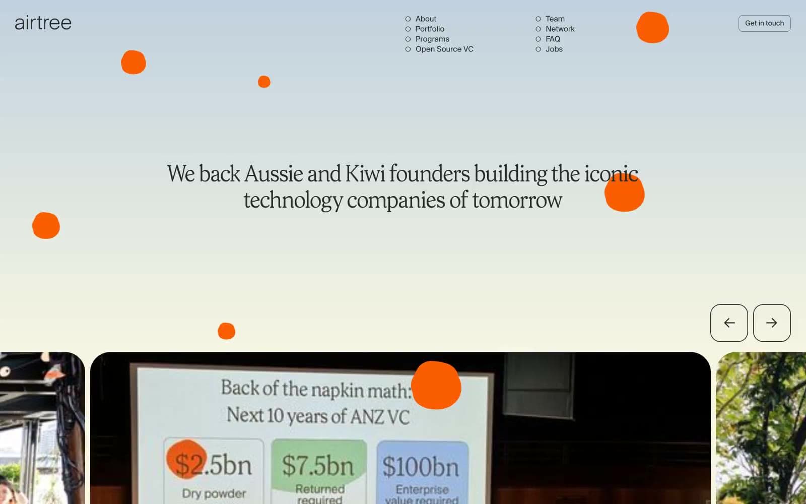
Airtree
Finance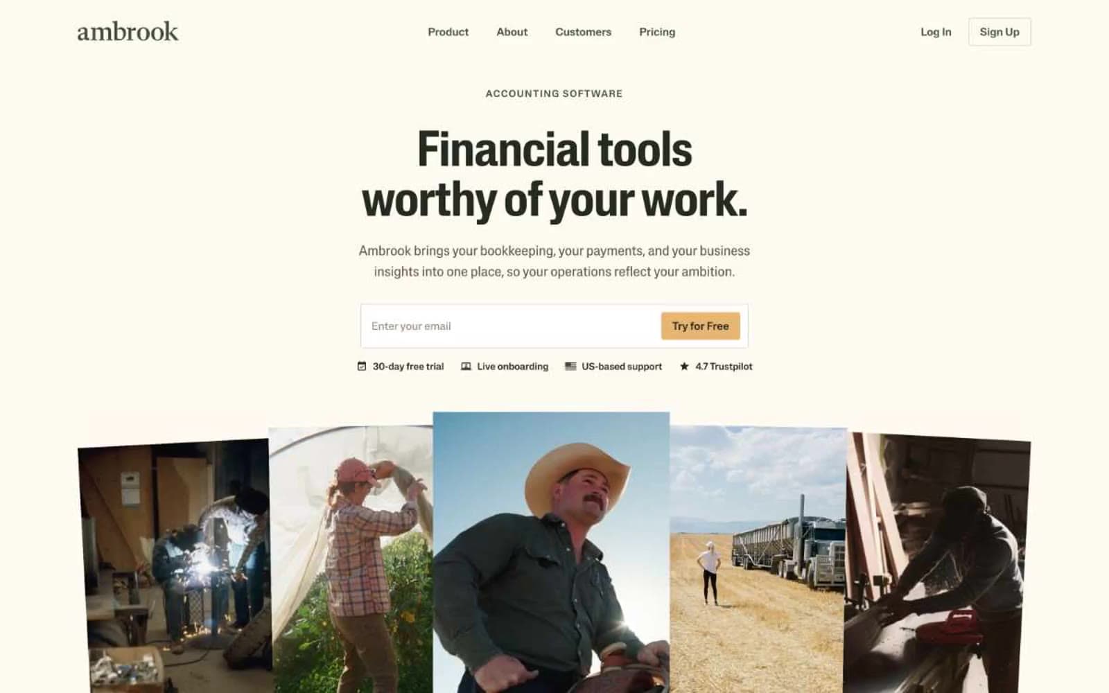
Ambrook
Finance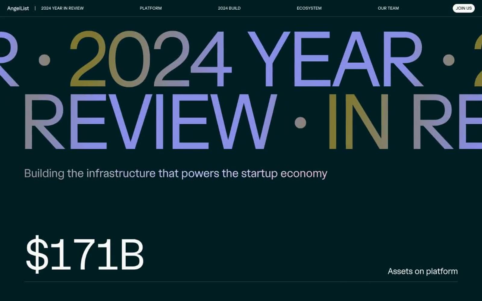
Angellist 2024
Finance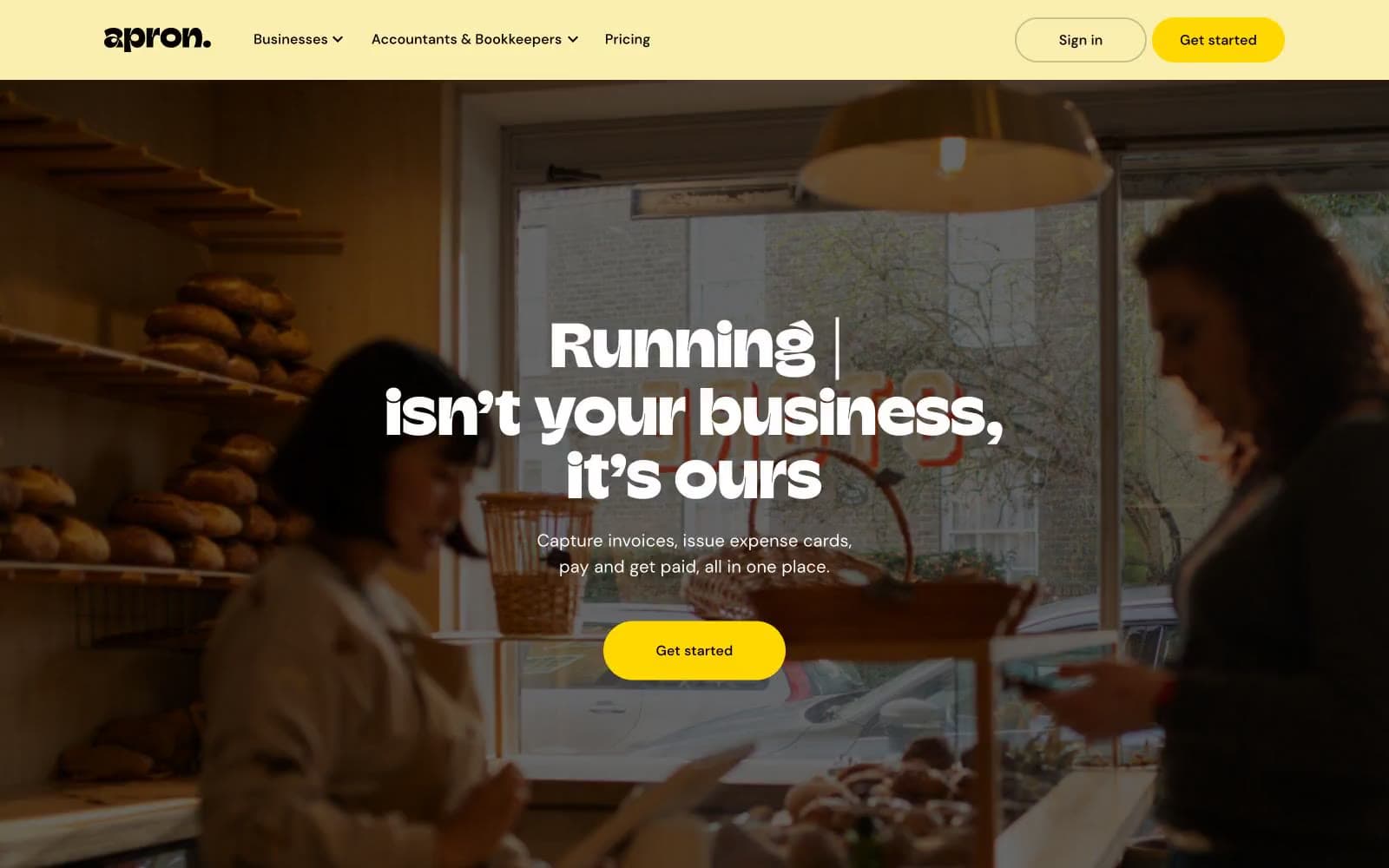
Apron
Finance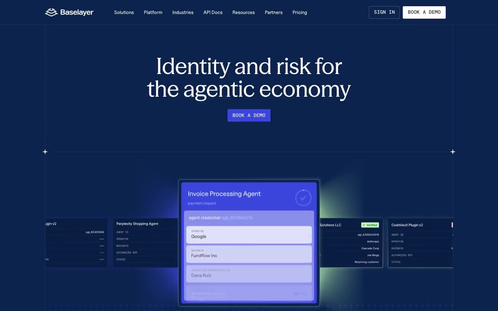
Baselayer
Finance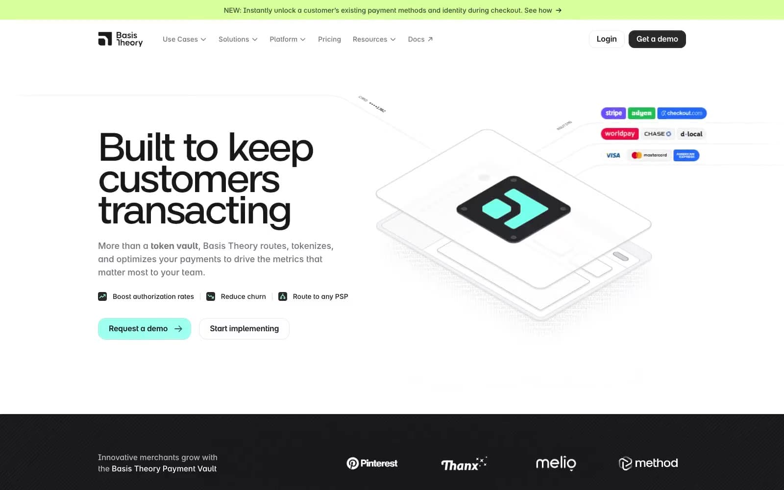
Basis Theory
Finance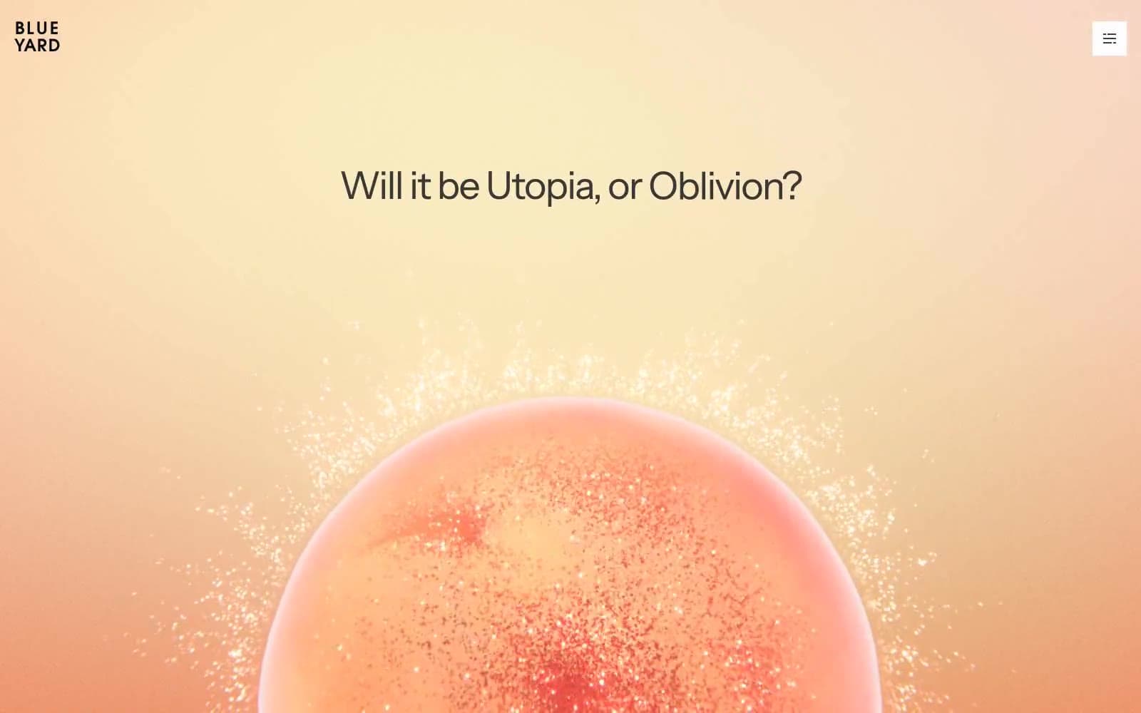
BlueYard Capital
Finance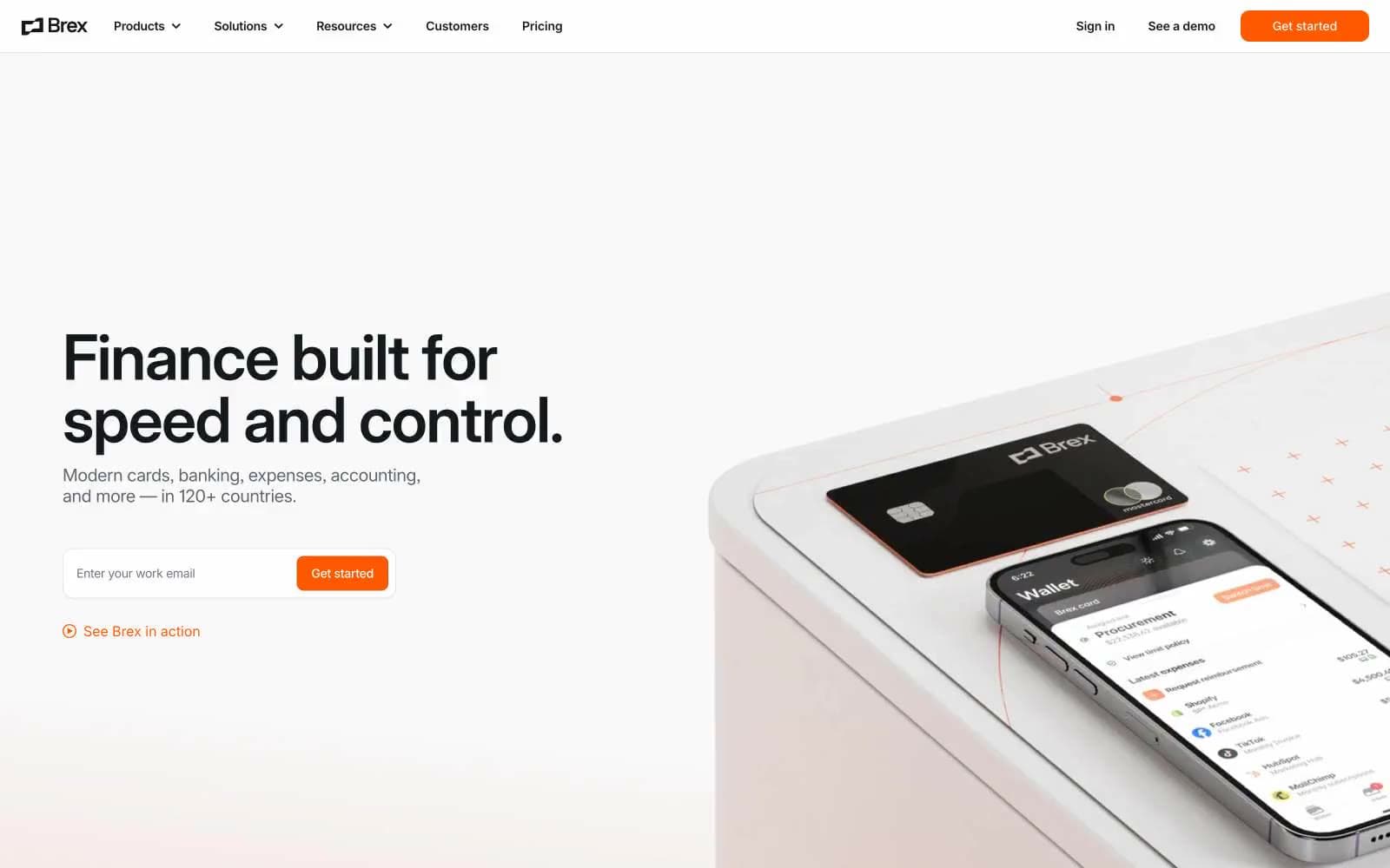
Brex
Finance
Coda
Finance


