
Moxie. Serif headlines float on a black void while a vivid blue accent punctuates the silence.
- Studio
- Dark theme
- 4 colors
- 2 typefaces
Moxie's design system operates as an editorial PR-agency darkroom: deep black canvas, warm cream typography, and a single vivid periwinkle accent that lights up interactions like a stage spotlight. The pairing of IBM Plex Serif (for headlines) with IBM Plex Sans (for everything else) creates a magazine-meets-product tension — the serif whispers authority and editorial polish, while the sans keeps functional UI grounded and modern. Layout breathes generously with large centered serif hero statements, asymmetric card grids for work showcases, and horizontal scrolling case-study carousels. Color is used sparingly: the cream (#f4efd4) does the heavy lifting for text and hairline borders on cards, the periwinkle blue (#84acfb) acts as a singular accent for italic emphasis, active states, and the sole filled CTA, and deeper warm grays layer card-on-card depth. There are no shadows, no gradients, no decorative chrome — the system relies on generous spacing, type contrast, and selective color punctuation to create hierarchy.
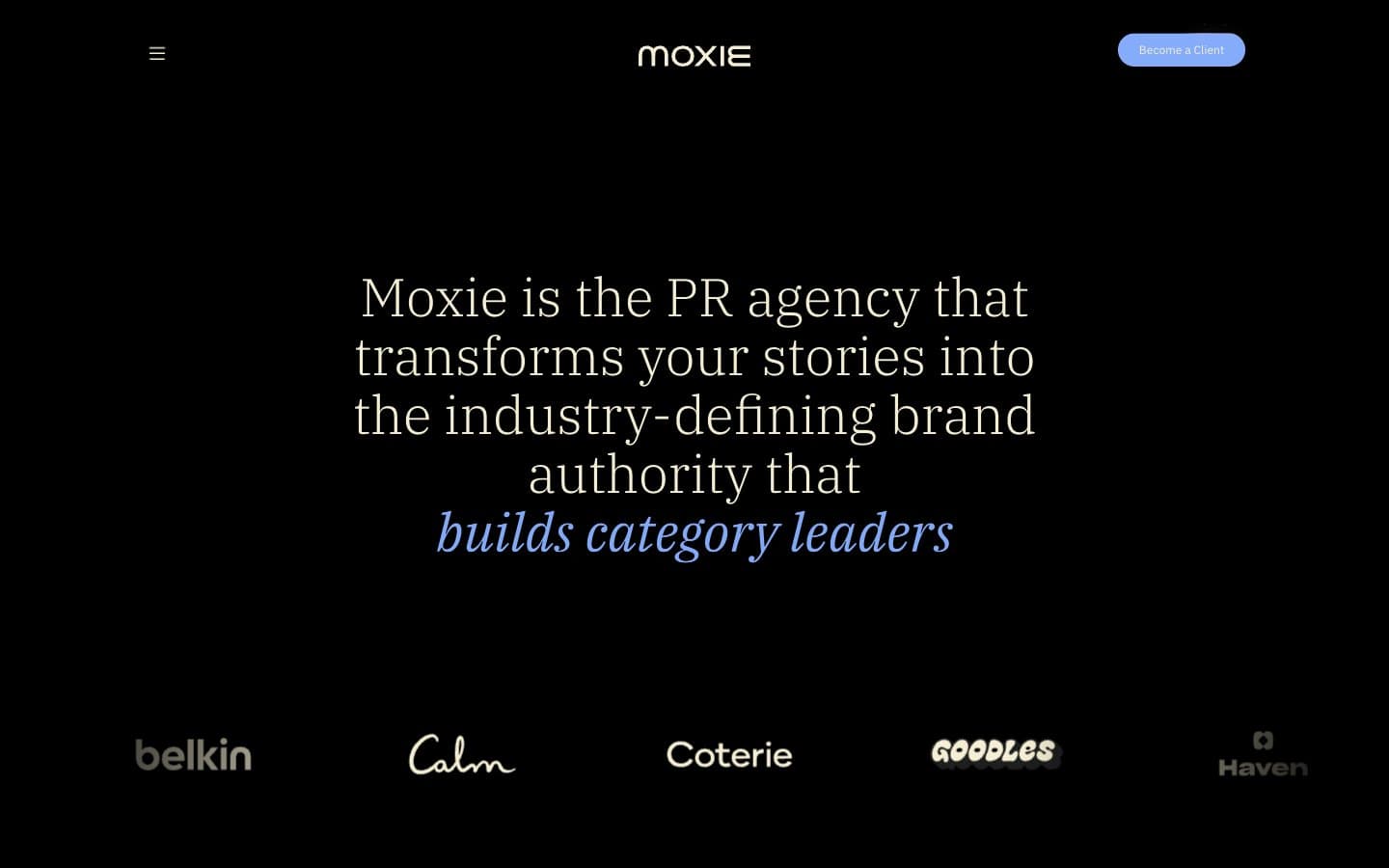
Moxie design system

Brand1
Primary action background, italic emphasis text, active nav state, heading accent — the lone chromatic signal in an otherwise achromatic system, used surgically to make interactions feel switched on
Neutrals3
Subtle borders, low-emphasis dividers, body text borders — the deepest visible neutral for near-invisible structural lines
Secondary card borders, muted text, button borders — a mid-tone warm gray for layering depth between cream borders and the black canvas
Primary text, card borders, hairline dividers, card surfaces — a warm off-white that softens the black void and carries the editorial tone
Try a pairing
Pick any two colors from the palette to check whether text stays readable on top.
Aa
Charcoal Veil on Periwinkle Flare
5.58 : 1 contrast
- Body textPasses AA 4.5
- Large textPasses AA 3
- StrictFails AAA 7
More DESIGN.md files. Same web, different personalities.

Basement Studio
Studio
Production Portugal
Studio
Active Theory
Studio
Adnaut
Studio
Agence K72
Studio
Akash Tyagi
Studio
Analogue
Studio
Athletics
Studio
BAM Photographers
Studio
Bareis + Nicolaus
Studio
Becklyn
Studio
Branding
Studio


