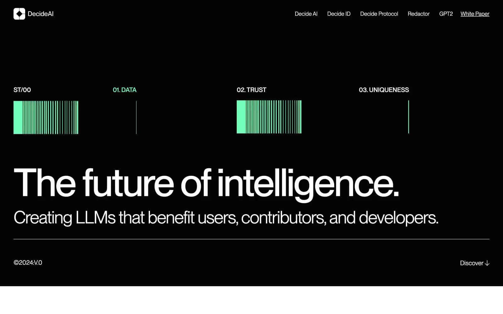
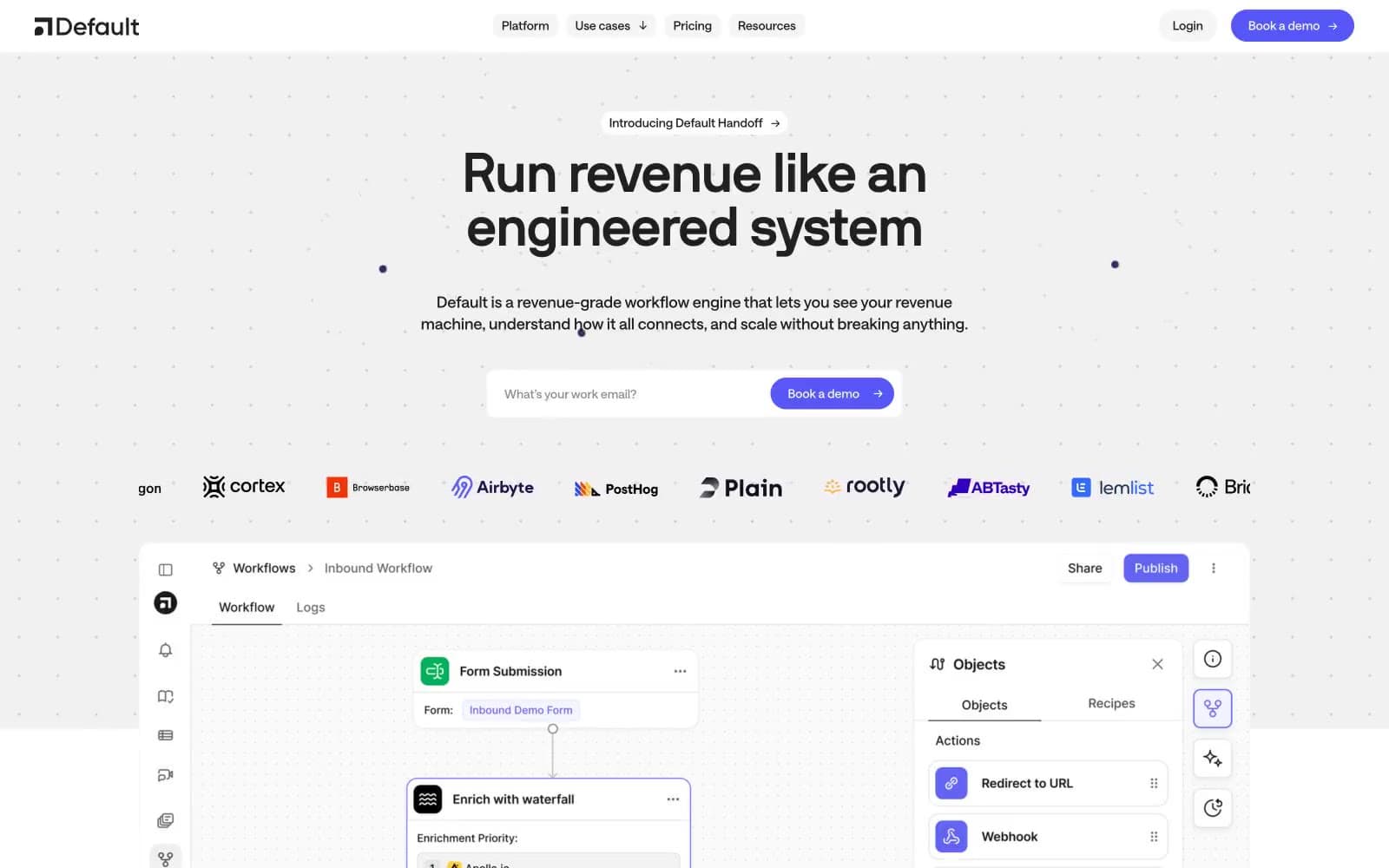
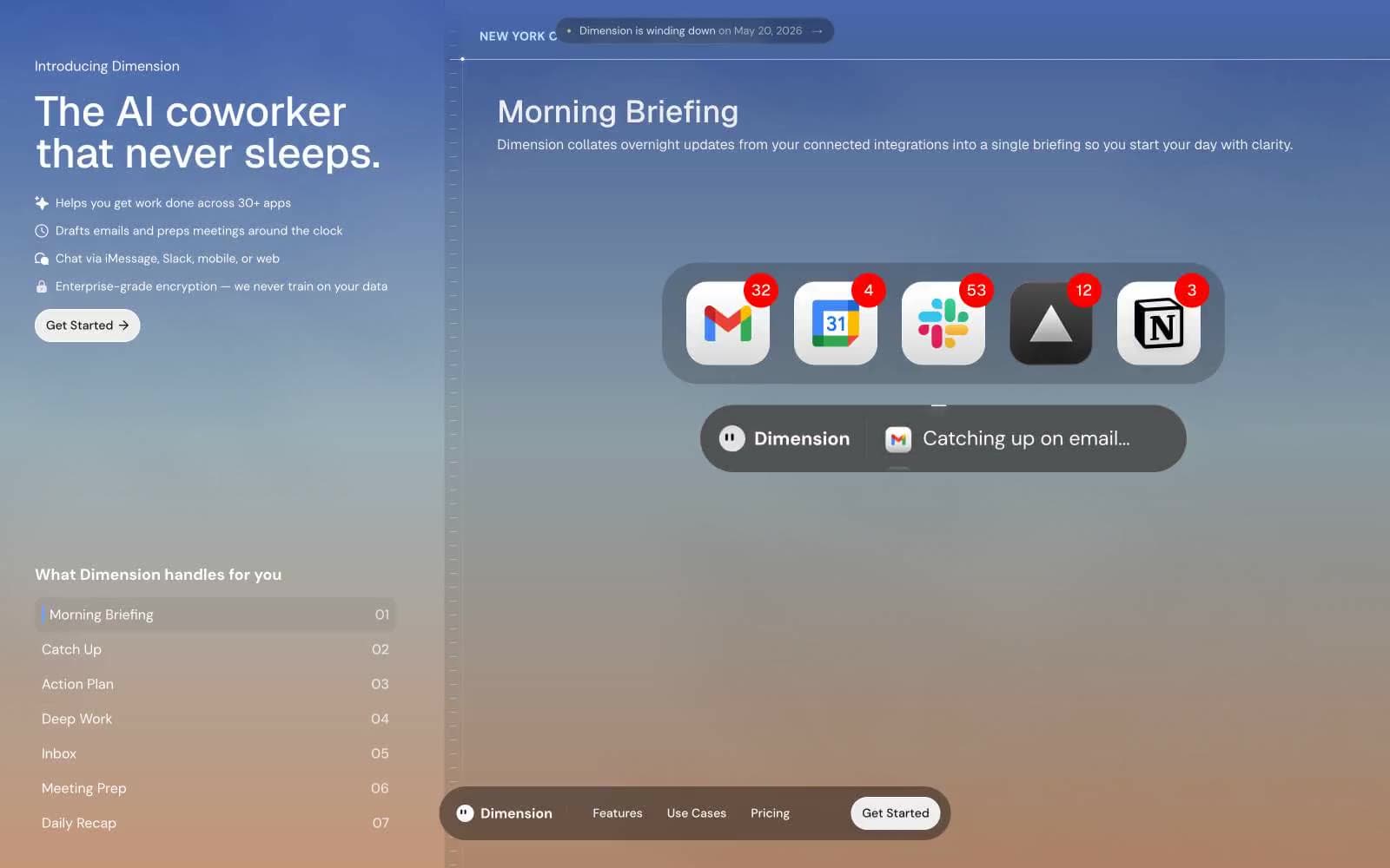
Morphic. Dark cinema canvas for AI storytelling.
- AI
- Dark theme
- 13 colors
- 1 typeface
Morphic operates as a dark cinema canvas for AI storytelling — pure black backgrounds swallow visual noise so generated imagery becomes the only source of color and light. The system is 99% achromatic: a tightly stepped neutral surface stack from #000000 through #212121 to #333333 carries the interface, while white text and gray subtext create hierarchy without competing with the artwork. A single vivid blue (#0075ff) is the only chromatic accent, reserved for primary actions, the 'New' badge, and the Share button — it functions as an electrical pulse against the matte dark, never decorative. Typography is Inter at all weights and sizes, with whisper-tight tracking on large display sizes and generous line-height on body copy. Components feel glassy and recessed: thin borders at near-invisible opacity, soft 10-16px radii, and almost no shadows. The density is compact (4px base, 8px gaps) and the layout is wide-bleed with horizontal-scrolling card rows, giving the site the rhythm of a streaming gallery rather than a traditional SaaS page.
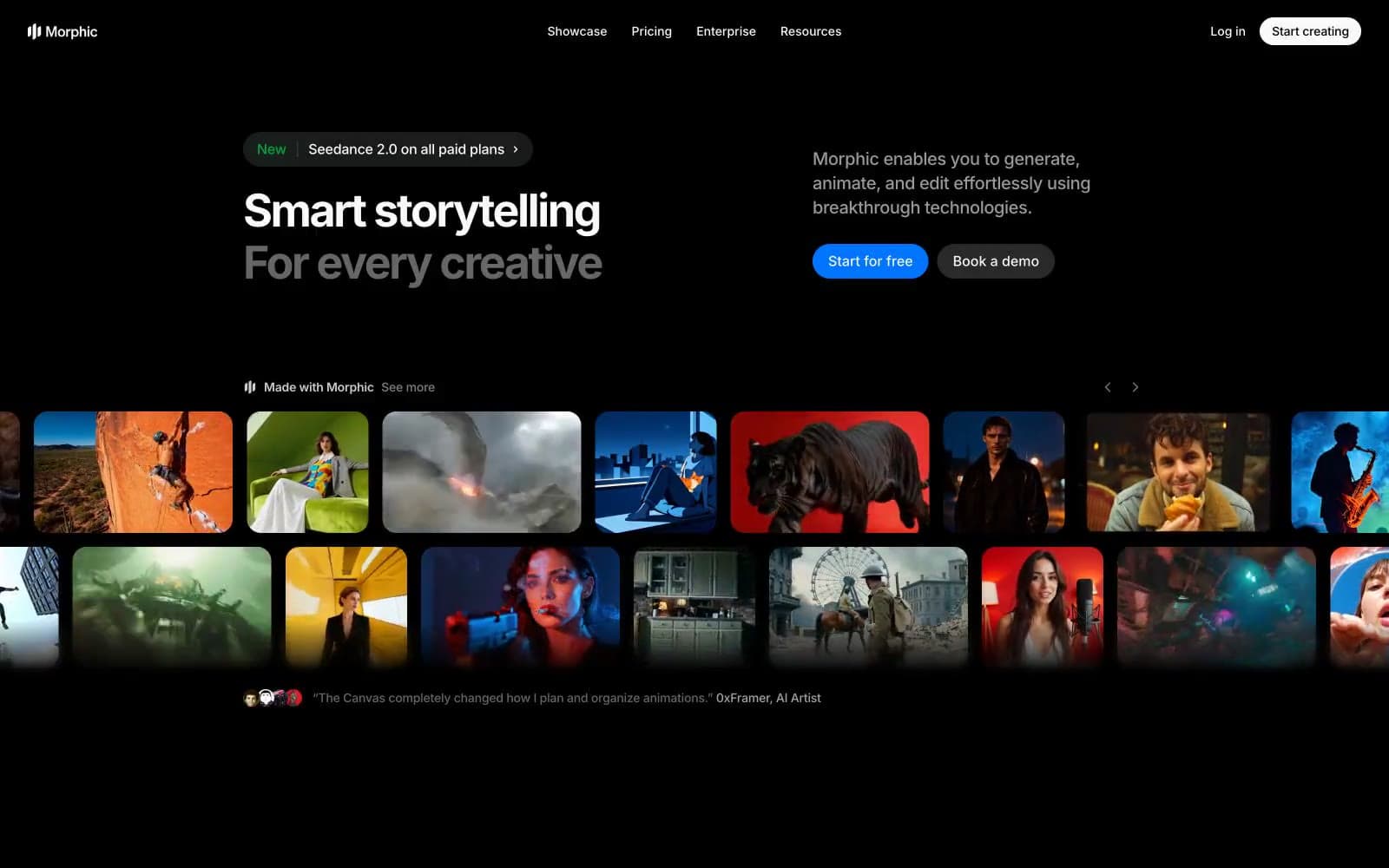
Morphic design system

Brand1
Blue action color for filled buttons, selected navigation states, and focused conversion moments.
Neutrals12
Page canvas, hero backgrounds, full-bleed sections — the void that makes all imagery and accent color read as luminous
Primary card surface, elevated panels, and section backgrounds one level above the canvas
Secondary button background (ghost/outlined), nested cards, and hover surfaces one step lighter than Surface One
Tertiary button background, highest elevation layer, and active-state surface tints
Icon strokes and outlines at medium contrast, secondary borders
Lowest-emphasis body text, helper copy, and subdued annotations
Tertiary headings, caption text, and supporting metadata
Link text in resting state, secondary annotations, and icon strokes at low contrast
Muted body text, inactive labels, and disabled-state copy
Hairline borders and dividers — applied at very low opacity so cards have edge definition without visual weight
Soft highlight washes, secondary text on light surfaces, and subtle icon fills
Primary headings, button text, logo, and high-emphasis copy on dark surfaces
Try a pairing
Pick any two colors from the palette to check whether text stays readable on top.
Aa
Pure Black on Electric Blue
4.99 : 1 contrast
- Body textPasses AA 4.5
- Large textPasses AA 3
- StrictFails AAA 7