
Monzo. Confident restraint with a single hot accent.
- Finance
- Light theme
- 11 colors
- 2 typefaces
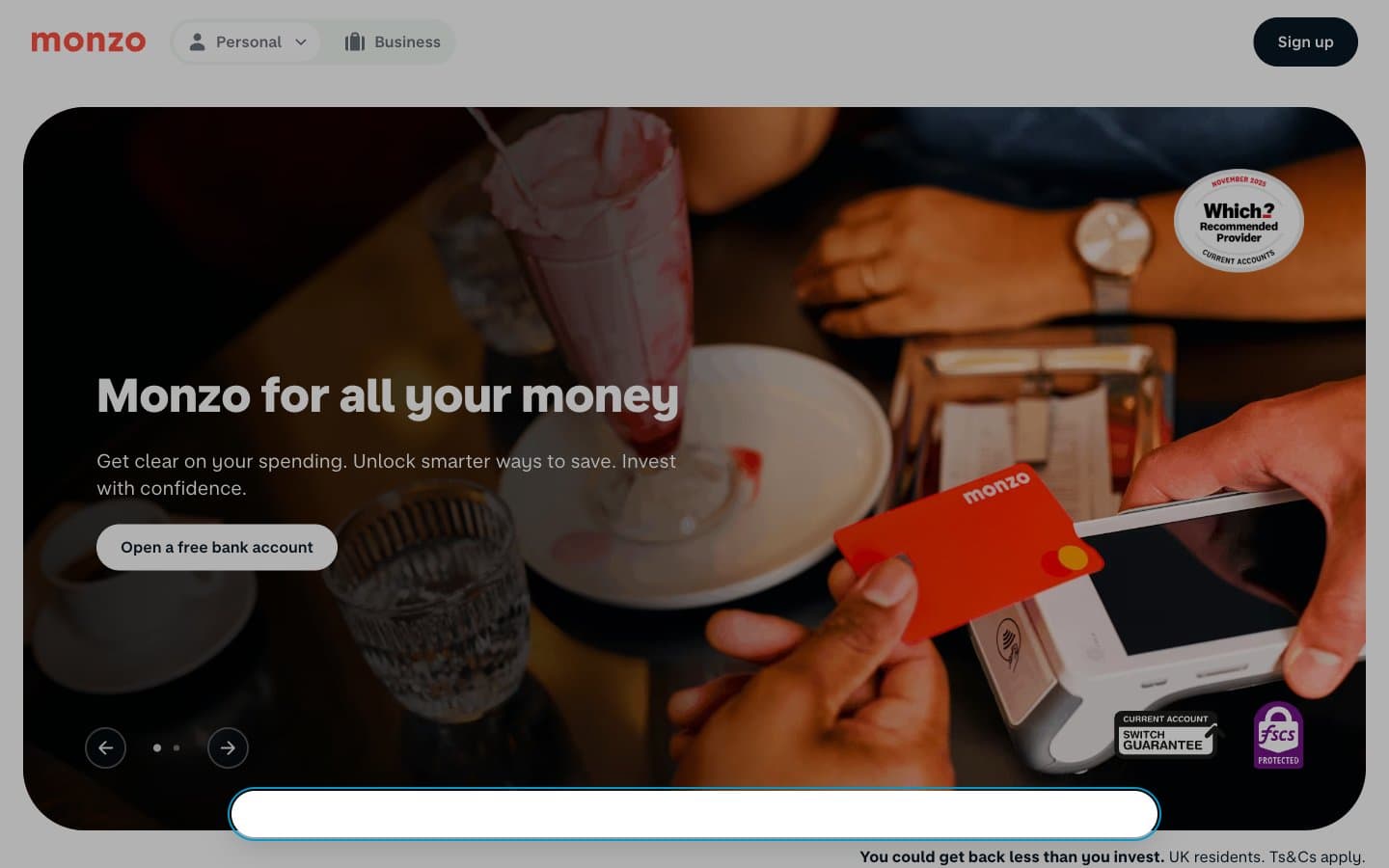
Monzo operates as a digital-first challenger bank with a light, warm, and unapologetically friendly visual language. The canvas is a whisper-soft mint off-white (#f2f8f3) that sits behind crisp white card surfaces, creating a layered paper-on-paper feel without relying on heavy shadows. A single vivid Hot Coral (#ff4f40) carries all chromatic energy — it stains the logo, links, headings, icons, and the physical card product itself, while the rest of the interface stays achromatic and quiet. Typography is custom sans-serif in two voices: a text family with a distinctive negative letter-spacing of -0.05em that tightens paragraphs, and a chunky display face at 600-800 weight for headings. Components are generously rounded (pills for actions, 64px for containers) and deliberately low-elevation — the brand trusts color, type weight, and whitespace to create hierarchy, not drop shadows.
Monzo design system

Brand1
Brand signature — logo, links, headings, icons, card product. One vivid accent against the achromatic interface; every chromatic moment in the system draws from this single hue
Neutrals10
Maximum-contrast text, the darkest token in the system. Used sparingly for the highest-emphasis text on light surfaces
Dark supporting neutral for text, icons, and strong contrast. Do not promote it to the primary CTA color
Secondary surface tint and footer accents. Slightly lighter than Midnight Ink for layered dark elements
Supporting neutral for secondary UI, dividers, and muted labels. Do not promote it to the primary CTA color
Secondary body text, metadata, descriptive copy. The workhorse neutral for supporting information
Icon strokes, decorative line work, subtle dividers
Tertiary text, placeholder, low-emphasis borders
Hover washes, subtle filled buttons, inset surface treatment. Sits between the page canvas and white cards
Page canvas — the dominant background behind all content sections. A barely-green off-white that gives the interface warmth without competing with white surfaces
Card surfaces, elevated panels, button text on dark fills. Sits one layer above the mint canvas
Try a pairing
Pick any two colors from the palette to check whether text stays readable on top.
Aa
Pure Black on Hot Coral
6.44 : 1 contrast
- Body textPasses AA 4.5
- Large textPasses AA 3
- StrictFails AAA 7
More DESIGN.md files. Same web, different personalities.

Mollie
Finance
a16z speedrun
Finance
Acctual
Finance
Airtree
Finance
Ambrook
Finance
Angellist 2024
Finance
Apron
Finance
Baselayer
Finance
Basis Theory
Finance
BlueYard Capital
Finance
Brex
Finance
Coda
Finance


