
Miti Navi. Tuscan sea-view chapbook on raw linen.
- Brand
- Light theme
- 6 colors
- 4 typefaces
Miti Navi operates as a warm, paper-toned editorial canvas — think a luxury yachting magazine spread printed on unbleached craft stock. The entire interface is built on a sand-beige field (#e6dece) with deep ink-black typography, giving the site a tactile, hand-printed quality. Monospaced type (GT Pressura Mono) carries all functional UI — nav, buttons, body — lending technical precision that contrasts with the swooping, romantic serif (Voyage) reserved for editorial display lines. A single warm peach underline (#ffdead) is the only chromatic accent, used sparingly to mark interactive moments. The hero photograph is masked by a dramatic arch, the navigation splits into three balanced clusters around a centered wordmark, and a vertical sticky side tab interrupts the right edge with rotated text — all choices that read more like an art book than a product page.
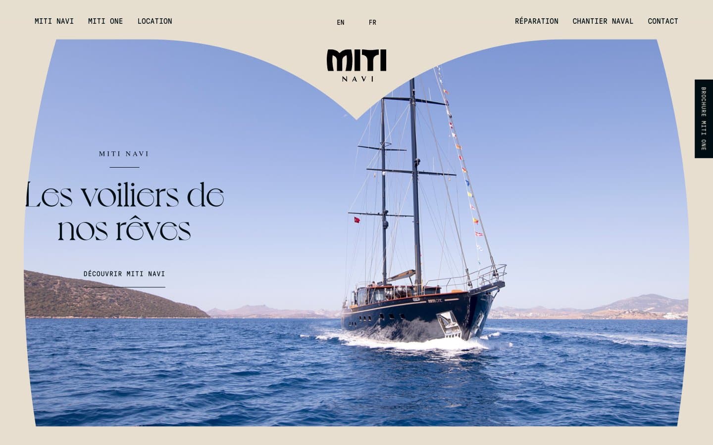
Miti Navi design system

Accent1
Interactive link underlines, outlined action borders, the sole chromatic accent — used as a 1px rule beneath active elements to signal affordance without weight
Neutrals5
Pure black for maximum-contrast headings and icon fills where Carbon reads as warm
Primary text, navigation, structural borders, logo lockup — near-black with the faintest cool undertone
Body text, icon strokes, secondary headings, hairline rules, card borders — workhorse dark for dense UI elements
Muted helper text, inactive nav items, subtle dividers, secondary metadata
Page canvas, card surfaces, section backgrounds — the warm unbleached-paper field that carries all content
Try a pairing
Pick any two colors from the palette to check whether text stays readable on top.
Aa
Obsidian on Warm Apricot
16.30 : 1 contrast
- Body textPasses AA 4.5
- Large textPasses AA 3
- StrictPasses AAA 7
More DESIGN.md files. Same web, different personalities.

Airbnb
Brand
Aker
Brand
Alison Roman
Brand
Alpine Bio
Brand
Alveos One
Brand
Amrit Palace
Brand
André Cândido
Brand
Anna Jóna
Brand
Apollo
Brand
Apple
Brand
Arva
Brand
Ashton Bespoke
Brand


