
Midday. A 72px serif headline over warm stone, spaced sans-serif body text, pill-shaped controls, zero shadows.
- Finance
- Light theme
- 7 colors
- 2 typefaces
Midday reads like an editorial broadsheet translated to software: a warm parchment canvas, a spaced sans-serif body voice, and a serif display face that announces sections like magazine pull-quotes. The system is monochrome to the point of austerity — surfaces stack in warm off-whites, borders are hairline-thin, and chromatic color appears only as functional punctuation for financial data (a single moss green) and the dark filled CTA. Every interactive element is pill-shaped; nothing is squared off. The design is completely flat — no shadows, no gradients, no decorative depth. Spacing is compact and rhythmic on a 4px grid, keeping dense ledger data legible without breathing room.
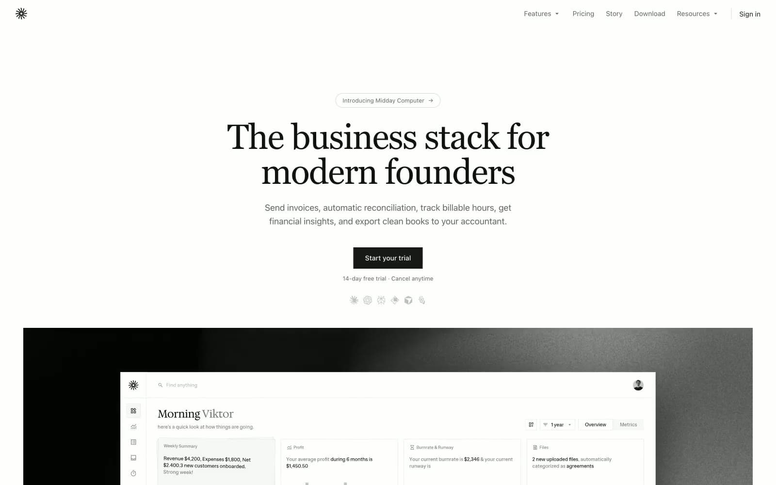
Midday design system

Accent1
Green text accent for links, tags, and emphasized short phrases
Neutrals6
Primary text, icons, and logo — near-black for maximum contrast against parchment and paper
Primary action fill — dark filled buttons and active navigation state, white text reverses on top
Secondary text, muted labels, chart axis lines, non-active icon strokes
Page canvas and hairline borders — the warm off-white that unifies every surface and defines every divider at 1px
Secondary surface for table rows, inset panels, and tonal contrast between stacked cards
Card surfaces, input fields, pill button fills — pure white sits one level above the warm canvas
Try a pairing
Pick any two colors from the palette to check whether text stays readable on top.
Aa
Ink on Moss
6.74 : 1 contrast
- Body textPasses AA 4.5
- Large textPasses AA 3
- StrictFails AAA 7
More DESIGN.md files. Same web, different personalities.

Mollie
Finance
a16z speedrun
Finance
Acctual
Finance
Airtree
Finance
Ambrook
Finance
Angellist 2024
Finance
Apron
Finance
Baselayer
Finance
Basis Theory
Finance
BlueYard Capital
Finance
Brex
Finance
Coda
Finance


